The Zoe Quinn Website Quiz is an online questionnaire published by Zoe Quinn, a video game developer and comic book writer, that promotes her series titled ‘ Goddess Mode’. It is a part of a collection of community resources and projects available on her website. The online quiz is a unique web experience that prompts the user to answer a series of multiple-choice questions leading to an assigned Oracle Personality from the world of the comic ‘Goddess Mode’.
Visual Design
The visual design of the website is minimal with a clean and simple interface. There is a lack of depth and visual hierarchy present amongst the elements on the pages. The language used appears to be indicative of the author’s style and a representation of the series but it fails to communicate information explicitly. We can observe consistency in design throughout the website but there is scope for improvement to make it more intuitive and understandable.
Home Page
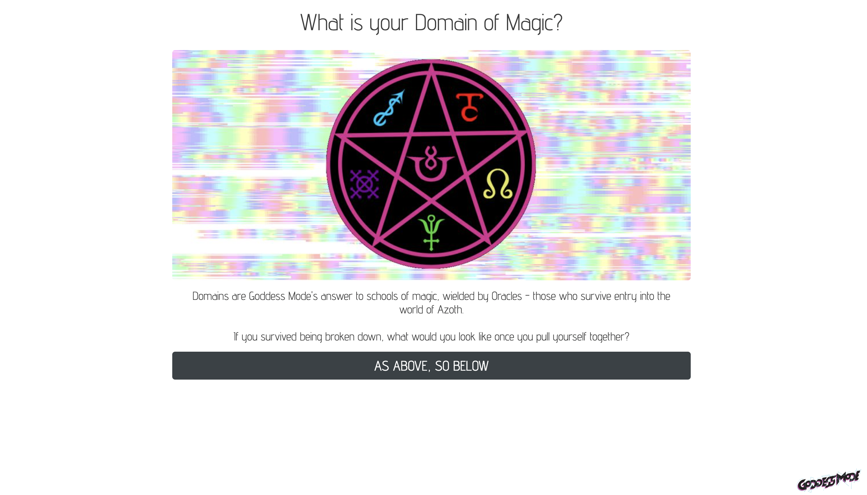
The landing page for the website is ambiguous with limited context and is not in favor of the two important characteristics of design : discoverability and understandability. The content available on screen to the user doesn’t clearly indicate the nature of the web experience, the purpose of the quiz and the result that it will yield. The affordance is implicit, with a lack of signifiers that clearly indicate the intention of the website. Unless the user has been directed from the author’s website, there is limited information about the quiz and its relation to the author and the series.
The title at the top of the screen being a question and the button at the bottom are vague design cues and they do appeal to the user’s “knowledge in the head”. These are identifiable conventions that signify to the user the logical consecutive action to be taken with expected feedback from the website.
Quiz Process
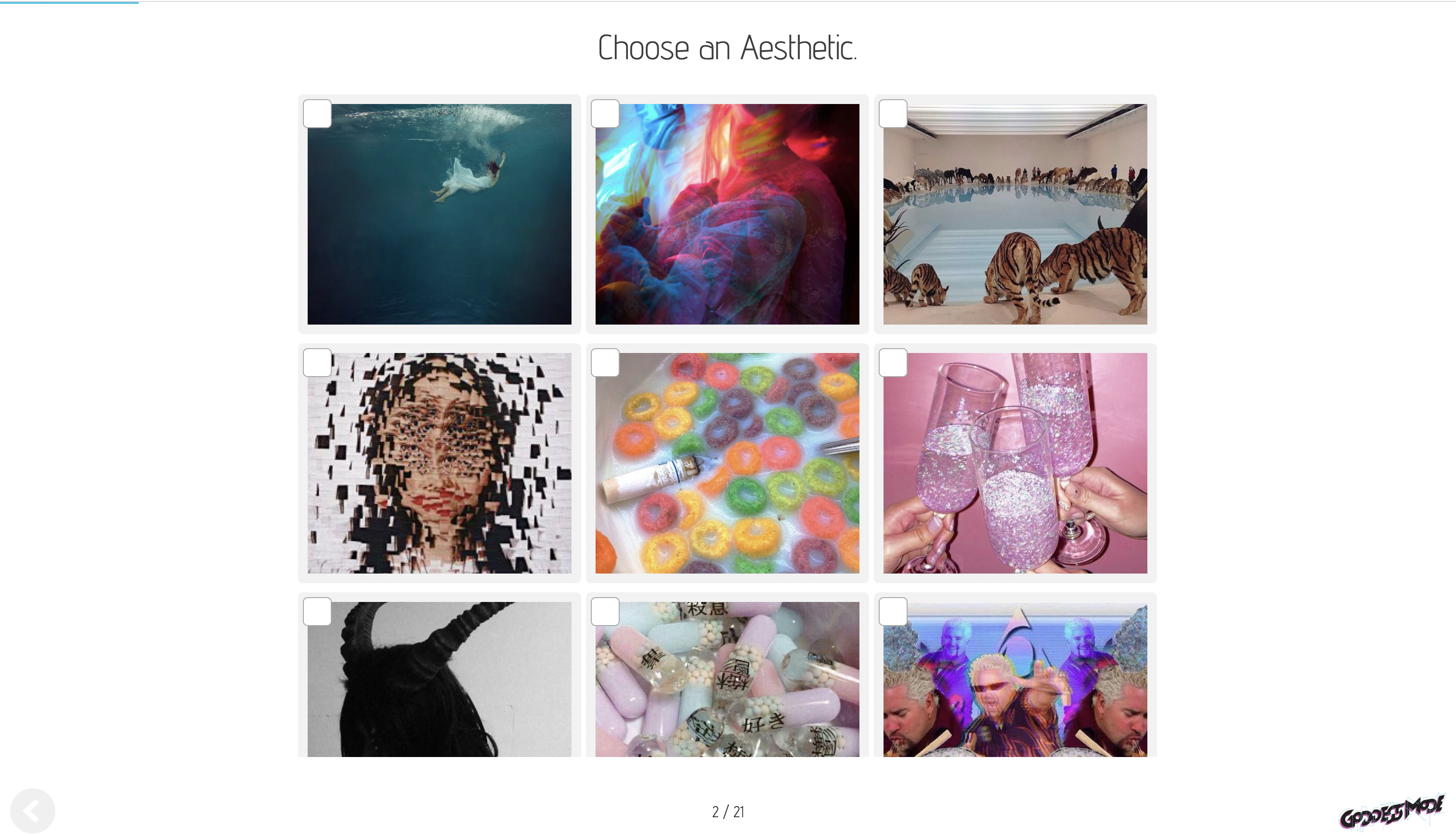
Once the quiz begins, the user navigates through a series of multiple choice questions. The process is simple and quite straightforward. The signifiers and mappings are easily understandable. The structure of the quiz is designed with the ‘appropriate constraints’ and ‘forcing functions’ that makes the whole process feedforward with appropriate feedback. This guides the user’s behavior and actions to help complete the quiz seamlessly.
With the questions being straightforward, the website minimizes causes for errors and slips. But considering how humans think and their psychology, asking users to make a choice can result in a lot of reconsidering and backtracking. The design lacks the ability to allow users to confirm their selection for each question and also doesn’t completely allow users to reverse their actions; the absence of arrows to move forward and backward in the quiz.
Result for the Quiz
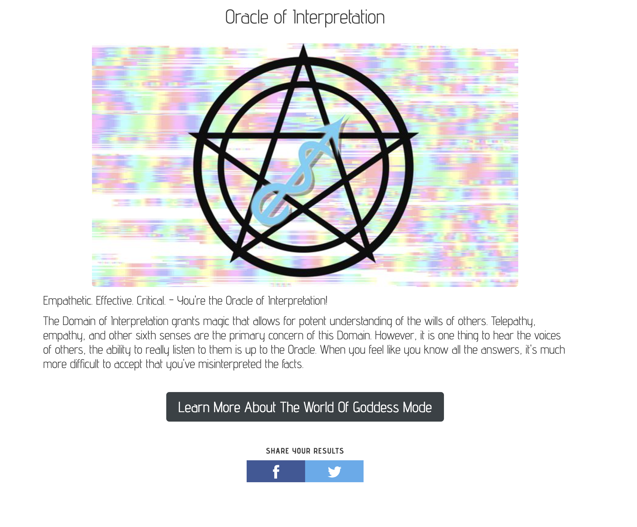
The final result of the quiz presents the user with an oracle personality and the option to learn more about the comic series ‘Goddess Mode’ by navigating to its website. The quiz is a fun experience that is meant to attract users to learn more about the comic. While the final result is as promised, it is underwhelming and fails to capture the attention of the user. For a new user with no previous introduction to the artist or this comic, the quiz, its questions and the result are too vague to hold the interest of the user.
The results page also does not enable the user to navigate to the start of the quiz. The only options available are the comic’s website or sharing results on Facebook or Twitter. This places constraints on the user to freely navigate across the website. The lack of other options to share the quiz results also place limitations on the user.
Explore the Comic
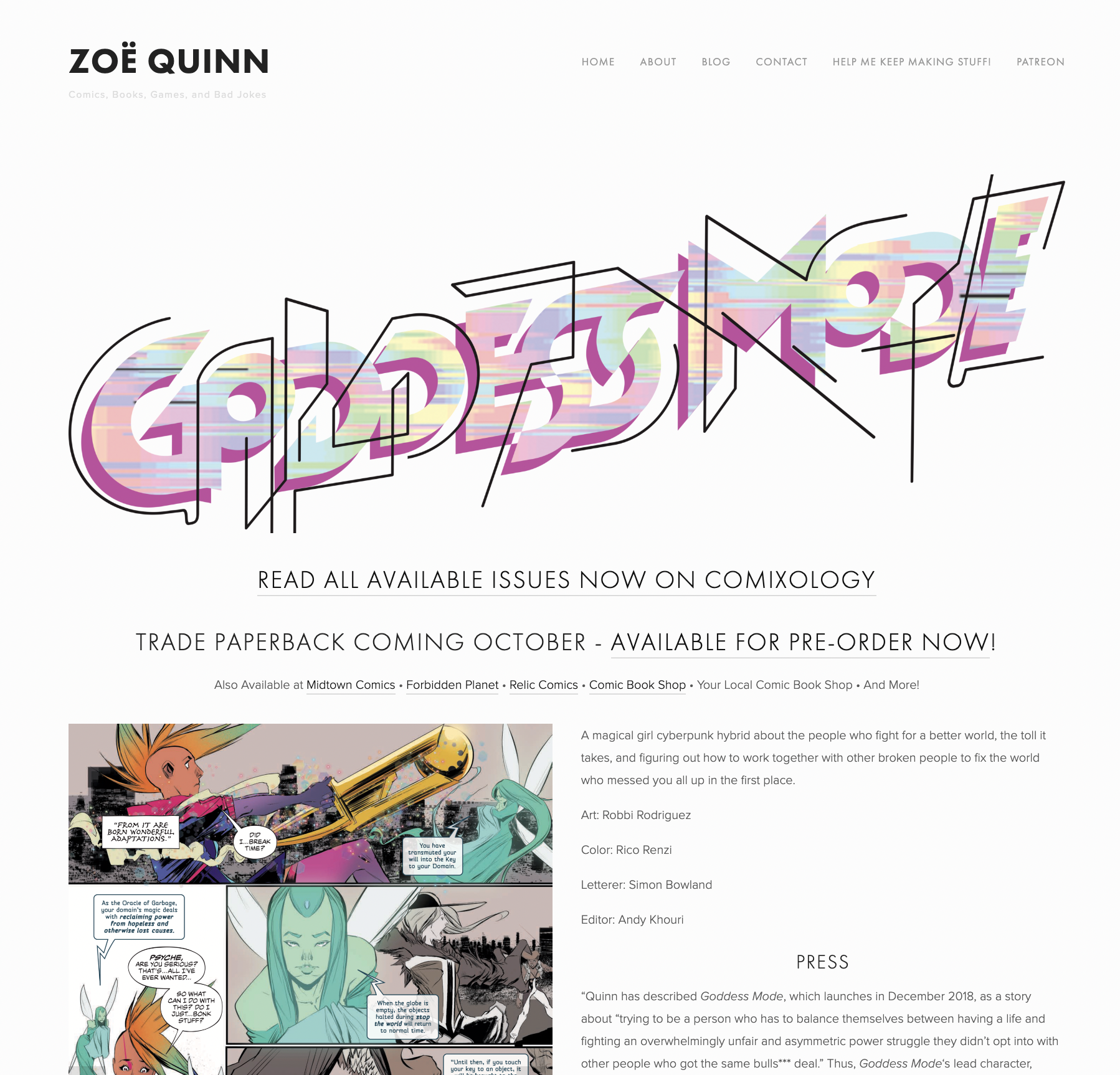
To explore more about the comic, the user has to navigate to the artist’s website, which is similar in aesthetic to the quiz website but differs in its visual design with differences in layout, text and content. The webpage promptly introduces the user to the series and provides links for websites to purchase. By scrolling down, the user can go through the six different volumes in the series and learn more about them. The artwork to support these volumes is accompanied with a brief description.
The volumes are placed one below the other as we scroll down. However there isn’t an option to view all the volumes in the series at once or navigate to them individually. I would recommend more information about the volumes be present in the introduction and also enable navigation to view them.
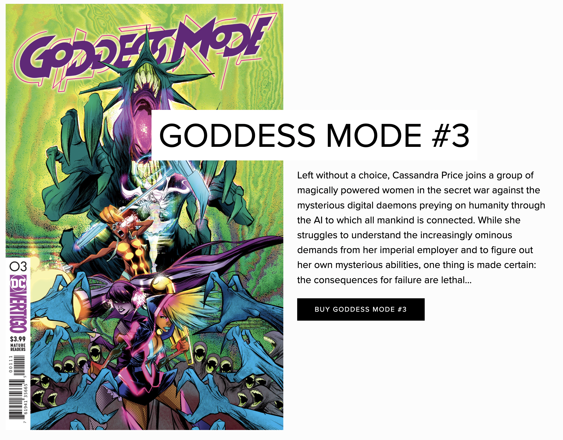
The bold colors and artwork displayed are clearly distinctive of the artist’s style, helping the user discern more about the series. The images and text are represented clearly with adequate separation between the sections indicating good mapping of the webpage. We can see clear representation of Norman’s three levels of design with agreeable appearances, effectiveness of display of products and conscious approach to match the aesthetic of the artist’s work.
Conclusion
The Zoe Quinn Website Quiz is a unique online experience which manages to fulfill the basic requirements but misses the mark in its design and understandability. The website can be improved by working on the visual design, the mapping and the language used. There are numerous vague elements present across the website which a new user would not be able to discern. There are numerous changes that can be made to capture users attention and help them to enjoy a better experience.