The UK’s most popular fashion online retailer, ASOS provides a world-class customized shopping experience. It offers a variety of fashionable options from household brands by making it efficient for users to make their purchases. ASOS has become a place to find inspiration, create your own sense of style, and enhance shopping at affordable retail prices.
Homepage
The application provides discoverability allowing users to select designated countries, following their currency and preferred gender. Each button acts as a signifier becoming knowledge in the head for users that have used iOS shopping apps, to select categories before moving to the next step. Once users select a gender, natural mappings indicate what gender items are being shown. The use of descriptive typography signifies the categories to enhance the user’s shopping experience by filtering what is trending within the season.
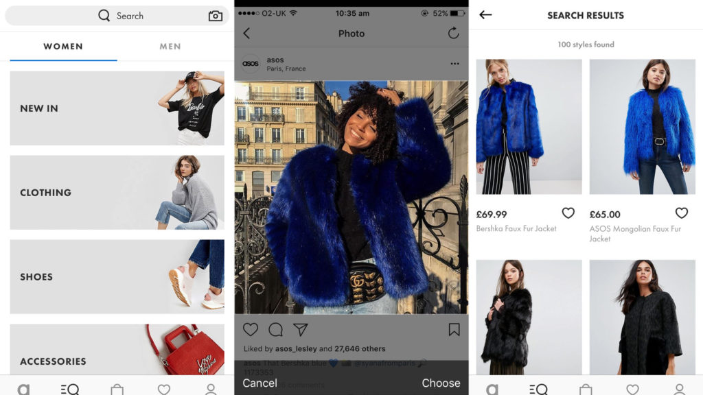
Search Content
While on the homepage, the user can access the top navigation bar of selected categories provided the bold typography signifies the user must tap on it. The user knows it works because of the bar underneath highlighting they’re on the page. Another option for the user to search would be the search bar above and below the page. The mapping enhances the system image by having two corresponding icons giving the user an idea of how to navigate.
‘Clothing’ gives the user a full range of items. When the item is selected the full page appears, providing natural mapping of imagery, icons, video, reviews, and descriptive text on one page. This eliminates the user having to seek information elsewhere about the product, which gives overall feedback. There is also a carousel layout, the dots below act as a signifier by letting the user swipe in either direction or notify them that multiple images are displayed. ‘ASOS Petite’ affords the categorized items the user might have selected when doing a search. Scrolling signifiers are indicated to scroll down to review more information about the product and reviews. The reviews ensure the transparency of the products are being told by actual users to enhance the experience.
Adding Saved Items
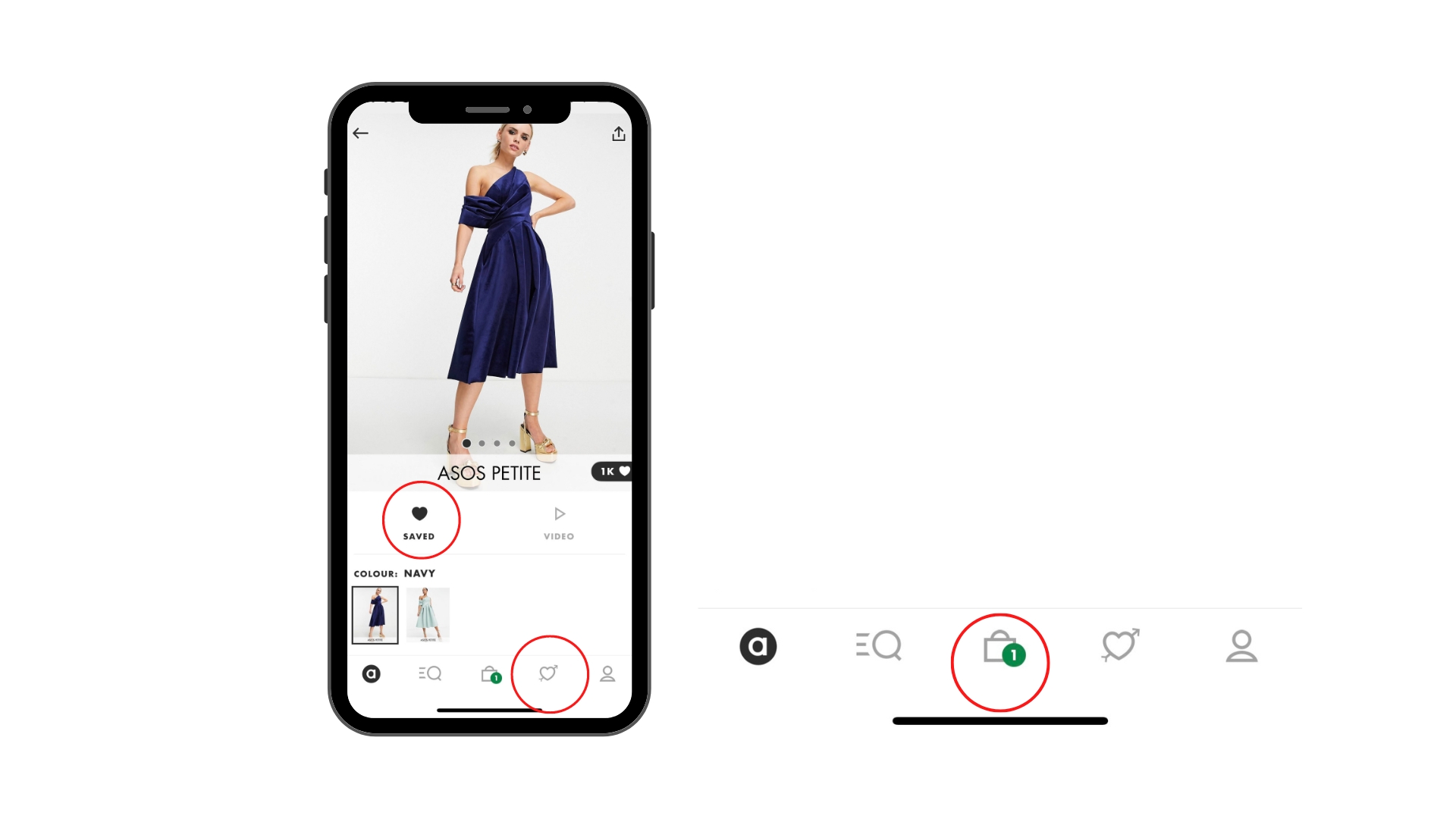
The bottom navigation bar is discoverable and affords the user to click on each icon to determine its purpose. However, when the saved items icon is tapped the user doesn’t get a signifier of where the items went or how to get there. Without the icon being responsive to the action indicating an item has been saved it doesn’t provide proper feedback. A Gulf of Execution happens causing the user to become confused when searching for their saved items. Adding signifiers demonstrated on the ‘cart’ icon can provide a clear conceptual model leading to understanding what has been achieved. The cart icon provides logical constraints because of the number being displayed. It tells the user how many items are currently in their cart.
Conclusion
ASOS demonstrates great usability practices, and it’s simple to navigate the application. However, it should add more signifiers to avoid users at a visceral level. Users are more inclined to be frustrated when they aren’t sure how to understand a design and its process. Nevertheless, the application provides a seamless user experience.