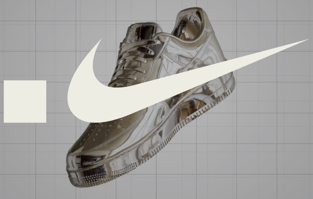
Swoosh.Nike is a new virtual space where everyone interested can collaborate in designing and owning the future of Nike’s digital products through blockchain. People can co-create, build collections, earn royalties, and trade virtual Nike products for digital fashion in web3. The platform promises to use its own NFTs as wearables to incentivize people’s individuality and identities in games and other immersive experiences.
Discoverability:
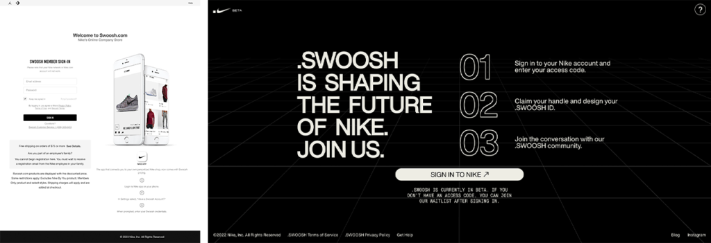
At a glance, when someone encounters Swoosh.Nike for the first time, the landing page displays the product value proposition. It also includes basic information about the product, how it interacts with the user, and how the platform interacts in the blockchain. It goes over its features, invites people to join and build their community as well as feedforwards enough information for someone to take action.
The design is intended to cause a reaction. The product’s visuals and other sensory aspects are purely visceral; the visual language helps us make a rapid decision about what the product is about and communicates excitement. It evokes emotion. In terms of visual design, the landing page is well done. There are visual hierarchies present across the page. The size in terms of typography, the high contrast, the exciting alignments of the content, the negative space around the layout, and the proximity between information and images make the content attractive and easy to understand.
The use of signifiers on the page communicates a joint action to access the platform makes it inviting. At a glance, the affordance is explicit and the intended step should be easy and effective. Visually speaking, the signifiers are concise and should allow the user to join the space.
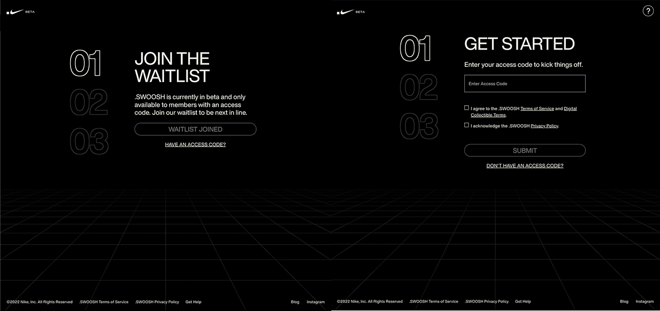
The site could be more precise in its interactions with the user. The current mapping makes joining the Swoosh platform difficult and doesn’t let us manage simple, everyday behavior patterns in the digital world. In other words, the intended action to join is quite complex and signing in is laborious. To access the platform, the user first has to:
- Create a new account or sign in with an existing one
- Join the waitlist
- Expect an access code that will grant access to the platform
Note: Signing in should be easy if the user is a member with an access code.
Suppose the user is new to Nike’s web world. In that case, the person will have to create a Nike member profile on Nike’s E-commerce website and repeat the steps above. The onboarding process is confusing and doesn’t take the user too far. Simply put, getting into the platform is challenging. Overall, the onboarding experience has significant room for improvement. The affordances, signifiers, and mappings present do not simplify the encounter with their users.

Swoosh.Nike and Swoosh.com fails to yield the seven stages of the action cycle. The specific process around onboarding does not drive action and result. There needs to be a better experience to gain the results the site seeks. In this case, the user should be able to sign in and use the product. The interactions in the onboarding between swoosh.nike and its self-service user sign-in are complex and repetitive. The user should be able to achieve the end goal: using the app to create and trade digital content.

The logical relationship between the website, its signifiers, the action affect, and both its components’ spatial and functional need to be more accurate. The site invites people to register and try the app, however this workflow is only possible for some. It is hard to determine how we the users can evaluate the permitted actions; hence, we cannot sign in or get the access code. As stated by Don Norman in his design-focused book, “the lack of clear communication among people and organizations constructing part of a system is perhaps the most common cause of complicated, confusing designs.” (Don Norman, 2013, p. 137).
As a new user, I couldn’t interact with the intended application; instead, I spent hours on the onboarding with little to zero luck and with high hopes of getting to use their product. I look forward to experiencing the platform.
Norman, D. (2013). The Design of Everyday Things (p. 137). Basic Books.
