MY ROLE
User Researcher
User Experience Design
TIMELINE
7 weeks
TOOLS
Design: Figma
Project Management: Notion
User Research: Google Sheet, & Google Form
Presentation: Google Slides
CLIENT
Smithsonian Institute Traveling Exhibition Services (SITES)
TEAM MEMBERS
Tawny Tidwell
Wenge Wang
Sneh Ganjoo
Smithsonian Institute Traveling Exhibition Services (SITES) creates exhibitions that bring knowledge, discovery, and experiences traveling to people across America and beyond.
The Challenge
SITES strives to cultivate learning through their exhibits. During our client kick off meeting, the client wanted to know what their target audience thought of their website to increase leads and make it easier for people to book one of the exhibits.
Several pages on the site were redesigned to accomplish ease of information finding. Instead of using their original, unconventional sign up method to collect user’s data, we designed a system where users provide their information when they contact SITES. I added designs to a few pages to increase discoverability of which exhibits were open. The team decided based on user insights that some “call to actions” needed to be removed and pointed out where content needed to be clearer. This redesign ensures that every user is able to get ALL the information they need to book an exhibition without the hassle of logging in!
Process
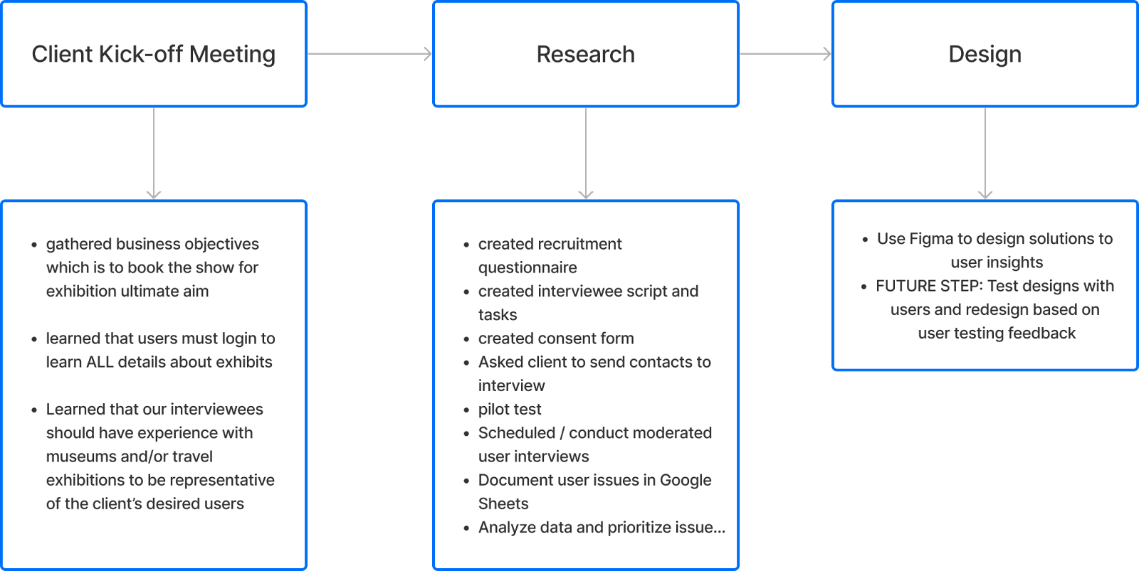
USER PROFILE
- 10 interviewees recruited from recruitment form we sent out to hundreds of Pratt Museum students and a contact list of previous SITES users from our client
- Each were desktop users and had experience with travel exhibits or museum experience
- Less than 50% of interviewees were users from SITES’ user base
- It was essential to have this type of user because it was described as the ideal user by our client
USER INTERVIEWS
Script
Thank you for agreeing to chat with us! Today you will be helping us test a website that offers traveling exhibitions, the Smithsonian Institution Traveling Exhibition Service or SITES. As we go through our evaluation, there are no right or wrong answers. All of your observations will help us improve the website. Our focus today is understanding the experience of using the site to book a traveling exhibit for a museum. Here is the scenario I’d like you to imagine yourself in:
Scenario
You’re a museum curator who wants to bring a new exhibition to your venue. You heard about SITES and think it could be a good option for your museum. You’re at the very beginning stage of your research, so you’re looking for something that would interest your patrons while keeping the practical aspects of your space and budget in mind. You aren’t set on a date yet either.
Tasks
Task 1: Explore the site homepage without clicking anything. Think aloud about what you are seeing. What information are you looking for while you’re exploring?
Task 2: Explore exhibits and decide to pick one exhibit that interests you. What interests you on the exhibit page? What kind of information would you need to bring this to your museum?
Task 3: You decide to explore the schedule of the exhibit further. Did you find all the information you needed to make the decision on the exhibit?
Task 4: Use these login credentials to check out the logged in experience. What do you notice?
Post Interview Questions
- Did the process of looking for an exhibit that fits your budget seem 1. Easy to perform, 2. Slightly difficult 3. Really complicated?
- If it was complicated or difficult, what part made the process the most difficult? (Alternatively)
- Did you complete the task you intended to do?
- What factors on the website were pivotal in your decision making process?
- Would you share your email to stay abreast with what SITES is coming up with?
Award
All participants received a 10$ gift card.
USER RESEARCH
Qualitative Interviews Identified User Needs and Struggles.
I interviewed 2/10 potential users to gather insight about the SITES website. The interviews were completed in 30-minutes in person or over zoom. Below are the insights I documented and the list of the full user issues are here:
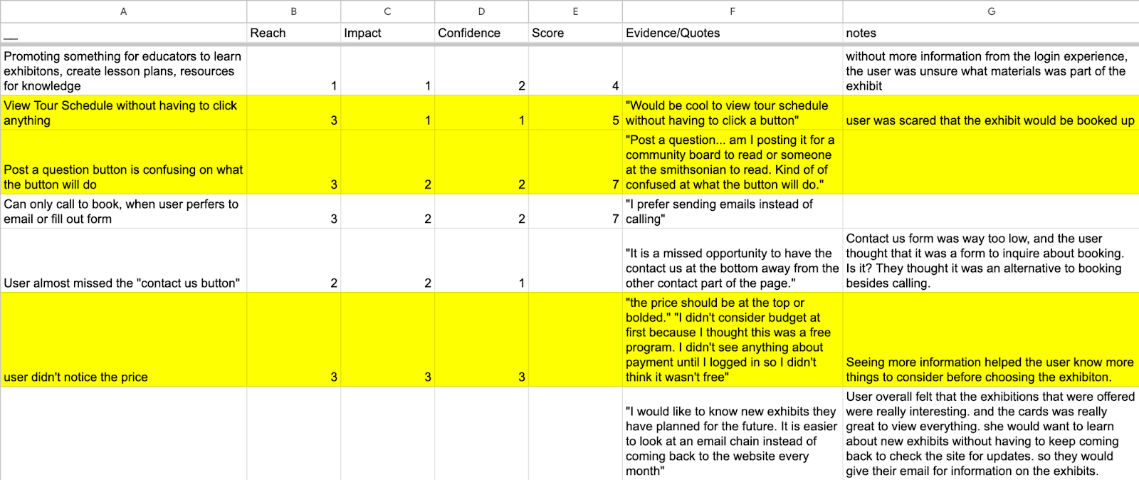
What I Learned…
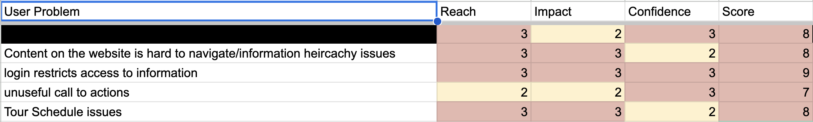
These are the 4 issues that were common throughout the observations that my teammates and I documented from our interviews. We prioritized the issues using the RICE methodology (since we are not engineers and cannot estimate on a technical level how much work these user problems will take to solve, “E” is not evaluated here which stands for “Effort”). This stands for Reach(the amount of people this feature will affect within a given time period), Impact(the amount of impact on individual users), and Confidence (the level of confidence we as researchers have about the Reach and Impact scores we gave). This was rated on a scale of 0-3. 0 being the least and 3 being the highest.
1. Login Issues
Creating an account doesn’t follow industry standards. And the login aspect has information that users need to see without logging in. 100% of users interviewed said they wanted to see this information upfront.
2. Navigation Difficulties
Navigating the site can be hard because filters are only available when one logs in and there still could be more filters added to improve search such as allowing users to toggle for what exhibits have slots open. 70% of users had issues with the filters.
3. Content is hard to find
Discovery is poor. For example, it takes 3 clicks to see the tour schedule and even then it isn’t immediately clear what exhibits have open slots and which ones don’t. Additionally, some exhibit categories are unclear. 70% of users had issues with the tour schedule’s visibility.
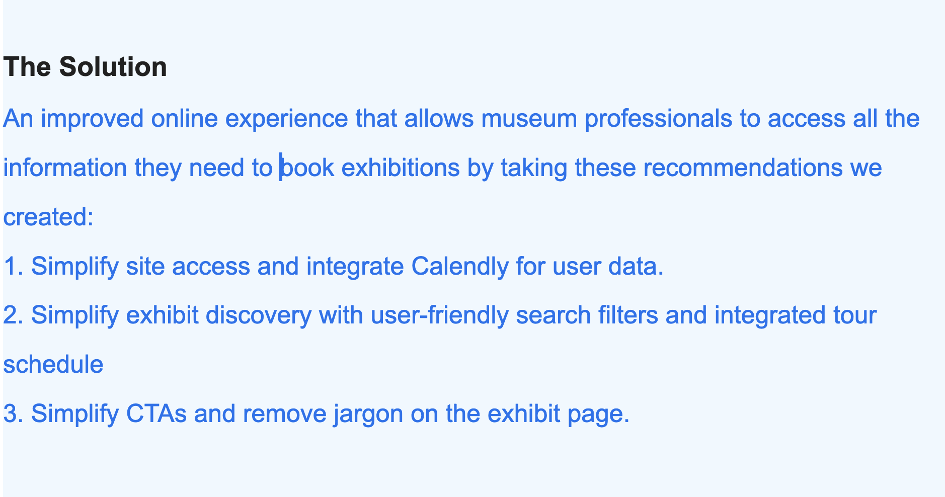
RECOMMENDATIONS
Our team identified several areas of improvement, including reorganizing the homepage to make it more intuitive and user-friendly, adding clearer and more detailed exhibit descriptions, improving the scheduling process, and making the login process more accessible. We provided actionable recommendations to SITES to help them improve the website’s user experience.
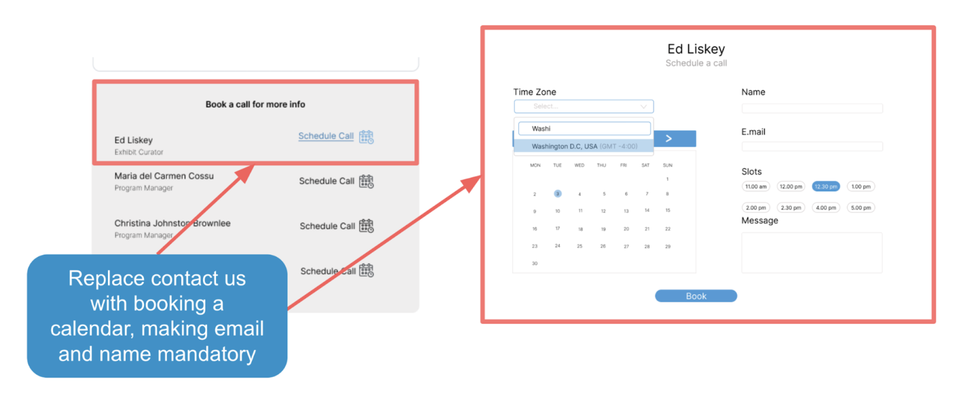
1. Simplify site access by removing login and integrating Calendly for user data.
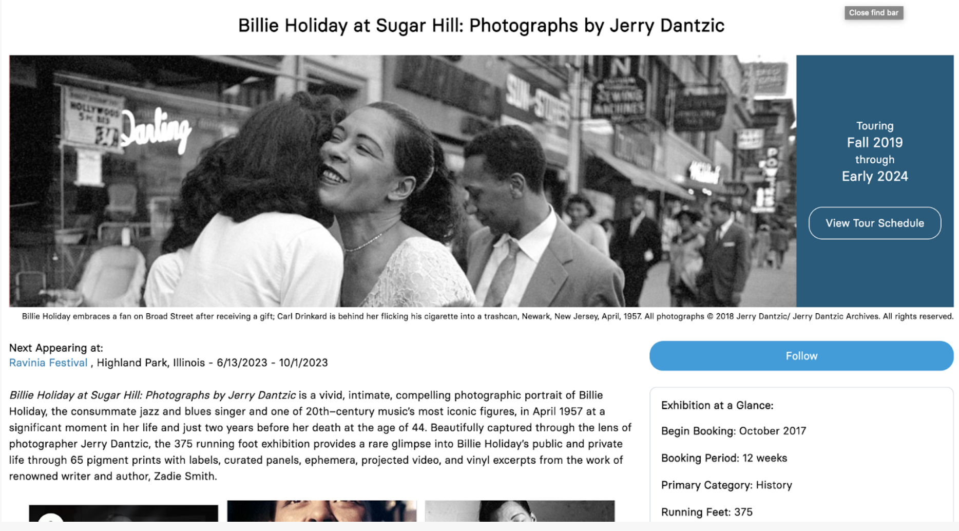
To access most of the relevant information on SITES website, users are required to create a login which can take up to two days for manual confirmation. By removing this requirement, the organization can ease the user’s access to the information they need and allow them to explore exhibits and understand what is available in their exhibition room size and price range more easily.
The login is currently in place to retrieve user data. We proposed that using Calendly to schedule a call and requiring user’s information would be a hassle free way of getting their data. Once a user finds an exhibit they would like to book, users can use SITES’ Calendly scheduler to have a SITES employee contact them. This scheduler collects the user’s name and email, making it easier for the SITES team to get more leads through a less demanding call to action.
Current Design
Our Design
Replace contact us with booking a Replace contact us with booking a calendar, making email and name mandatory To keep the user focused on exhibition content, increasing font sizes and reducing unnecessary CTAs helps achieve that goal. Finally, adding the exhibition title on another part of the page enhances readability and grounds the user in the content.
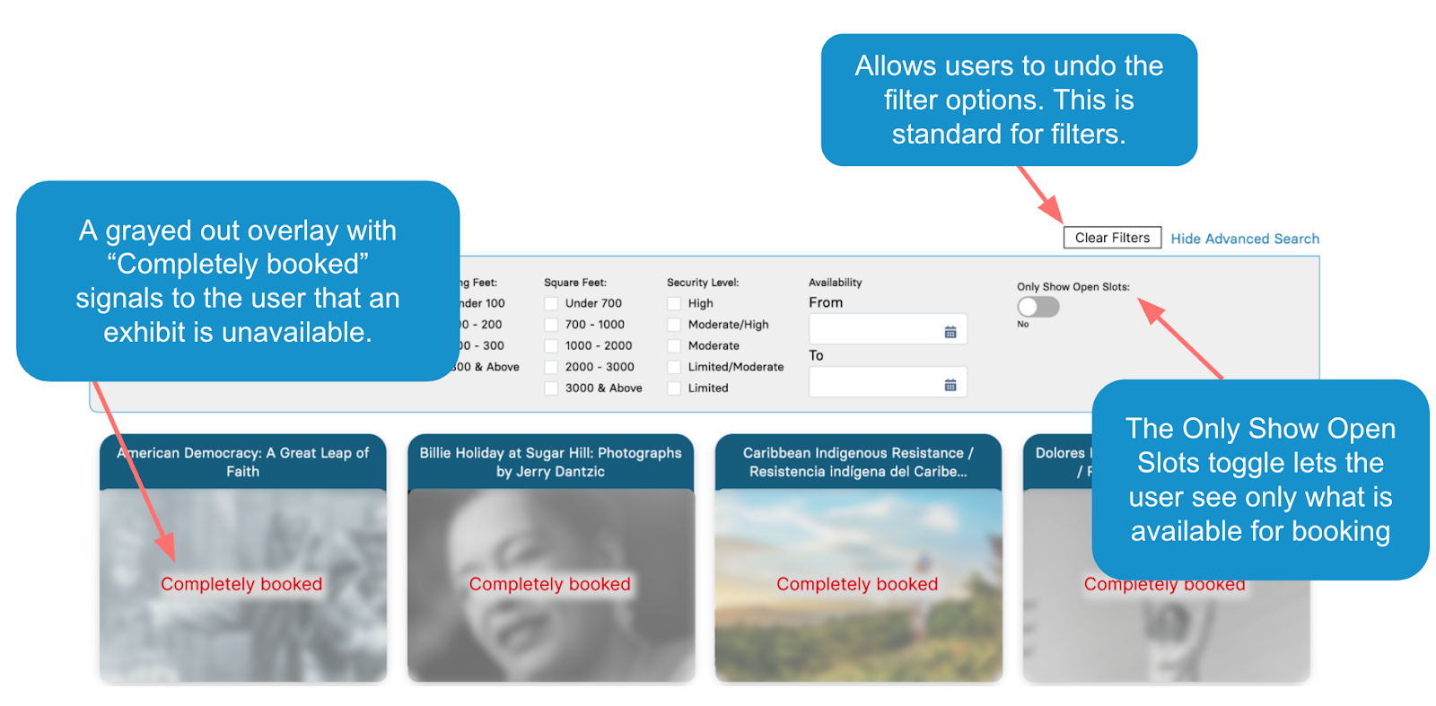
2. Simplify exhibit discovery with user-friendly search filters and integrated tour schedule (MY DESIGN)
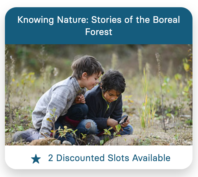
To enhance navigation on the site, our suggested improvements are to label sold-out exhibits clearly with text and by graying them out, provide a toggle for users to view only available exhibits, and include a ‘clear filters’ button.
Current Design
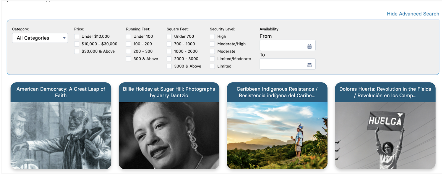
Our Design
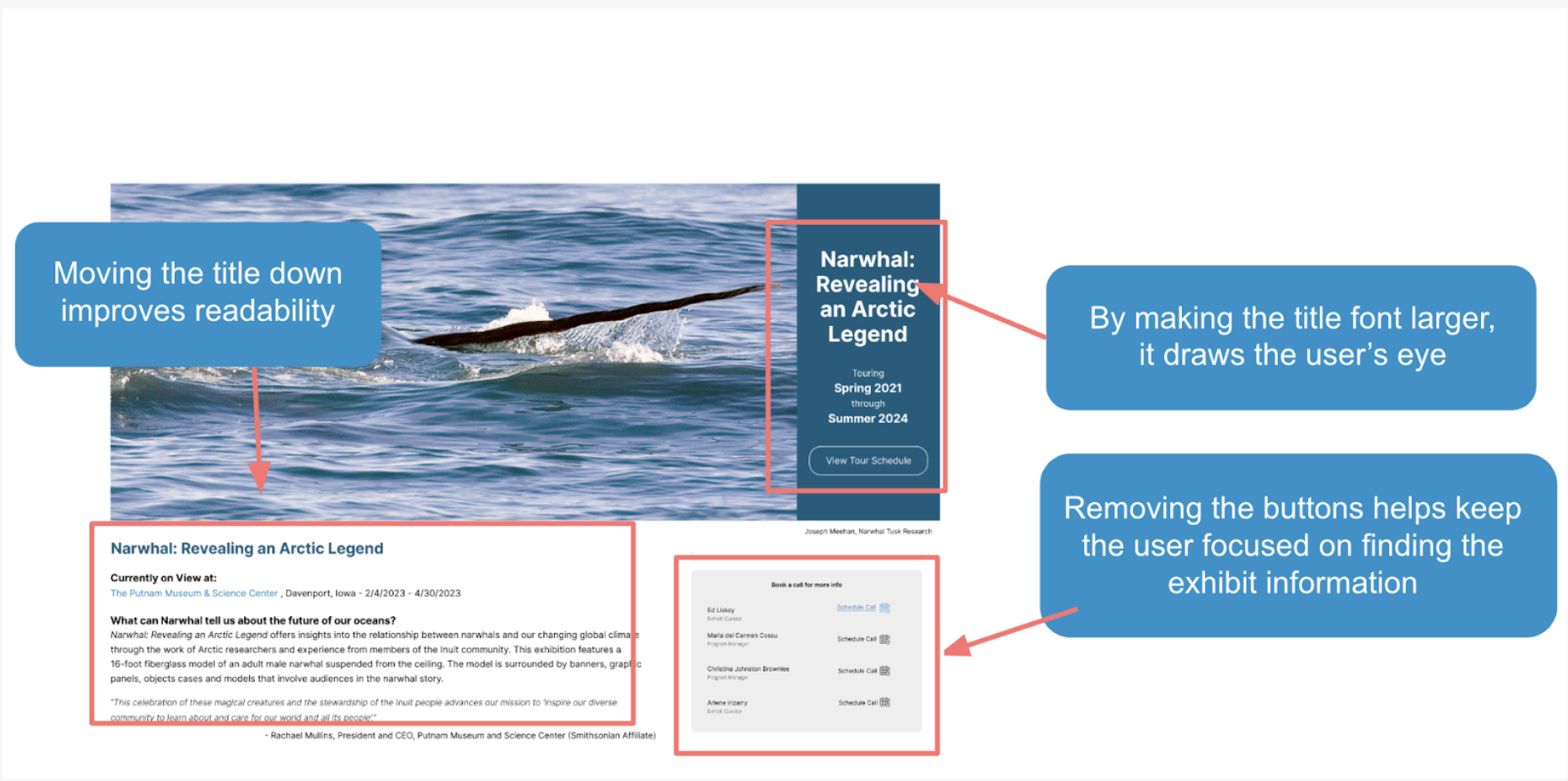
3. Simplify CTAs and remove jargon on the exhibit page.
To keep the user focused on exhibition content, increasing font sizes and reducing unnecessary CTAs helps achieve that goal. Finally, adding the exhibition title on another part of the page enhances readability and grounds the user in the content.
Current Design
Our Design
CONCLUSION
My team and I virtually presented a slide deck about our research process, user findings, and recommendations to our main point of contact Carol Bossert and 5 of her other colleagues!
Take Aways
1. The clients were impressed!
They loved our presentation, felt that the insights were useful and said that the research confirmed their assumptions about the website’s flaws. Carol even said she can’t wait for us to graduate so that we can work for her!
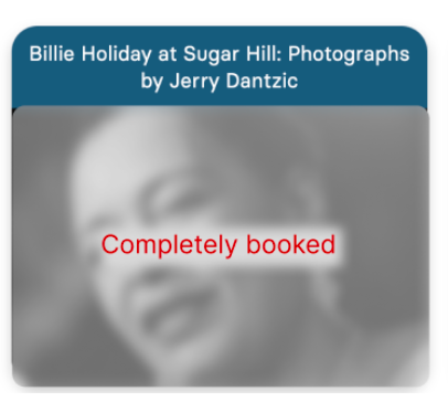
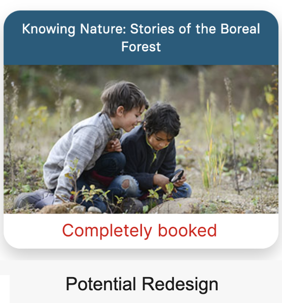
2. Feedback
The constructive feedback that we received was that we could have explained or removed all jargon like “CTA,” “filter” or “discoverable.” Another constructive feedback was that they didn’t like my design choice shown under ‘Current Redesign’ because they think users that are searching for information wouldn’t want to click on it to learn more about the exhibit if an exhibit explicitly said “completely booked.” However, from a research standpoint, usability testing would have to be done to confirm if that assumption is true. I did come up with a new redesign shown under ‘Potential Redesign’ to mimic the style they already have on the website just with different text. This could appeal to the clients more since it fits their style already but would still need to undergo user testing.
3. Future Steps
If we had more time, the next step would be to conduct usability testing on the designs we created to see if they were appropriate fixes to the insights and pain points we received.
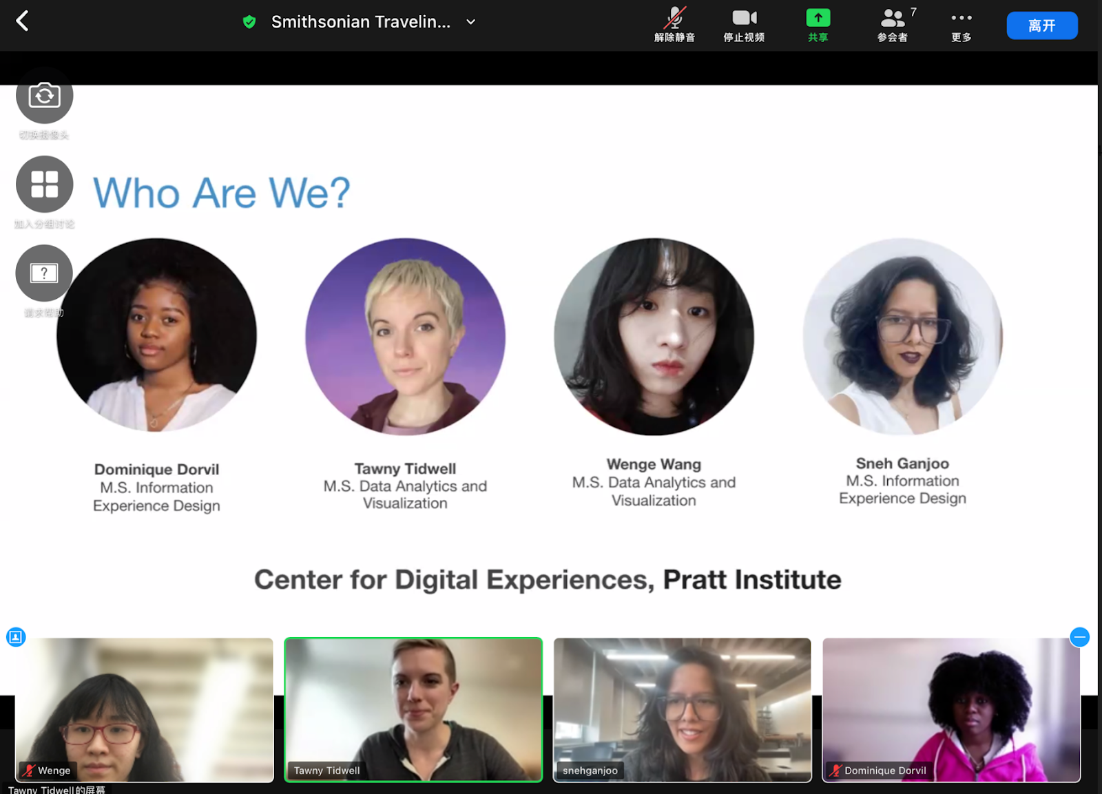
Screenshot of me and my teammates presenting our findings and recommendations to the client.