Introduction
We studied Pratt Institute’s website interface to improve the user experience of Pratt’s community in accessing resources regarding counselling and mental health & wellbeing.
Pratt Institute aims to assist its community, students, staff and faculty, in maintaining a healthy lifestyle by providing counselling and health resources in collaboration with The JED Foundation; a nonprofit that protects emotional health and prevents suicide in young adults. The Pratt community can access the resources and leverage the services using Pratt’s website anytime. Though these resources are easily accessible on the website in 3-4 clicks, it’s discoverability is low. In this project, studied the website interface and conducted moderated remote user testing with Pratt’s students to evaluate the usability of these web pages. Additionally, provided recommendations to improve the user experience.
“The website is beautiful but not useful”
A Pratt Student
Our Client
Pratt Institute
Anthony Cocciolo, Dean, School of Information
Research Method
Moderated Remote User Testing
Our Team
Sehyun Jeon, Vi Kobal, Jiacheng Chen, Itzamna Huerta, Nehal Sharma
My Contribution
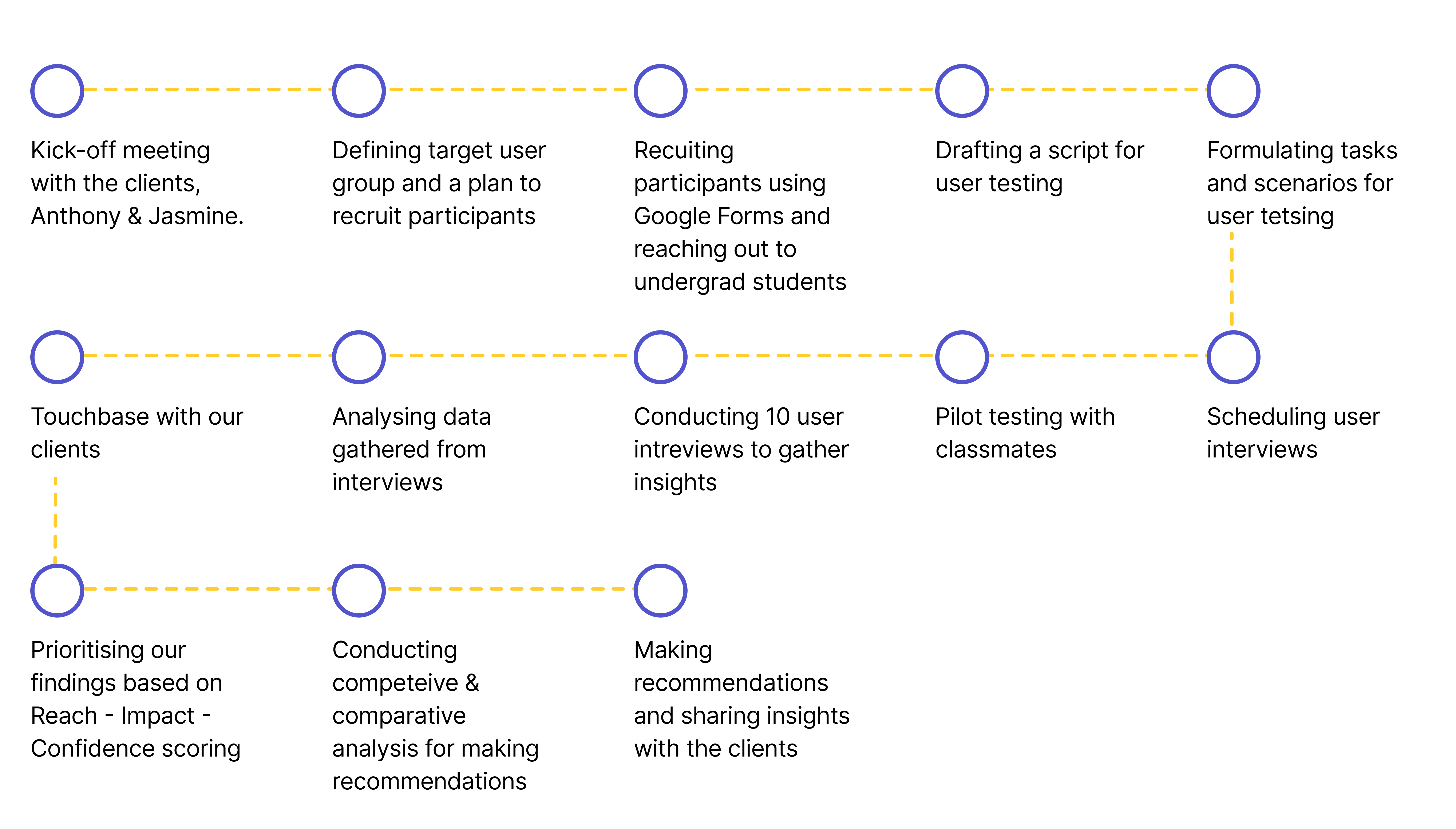
- Conducting a kick-off meeting with the clients to understand the goals and requirements of the project
- Constructing the goals and objectives of user testing to successfully conduct the usability evaluation
- Drafting a script for user testing sessions by formulating the scenarios and tasks
- Refining the target user group for the current scope of the project
- Recruiting participants for moderated user testing
- Conducting 3 moderated remote user testing with users to gather insights and make observations
- Analysing the findings and drafting problems along with the team
- Formalising recommendations and creating high fidelity mock-ups for the recommendations to provide our clients with a design alternative
- Presenting to our clients along with the team
Research Process
The research process included the following:
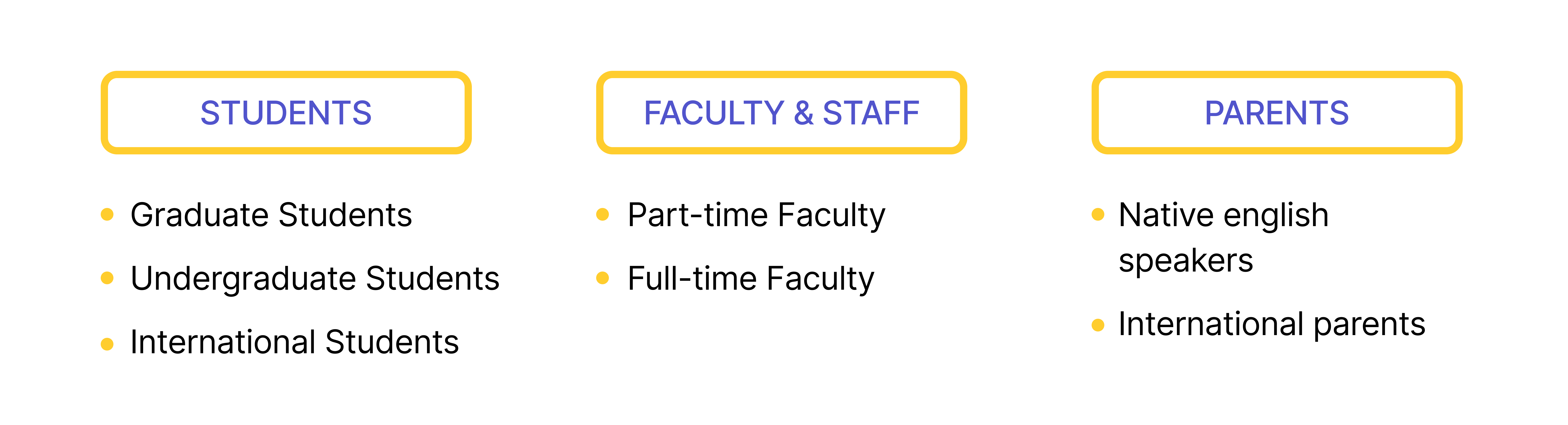
Defining User Group
There are three major user segments of Pratt community. Based on our discussions with the client and the project goals, the focused user group of this research is Undergraduate Pratt Students.
The user group was selected on the basis of the following data:
– The number of undergraduate students are way more than the number of graduate students
– The majority of the website users are students
– Undergraduate students, age 17-21, are the primary users of Pratt’s services such as counselling centre and resilience, wellness and weal-being
Scenario and Tasks
The tasks for the moderated user testing was designed to evaluate the ease of navigation of the three pages – The Counselling Center, Resilience, Wellness and Well-being and Health & Safety. The goal of the tasks were to identify the problems facing by the users, assess if the users are able to find the information they were looking for and understand the target user behaviour.
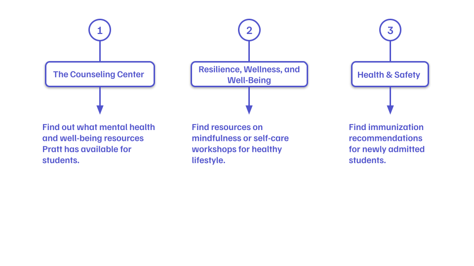
The test was conducted with 10 participants in total over a 30 minute call using Zoom.
Data Analysis
The gathered data was then analysed by the team by listing the problems faced by each participant. Similar problems were then grouped together to find common patterns in user behaviour and difficulties.
These problem groups were further evaluated to prioritise the problems discovered during the user testing. This evaluation was done on the basis of the following parameters.
Reach – Considers the number of people affected by this problem
Impact – Considers the amount of impact this problem would make in completing the desired task by the user
Confidence – Considers the confidence of the researchers on the evaluated Reach and Impact
After calculating the RIC scores for each problem, the team formulated 3 problems and 4 recommendations to solve the respective problems to enhance the usability of the web pages.
Findings and Recommendations
Problem 1
Lack of content hierarchy and information heavy pages
The three web pages are informative and contains useful resources for the users but the users struggled to find the important information on the pages. 80% of the users ended up scrolling through the page and said “it’s overwhelming to see so much information and no contact information whom I can reach out”.
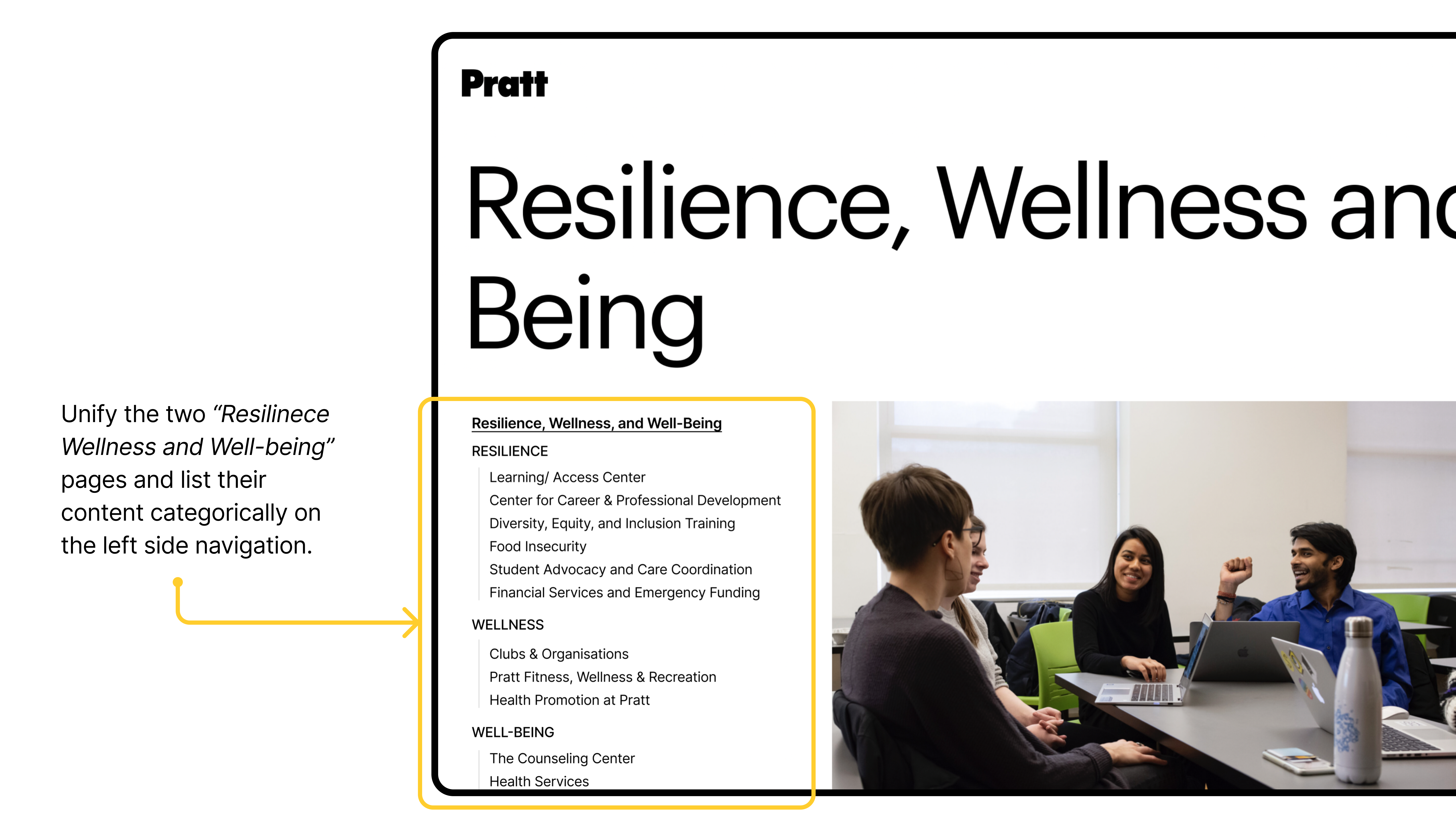
Additionally, when the users were completing the tasks, they found out the two separate pages for Resilience, Wellness and Well-being with similar content – which confused them further.
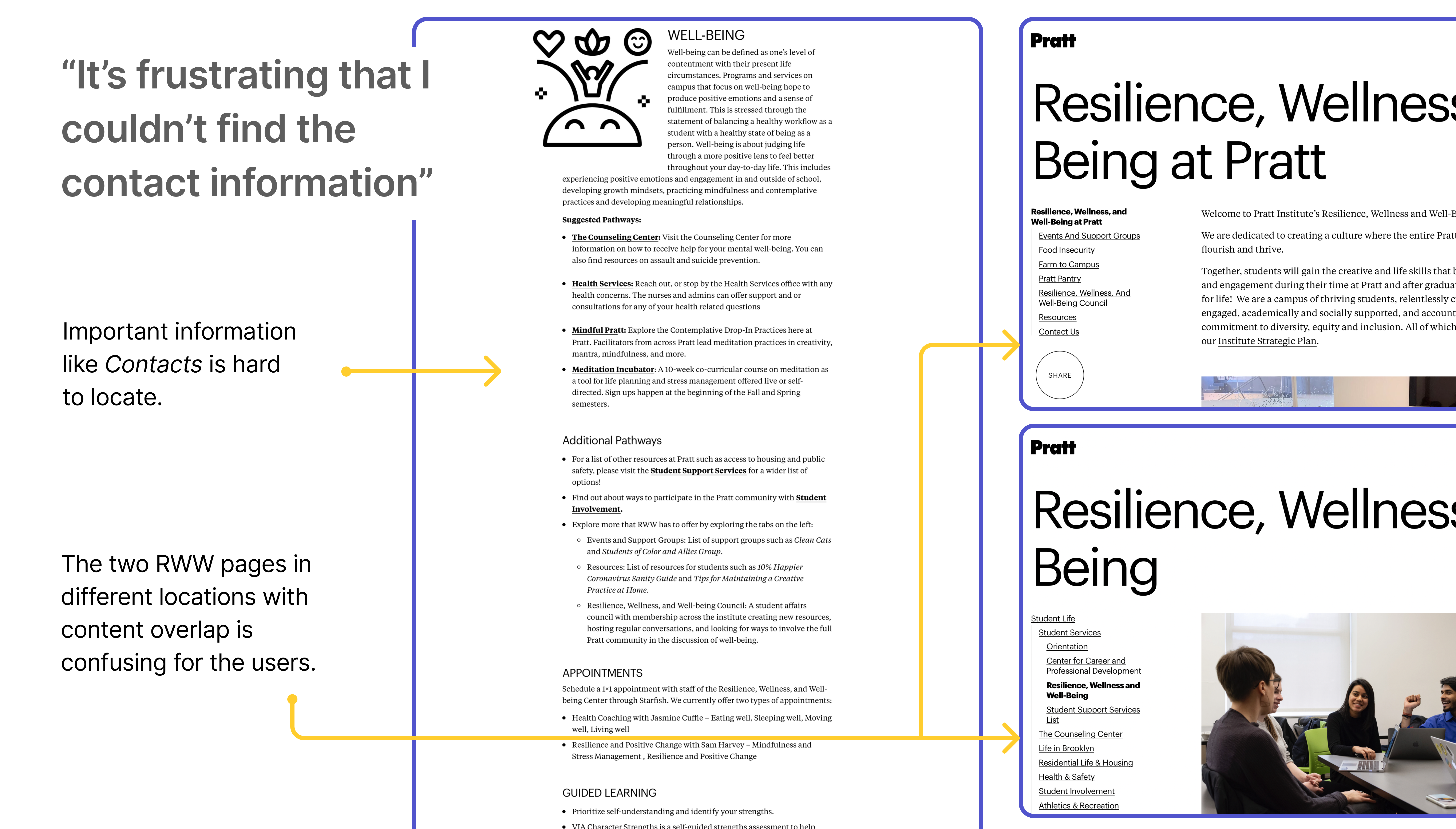
Recommendation 1
Create shortcuts and structuring the content on left side navigation
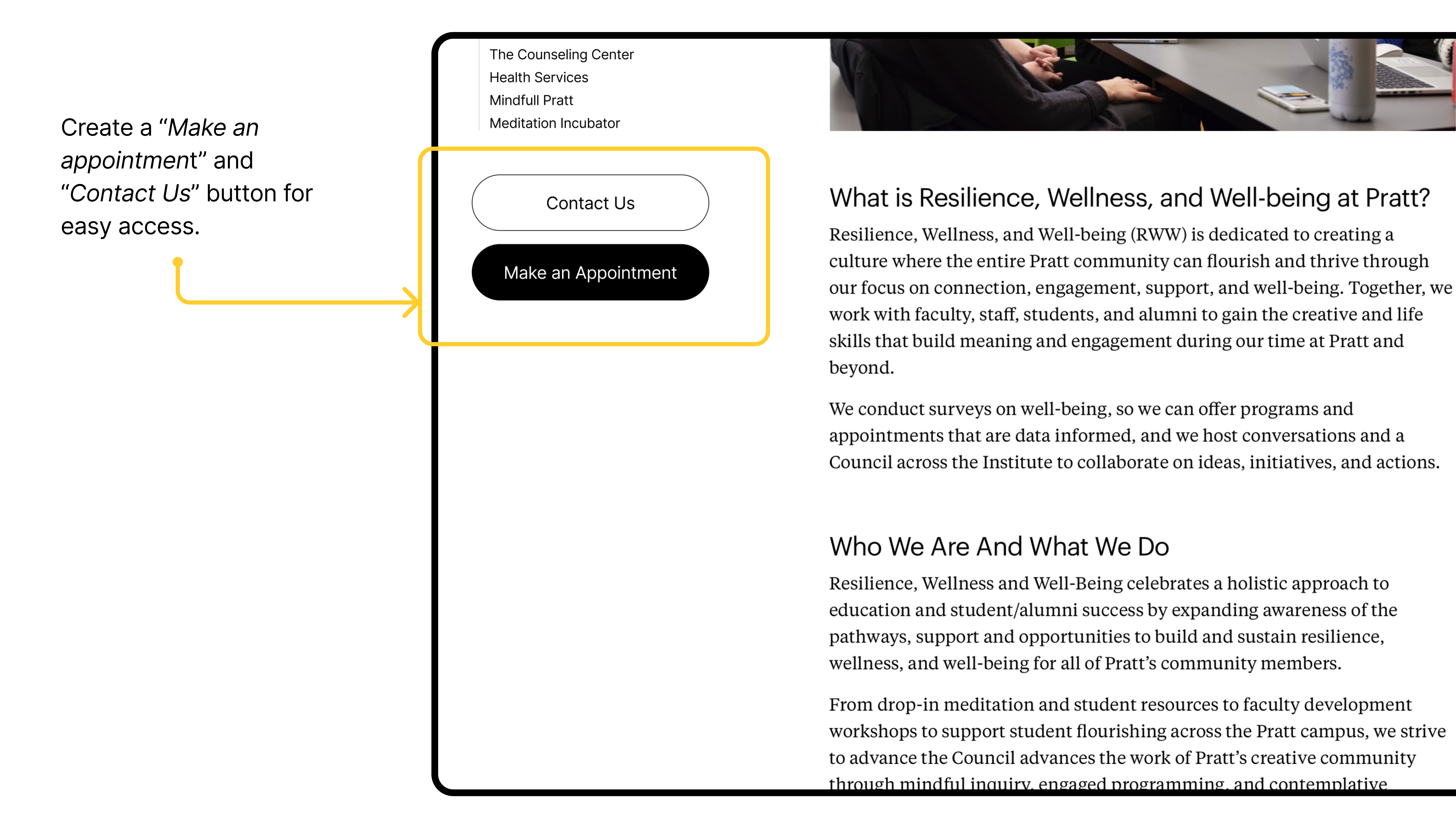
Through our interviews we found out that for our users were primarily concerned with 2 information:
1. Contact Information – The users were looking for a point of contact whom they can directly talk to.
2. How to make an appointment – A way to make an appointment without any hassle.
To incorporate our findings, the recommendation is to:
Problem 2
Scattered information across all three pages
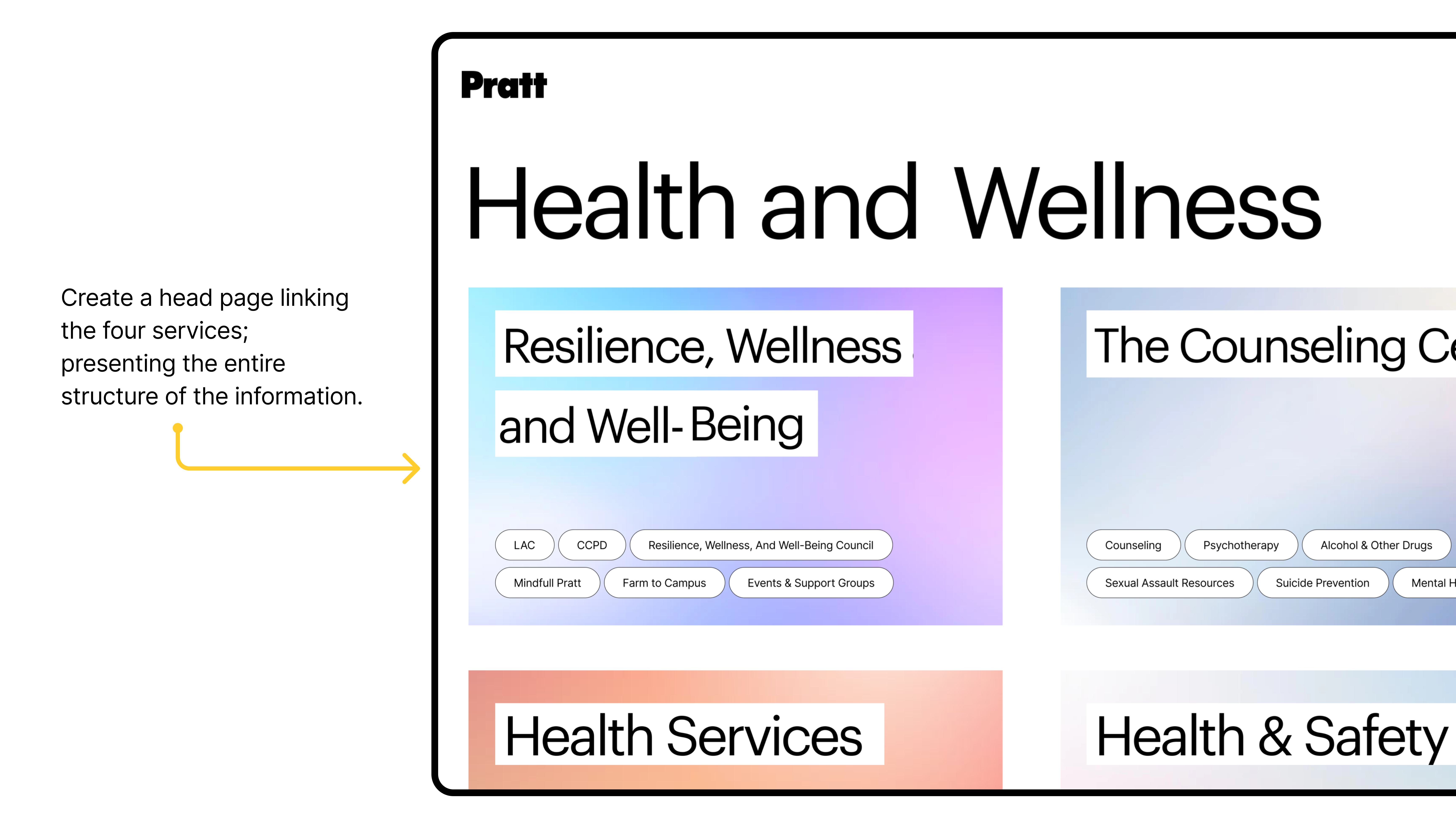
70% of our users were confused with the information being scattered between the three pages. The users struggled to identity the services provided by these separate entities at Pratt.
Recommendation 2
Create a head-page to showcase the four inter-related pages; highlighting their individual services
The recommendation aims to improve the discoverability and interconnectivity of the four services which seemed similar to our users. It provides the users with a one-page summary of these services for them to scan and quickly access what they were looking for.
Problem 3
Lack of direct navigation from the homepage
40% of our users went to “Resources” to complete the tasks instead of going to “Student Life”. 20% of them mentioned that they would go to “Student Life” to find campus housing and residential information. 30% of the users directly went to the “Search” to look for keywords and only 70% of them were successful in finding through searching for keywords.

Recommendation 3
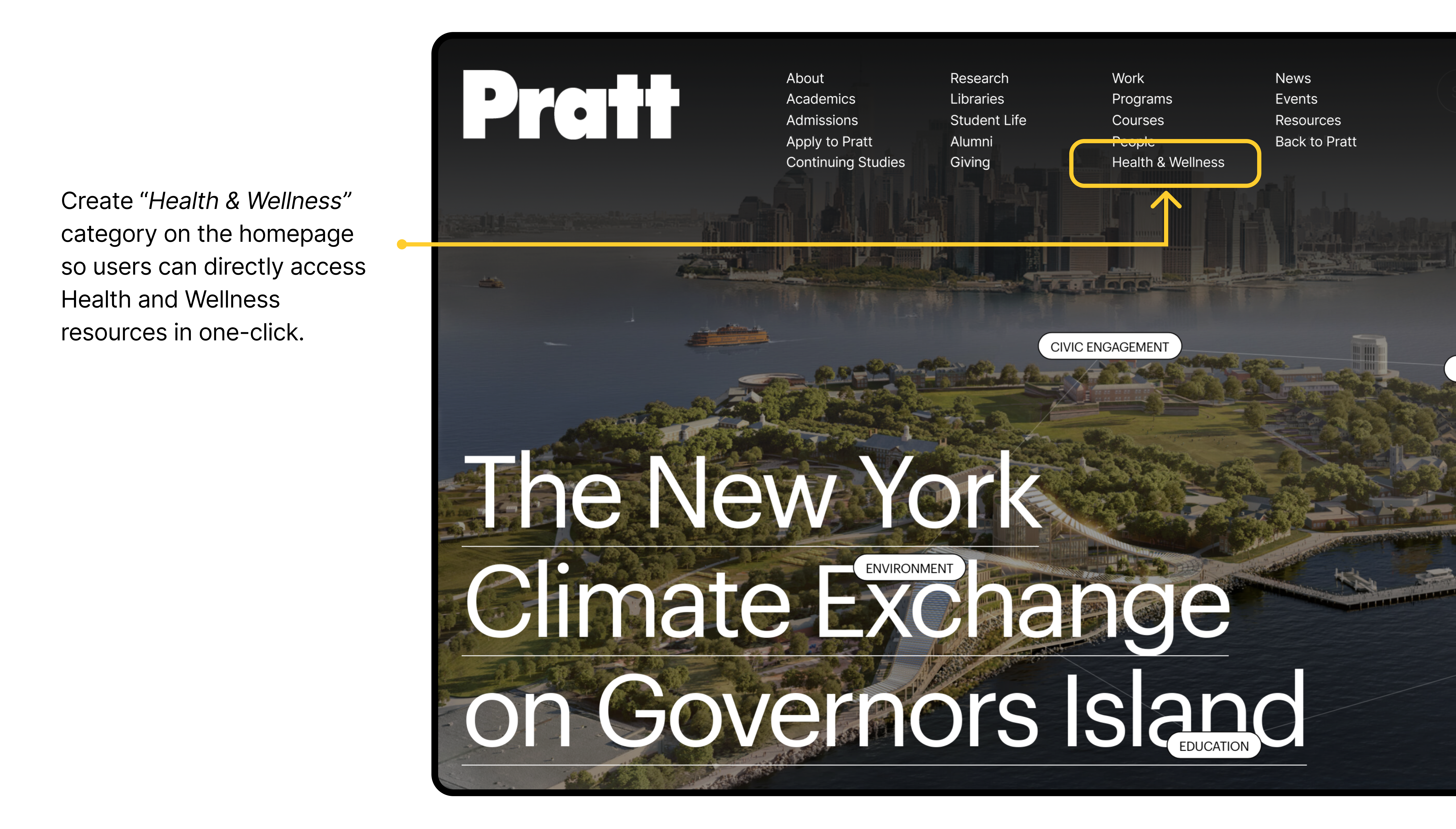
“Health & Wellness” category on the homepage navigation
In support with the interview insights and competitive analysis, we recommended to add a “Health & Wellness” category on the homepage for our users to directly access the health resources in case of emergency. We also evaluated the use cases of the pages which this category may entail by asking the users and documenting their behaviors.
Problem 4
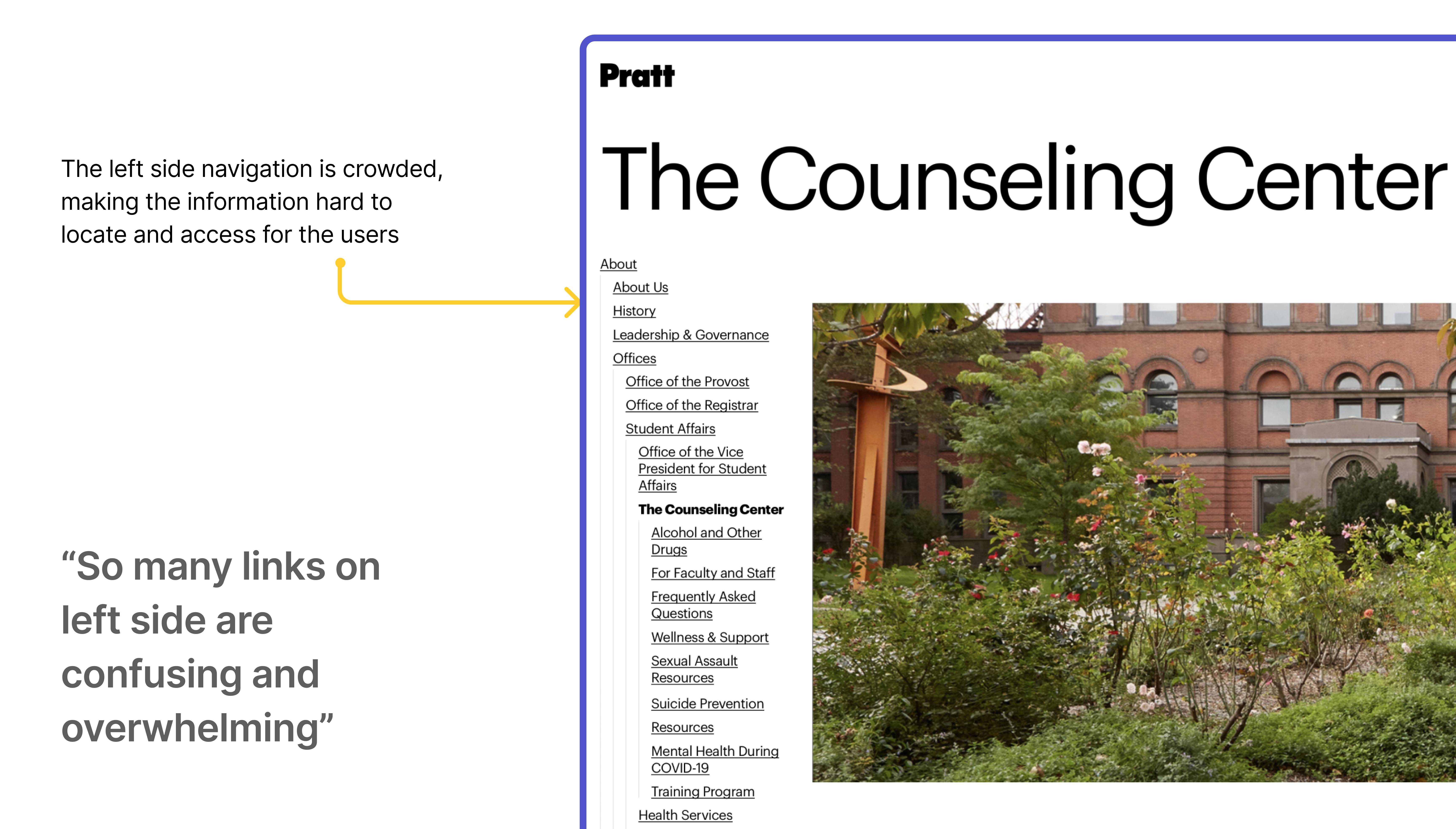
Lack of visual hierarchy in side navigation
We observed that due to the lack of visual hierarchy in side navigation, the users struggled to access information and navigate between the pages. This in turn, resulted in either confusion or frustration on the users end.
Recommendation 4
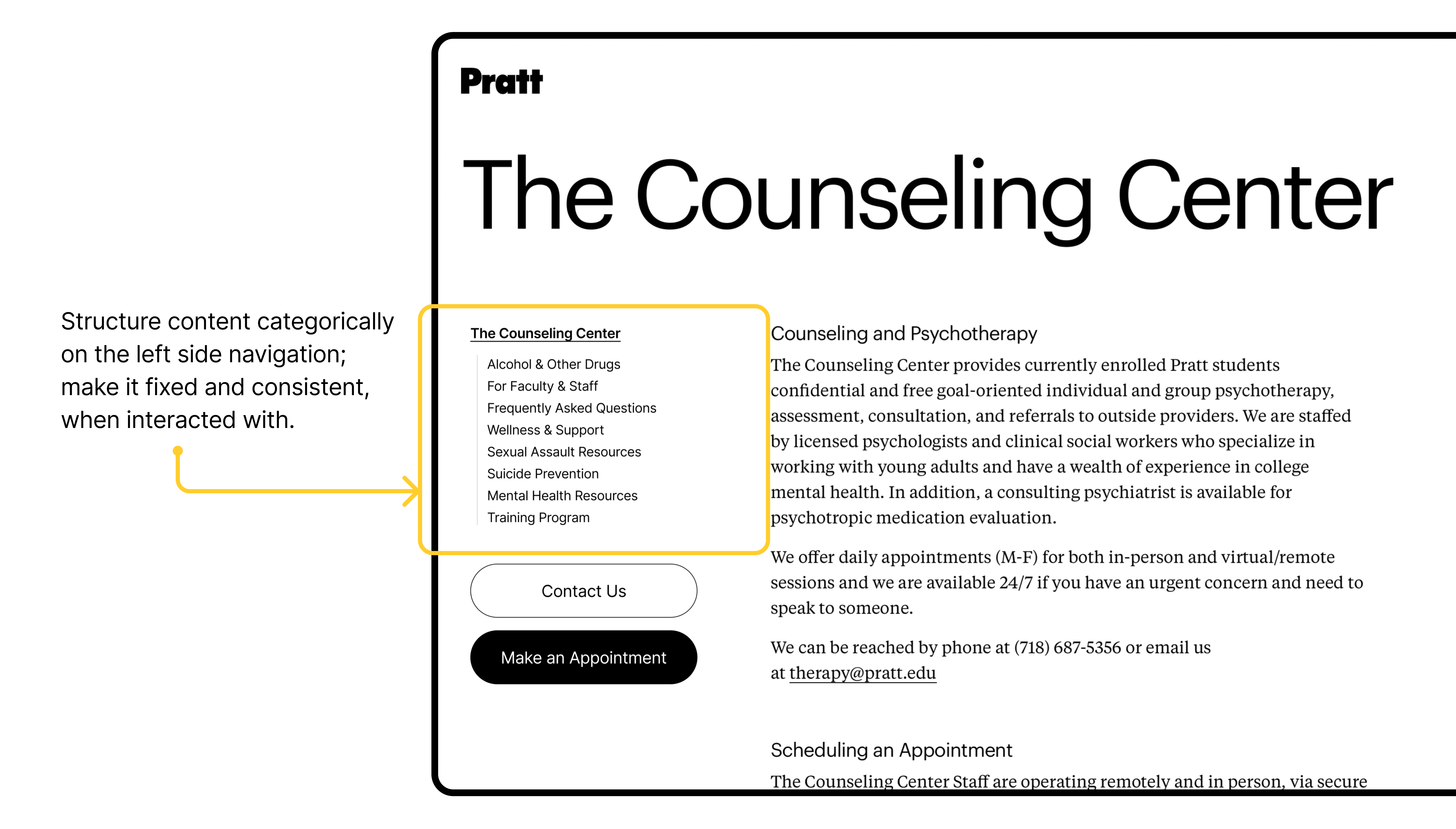
Increase visibility by only showing the categories within ‘The Counseling Center’
To enhance the discoverability and ease of access, we recommended to re-structure the side navigation and showcase only the categories which falls under the title of the page. In addition, the proposed side navigation is fixed and remains consistent when interacted with. This clearly shows a clean list of the page content for users to scan through and find what they were looking for.
Conclusion
The primary and secondary research followed by the analysis helped in designing effective and actionable recommendations to enhance the user experience of the three web pages, The Counselling Center, Resilience Wellness and Well-being, and Health &Safety. The researchers were able to formulate and document the findings to validate the client’s concerns.
The goals and objectives from the clients were achieved successfully.
The findings from the research led me to some points to think about:
How the experience would differ when we change the target user group from undergrad students to parents of the international students who are not native English speakers?
Please check out the client presentation here!