Pratt’s health services, counseling center, and resilience, wellness, and well-being webpages are evaluated by a UX research team, including myself, to determine solutions for improving the experience of Pratt web pages. The goal is to access health and safety information web pages within 1-2 clicks of entering the home screen on the Pratt.edu website. A moderated user test of 10 participants was conducted due to issues with visibility to health services web pages.
Problem 1: Lack of Content Hierarchy and Text Heavy


The important information is hard to locate on the webpage given how text heavy is it.
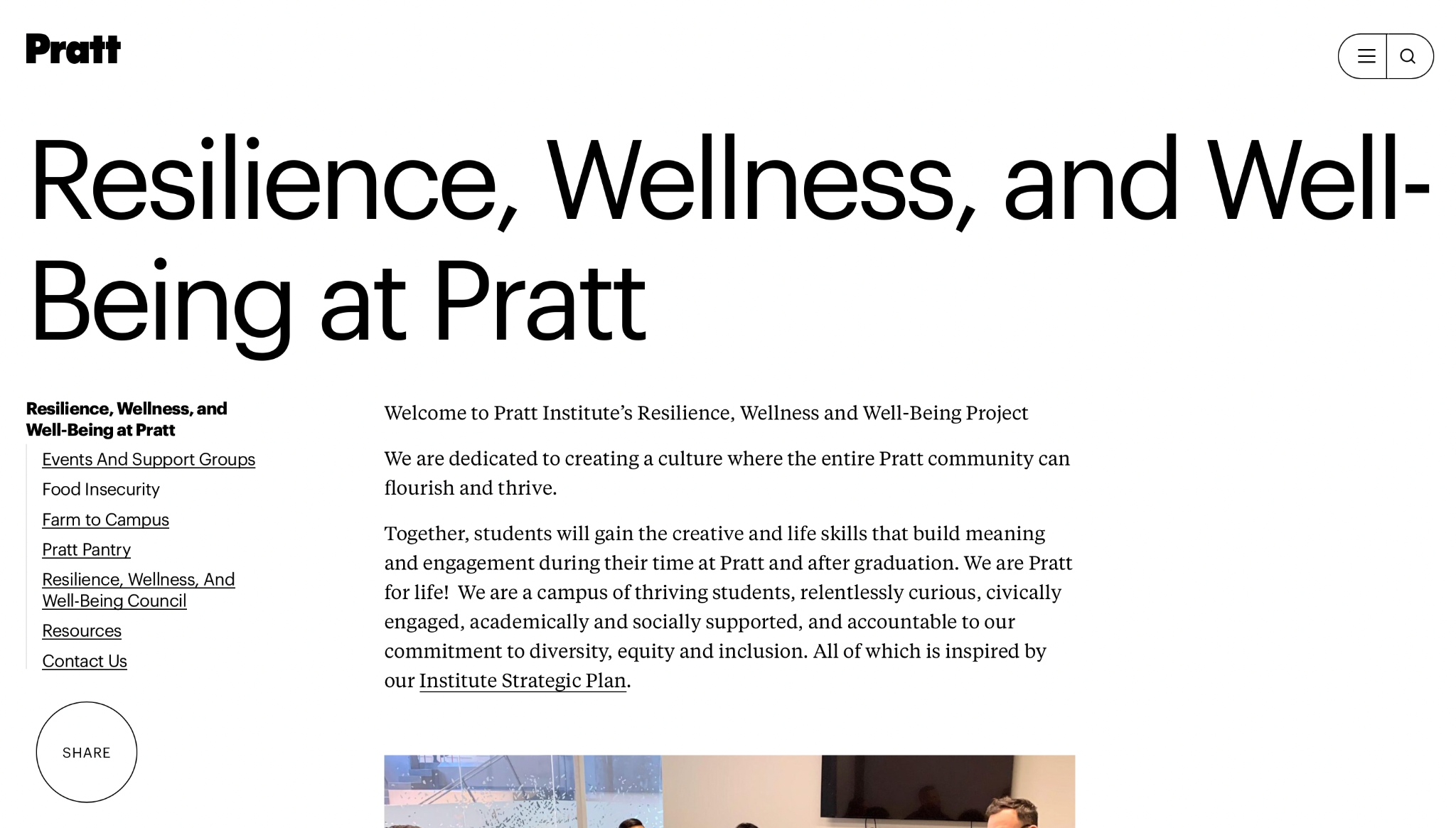
There are two RWW pages in different locations. This can be seen from the hierarchy navigation bar to the left.
Our solution was to make a shortcut for contact or making an appointment which is the most important information on the page that was previously hard to discern or overwhelming to find given the dense text throughout the page. The second recommendation we made was to merge the pages into one category.
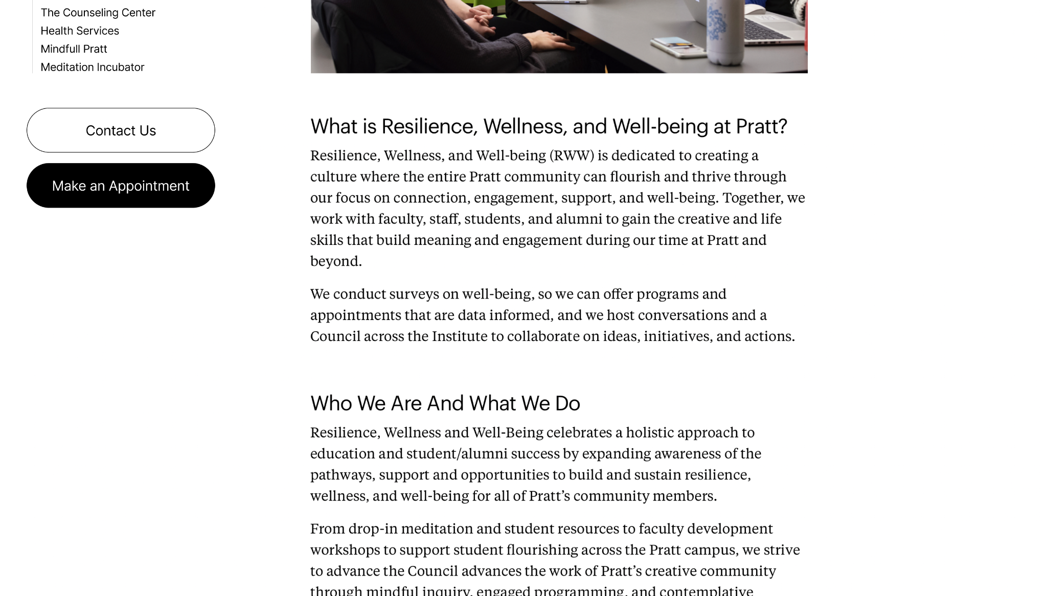
Problem 2: Information scattered across the 3 pages
Information on the web pages are scattered on each page, causing confusion for the users. Each page does not have concise categorical labels. Users got confused and didn’t know where to go to access specific information.

Create a head page that shows all the categories, presenting the entire structure of the information.
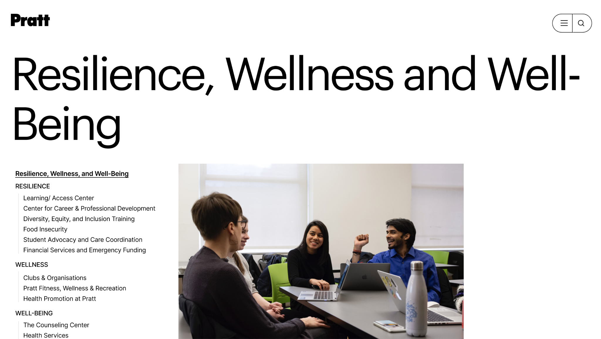
Problem 3: Lack of navigation from homepage

Users didn’t know where to go to access Health and Wellness information from the home page.

Create ‘Health & Wellness’ category so users can directly access Health and Wellness info from the homepage.
Problem 4: Lack of visual hierarchy in side navigation
There are too many categories for nesting pages on where they reside. This causes the overall page to be unclear. Clicking any of the categories of side navigation directs the user to an entirely different page and inconsistent side navigation structure as well.
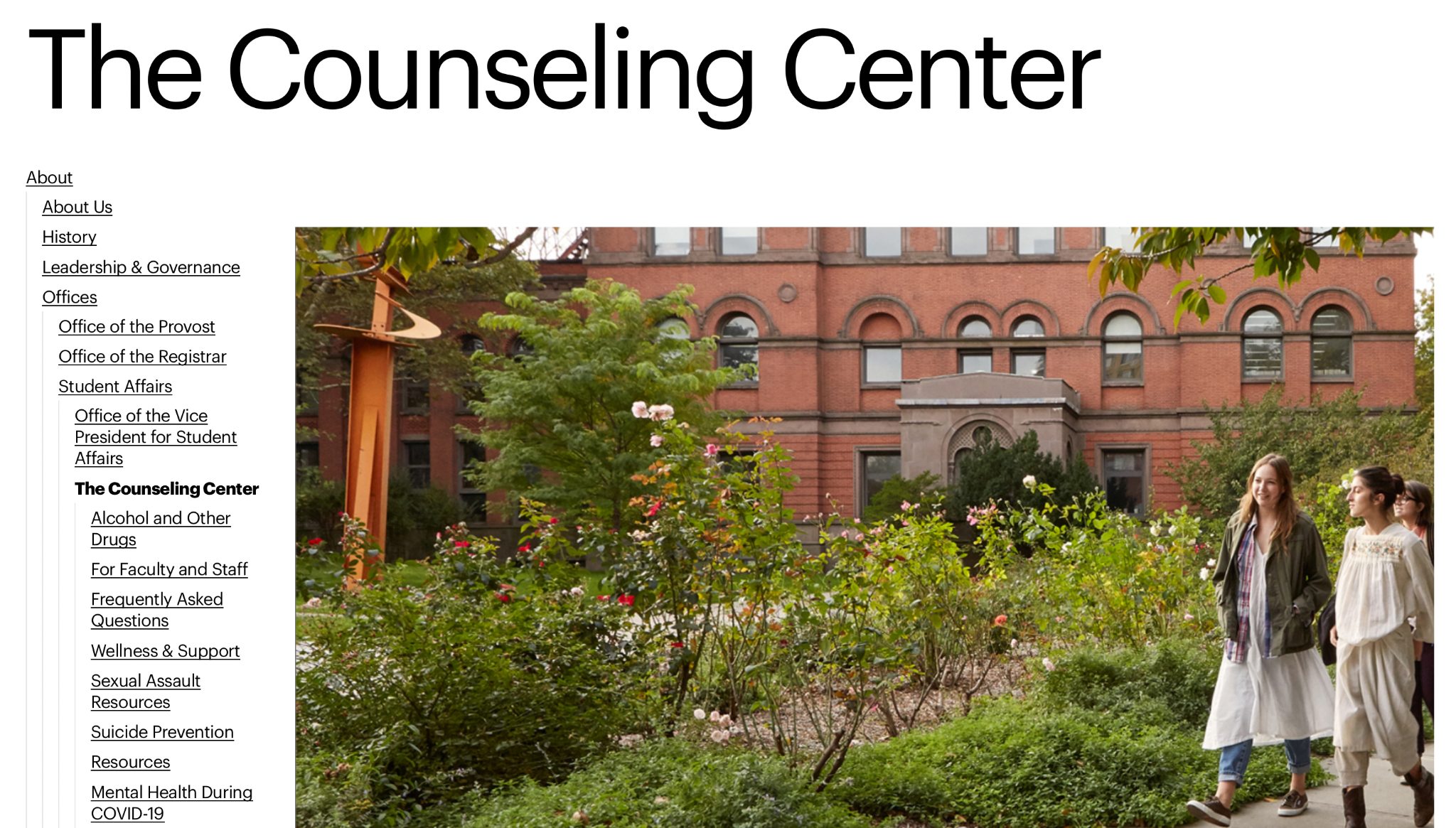
Our suggestion to this issue was to increase the visibility by showing only categories within ‘The Counseling Center’. To improve access to the services, we included a ‘Make an Appointment’ button for users.

Conclusion
While Pratt’s website is undergoing changes once again. We have been informed that these iterations will be used as a reference for the redesign. While the site is beautiful, it is not useful for most students.