About SITES
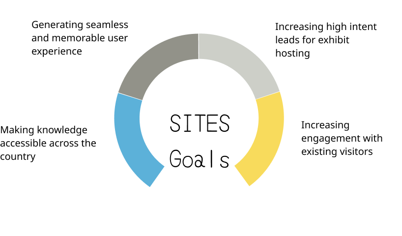
Smithsonian Institute Traveling Exhibition Services or SITES is a service by the Smithsonian Museum that curates and offers Smithsonian-quality exhibits or displays to museums and communities around the US.These exhibits feature artifacts and immersive experiences in fields of science, art and history. The website functions as a primary source of information for hosting venues across the country.
Role: UX Researcher.
Project Duration: 1.5 months
Research Methodology: Moderated User Testing
Research Process
The research process involved initial conversation with the client where information with regard to the goals of the website and problems were uncovered. The meeting also acted as the basis of our building of the user person. Post touching base with the client a plan was carved out for the Research

User Persona and Recruitment
Basis our client meeting and the derived goals the focus area of this research would be on the persona that engages with SITES to host these exhibits. While there is a sub-set that visits the website to check the exhibit schedule as museum visitors, this research was not focused on this persona.
SITES has a responsive website, but checking for mobile responsiveness was omitted from the research scope basis Google Analytics data shared by the client and data received from our participant recruitment questionnaire. Both attested to the fact that users used a desktop at work the most and existing SITES users visited the website on their desktop the most.

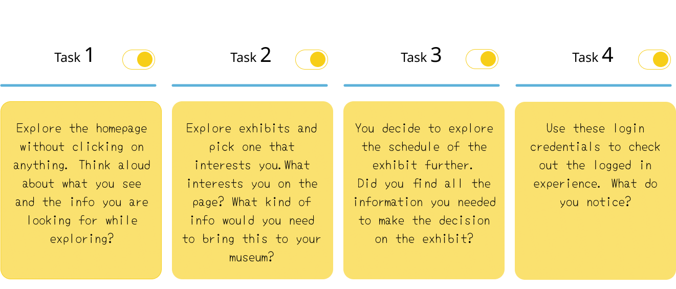
Moderated User Testing Tasks
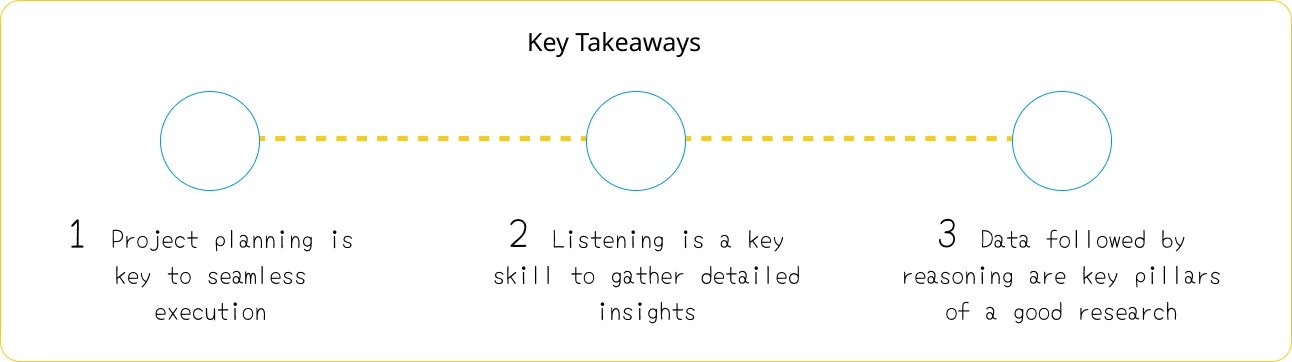
The tasks for the moderated user testing were designed to test ease of navigation, ability to get the information users need for decision making and general user satisfaction with the experience. The test was conducted with 10 participants over 30 minute interviews with each participant individually. Interviews were recorded on video and through detailed note taking. Data from the interviews was analyzed as per RIC (Reach, Impact, Confidence) score to make recommendations.
Analysis and Recommendation
The analysis and recommendations process involved, listing commonly observed problems amongst all participants. We as the team of 4 UX-Researchers working on this project individually rated the problems each of us had listed and further combined our lists. The scoring was done as per RIC. Where each parameter (R,I,C) is rated on a severity scale of 0 to 3 and then a cumulative score is arrived at by adding the scored parameters.
R – Reach – How many people will this problem affect within a given time period?
I – Impact – How critical is this problem to individual users
C – Confidence – How confident are the Researchers about the impact and reach scores.
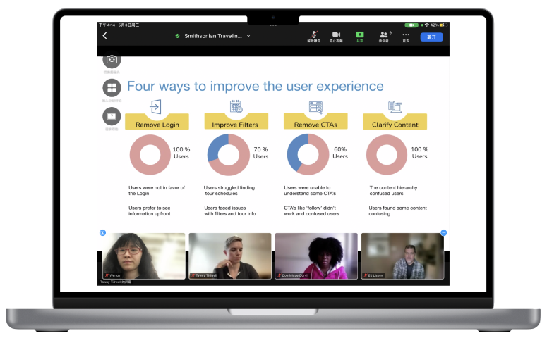
The individual scores awarded by each researcher against each listed problem was debated and reasoned with evidence and a final RIC score for each problem was arrived at basis which the prioritizations were done. 4 recommendations to solve the top 3 problems were made to the client using mock-ups

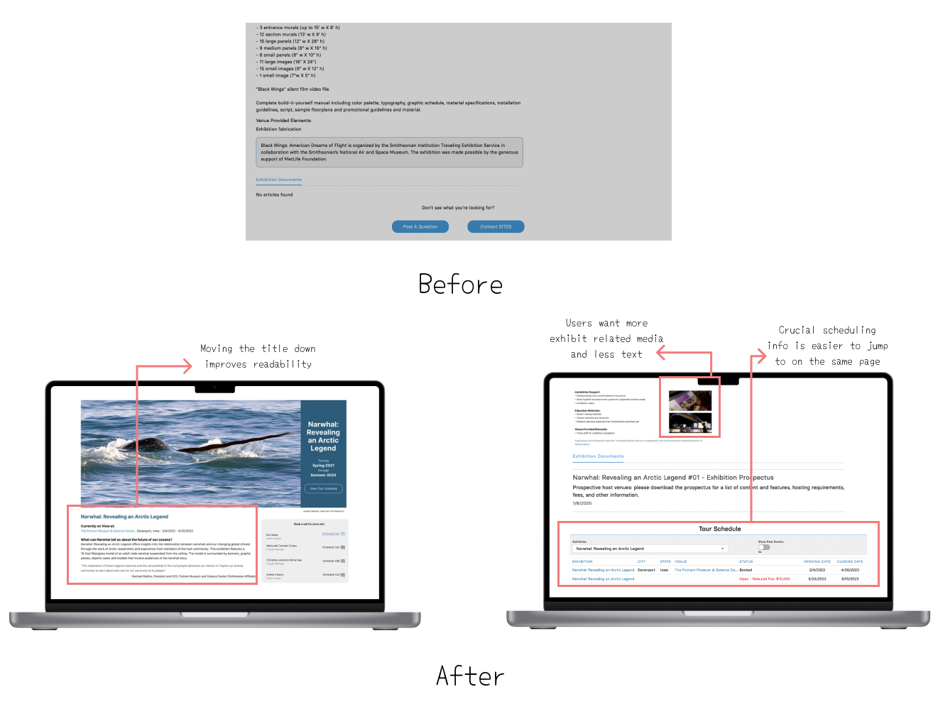
# Remove the Login Flow
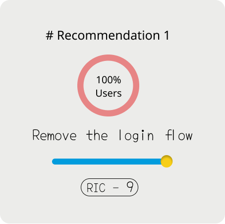
The Login flow hides a lot of information and additionally requires new users to request for a login. All users couldn’t find relevant information before logging in and even wanted to drop off. The client has the Login in place with the goal of collecting email information of interested leads.
Keeping with the client goals the recommendation is to remove the login and replace it with a CTA that helps users schedule calls with the SITES team through a calendar integration. The recommendation also focuses on the exhibits by having an exhibit search bar. This ensures the following ;
- Emails of high-intent users collected
- Users get all the information they need up-front
- Improved accessibility and search-ability of exhibit content

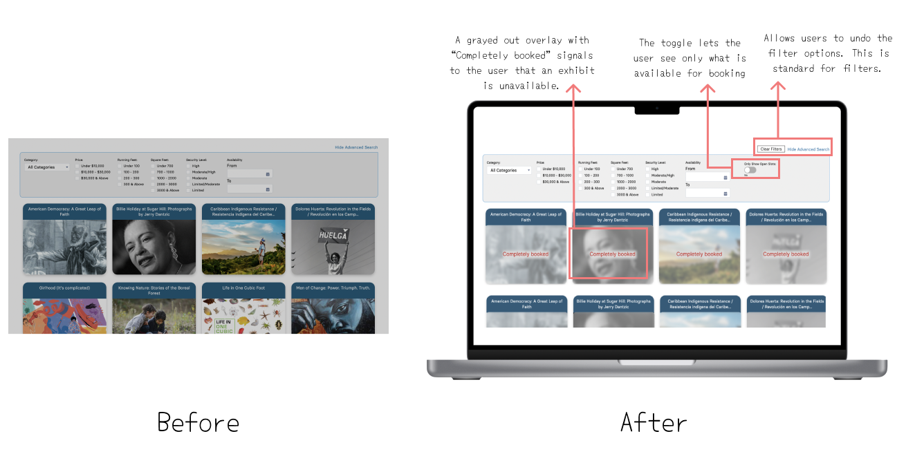
# Enhance the filters

The Filters are difficult to use and require multiple clicks to view them. The user has to login to use the filter and then go through each exhibit despite filtering , to figure out if dates are sold out. Resetting the filter also doesn’t follow usual convention and confuses the user. The recommendation listed can lead to lower friction in terms of navigation and easily viewable accurate information. This recommendation helps achieve the following ;
- User can filter as per price and availability and can easily reset the filters.
- User can clear filters and search again easily
- User is saved from multiple clicks by showing unavailable exhibits upfront
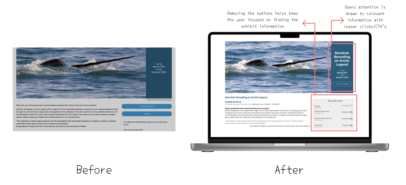
# Remove Misleading CTA’s
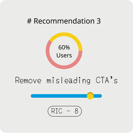
The website has Call to action (CTA’s) buttons like ‘Follow’, ‘Post a question’ and ‘Contact Us’ that are least interacted with or sometimes misunderstood by the user. The users in the interview assumed that ‘Follow’ would help them stay posted about the tour dates of an exhibit. They also wished to see a forum with visible interactions in ‘Post a question’. By removing CTA’s and focusing on important information the following goals are met ;
- User Looks at important information and doesn’t lose context
- Focus on getting emails by placing ‘schedule call’ instead of ‘contact us’
- Give user tour information upfront instead of a ‘follow’ button
# Improve content Hierarchy
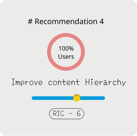
The users expect to find information in a certain hierarchical order but find it difficult to do so with the current website. The recommendations will ensure Visual as well as informational hierarchy. This will help drive client goals by ;
- Drawing user attention to important information
- Helping maintain user context
- The user naturally finding subsequent information that will aid in faster decision making and conversion.
Conclusion and Feedback

The research and analysis led to solid and actionable recommendations. The complete data and takeaways were presented to the client and they were excited by the results and wanted to get started on implementing them. The user interviews also brought forward some other really rare insights such as:
- Exhibits can be made more accessible by breaking the educational materials down into smaller price categories.
- 80% users wouldn’t subscribe to a Newsletter to stay updated about new exhibits.
- Users like upfront categorisation of info to make browsing easy