Design Critique: Mapping Inequality Project
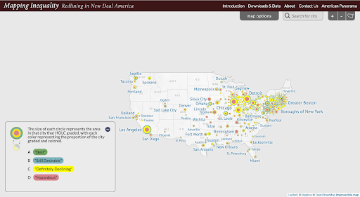
Mapping Inequality’s project page features a white map of the U.S. with circles of varying sizes that are all a combination of green, blue, yellow, and red. However, the proportion of each of these colors is different from circle to circle. At the top of the screen is a navigation bar with the project title […]
Design Critique: Mapping Inequality Project Read More »