After several weeks of presentations and learning about usability this semester, I decided I wanted to know more about eye tracking. Obviously, the name indicates what eye tracking is, studying questions like: Where does the eye go first? What does it look at the longest? What does it ignore? etc. But I wanted to learn more about how exactly eye tracking worked, since it’s not a method being used in class.

One of the first things I learned, from Kara Pernice and Jakob Nielsen’s report “How to Conduct Eye Tracking Studies” was that most people should not use this method for usability. While interesting, eye tracking only adds to your findings after you’ve done quite a lot of user testing, about 100 rounds according to Pernice and Nielsen. Eye tracking is best carried out by organizations who already conduct a lot of usability testing, since it requires a lab setup. The Nielsen Norman Group does eye tracking because they are a usability-focused company and, in their own words, they wanted to put out a fancy new book with pictures showing the benefits of eye tracking, not something most other companies want or have a need to do.
Eye tracking is not a new concept. People started conducting studies of eye tracking in the 1800’s to understand how people read. Most early eye tracking relied tools directly connected to the eye or head mounted devices. But early on studies were also conducted using light and film to record pupil movement. In the 1980’s, researchers started using eye tracking to study human-computer interaction. Today, eye tracking still uses infrared lights and recording of actions, but the software is more advanced.

Eye tracking measures a few key areas:
- Heat maps, which show where the eye looks and how long it stays there
- Fixation points, where the eye focuses the longest
- Saccade pathways, show the path of movement of the eye
- Time needed to find what eye is looking for
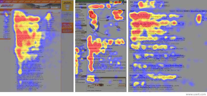
Eye tracking studies have shown that the majority of web content readers read a page in an F-shaped pattern. This was first reported by Jakob Nielsen and while not everyone reads this way, it is now a regularly cited piece of information on how people read on the Internet.
According to F-shape pattern maps, users start by reading the first sentence or two of a page. Then a bit of the next sentence or so, and then users scan the rest of the page, hence a heatmap that resembles the letter F.

Interestingly, the Think Aloud method that we are using for our User Testing Reports is not ideal for eye tracking. In order to make sure the study records eye movement in the most organic way possible, it’s important not to distract the user. Talking to users can cause them to linger longer on one spot than they might normally.
While testing now relies on software and computers to gather as precise information as possible, things like a user wearing glasses or being very tall or short can make it hard to set up the tracking software. Users have to sit directly in the center of the computer, ideally they should not use hand motions or hold items like a glass of water near the face to block the eye tracking software.
Eye tracking requires a very detail oriented setup and participants willing to sit still for long periods of time, so while it offers interesting insights into usability, it is clearly not for the casual usability tester.
References
Pernice, Kara, and Jakob Nielsen. “How to Conduct Eyetracking Studies.” 2009. http://media.nngroup.com/media/reports/free/How_to_Conduct_Eyetracking_Studies.pdf
Eye Tracking. Web. http://www.usability.gov/how-to-and-tools/methods/eye-tracking.html
Guo, Frank. “Leveraging Eye Tracking to Create an Engaging User Experience.” UX Magazine 27 Mar. 2014. Web. http://uxmag.com/articles/leveraging-eye-tracking-to-create-an-engaging-user-experience