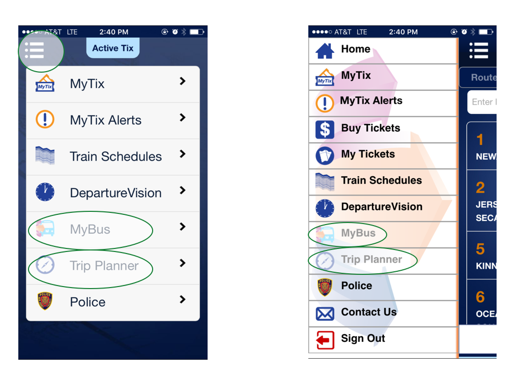
The NJ Transit Mobile App provides an easy way to make travel plans, buy and display passes and tickets, and get transit information. Overall, the application is useful for most of users. But the first time I use this app, I feel like the application is not easy for me to use. This article aims to evaluate the “MyBus” and “Trip Planner” function in NJ Transit from a perspective of first time user and then provide a research strategy to improve it.
MyBus: Reasonable user flow but not user friendly
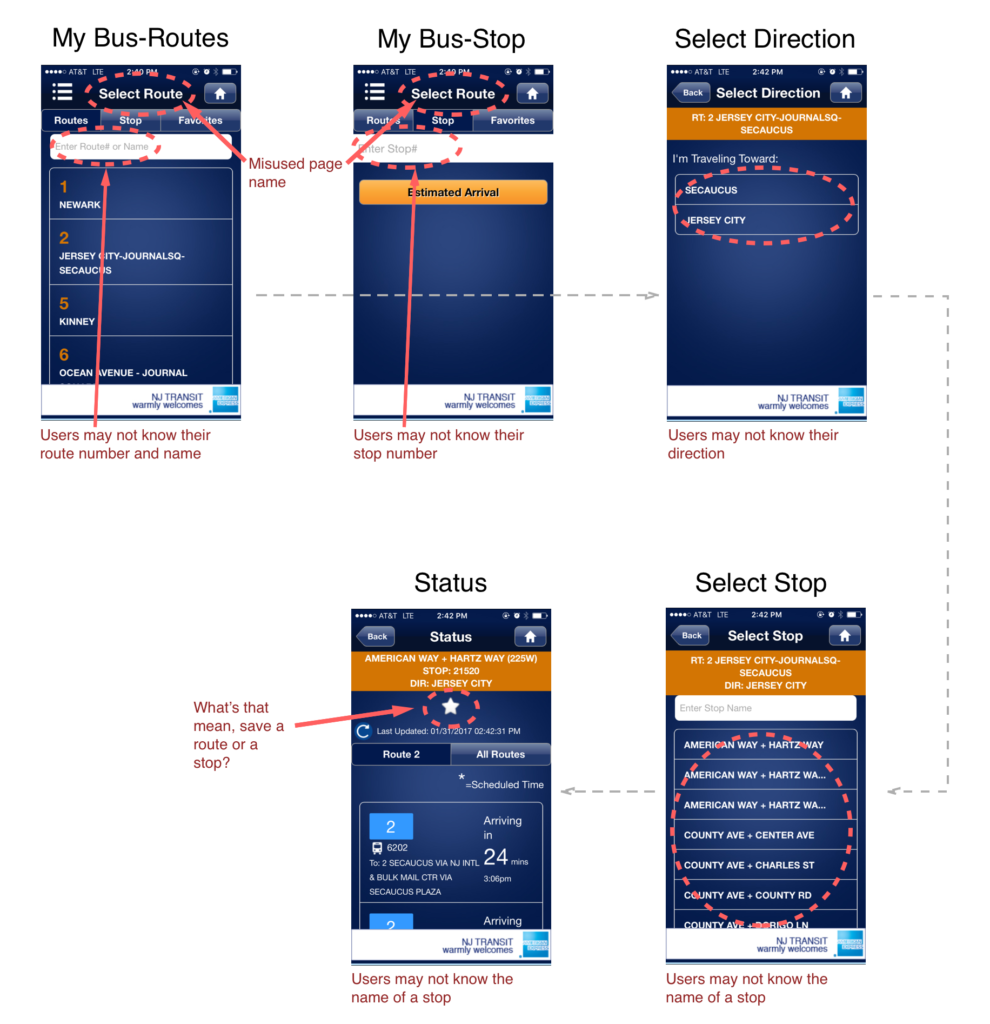
MyBus function is for a user to check the status of a bus. The user can either type the stop number to check the status of buses which will pass by this stop or choose a route first, select direction, then select a stop, at last check the status of a bus. The user flow of this situation is good. But the user may not know the stop number (although stop number shows in bus station, users may not in the bus station when they use the app). The display of the information is not easy to navigate for a first time user or a user who want to check an unfamiliar bus status. He/she may only know where he/she is and where he/she would like to go. At this time he/she should go to trip planner to check the routes, directions, and bus stops and then type these information into MyBus to check bus status.
Trip Planner: Reasonable user flow and user friendly. Should be combined with MyBus to enhance each other
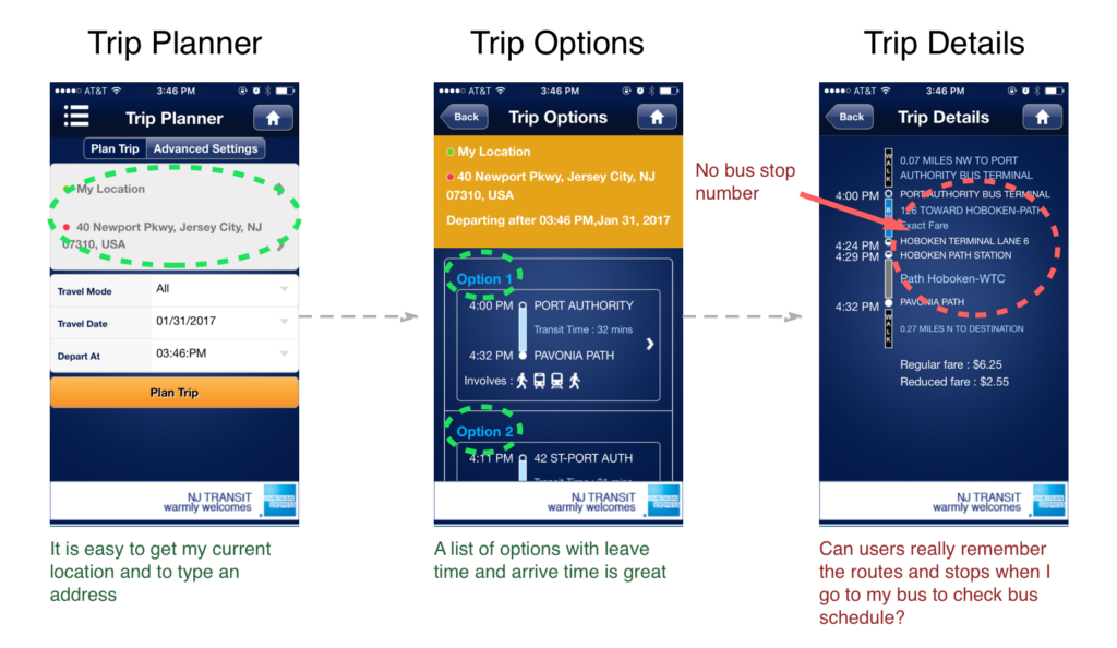
When this user open the trip planner page, he/she type the origin and destination. User can type a station, address, or my location in origin and destination. After users choose origin, destination, travel mode, travel date, and depart at information, he/she enters the trip options page with a list of trip options. After user chooses a trip option, the trip details page with trip routes, origin and destination stops, and trip times listed. However, there is no stop number which users may need to type in MyBus. What’s more, it is hard for a user to remember a route number, a route direction, and a bus station name to get the bus status with MyBus after he/she use TripPlanner.
Research Strategy to improve “MyBus” and “Trip Planner”
In order to improve the usability of “MyBus” and “TripPlanner” in NJ Transit for first time users or users who are not familiar with a bus routes. I think they should learn these users’ situation, mental model, frustration, etc. by using questionnaire, interview, and observation. Then create a persona, a user scenario, or a user journey for these users to redesign “MyBus” and “TripPlanner” to better serve these users. Some interview questions for can be:
- Have you ever use NJ Transit?
- How was it like when you first use it?
- How long/ how may times it takes for you to get used to use it?
- What sort of situations you use NJ Transit for?
- What will you do when you want to check the route from your location to a new destination?
- What’s your experience with Trip Planner and MyBus?
- Can you describe a typical time you use it to plan a new route and check the bus status?


