At first sight the U.S. Citizenship and Immigration Services (uscis.gov) portal is as expected — sporting the banal palette and the perfunctory ineffectiveness of American bureaucracy.
Government websites are not known for their cutting edge technological capabilities or innovative graphic/UX design. As a culture, we forgive them their usability sins for the vital services they provide. It is increasingly necessary to view design as intentional communication– not aesthetics, not passive transmission of information via the internet– intentional top-down communication.
User experience, design, and librarianship are career fields that require a certain level of emotional intelligence. A basic understanding of the internal experiences of others, if missing, can be supplemented by user-centered research. If all else fails, ask the users. Evaluating the Immigration Services portal means to evaluate the service design of the Immigration Services Department. As user experience researchers and designers and American citizens our work requires a new kind of vigilance. Grappling with the social implications of the language and visual treatments of a public service department is an act of advocacy.
As a citizen under a violent autocracy it is a responsibility and an act of rebellion.
A mix of basic emotional intelligence and research over the last few weeks show that the most common emotions reported by immigrants are hope and anxiety. The content and structure of the Immigration Services website are dismissive of the needs of a huge portion of its users. The language is unsupportive of users with lower English literacy levels as if all peoples internationally are comfortable with a) English b) legal jargon and c) the immigration process and requirements. Accessing translation features is challenging.There are irrefutable social implications of its poor usability.
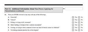
“Other languages” can operate only as an intentional implication that English is the official language of the United States or a sub-conscious exclusion of non-English speaking immigrants. This language is accusatory and manipulative. If a user were a victim of a genocide or human trafficking it is likely that they select “yes” having been involved in those crimes in “any” capacity “ever.” Responses to this question greatly impact the applications result. With no indication of the context of the question or response, how the answer may represent a user has dangerous outcomes. As an oversight or offensive action, questions of this nature systematically eliminate vulnerable applicants.
The complicated language and mail-in process of applying lowers confidence in user performance and the system/process. It does not create trust between user and institution. By, for example adapting these printable documents to interactive forms users would be alerted to invalid answers, provide space for contextualizing and feedback, and help to streamline the application process conserving emotional and mental energy on both sides of the application. The change would also streamline the process of updating forms reducing waste, quickening application review, lower work loads for department employees allowing usability to be evaluated and improved more frequently.
It is the responsibility of the researchers and designers to create systems that alleviate these stressors. As students we remember the most fundamental lesson of Don Norman’s work. User-centered design is not about making things not not painful but for making them pleasurable. Understanding this allows us to think more critically of the context in which our work functions and its social and cultural relevance. As designers, librarians, researchers (and humans), a life’s work should be most essentially to make other lives better.

