Using animations to improve user experience is a great strategy, but it should be done in the right way. Animations when done right, make the users feel valued because of its human-centered design, which in turn gives them a sense of well-being. These animations are used to unite beauty and functionality within the application. Animations are not only eye-catching but enhance the meaning of user interface and create successful interactivity. One can use them to communicate all sorts of statuses, to instruct behavior, to draw attention and to add affordance, or simply to let users see what the consequences of their actions would be.
With animation, a motion should supplement the flow and not interrupt the flow of the experience. Also when the objects change and adjust on the screen, there should be a continuity and natural flow. Sometimes even a slight touch creates the most meaningful motions. In short, animation is not only about the look but also the feel of design.
Some of the widely used animations in Mobile UX design are:
User Onboarding
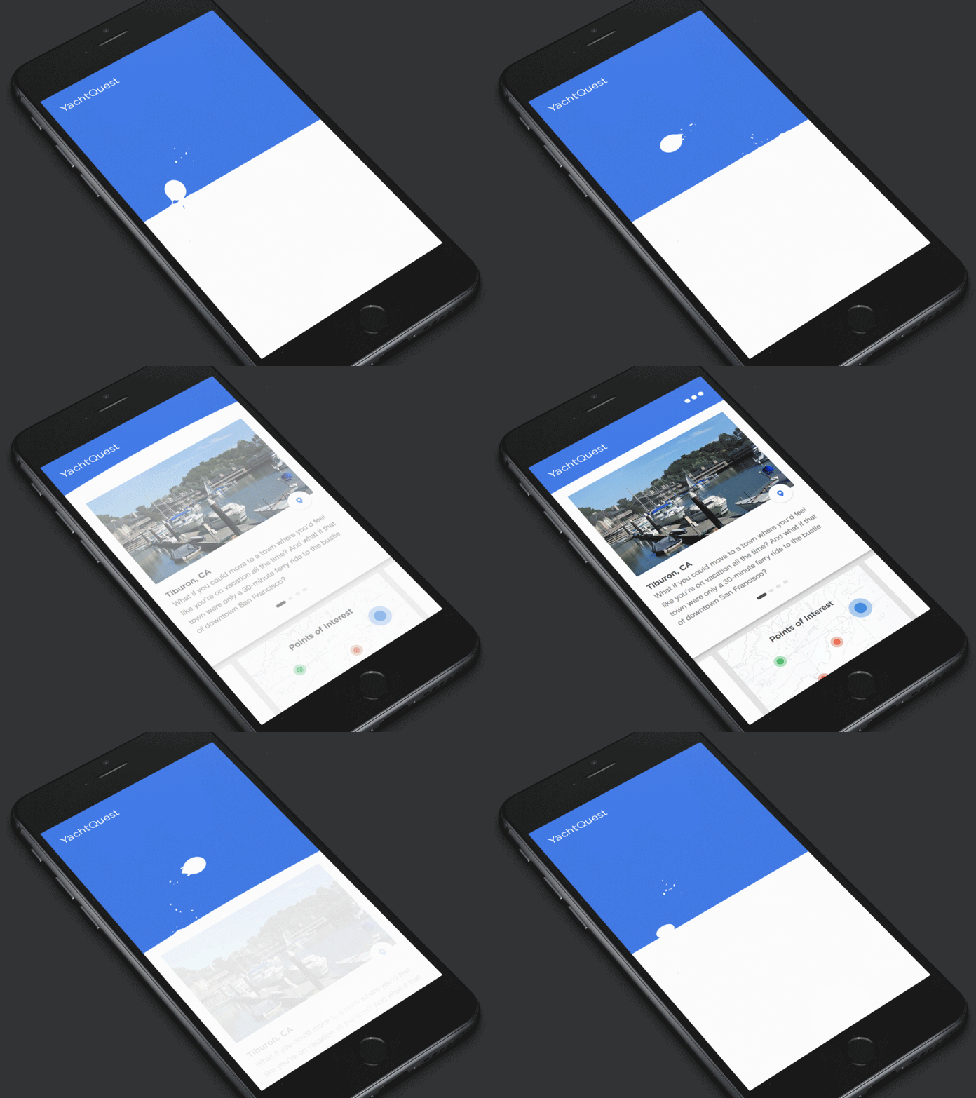
Most of the apps are deleted after their first use and this only because people feel completely lost when they open the app for the first time. This why one has to focus user onboarding and make as understandable as possible. Designers can use animations to create short visual stories during the onboard process about different features of the app and later show how to use them. It also reduces the need for long explanations of these features making the onboard process visually appealing.
Provide Visual Feedback
Visual feedback is crucial for any user interface. It makes users feel in control, which means that user is aware of the current state at given point of time. In terms of user interface design, building a responsive interface means building an interface that responds to the user at all times. Human software should feel as responsive as the humans who are using it.
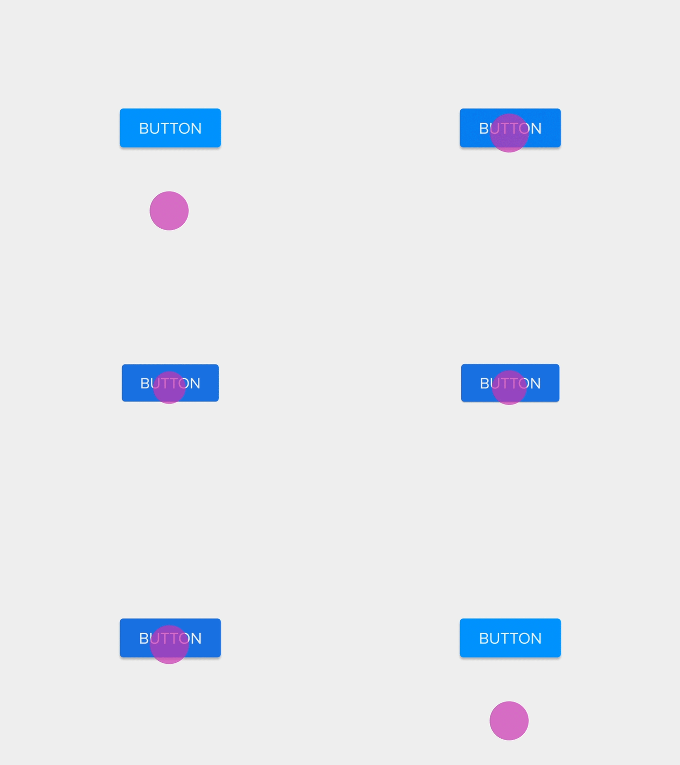
Elements like buttons and controls should appear tangible. On interaction, it should animate and show some kind of feedback.
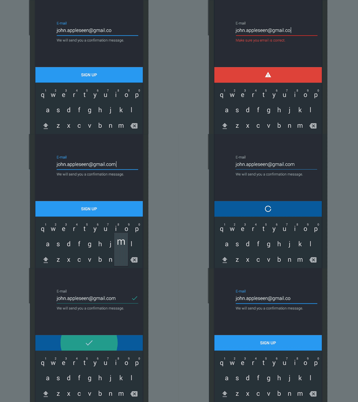
It can also be used to visualize the result of an action. When the user clicks “Submit”, a spinner briefly appears before the app shows the success state. Checkmark animation makes users feel like the process has been completed successfully.
System Status
There are many processes happening at the backend (e.g data is being downloaded from the server, calculations are taking place) and these things often take some time to load. At his point, animation comes to the rescue and it could be used to indicate the status of its ongoing process, where the user can know that the app isn’t frozen.
Also, indicate error state for example if a user by mistake enters wrong email information, provide him with some feedback that suggests that he has made an error.
Meaningful Transitions
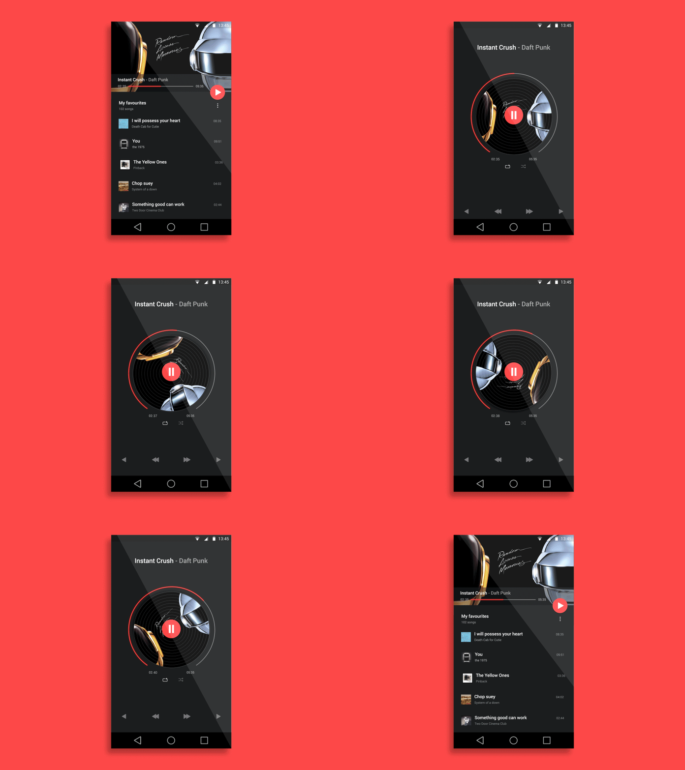
Animation can conveniently move the users between navigational contexts, highlight the changes in the structure of elements on a screen or emphasize element hierarchy. It can successfully capture user’s attention and give information and delight and one can create visual connections between transitions with the help of color and regular elements. Although, the flow between two visual states must be clean, fluid and natural. The direction elements should move cohesively across the transition. Animation follows the information hierarchy, marking which content is most significant by giving a track for the eye to lead on. The moving elements must present a clear picture as to where to look for the user. Disjointed transactions do more harm than good; make sure to avoid them. Stick to coordination in transitioning objects as haphazard motions are very distracting for the users.
Create delightful feeling
Use of animations make a boring design come to life, use of motion design at certain places can create delight among users. It makes your app stand out and also create memorable experiences.
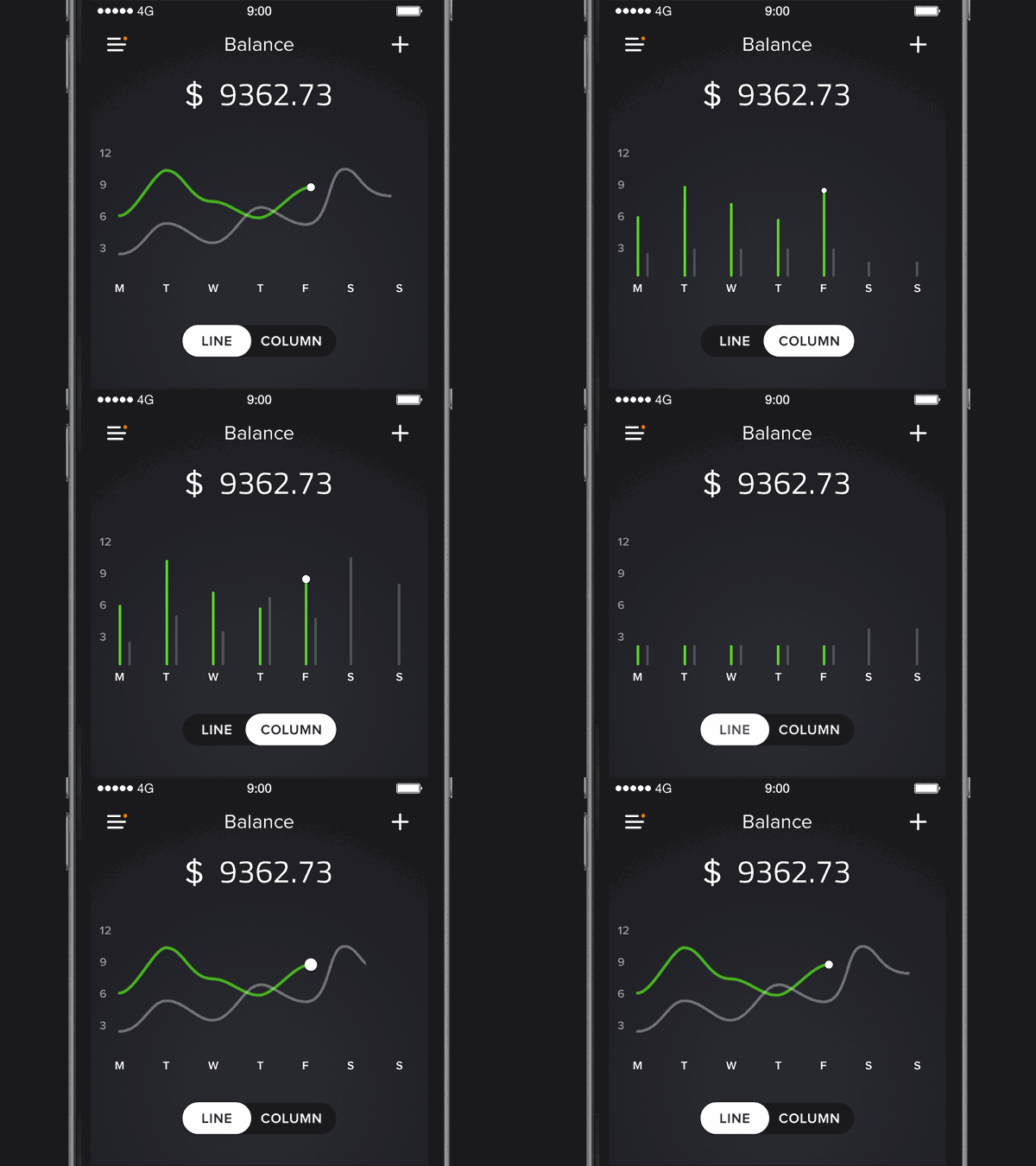
For example, using simple animations to communicate the change between the different graph views when the user toggles between the ‘Line’ and ‘Column’ option creates a sense of immediacy from their action by bringing the result to life through movement.
Conclusion
Animation is a very useful tool when used in a right way to create meaningful experiences. But the unnecessary use of it will obviously ruin its value. So, always use motion design in a judiciously way wherever it can create an impact and enhance user’s experience.

