I’m examining the concept of Nudge theory as it is implemented in user experience design. This exercise leads us to a fundamental question about ourselves as UX designers:
Am I a Good Witch? or a Bad Witch? Which?
By the end of this post, you will have to decide.
The Nudge theory was codified by Richard Thaler, a behavioral economist from the University of Chicago, and Cass Sunstein, a legal scholar, in their book, Nudge, published in 2009. In the book they describe a concept in behavioral science which argues that positive reinforcement can improve good decision-making. In any given scenario, one offers all choices, good and bad, simply prioritizing the good decision options for the user without removing the options that one feels are bad choices. It’s a rather altruistic and seemingly fair approach.
Okay, UX designers, here’s a quiz question for you: who has a similar theory of human behavior? Why, Don Norman, of course! This two-paned approach is directly reminiscent of Mr. Norman’s three levels of human brain processing: Reflective (conscious cognition), Behavioral (learned skills), and Visceral (immediate perception, or as Norman puts it, “the lizard brain”). In a simplistic way, Norman’s behavioral and reflective processing link to Nudge’s reflective and logical thinking, and his visceral processing relates to Nudge’s intuitive and affective thinking.
The best example of Nudge theory in action is as follows: designers painted a small fly in a strategic spot in the urinals at the Schiphol Airport in Amsterdam, and thereby reduced spillage by 80%. As Thaler and Sunstein say, “It turns out that, if you give men a target, they can’t help but aim at it.”
Other examples of good nudges include the little signs you often find in your hotel room that encourage you to save the environment by hanging up your towels so they don’t go into the laundry. If you want to have laundered towels, you leave them on the floor. Not only does this nudge you to be virtuous, cleaning up after yourself in order to reduce water and energy consumption, but it also may make you feel a little guilty about throwing something on the floor, thus making more work for someone AND ruining the environment at the same time!
The Good Nudge in Mobile Design
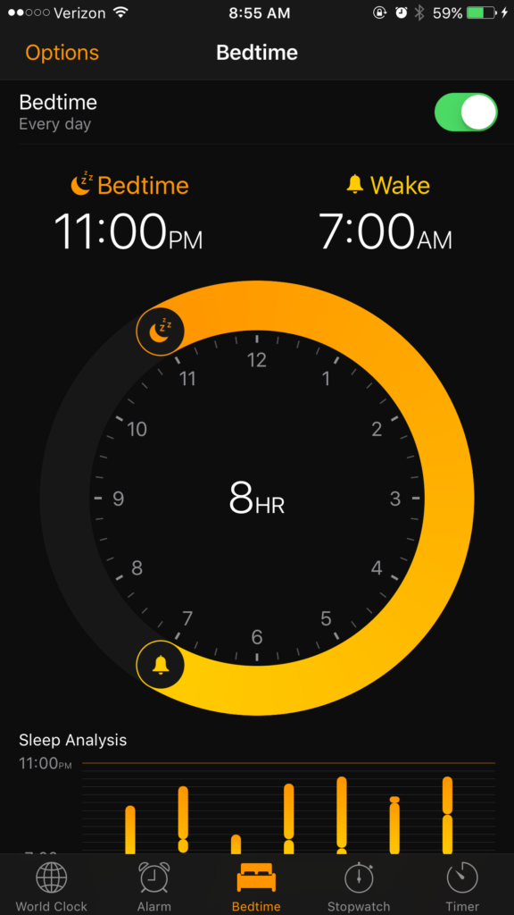
There are many ways to apply the good nudge in mobile design. There are apps which encourage good sleeping habits of eight hours per night, by sounding one small alarm sending you to bed at 11:00 and another waking you up at 7:00 AM.
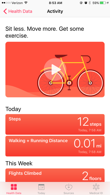
The iOS Health app tracks your movement (in steps and flights and distance) and politely tells you to “Sit less. Move more. Get some exercise.” (Okay, maybe it only says that to me. Maybe you are out running five miles a day.)
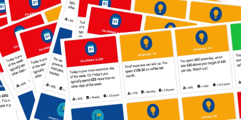
The British bank HSBC created an app that helps users track how they spend their money, quantifying purchase types and reminding them that “small purchases [like coffee] can add up.”
Hello Wallet performs the same type of good nudge, but someone there apparently is more favorable to caffeine consumption.
The debate over the beauty of the Nudge is whether it actually supports the intended libertarian ideal of freedom of choice, or is just a euphemism for psychological manipulation. In UX design, is this the gateway drug to . . . DARK PATTERNS? In Wizard-of-Oz terms, I believe that the good-nudge Witch helps the user get home to Kansas. The bad-nudge Witch just wants to sell more of those shiny ruby slippers.
But each of us gets to decide. Just as Dorothy always had the power to get back to Kansas all by herself, UX designers, you have the power in you.
Nudge for the good!


