UX Design has many aspects, but not all of them exist to make the users experience better. Some of these designs are made to benefit a company, and trick users into bad experiences. This type of design is called Dark UX, or dark patterns. Dark patterns are tricks that cause users to buy or sign up for things they never intended to.
Let’s talk about a couple of those patterns here.
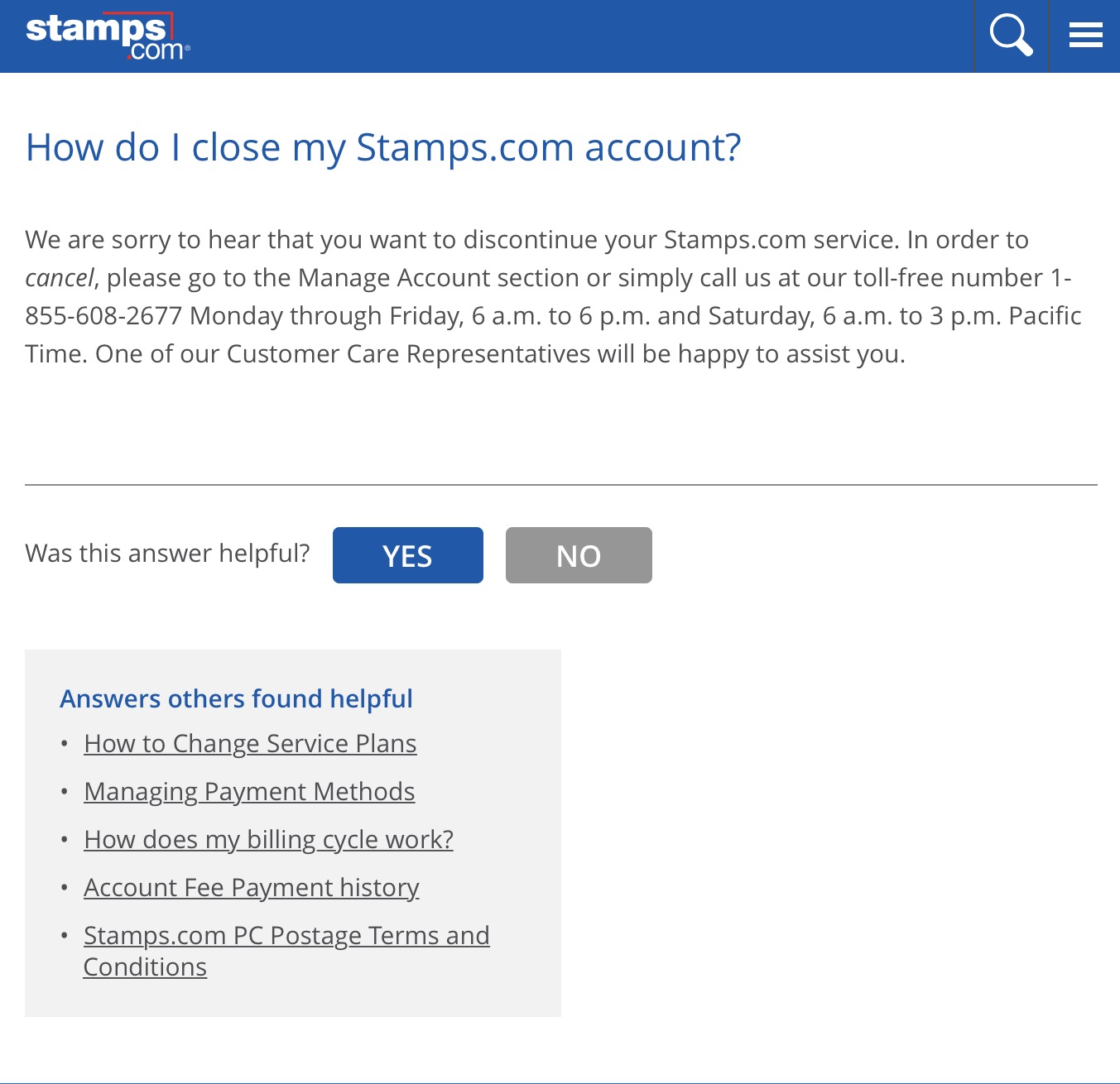
First up is a design known as the roach motel. This, like most dark patterns, is surprisingly common. The roach motel design makes it incredible easy for a user to get into a certain situation, but difficult to leave. An example of this dark pattern would be having a difficult time finding or being able to unsubscribe from a mailing list or a service, that was initially easy to sign up for. If you go to unsubscribe from that mailing list or service, and are asked to enter the email address, or told you need to call a toll free number instead, this is a roach motel. Hulu uses your emotions against you with this dark pattern, playing a video to make ‘really really sure’ you want to cancel your subscription. Even being asked to enter a CAPTCHA phrase to unsubscribe from something is a roach motel!
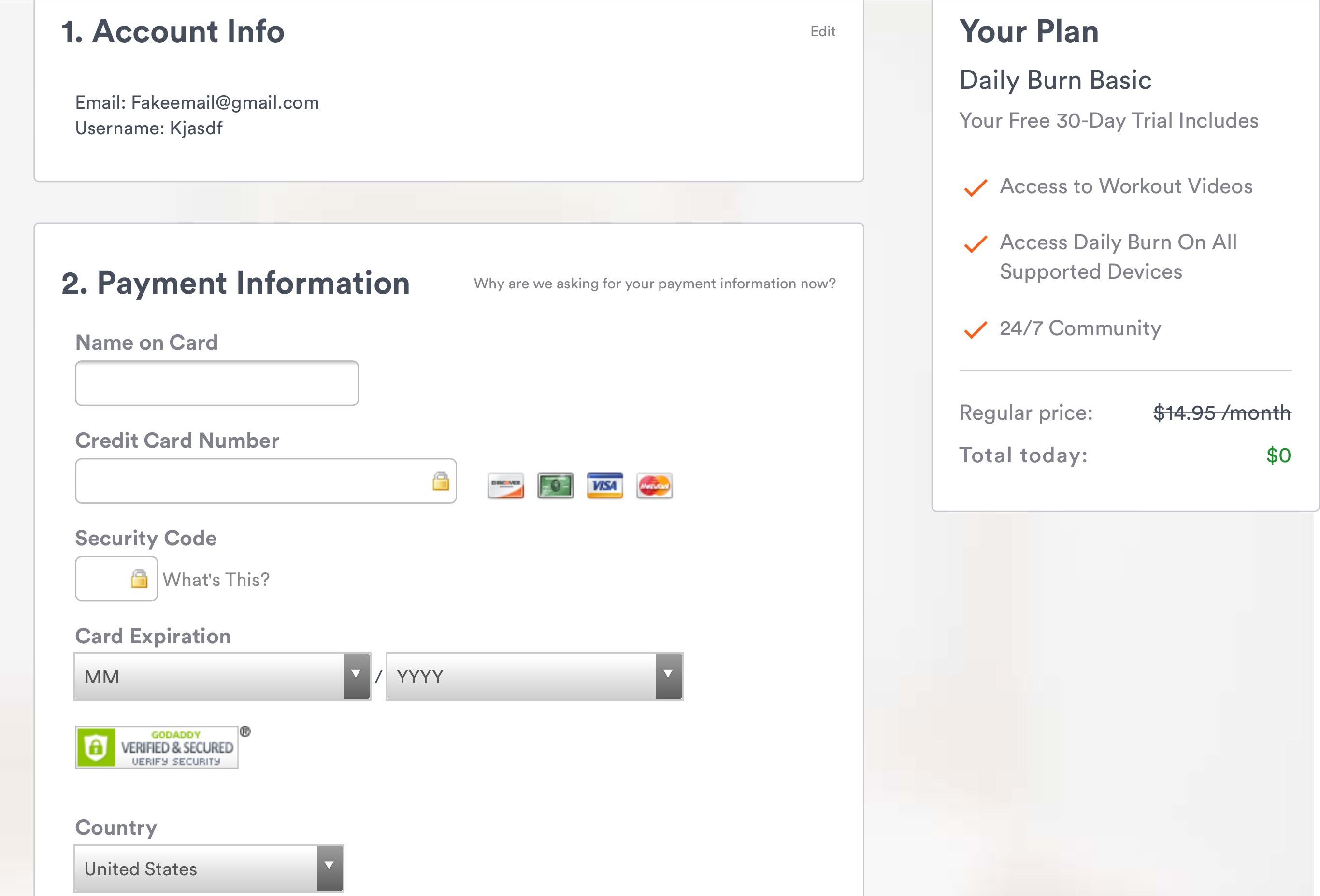
Next up, is an insanely common dark pattern that most people in this day an age have probably experienced, this would be forced continuity. Forced continuity is when a user is asked to enter credit card information for a free trial, which they forget to cancel and are in turn silently charged for services without warning. Almost every website that boasts a free trial period will ask for credit card information, making this an incredibly common dark pattern. This is something many Amazon Prime users have experienced, after signing up for a free trial, or a student membership, only to be suddenly surprised by membership fees once those periods are expired.
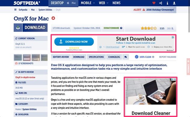
Finally let’s talk about disguised ads. These tricky little bugs are advertisements designed to look like they belong on the website they are placed, but will cause a user to end up at a different, most likely, undesirable destination. This dark pattern is strangely prominent when users are trying to download or install a software from a website. This would be seen as an advertisement that looks like the download button, causing a user to go to a site they never intended.
These dark patterns can cause a user to have a bad experience on their own, but it is not uncommon for them to be seen together. Go back to Hulu for a second, not only are you required to give your credit card information when you sign up for a free trial, they really don’t want you to cancel your subscription when that trial is up. While these might not be witnessed at the same time, forced continuity and roach motels are both part of Hulu’s user experience.
Don’t forget there are many other types of dark patterns, so keep your eyes open for them.
References: