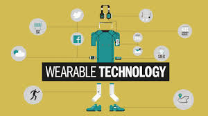
What a world we live in! Not only can we contact anyone from anywhere in the world, we can now do it from our glasses and watches! Since Gradinar Razvan wrote his article, Designing a User Experience for Wearable Devices, the technology for wearable gadgets has been growing by leaps and bounds. The devices of two years ago are no longer the devices of today. While tech glasses were still in existence back then, consumers expressed their disinterest in Google Glasses and barely a hint is heard about it today. Watches, on the other hand, are now a major portion of both Apple and Samsung’s sales. Both of these two major technology firms have come out with multiple versions of their watch. By abiding by Razvan 3 Keys, Apple and Samsung have adopted various colors and schemes to keep it both fashionable and wearable as an accessory, as well as functional so that it saves the user the extra step of taking out their phone.
In his article, Razvan brings up many good points and offers insights into how the future for wearables would turn out. Considering his article was written two years ago, it is clear that his recommended 3 Keys for designing wearable devices have been followed:
- Devices should be usable: When dealing with the small screen on a watch a well thought-out and simple U.I. is needed so that an immediate grasp of information is possible and users can figure out what they are doing while multi-tasking (e.g. when going for a run).
- Make sure that anyone of any age can figure out how to use the device: The technology must be accessible to everyone and easily understandable. The problem with the earlier generations and models was their complexity resulting in many users “dropping” the device. By losing users quickly you don’t allow the technology to grow (i.e. what happened to Google Glasses: https://virtualrealitypop.com/what-the-hell-happened-to-google-glass-eff123b96dd).
- Make devices accessories: The user needs to want to wear the watch and use it for dual purposes – for a mobile device but also for a fashion statement. Users don’t want a clunky ugly thing on their hand; the device should be pretty and nice while at the same time carrying out all its intended functions.
Razvan makes an interesting assessment: “We can assume that the typical user is in their twenties or thirties with an above-average income. They are open-minded early adopters…. This means that there are very few restrictions related to how advanced the user interaction (UI) can be.” Bernard Marr corroborates his numbers in this Forbes article citing that almost 50% of users are 18 to 34 and all the tests show that most users are early adopters of technology. However, once the technology is out there for more years and moves past the beta stages it will be adopted by older groups (aka those that are slower to adopt). Therefore, the complexity of the interaction, like Razvan says, needs to be advanced enough to attract the experienced professional, yet simple enough that anyone regardless of age or technological proficiency can use it.