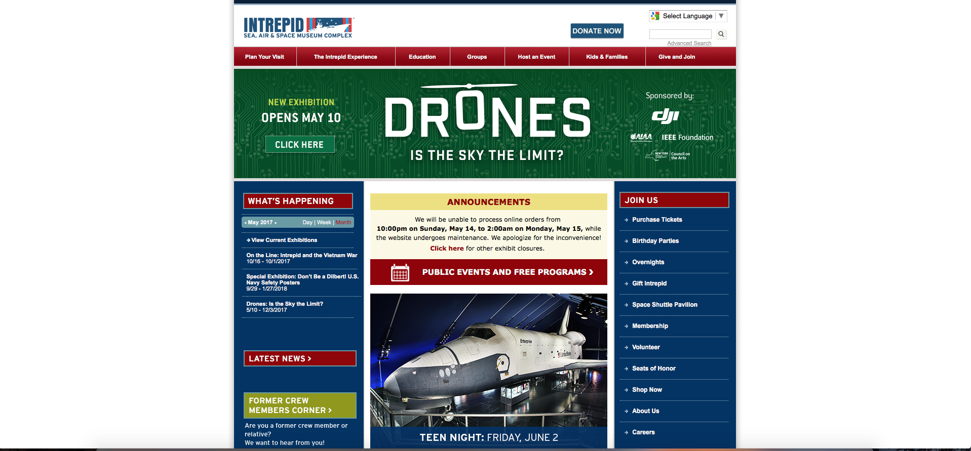
Our Client: Before
Our task was to redesign the website for the Intrepid Air and Space Museum. We were told they were looking to appeal to New Yorkers and make their website more mobile-friendly, but we soon found they have many more problems.
The Card Sort and Tree Test
With our goal in mind and a firm grasp on the user bases we wanted to interact with, we hosted a series of Card Sorts. We learned from our users that while they could easily decide where to categorize Membership, there was no consensus for the other categories.
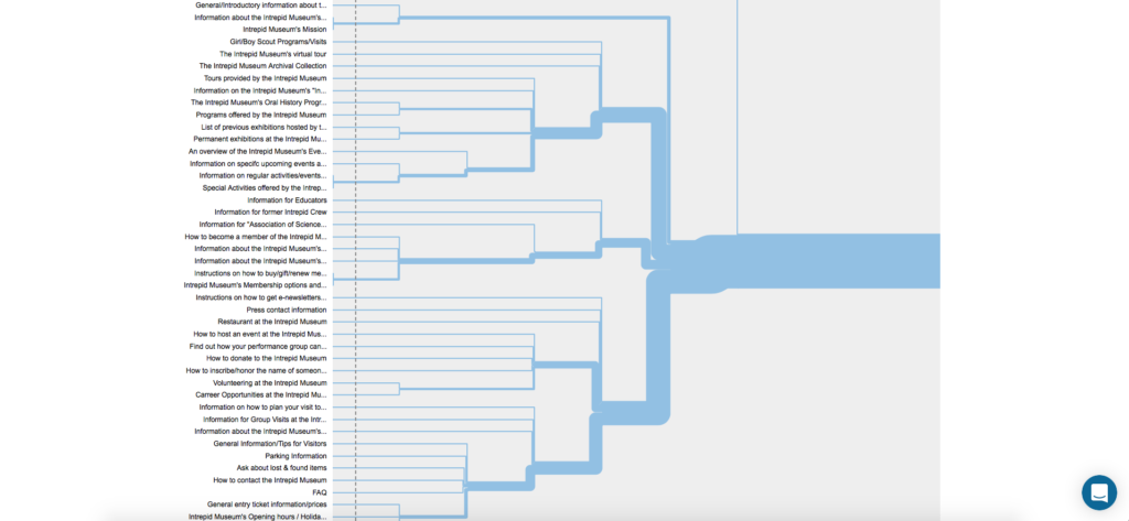
Nevertheless, we persevered and used the data to form our Tree Test. It was here that things started coming together. Users felt as though there should be multiple solutions to particular tasks. As such, we created a Site Tree that reflected just that.
Competitive Analysis
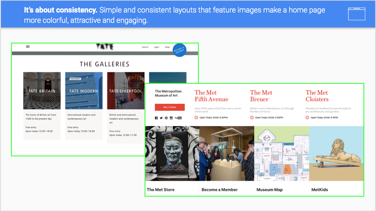
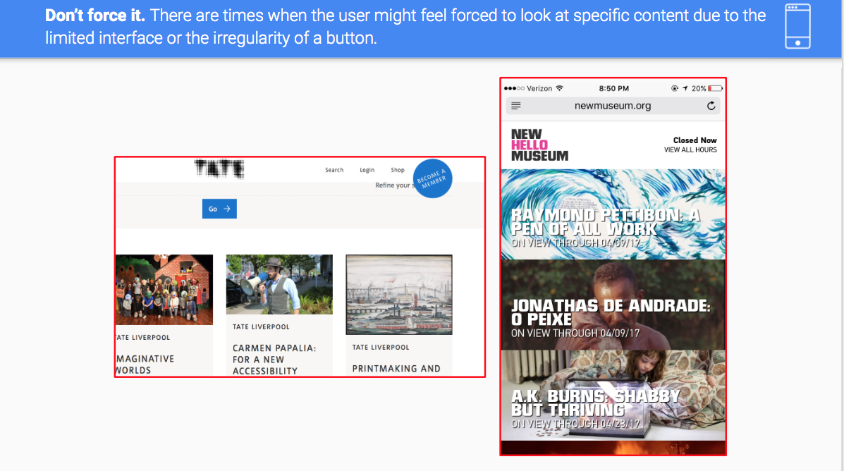
It was during the Competitive Analysis that our vision really started to come together. Taking cues from websites such as the Met and Tate, we incorporated several choices that would make the experience better for our users.
Sketching
Utilizing all this, we came up with a series of sketches that would later develop into our finished product. While some choices did make it into the finished product, there was plenty of revision and retooling.
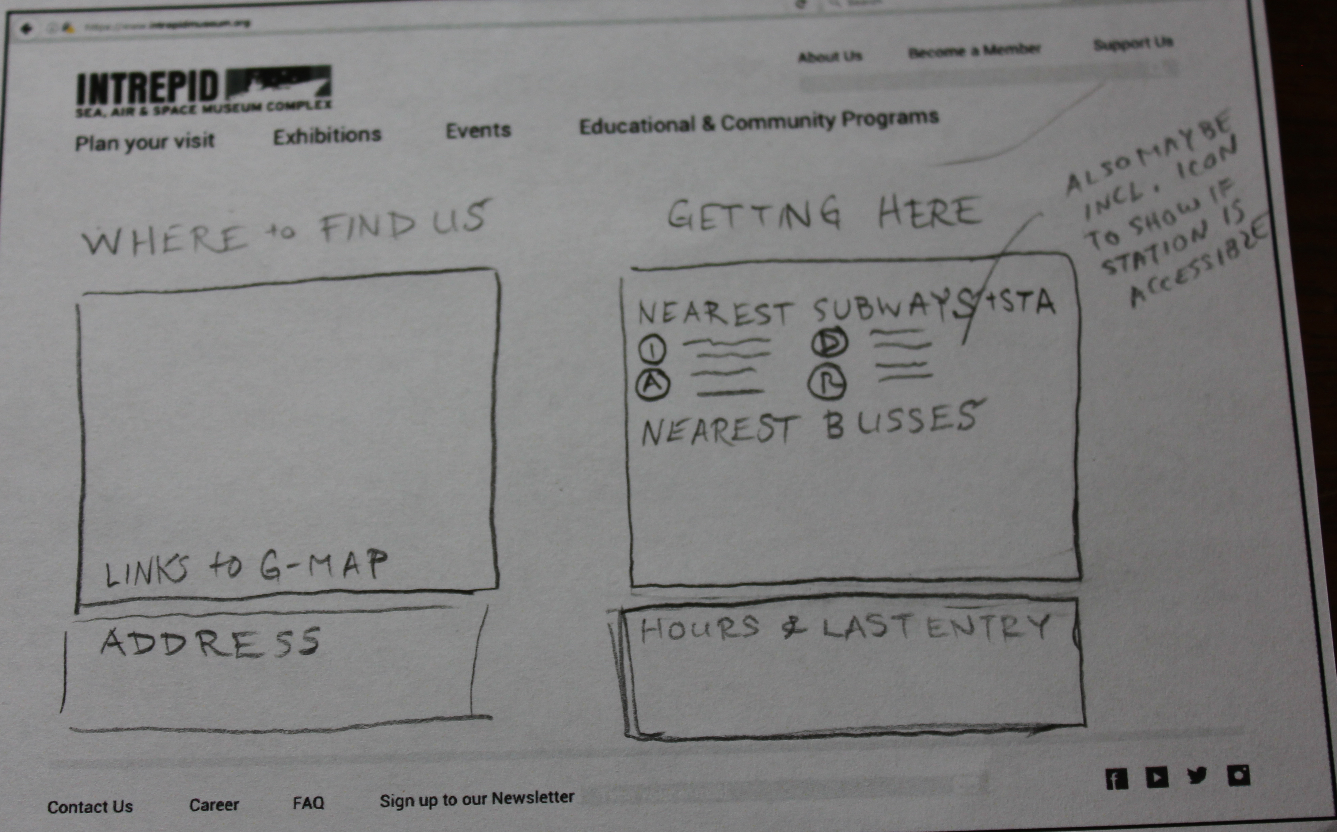
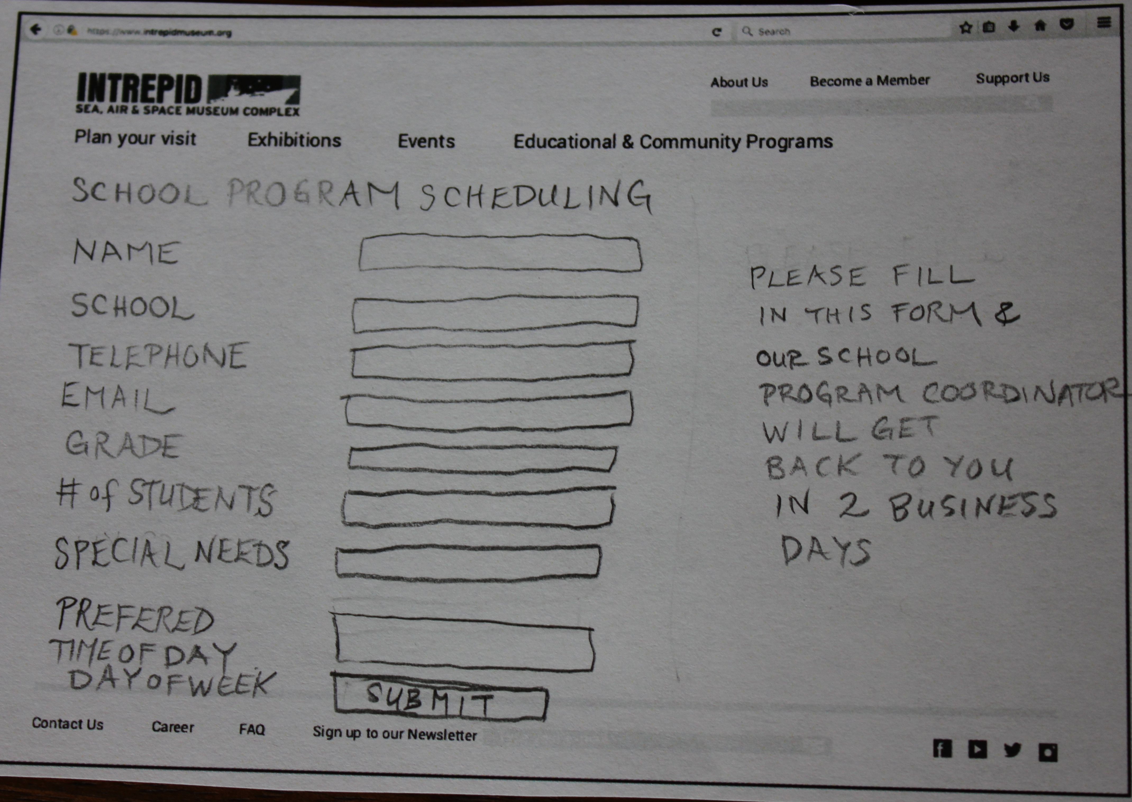
These soon got translated into wireframes, which were used for the prototype.
Finished Prototype
The sketches provided the perfect jumping off point to craft our prototype. Thanks to the help of Setareh Parvin, Amanda Belantara, and Anish Jajodia, I was able to hone my communication skills and help my group come up with an effective prototype that the Intrepid could certainly see fit to adopt into their website design.
