This is an in depth critique of the Apple Watch Series 2. Before owning my Apple Watch people (acquaintances or random people in everyday life) would often comment on my engagement ring. People would see my ring and ask a spectrum of questions ranging from the personal, “How old are you?!” to the superficial “How long have you been married?”, based on this one piece of jewelry. After purchasing my Apple Watch five months ago, people have started looking past my fingers to ask about the object on my wrist. I usually tell people how much I love my device, answer their questions and advise them to purchase one themselves. However, after reading The Design of Everyday Things by Don Norman, and using his design principles to jot down notes for this post, I may have a different outlook now.
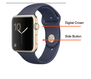
When looking at the Apple Watch it is important to note that there are four affordances for communicating with the watch.
- Touching – the face of the watch has a screen and affords touching.
- Side Button – the long flat button on the side of the watch, affords pushing
- Digital Crown – round button that based on cultural aspect of watch design signifies rotation. This crown can also be pushed unlike a conventional analog watch, in which the button is pulled.
- Speaking – the watch will respond to voice when in certain situations (apps and Siri).
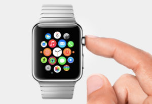
 Discoverability begins when I first lift my arm and turn the watch towards me. The watch senses this motion and instantly lights up. The time is now displayed on the touch screen providing feedback that the watch is on. To launch an app on the watch. I must first push the digital crown in and then select my app. To select an app I can either click on it using my finger, or centralize the app on the screen (using my finger) and rotate the digital crown to zoom into the App. I rarely use the zoom feature as it takes longer and the digital crown rotation is not intuitive, based on cultural constraints. Before owning my Apple Watch, I wore an analog watch. I utilized the crown on my analog watch twice a year on average, during daylight savings time. If I used the crown any other time of year, I would off set the time on my watch having negative effect on my every day life, usually being late for an appointment.
As a result, I view using the digital crown on the Apple Watch as something to be used infrequently. I do not classify this a bad design. I think later generations will adapt to the digital crown especially if this would be their first watch, and then cultural constraints would not apply. If something were to change, voice command built into the app to state the time and omit the need for a digital crown. There could also be a plus and minus sign on the touch screen display, and pressing these symbols would increase and decrease the time.
If the digital crown were not omitted from the design of the watch, I would change the placement of the digital crown. The digital crown and the side button are adjacent to one another. They both afford pushing but perform different functions. The side button when pushed brings the user to a dock of frequently used apps, and the digital crown brings the user to all the apps. Often times I mistakenly “slip” and push the side button when I mean to push the digital crown. It is definitely a nice design to have both buttons on one side, but does not lend itself to the functionality. I would move the side button to the opposite side of the watch as conventionally, one can find the crown on the right side of most watches (smart or not).
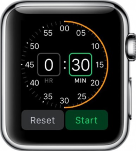
Lastly, mapping on the watch is consistent. When I swipe my finger to the left the apps follow, same with the right. When I scroll my finger up in an app to expose the rest of the page the page moves upward. This is also consistent across multiple apps, reducing the use for knowledge in the head. When setting the time in the timer app, something I do when I am cooking I must rotate the digital crown up to increase time. When using the Nike Running Club app, and I would like to set a time for my run, I would also move rotate the digital crown upwards.
Overall, beyond the flaws, I still think the Apple Watch is an amazing piece of technology. Although the device tells the time, its scope far surpasses this one function, and thus may be branded incorrectly. I would be curious to know how the device would look if designers were not limited by the connotation of a conventional watch. It is hard to say if the watch elements give the design cohesion or hinder its capabilities. I am sure there will more Apple Watch generations to come that will answer these observations.


