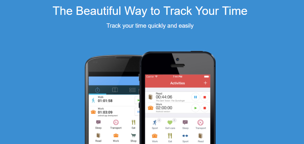
ATimeLogger 2 is an application for helping users to track time, and related functions can also be achieved, such as enhance users’ ability of time management or record multiple tasks’ time-consuming. Furthermore, ATimelogger 2 has an outstanding performance in signifiers and constraints, which brought forward by Don Norman. The clear interfaces and logical constraints successfully satisfy users’ needs.
Design Thinking
Tracking time is an effective way to do the time management, but several designers often focus on the tracking function itself without digging out the real issues behind it, which is saving time, improving efficiency and so on. I believe the designers of ATimeLogger 2 did a serious design thinking before they develop this application, which they may take the time tracking as a “suggestion” rather than an original problem. Their target is attached closely to the real issue and the whole design is “invisible”, like Don Norman said in his book the design of everyday things, “good design fits our needs so well that the design is invisible, serving us without drawing attention to itself.”
Concepture model – Interfaces
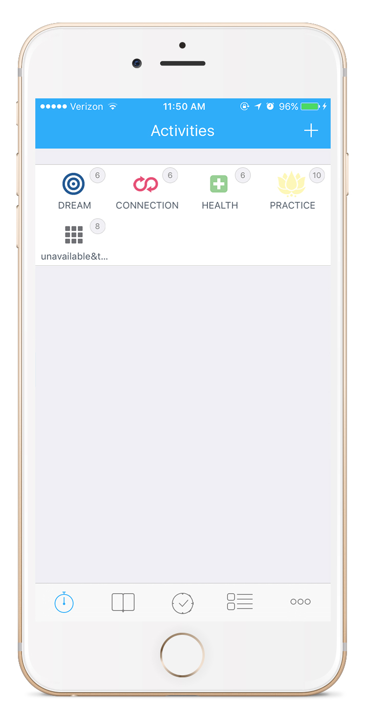
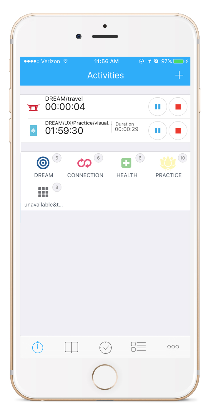
There are 5 buttons at the bottom of the main menu and the corresponding interfaces only display necessary content, which successfully supports users to identify each piece of information in short time. After a user taps the first bottom icon, the minutes of activities’ time consumption showed immediately on the top. Each activity has been signified with one simple icon and a small font text, which locates on the left of the activity bar. As the same size with the activity button, the pause and stop button locate on the right. The user can immediately know different activities’ time consumption and adopt the action for pausing or stopping them. Besides, other activities are all listed behind the activity bar, which icon is bigger than its text. These obvious signifiers are helpful for users to switch to record other activities’ time.
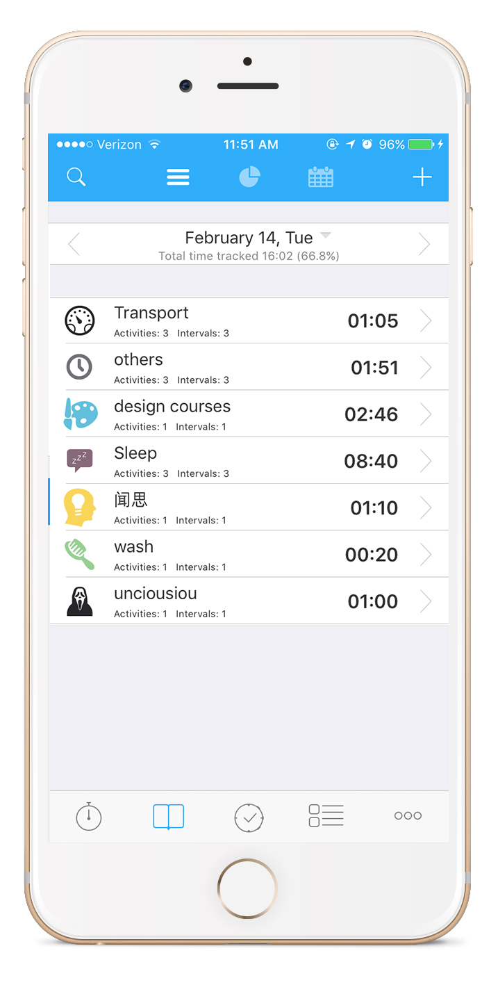
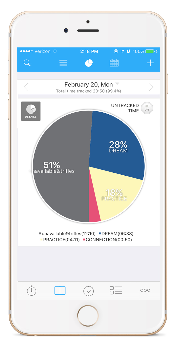
Also, the interface to the second menu button recorded the history time consumption. Users can tap the two buttons on the top to switch the form of time record as list or pie chart. This function is a complement of the time tracking, and provide users an impressing feedback of their behavior.
Simplified Icons – Initial learning
The buttons, including buttons for signifying activities, are all flattening icons. This simple style attains a good communication with users for completing a completed time tracing action during a limit time. Furthermore, the simplified icons are related to the image that we are familiar with, such as the stopwatch, the plus sign, which is discoverability for users to determine what actions are possible or ensure the current state.
Simple Gesture
When the user wants to start, pause, stop tracing time, switch tasks, or check the past record, they only need to tap once on the interface. Also, ATimeLogger 2 doesn’t adopt other gestures, like dragging, 2 finger tapping, to complete any action. It seems constraint users, but actually, it effectively saves time for users to learn and use this application. Without the complex gestures, users can avoid trial and error especially when they use this app during a busy time.
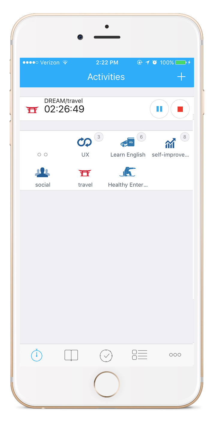
However, I consider the only shortage of this app is the deficiency of mapping. Various type activities can be collected into different groups; however, once the user puts one activity into a group, he or she has to tap twice to start tracking time (the first to open the group). Once the user entered into one group, the menu of higher level activities are all hidden. I think to keep all the activities and show a hierarchy is better for users to understand the current state.