(image: https://www.chargify.com/blog/13-tips-to-improve-user-onboarding-from-saas-leaders/)
User onboarding is a sequence of processes to help users get familiar with the product and to have users continue to use it. Onboarding is a term from human resources for new hires, but recently also used for developers to refer to taking on and orienting a new customer. According to the Andrew Chen’s research for Android apps, “the average app loses 77% of its DAUs (Daily Active Users) within the first 3 days after install, 90% within the 30 days.” To make as many users remain as possible, the app should guide how to use the app effectively, and make the users come back. In other words, effective onboarding strategy is important to engage users during those first interactions.
Which cases will user onboarding be useful
Although the goal of every application is the same – retain users and make them effectively use the app – not every mobile app needs to have onboarding process. Onboarding process might not be required if the usage is straightforward. For example, Google Maps does not have to walk through how to use the app unless they launch unfamiliar features. According to an article, onboarding strategy is useful in case the app
- Contains non-standard interactions
- Has a fairly complex workflow or handles complex tasks (e.g. a complex business app, which has a variety of user roles, each with specific access rights and restrictions).
- Requires users to populate it with data because its default state is empty.
- Has undergone a major redesign and you want to introduce existing users to new features and changes.
- Introduces a brand new concept itself. The concept might be unfamiliar to users.
(source: https://www.shopify.com/partners/blog/mobile-app-onboarding)
What will be good user onboarding strategies?
- “Show less, provide more”: Avoid long / redundant upfront tutorial
: Almost every app provides swipe-through onboarding steps at the first installation. But if there are too many swipe-through screens, users are reluctant to look through all the screens in detail or do not concentrate on the content on the screens. Users might lose interests even before they start using the app. In addition, some apps show semitransparent screens to indicate the locations of new features but users will not remember all those new feature when they really use the features. - Make Onboarding Contextual
: ” New users don’t sign up for your product because they are excited about learning how your UI works. They signed up because they were interested in the value that you promised to deliver. ” (source: https://uxplanet.org/best-practices-for-onboarding-92f3a9f0b21a)
Contextual onboarding provides helpful guidelines at the point of action. For example, Snapchat provides onboarding screens for its first time users only, such as “Tap to take a photo”, “Hold to take a video”, “Tab on your face to use Lenses” as users walk through the app. By clicking those popups, users can opt out and will not see them next time, since the app considers that this user is already used to the app.
- Maximize Empty States
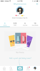
: If an app’s default state is an empty and requires users to fill out something, the empty state is a right starting point to provide onboarding, which also can be a learning opportunity for users. To utilize the empty state, the app provides some sample data that users later can remove, or give textual guidelines. For example, the image on the left presents “Add a post and being loved” to encourage users post themselves. The image on the right lacks onboarding and the empty space does nothing.
(image: https://www.smashingmagazine.com/2017/02/user-onboarding-empty-states-mobile-apps/)
Onboarding Teardowns Examples
Here are two examples that I think have interesting onboarding process.
1.Navdy
Navdy is a portable head-up display (HUD). By connecting it to your smartphone via Bluetooth, Navdy displays calls, text, music, and alerts. To utilize Navdy with your smartphone after purchasing a Navdy, you need to download the Navdy app. Navdy app doesn’t play a standalone role, so at the onboarding stage it introduces you how you install and use it very specifically.
The current version of the Navdy app has total 20 onboarding screens – looks pretty a lot. First 5 of them demonstrate values of the system, and the rest of them are step by step how-to-install guidelines. What is unique about Navdy is its head up display. On the onboarding screens, Navy app shows how the device looks like in a car to emphasize the app usage.
2. MealPal
MealPal(formerly MealPass) is a monthly meal subscription services. Users can sign up and use the app via its mobile app as well as desktop browser. Although MealPal has its own / uncommon system to buy everyday meal, it does not clearly suggest how the system works. Here are 4 essential steps to use MealPal.
- Buy a monthly plan (MealPal offers 2 options for lunch and dinner respectively.)
- Subscribers can order lunch between 5 pm on the day before the lunch and 9:30 am next day. For dinner, the order opens 5pm on the day before the dinner and closes at 3pm on the same day with the dinner. To order, subscribers use the app or the website.
- Subscribers can choose one of participating restaurants.
- On the day, subscribers visit and pick up at the restaurant.
Unfortunately, although the process is not that straightforward, current version of MealPal app doesn’t demonstrate how the subscription works. It leads users to put their credit card numbers right after sign up. Who can gives credit card information without knowing what to do next? What if there is no right lunch spot around my office but I already signed up for a month?
More about user onboarding
- The user onboarding academy (https://www.appcues.com/user-onboarding-academy)
: Appcues is a service that helps customers implement personalized user onboarding process. The website also presents onboarding basics, best practice, resources, etc. - Useronboard.com (https://www.useronboard.com/)
: onboarding teardowns for popular apps and websites
Reference
- https://www.linkedin.com/pulse/losing-80-mobile-users-normal-why-best-apps-do-better-andrew-chen/
- https://www.shopify.com/partners/blog/mobile-app-onboarding
- https://blinkux.com/blog/up-running-3-tips-for-an-awesome-onboarding-ux/
- https://uxplanet.org/best-practices-for-onboarding-92f3a9f0b21a
- https://www.smashingmagazine.com/2017/02/user-onboarding-empty-states-mobile-apps/


