Design alone lacks understanding the user. When a designer utilizes the principles of psychology in design, it becomes a powerful tool and language that can influence the actions for the users. Psychology plays a prominent role in impacting human-centered user experience design.
Today, understanding the users have become one with design. As Donald A. Norman states in his book “The Design of Everyday Things,” he defines design as an act of communication. This also incorporates the idea of understanding the person whom the designer is communicating with to know the needs of the users. Norman understood and emphasized the importance of knowing the user. To make good design, it is important to understand the psychological principles of human behavior, aspirations, and motivations. Here are some effective psychological principles often applied in the design process:
Gestalt Principles
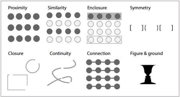
Gestalt Principles are set of principles stating that human minds organize patterns and objects. These principles include these five categories: Proximity, Similarity, Continuity, Closure, and Figure/Ground.

Similarity: If a user sees objects that look somehow similar, they may automatically perceive them as the individual elements of one group. The similarity between elements is usually defined with shape, color, size, texture or value. The similarity gives users the sense of coherence between the design elements.
Continuity: It is the principle according to which the human eye moves naturally from one object to the other. This often happens through the creation of curved lines allowing the eye to flow with the line.
Closure: It is a technique based on the human eye’s tendency to see closed shapes. Closure works where an object is incomplete but the user perceives it as a full shape by filling in the missing parts.
Figure/Ground: The principle demonstrates the eye’s tendency to separate objects from their background. (UX Planet, Psychology in Design. Principles Helping Understand Users)
Gestalt Principle is useful in design to understand how the human mind unifies the visual elements and structure of design. It gives designers more freedom to design assuming that the human minds can organize patterns and objects (UX Planet, Psychology in Design. Principles Helping Understand Users).
Visceral Reactions
This is an intuitive gut reaction that we respond with when encountered with an experience or stimulus. Our neurotransmitters determine what emotions we feel, causing us to react without having cognitively process the information.
Visceral Reactions can be used by designers to create with impactful elements the target audience may favor. Some elements include beautiful photographs on the landing pages and colors, fonts, etc. that attract the target audience.
Psychology of Colors
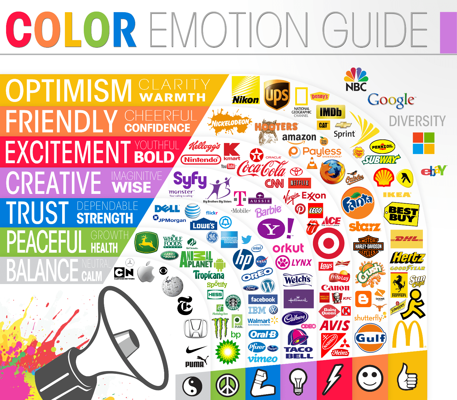
Colors have impact on the user’s’ perception. It impacts emotions and reactions of the viewer. Color psychology is the “study of hues as a determinant of human behavior” (Wikipedia, Color Psychology). The use of color psychology is very commonly seen in company logos and branding. Here are some examples of meanings associated with colors:
- Red: lust, power, excitement, love
- Yellow: competence, happiness
- Green: good taste, envy
- Blue: masculine, competence, high quality, corporate
- Pink: sophistication, sincerity, feminine
- Violet/purple: authority, sophistication, power
- Brown: ruggedness
- Black: grief, sophistication, expensive, fear
- White: happiness, sincerity, purity
Designers can utilize the psychology of color to influence human’s mind, behavior, and reaction when designing with knowing what reactions the colors may cause in the user.
Recognition Patterns
Recognition patterns is the process of our cognitive mind to match information with information from our long term, short term, or working memory.
Often websites and brands utilize this theory to provide its customers familiar design. They keep consistent look-and-feel so that the user can recall from memory on how to utilize the site without having to learn to navigate through it.
Recognition pattern can also give a sense of security for its viewers. Designers can provide the sense of security by incorporating design elements that are consistent to what users may already know. For example, a bank website should have clear language, branding, and images that customers are familiar with. If the site changes its colors away from their branding and users do not recognize it, it can cause a sense of discomfort and distrust in the legitimacy of the site.
Scanning Patterns
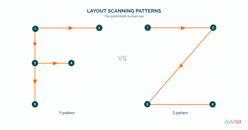
Scanning patterns describe the way users’ view a website to see if they are interested in diving in deeper to the content. According to studies by Nielsen Norman Group, UXPin, several commonly known patterns are “F” and “Z” patterns.
F-pattern is the most commonly used pattern. It is when the user scans left to right, then goes down the page and scans again left to right and then straight down to see if he/she finds any interesting keywords. This “F” shaped scan more commonly occurs on pages that are text-heavy.
Z-pattern is when the user scans left to right, then diagonally down, and back across the page. This commonly occurs when the page is not heavy with text and user does not have to scroll down.
Designers can utilize this theory to incorporate design elements that will catch the viewer’s eyes at a glance. This can help increase viewers’ interests to a website (UXPlanet, F-Shaped Pattern for Reading Content, Z-Shaped Pattern for Reading Content).
Hick’s Law
This law describes the time it takes for a person to make his/her decision. The theory states that more decision the users are faced with, the longer it will take them to make a decision.
Designers can prevent users from having decision fatigue by limiting the options for users. Being overwhelmed with options, products to choose, or pictures to look at can make the user’s experience of a website negative. To be effective, designers are recommended to keep the options to a minimum (UX Planet, Design Principle: Hick’s Law – Quick Design Making).

Conclusion
Psychology plays a vital role in user experience design. The theories are effective tools to provide users with design that is centered to their needs. As a result, the use of psychology principles in user experience design can help enhance the experience, usability, learnability, and discoverability of a website.


