The User Experience world also contains as dark side. On the dark side companies allow their interfaces and apps to host dark patterns. Dark patterns tend to trick users into doing something they normally would not do. I will discuss three dark patterns, in this post. So the question is, are dark patterns ethical or non-ethical?
In the world of UX, the purpose of user experience design is to enhance the user’s satisfaction with a product by improving the usability, accessibility and the pleasure provided in the interaction with the product. But UX can get dark pretty quickly by using their design expertise to create dark patterns. Dark Patterns are tricks crafted into the interface that tricks users into doing something they would not normally do. Harry Brignull developed a website that outlines all the dark patterns on the web to spread awareness and to shame companies that use them.
The reason dark patterns work is because companies take advantage of users not reading the fine print. Most online users simple skim the fine print and go off, of assumptions when signing up and buying things. The tricks lays in creating a page that looks like it is saying one thing but in reality it says something completely different.
Let’s talk about some dark patterns.
Bait and Switch
Bait and switch is the when the user sets out to do one thing but a completely different thing happens instead. In 2016 Windows decided to switch the “X” button at the top right to mean the opposite of what it would normally mean. The “X” button went from meaning closing the tab to “Yes, I want to upgrade my computer”. This occurred when the Windows 10 software upgrade became available. This stunt created a big backlash that went public.

Growth Hacking Through Spamming
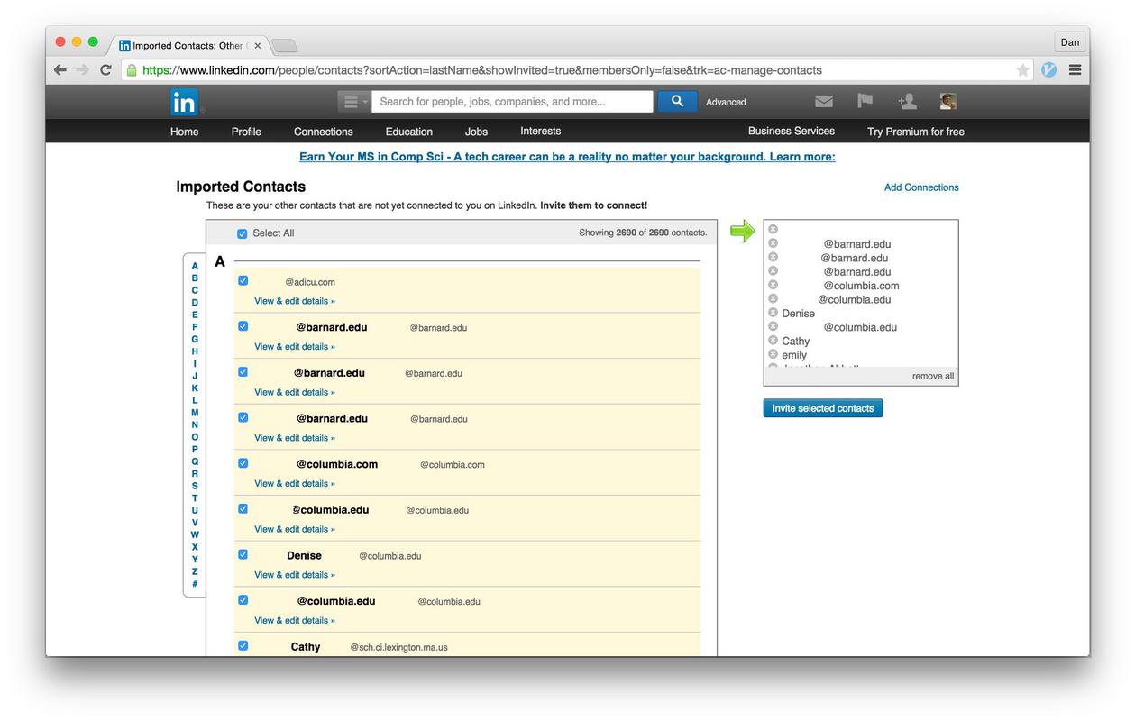
The interface or products asks for your email or social media permissions under the notion to help you find more friends. But in reality it allows the interface/product to have access to your contact list to spam them. One of the most famous cases occurred with LinkedIn. The platform asked their users to strengthen their networks but in reality LinkedIn emailed all the users contacts from the user themselves. In 2015, LinkedIn lost a lawsuit because of the dark pattern.

Privacy Zuckering
In this dark pattern users are tricked to share more information that than they intend to do. Facebook had an issues with their privacy settings that made it easy for user to overshare without meaning to. Privacy Zuckering is actually named after the Facebook CEO Mark Zuckerberg. Lately privacy zuckering mainly takes place behind the scenes that is all thanks to the data brokerage industry.
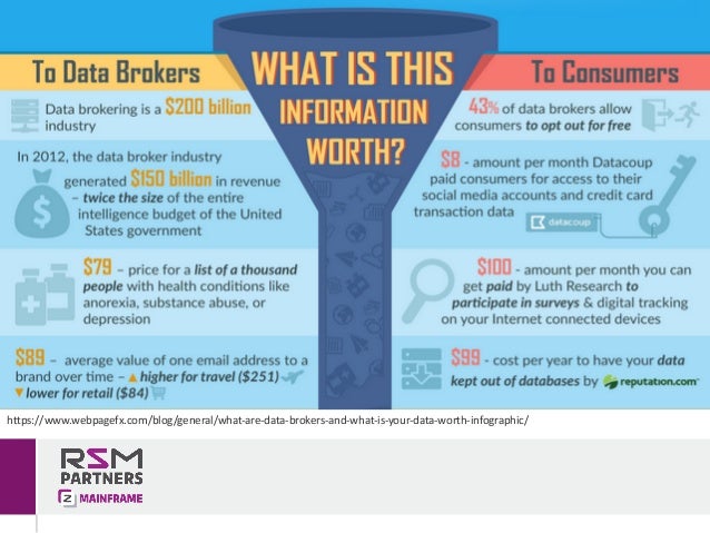
The data brokers, are big companies that collect all sort of information such as name, address, income, and where you go online. They sell this information to bigger companies, other brokers and the information is used to target ads to consumers. Users are allowed to block target ads that such up on their social media channels but they cannot protect their information from brokers.

Ethical
Big companies tend to use dark patterns for short-term results and to increase their numbers. Companies would rather increase their stats instead of making their users happy. Users do not like being hoodwinked and tend to call out dark patterns on social media platforms – Twitter. Users tend to not return to platforms and interfaces that have wronged them. In the long run companies tend to suffer because of their usage of dark patterns.
So the question is, are dark patterns ethical? In my opinion dark patterns are not ethical because it leaves users feeling tricked and deceived. The purpose of UX is to enhance the experience of the user instead of hinder it. In Europe, E-commerce dark patterns have been illegal since 2014, but still thrive in America. The U.S. does not any laws that protects its’ users from dark patterns or from allowing their information to be sold.
There are other dark patterns out there and below you can find other resources to learn more about dark patterns.
