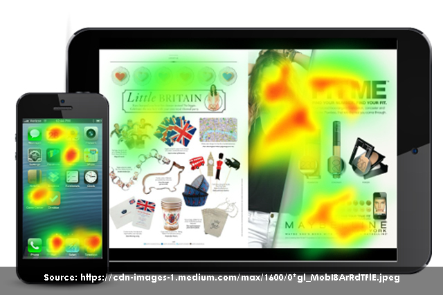
In today’s world, usability testing is critical for designing user-friendly interfaces. These tests take on different forms and methods that help designers identify usability issues. This is critical when analyzing the bridge between design expectations and user behavior. Sensory-based technology, such as eye-tracking, has been revolutionary in gaining deeper insights on how users interact with technology.
Eye Tracking is a usability method and tool that reveals users’ focus points and navigational patterns on a given interface. It provides designers with thorough feedback on which interface elements are visible and attention-grabbing. It also effectively evaluates design/content hierarchy. Eye Tracking is an insightful form of research technique, which determines the user’s focus and attention of the user.
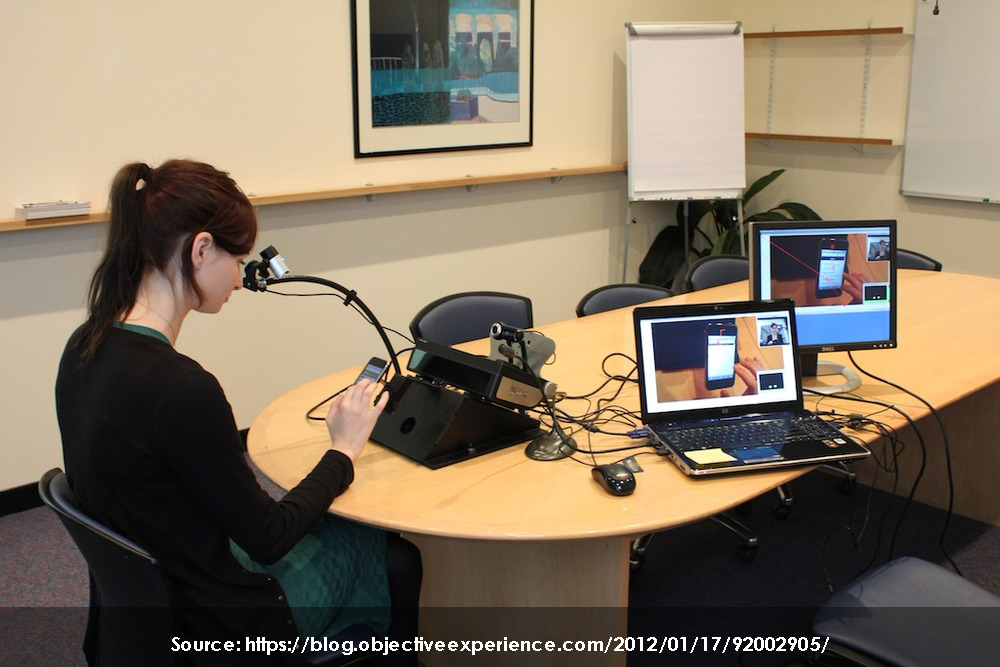
Eye Tracking for a Mobile-Centric World
Considering that more than 80% of the population has access to mobile devices, the percentage of mobile internet usage is surpassing traditional computing platform usage. Today’s world is mobile-centric. Thus, making it important to focus on the usability of mobile devices.
Jen Romano Bergstrom, a User Experience Specialist conducted a research study to compare the user experience of the same interface across multiple devices using eye tracking. As a result, she uncovered different issues across different devices. Below is the heat map of the data. The red spots are the main focus points, and the green and yellow are the areas which get less attention from the users. It is clearly visible that users have a different area of focus for the same interface on different devices.
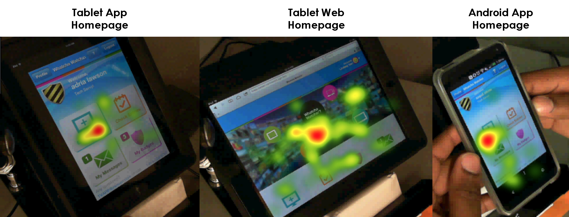
Image from Jen Romano Bergstrom’s eye-tracking research
Best UX Practices for Mobile Devices
Steve Krug, an information architect and user experience professional who is best known for his book “Don’t Make Me Think – A Common Sense Approach to Web Usability”, mentioned that designers keep in mind that the users first read before act. Content is read through before other links are carefully chosen and clicked. The reality is that people don’t read everything, they just read what they want to. This is a big takeaway, and reinforces the importance of usability tools such as the eye-tracking device.
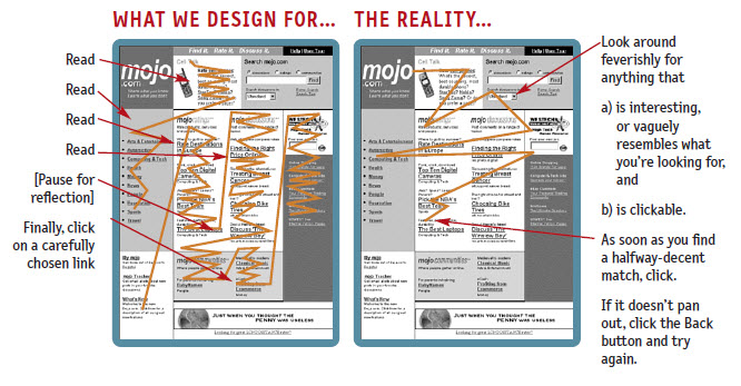
Image from Steve Krug’s book – “Don’t Make Me Think”
Jen Romano Bergstrom explained some key guidelines on the best UX practices that every User Experience professional should follow. These practices were drafted after several eye tracking researches were performed.
1. Functional icons across devices
Icons and images should be clickable across the devices as users expect them to be interactive. Making things clickable on the homepage will help make the page more intuitive.
2. Clear and precise error messages
If an error message pops up, it should explain what the error message is all about. Below is the example from one of Jen’s research. On the left side, an error message popped up. However, it was not clear to state which mandatory field was to be filled. On the right side of are the user’s gaze plots. The user is trying to search all over the screen for the mandatory field which is left. So, the error message should clearly point out the problem in order for the user to quickly move forward.
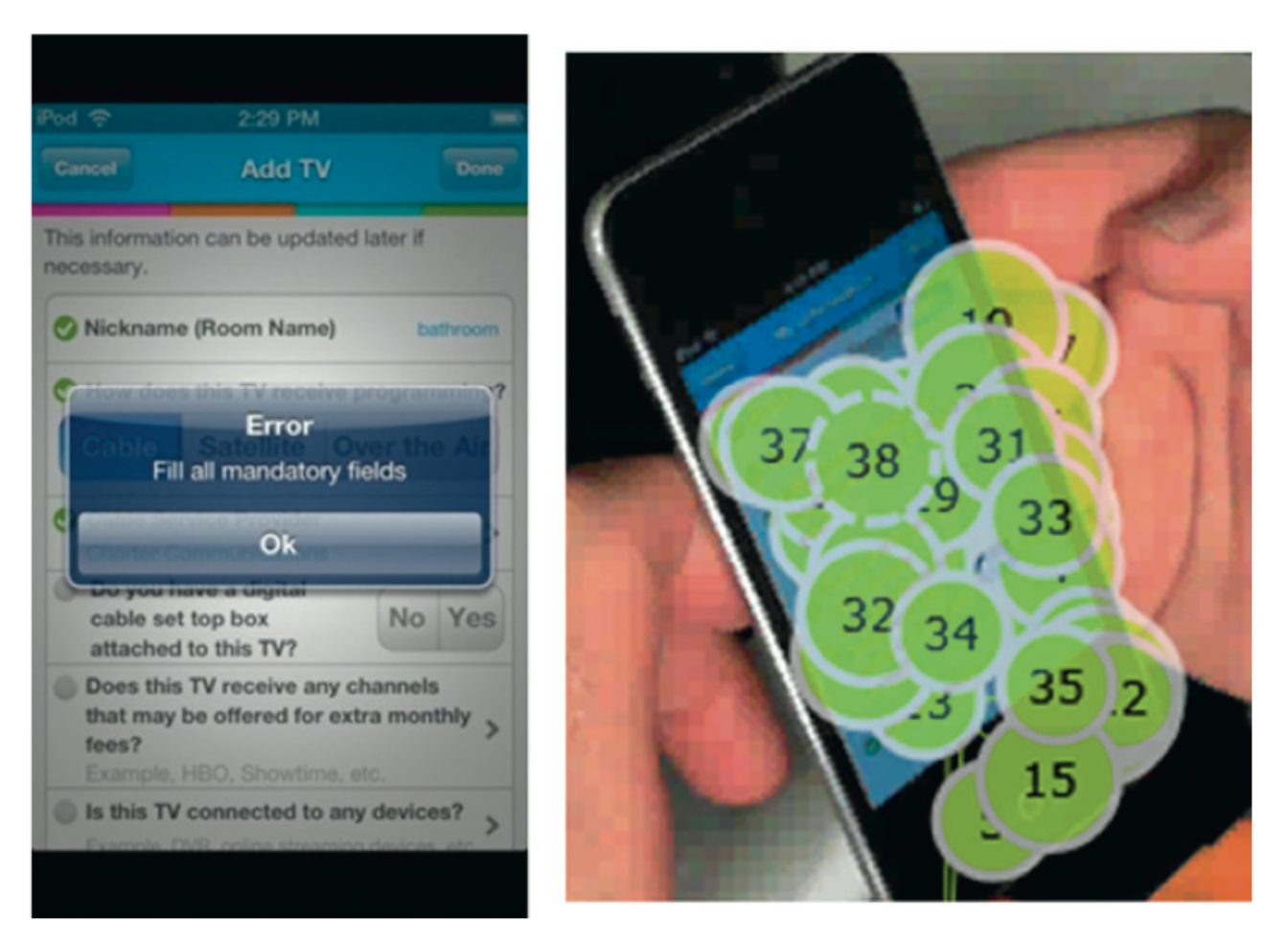
Image from Jen Romano Bergstrom’s eye-tracking research
3. Consistent layout across devices
Keeping in mind that the users have access to multiple devices, an interface’s layout should be consistent across various mobile devices. The flow of information should remain the same as good design gives users a consistent mental model throughout all platforms.
Conclusion
Despite the fact that eye-tracking is a time consuming and expensive process, it is a very useful technique to gain deep insights on a particular product. As far as the use of eye tracking in mobile devices is concerned, there is a lot more to explore in this area. Following these suggested UX practices will significantly improve the user’s experience.
References
http://bit.ly/2AGPlkz
https://www.slideshare.net/JenniferRomanoBergstrom/eye-tracking-the-ux-of-mobile-what-you-need-to-know
https://www.youtube.com/watch?v=JfzTevZZ-z0&t=326s
Don’t Make Me Think, Steve Krug, 2006