EveryDollar – Home Budgeting Made Easy
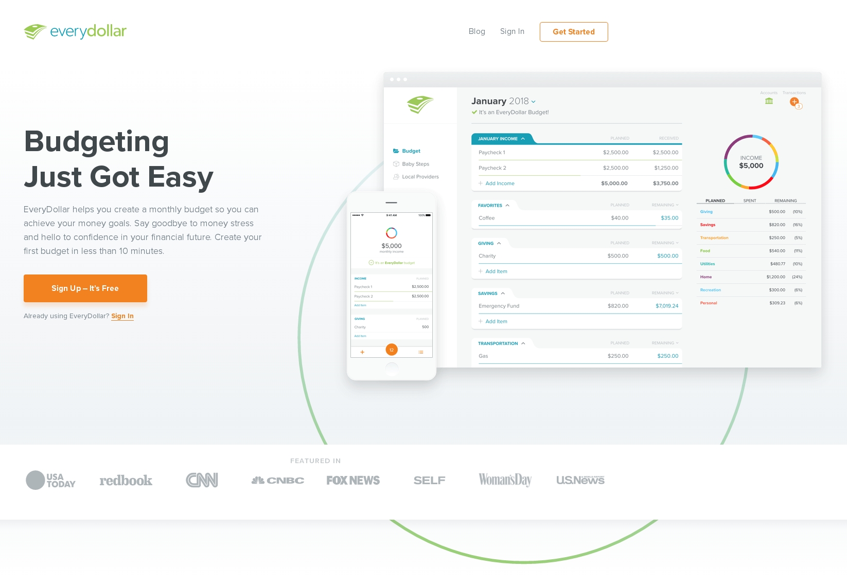
EveryDollar is a home budgeting app, available for web and iPhone, that is designed to make money management easy. The app was created by The Lampo Group, an organization based around radio show personality and financial authority figure Dave Ramsey, who advocates a debt-free lifestyle for Americans. The EveryDollar app uses zero-based budgeting to provide a framework for spending decisions. This blog post explores the budget setup process using the EveryDollar webapp.
“A Budget in Seconds”
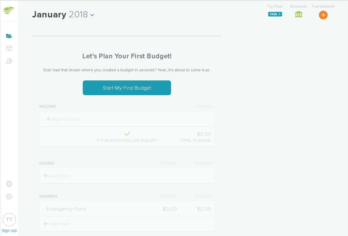
After sign up, the user is greeted with a welcome screen that demonstrates keen awareness of Dave Ramsey’s audience. Many Americans struggle with a stigma surrounding money and budgeting. A first-time EveryDollar user may be nervous or ashamed of the need for a budget tool. However, the welcome page content suggests that using EveryDollar is a painless experience, easy enough for a first-time budgeter to use and taking only seconds to set up.
The welcome screen provides a preview of what budgeting with EveryDollar will look like. The available tool bars contain signifiers for other features and settings within the app, and the ghosted preview image of the budget groups helps the user understand the system image before the work has even begun. This makes the experience less intimidating overall, which is necessary to encourage the user to press the only available CTA on this page, “Start My First Budget.”
Zero-Based Budgeting—Without Even Knowing It
EveryDollar is a zero-based budgeting system, in which all income and expenses must be accounted for before the month begins. However, EveryDollar doesn’t require any prior knowledge of zero-based budgeting due to the high level of discoverability built into the app.
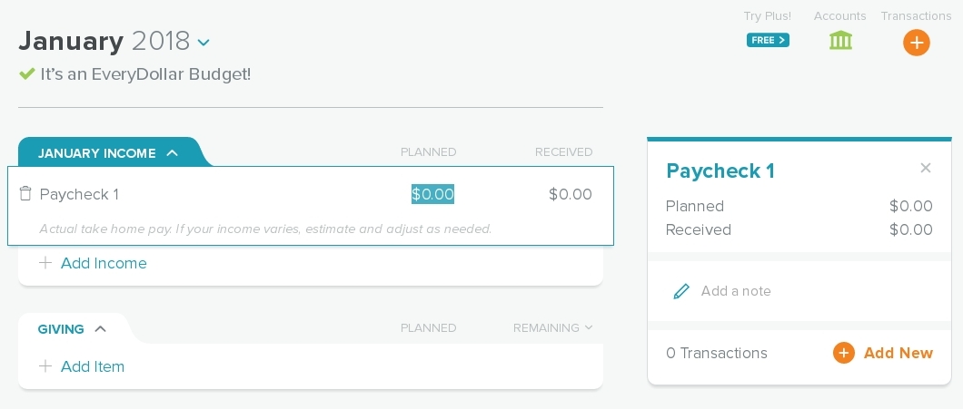
Upon clicking “Start My First Budget,” the user is prompted to input their expected income for the month. Starting with income is a fundamental chronological concept of zero-based budgeting, so this line is mapped to the top of the budget and cannot be moved to a lower position. Setting the planned income sets the constraints for the budget.
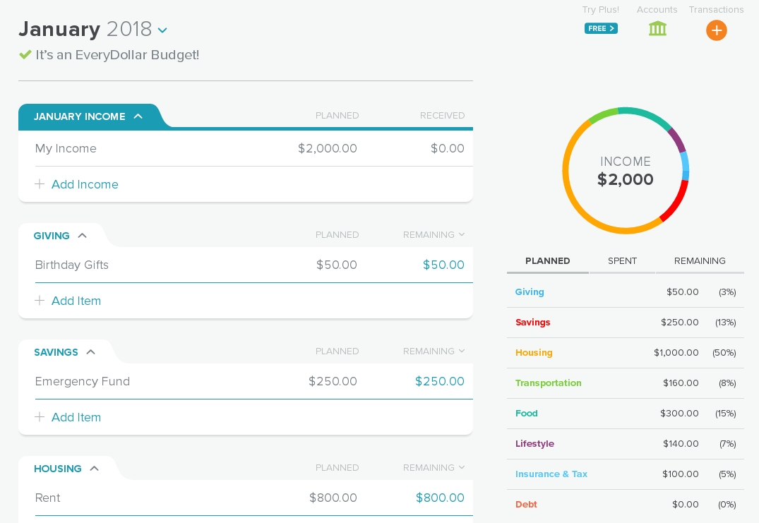
Upon entering any value—whether income or expense—the interface immediately updates to reflect the new information. A heading indicates if there’s income left to allocate, if the expenses are over budget, or if allocation is exact. The sidebar has a graphic that slowly fills up, indicating how much has been allocated to each budget group and how much is still left to allocate. The interface’s persistent feedback suggests to the user that the budget isn’t complete until they’ve allocated every dollar of income. This behavior builds a simple conceptual model for how zero-based budgeting works without ever having to explain it.
Editing the Budget: Adding and Moving Lines
Overall, editing the budget is easy, but a few points exist that could cause some confusion for first-time users.
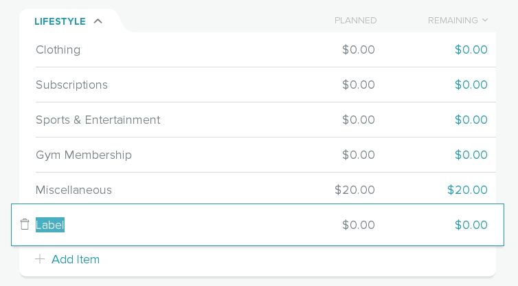
Line items have two modes, “active” and “inactive,” which allow for different activities based on their state. Active items can be edited and deleted, while inactive items can be dragged-and-dropped to a new position within their budget group. When a user presses the “+ Add Item” link mapped to the desired budget group, a new active item is created at the bottom of the group, which the user then edits. The user may then desire to move that new item to a different position within the group. However, the newly created item is in active mode, so the line cannot be moved. Splitting expected functionality across both modes in this way can make the new line appear “frozen.”
In order to “correctly” move the line item, the user must click outside the budget group in order to “deactivate” the line, and then drag-and-drop the now inactive item. If the user doesn’t realize this is the case, they may grab several inactive lines and move those instead, pushing them around the apparently frozen line so the group can be moved into the desired order.
A potential update to this behavior could be to allow movement for active lines by grabbing available white space on the line item. For consistency, inactive lines should be updated with this same behavior, instead of relying on the three vertical dots left of the line item’s label.
Editing the Budget: Deleting Lines
Deleting line items is easy as well, and thankfully, not too easy. Selecting the “trash” icon on an active line activates a forcing function that requires the user to confirm their intention.
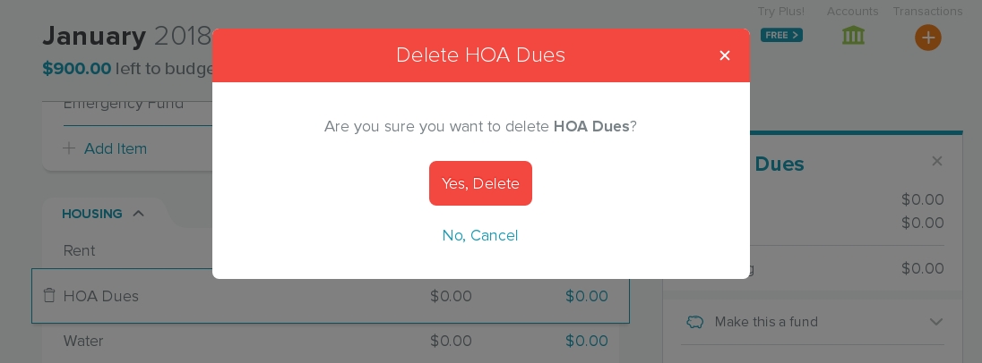
This restriction works well the first couple times it appears. However, during first-time setup, the user may encounter several pre-populated lines that they wish to delete, sending them into a deleting spree which can result in an action-based slip—a line item is deleted by accident. Unfortunately, once the line item is deleted, there’s no way to retrieve the line or any associated information.
A possible update to this behavior could be an “undo” dialogue window that appears at the bottom right-hand corner of the app where, on web browsers, there tends to be unused white space. The window, displaying the action taken and an ‘undo’ button, could fade out after a few seconds.
An App for Americans
EveryDollar is a home budgeting app designed with Americans in mind. The top-to-bottom chronological order of of line items reflects American concepts of time and order. The budget tool also uses the dollar-sign to represent currency. An individual outside of American culture could make use of the zero-based budgeting functions, but they may find initial setup more difficult, given the preset line items may be less relevant to their needs, or the possibility that tax and insurance calculations might be handled differently in their area.
The app’s focus on both the audience and its specific function—zero-based budgeting, and nothing else—works wonders for an American audience, though. Making the app available both on web and iPhone helps many Americans make smarter spending choices on the fly, which leaves them more financially empowered than they would have been without the convenience of technology.
