Final Fantasy VI is a Japanese role playing game that was originally released on the Super Nintendo in 1994. In 2014, it was ported to iOS and now features a completely redesigned control scheme and UI. The design changes make the classic game compatible with the touch-based interface of modern phones. As video game design is complex and involves many different interlocking systems, this design critique will focus entirely on the combat user interface, which works according to a turn-based menu system dubbed ATB or Active Time Battle. Examples of design principles and concepts applied in this critique come directly from Don Norman’s The Design of Everyday Things.
a brief primer on the ATB system
The Active Time Battle system pits the user’s stable of characters against a set number of enemy characters. Both sides take turns attacking and dealing damage to one another until one side is defeated. A party is defeated when their character’s health or “hit points” are fully depleted. The order of turns is determined according to a stamina meter, which is filled over time. When charged, the readied character may select an action and execute it. Only one character can move at a time. Only one move can be selected at a time. A conceptual model of this combat system might look something like this…
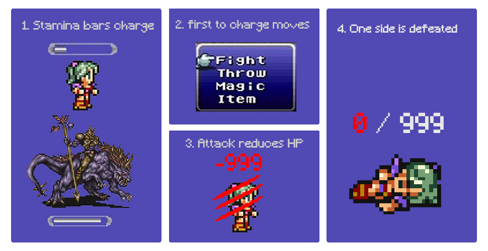
The potential actions that the ATB system affords are myriad. Players can select a number of different moves to execute, run away from battle, or use items from their in-game inventory. The signifiers that indicate to the player how participate in the ATB system vary between the SNES and iOS versions.
The original design (SNES, 1994)
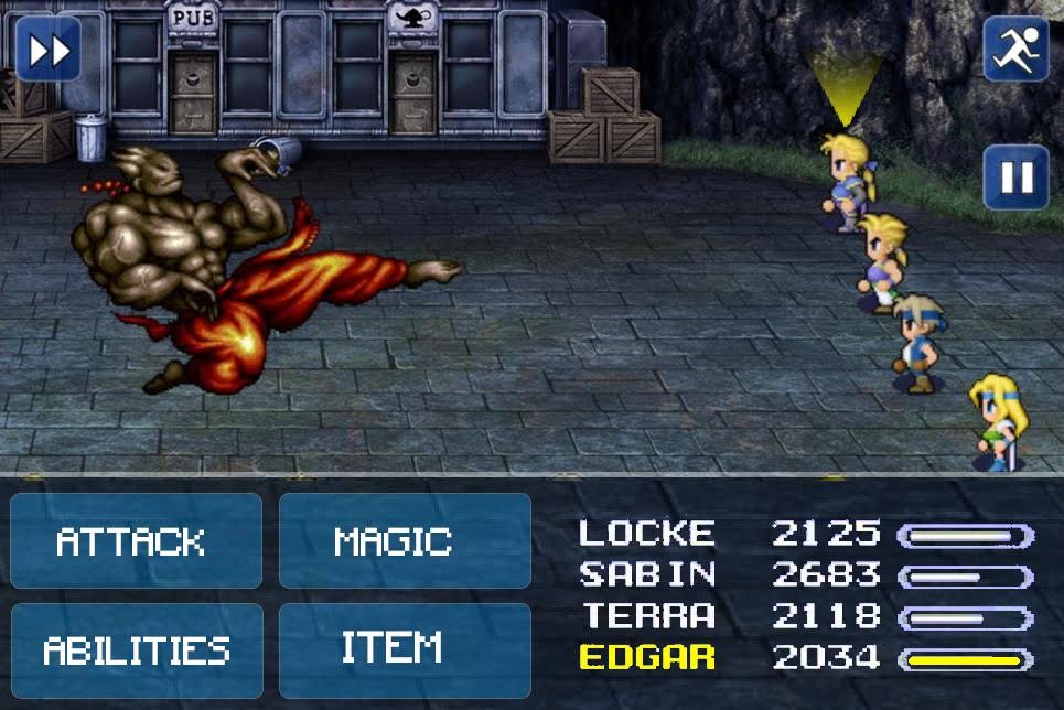
In the original design of the battle system, the players made move selections in battle by using the Super Nintendo controller.
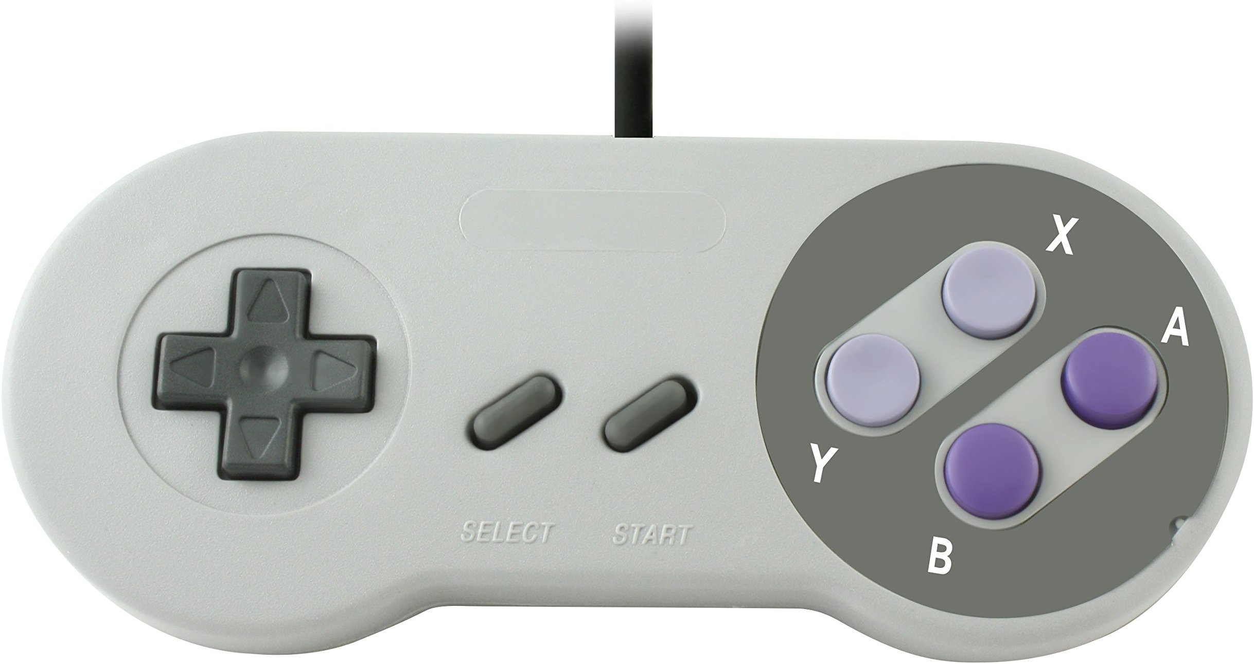
Directional buttons allow the user to move a cursor up and down contextual menus and options are selected by pressing the “A” button. The players receive feedback in the form of the SNES controller’s tactile button presses, the blip sound as the pixellated cursor (pictured below) moves across selections, as well as the bombastic visual effects that accompany action selections. This triangulation of feedback means that the player always sees the direct result of their actions and can quickly make decisions without unnecessary options or information cluttering the interface. This feedback signifies to the player what actions are happening, what actions are possible, and what is coming up next.
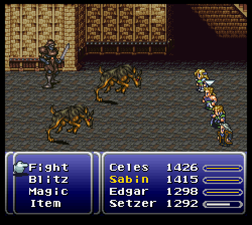
The gif above represents a player attacking the enemy. Please note the charging stamina bar and blinking arrow over the selected character, Sabin. The text that describes the player’s characters is in the right box and the current options to select are in the left box.
Interestingly, the layout of the names/hp/and stamina matches the positioning of the characters in the battlefield. Celes is on top and Setzer is on bottom both visually and on the menu. This is similar to Norman’s Third-best mapping technique, wherein the controls/information is arranged in the same spatial configuration as the objects to be controlled. The character name highlighted in yellow is a signifier for the current character that the player is making selections for on the left menu.
The success of the original interface
The player sees only the actions that are afforded to them at any given time. All of the information displayed on the screen is necessary to know and the user has the means to make selections with no obstacles standing in their way. By limiting the player to only options they can take, the physical constraints ensure that the user doesn’t see menus or actions that they cannot make use of. Visual cues like the highlighting, a sound-making cursor, and menu options help to bridge the gulf of execution by highlighting the potential actions.
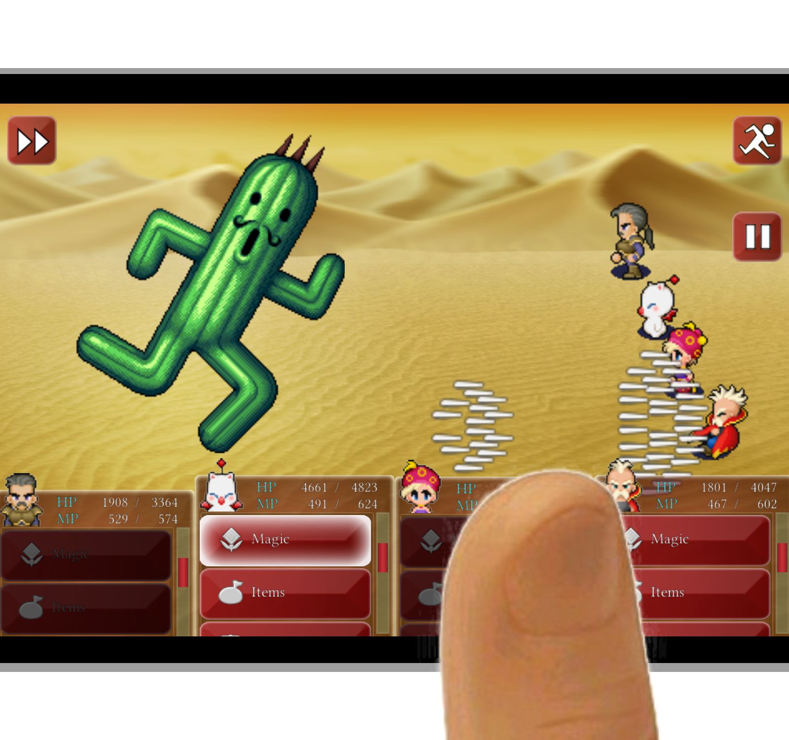
The new design (iOS, 2014)
In the new system, ATB has all of the same functions, but the controls are all touch based. The screen has switched from a 4:3 aspect ratio to a 16:9 widescreen, which fits the screen of the phone. The user interface has been tweaked to allow the user to make actions by touching the screen.
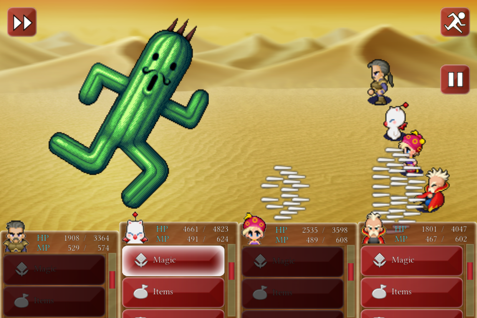
Rather than using visual stamina gauges, the iOS version replaces the entire right-side menu with with separate control menus for each character. Each character menu displays the progress of stamina by literally moving from the bottom of the screen up to a quarter of the screen. When the character menu reaches the quarter of the screen, stamina is filled and the controls change color to indicate that the player can select them. Even after stamina is fully charged, one will note that all of the options available to each character do not fully display. To the right each character menu is a tiny red scroll bar. The players use their thumbs to scroll up and down the options in order to make an action selection.
The darkened buttons represent controls that cannot be selected. The bright controls represent options the player can take now. This visual signifier is a way of ensuring the players know which characters are next in line for action and what they can and can’t do now. Keep in mind that only one character can move at a time.
The trials of the new interface
Recommendations:
Final Thoughts
Ultimately, the new FFVI combat UI is still functional and affords the same number of actions as before. However, a structural redesign of the UI elements could minimize the potential of slips and provide for a much less cluttered experience.