Launched in the summer of 2016, MTA eTix is a free mobile app that allows users to purchase tickets for the Long Island Rail Road and Metro-North directly through their own mobile device. This app aims at eliminating unfortunate events that commuters struggle with on a normal basis, such as losing tickets or missing trains due to long lines at the ticket machines.
In this critique, the Android version of MTA eTix will be analyzed using Don Norman’s design principles discussed in his book The Design Of Everyday Things.
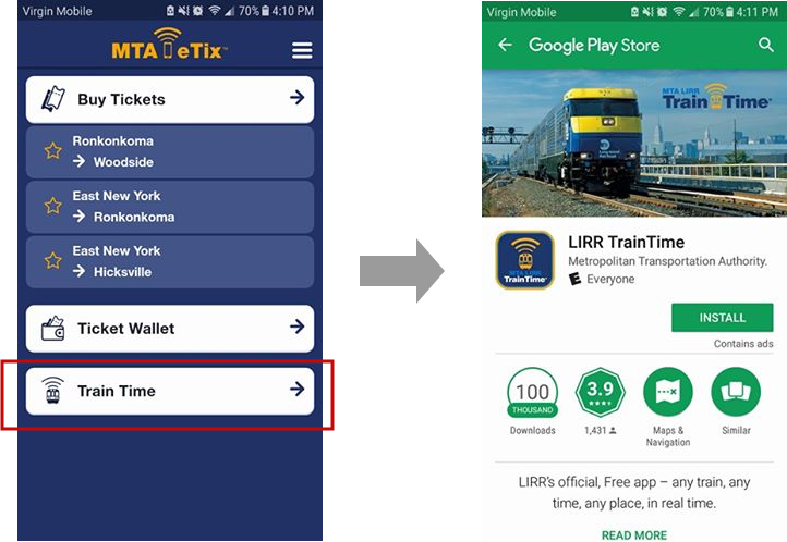
Finding Train Times
MTA eTix was designed solely for the purpose of purchasing tickets.This is signified by the poor mapping between the Train Time button, located on the homepage, and information on train schedules.
Once clicked, users expect to be taken to a page of app that displays train time information. However, that is not the case as the user is immediately redirected to the Google Play Store and directed to download other apps created for the MTA, such as LIRR Train-Time, or Metro-North Train Time. Only users that have downloaded the specific train app beforehand are afforded to view upcoming train times through the secondary app.
Recommendation:
This poor design can be frustrating to users in a hurry who expect to be able to immediately view upcoming train schedules. The need to download, or be redirected, to a secondary app when clicking that particular button may be seen as deceitful mapping from a user’s perspective.
Forcing the user to open and use a secondary app to view crucial information can provide for a negative experience. Therefore, it is recommended, if possible, to merge all apps into one, so trains times can be viewed by all users immediately, and allow for better mapping between the Train Time button and the information.
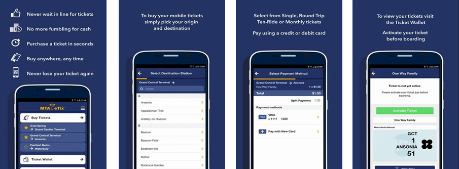
Streamlining the Purchasing Process
The process of purchasing tickets is made quick and easy by providing the user with a restrictive interface that guides the user with consistent signifiers, such as CTA buttons and arrows. Actions of the user are limited, and they are directed to follow a predetermined path. For example, the user is unable to select a destination without selecting their origin station first. Similarly, the user is constrained to picking a ticket type before being allowed to chose Off peak or Peak.
Users can star/favorite stations they travel to often, thus skipping the majority of the ticket purchasing process, which reduces the chance to make any mistakes/slips.
On the Payment page, the Accept & Pay button is grayed out with a lock icon, which signifies that it can not be pressed until the user enters the necessary information.

Transaction & Ticket Activation Confirmation
The MTA eTix app provides multiple positive examples of feedback.
After the user enters their credit card information and clicks the Accept & Pay button, not only is the user redirected to a confirmation page, but also a transaction receipt is immediately sent to their email. Thanks to these to forms of feedback, the user is not left doubting if the payment went through.

Now that the train is approaching, it is time for the user to activate their newly purchased ticket located in their Ticket Wallet. In the Ticket Wallet, once activated, the online ticket now has a bright green accent color to signify that it is active. On the ticket page itself, it now has a colorful barcode with the current time and date at the top, as well as the time the ticket was activated. The color alterations supply the user with immediate visual feedback that their ticket was indeed activated successfully.

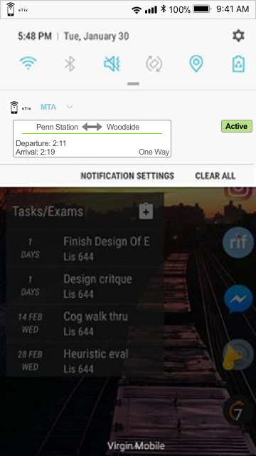
Supplemental Feedback Recommendation:
The app already provides exceptional feedback, however I would recommend adding one additional feature that would not only give feedback, but it would also provide the user with clear visibility of their ticket and travel information.
Although the discoverability and mapping of the process of opening an active ticket is clear, it is a time consuming process.

I would recommend that once a ticket is activated, the app pushes a notification that contains your travel information to your phone’s notification bar, and if clicked on takes your directly to the activated ticket. This feature would provide the user with immediate feedback that the ticket was activated, and also provides the user with a shortcut to a tedious process.
Conclusion:
The MTA eTix app is widely used in the NYC area due to its convenience. The app’s restrictive interface, high discoverability, and consistency makes it easy to use. Still being relatively new, available for slightly less than 2 years, there are still few details that can be improved upon to increase the overall experience for the user.