Steam is the largest PC gaming platform with over 125 million active users. It has a mobile app that enables players to chat with friends, view profiles, discuss in communities, verify accounts, and shop games, software or other digital products on their phones. The app is functional, but the user experience needs to be improved.
In my personal experience using the app, I found this mobile version Steam has almost all the functions of the desktop version, which is laudable. But the usability is relatively poor. With Don Norman’s The Design of Everyday things, I will apply the concepts in the book to critique the app.
1. Market
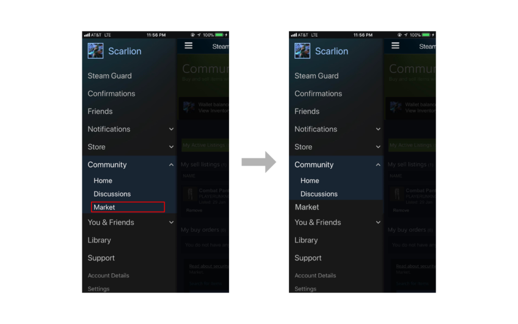
In the Market, users could sell or buy items which could be used in games online. Every time you try to sell an item in the market, whether using the PC or the phone, you have to confirm the trade in the mobile app (that might be the main reason for people to download the app). In this case, many users choose to sell items on the phone directly. In the app, the Market is a subtitle under Community that is a little hard to find. The discoverability here is not satisfying.
1) When the tabs are all closed, people will misunderstand where they are going. Regularly, we might suppose the market should be under “Shop” tab using our knowledge in mind. I recommend moving the Market to a higher level since it has a higher using frequency.
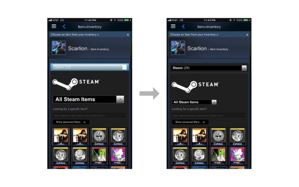
2) When choosing the item to be sold, there is a drop-down list of different item categories on the top. But another list below that is used to sort items of one category draws more visual attention. So the user would be confused (I was at the first time) about how to switch to another category. I suggest keeping the visual consistency to make the list more discoverable. The recommendation is in the picture below.
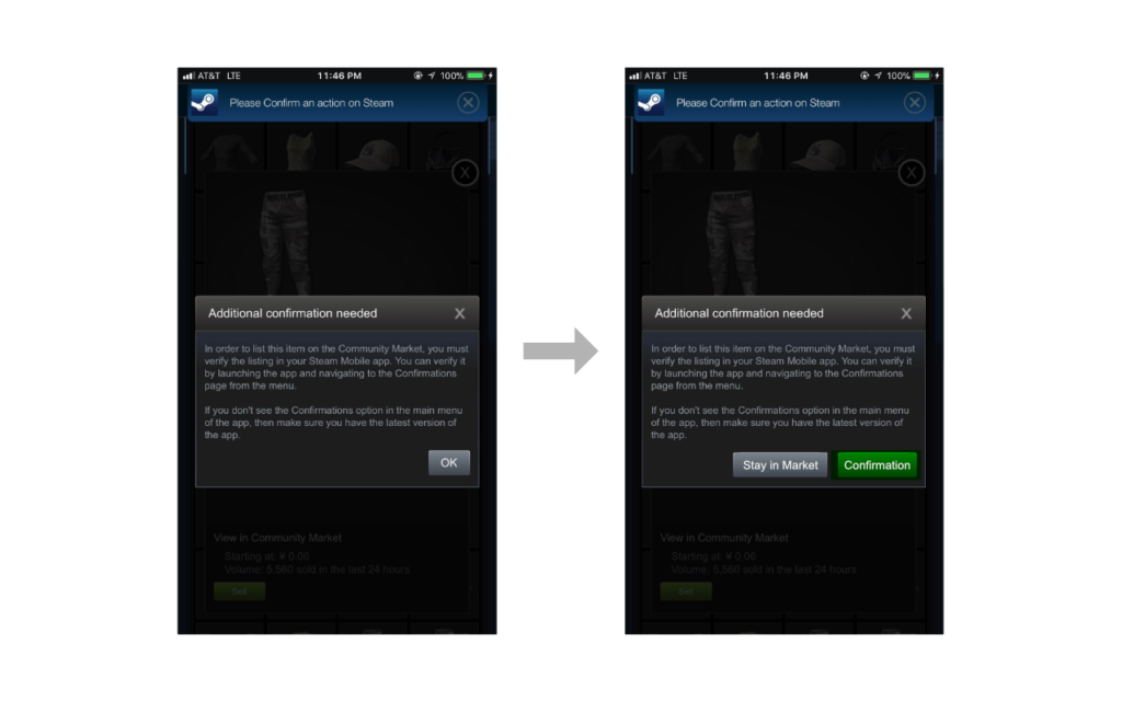
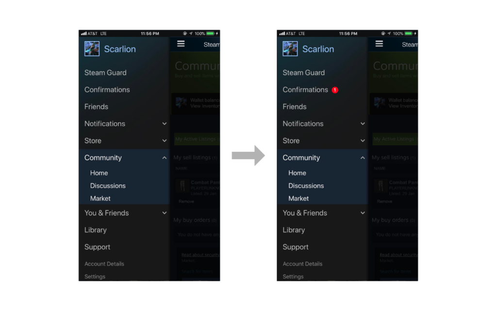
3) When finishing choosing the item, there is a prompt telling you that you should confirm the trade in the mobile app. The good constraint keeps the transaction safe. But even if you are using the mobile app, you still have to manually switch to another page to process. Also, there is no feedback on the confirmation tab. I suggest adding a small reminder as feedback on the confirmation tab, and also change the buttons on the prompt to offer users a good affordance.
2. Store
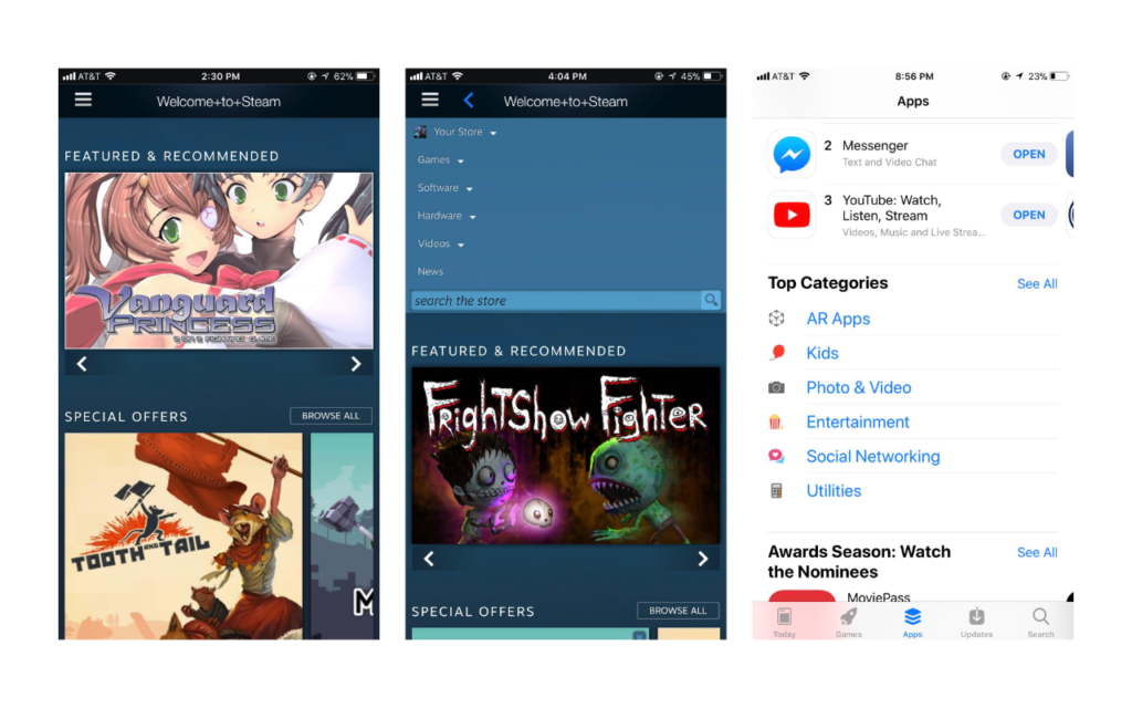
The Store page has a good mapping. The arrows show the directions that you can scroll. You can scroll down to view all the categories, and you can also scroll left and right to see the items of each category. When you access this page, the menu is hidden on the top. It shows when you slide down. The visibility here is poor. The menu has too much text with no good signifier shown. In comparison, the iPhone Appstore has a better conceptual model. My recommendation is to arrange the options of navigation horizontally fix the navigation bar position on top of the page, and add icons for subcategories.
3. Friends
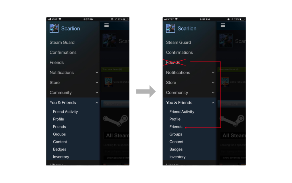
In the menu, there is a “Friend” and a “You & Friends.” And there is another “Friend” under “You & Friend” which has almost the same function. The only difference is you cannot chat in the second “Friend.” The better constraint is needed to reduce the unnecessary options for users. I suggest getting rid of the “Friend” on the main menu and move its interface to “You & Friend.”
4. Error Report
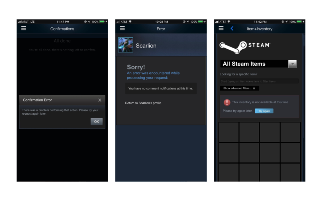
When using the app, I experienced multiple types of errors. Almost all of them are because of the connection problems. These error reports have different designs shown below. The one in the middle is not an error, but it shows as an error and gives me a “Go Back” button which does not go to the page I view before. In this case, the error report itself is an error. Considering the discoverability, I would recommend the one on the right with a “try again” button which gives users a straightforward direction of what to do next.
Hope Steam could improve its UX soon!
Thank you!

