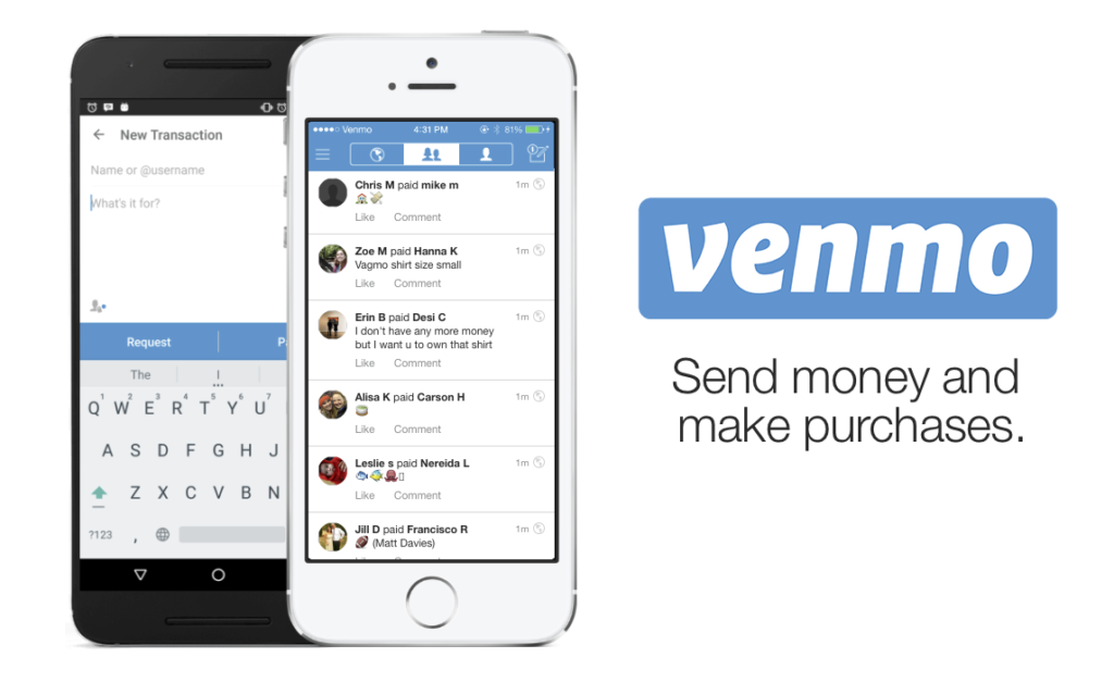
I choose Venmo (App) as my design critique topic. Venmo is an online digital “wallet” for people to make and share payments between their friends. It makes easier among friends to split the bill. The critique is based on the principles and methodologies from Don Norman’s book: Design of Everyday Things. In the critique, I want to discuss how Venmo meets/fails at these principles.
Discoverability for payments
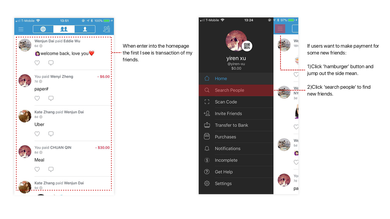
I believe the most important feature for Venmo is to make payment. But when users enter into the home page of Venmo, it shows the records of your friends’ payment. As a user, what I concern is I can’t discover any button or text as a signifier which I can press to make payment directly. It againsts my conceptual model. The situation becomes even worse when I try to make payment for a new friend: the ‘search people’ button is hided within the ‘hamburger’ menu. It is difficult for users to discover, especially for new users.
Also, transaction is a very private activity for me and I am not so interested with my friends’ payment records. It feels strange because it is not an UGC (user generated content) platform like Facebook, people actively post content which generated by users themselves. Instead, Venmo brings me a feeling that I am stalking others’ lives by reviewing their payment records.
I have checked some other articles online and I found that many people have the same concern with me. Here is an article about why you should set your Venmo account to private: http://internet.gawker.com/heres-the-number-one-reason-to-set-your-venmo-account-t-1687461730
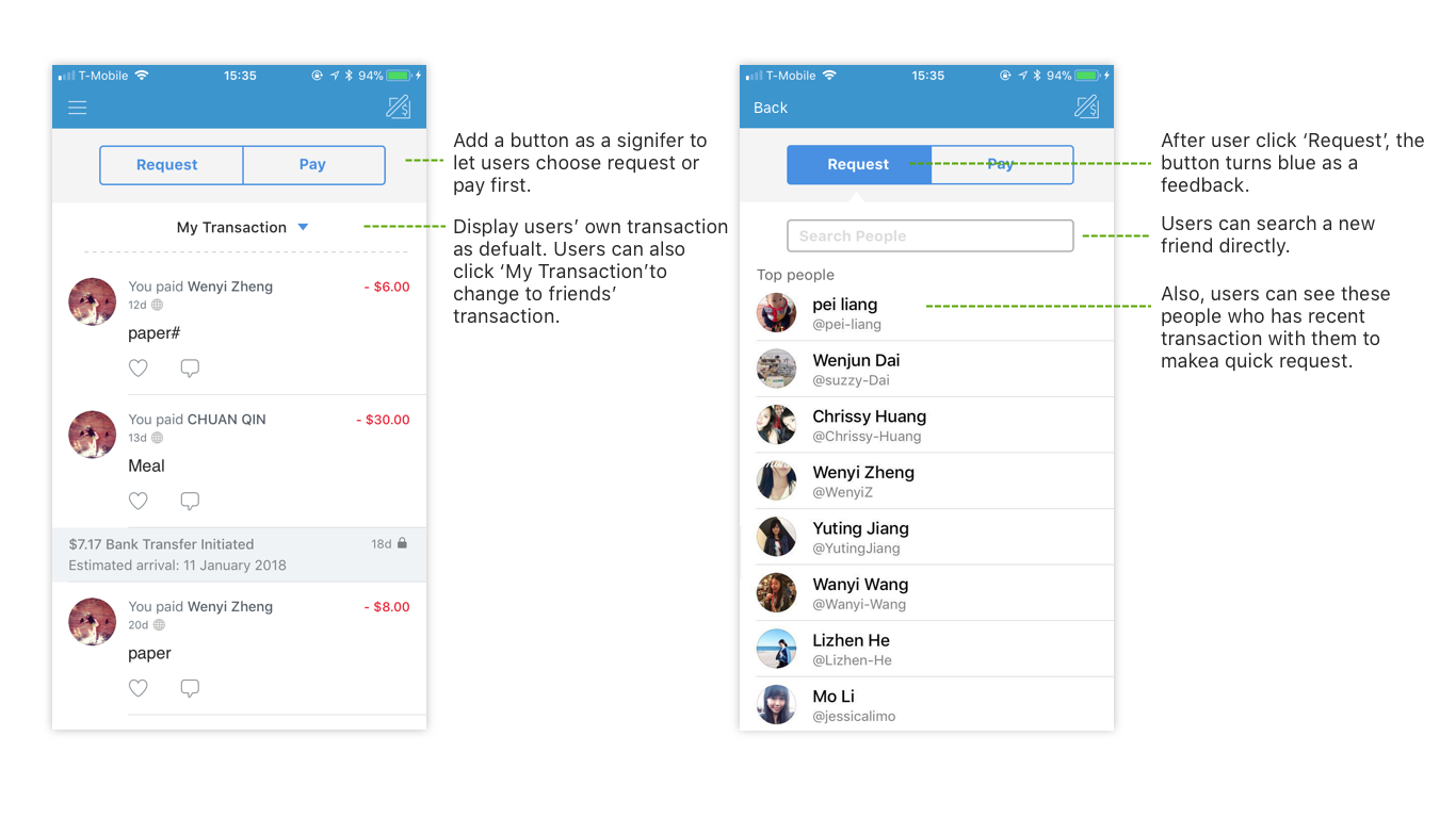
And here is my suggestion: In the homepage, I put a button with ‘Request’ and ‘Purchase’ at the top as a signifier for users to discover and make payments directly. When users click the button, they can choose friends or find a new one.
And I list transaction which associated with myself as default because it fits my conceptual model better: I care more about my own transaction, but not my friend’s. When I enter the home page I can make payment immediately and also check my payment.
Feedback for records
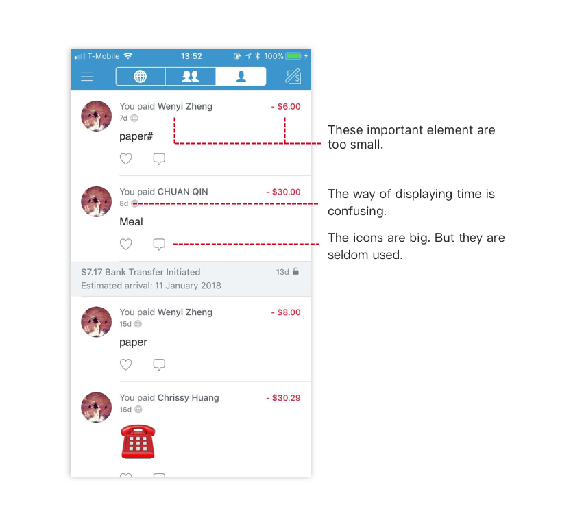
When users successfully make them payment the screen will add a column about payment details as a feedback. It is a pleasant design because users need to be confirmed about the transaction. But I also think the user interface can be improved a little bit: In the screen, the image and the icons are relatively big, but the payment amount is small. As a user, I will pay attention to 1) who I pay for 2) how much I have paid. 3)what I pay for.
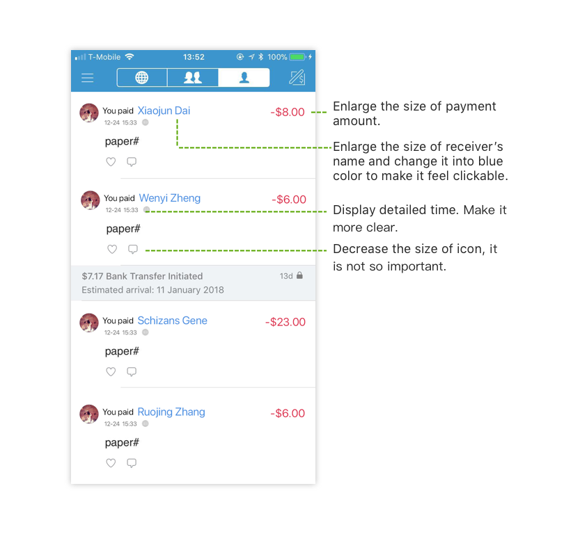
So, here is my suggestion: I reduce the size for both image and icon and enlarge the size of receiver and the amount. I also notice that the receiver’s name is clickable. But it is in black color. It leads to discoverability problem, so I also change the receivers’ name with blue color to make it more clickable. Overall, I intend to make the feedback more clear and clean.
Constraints
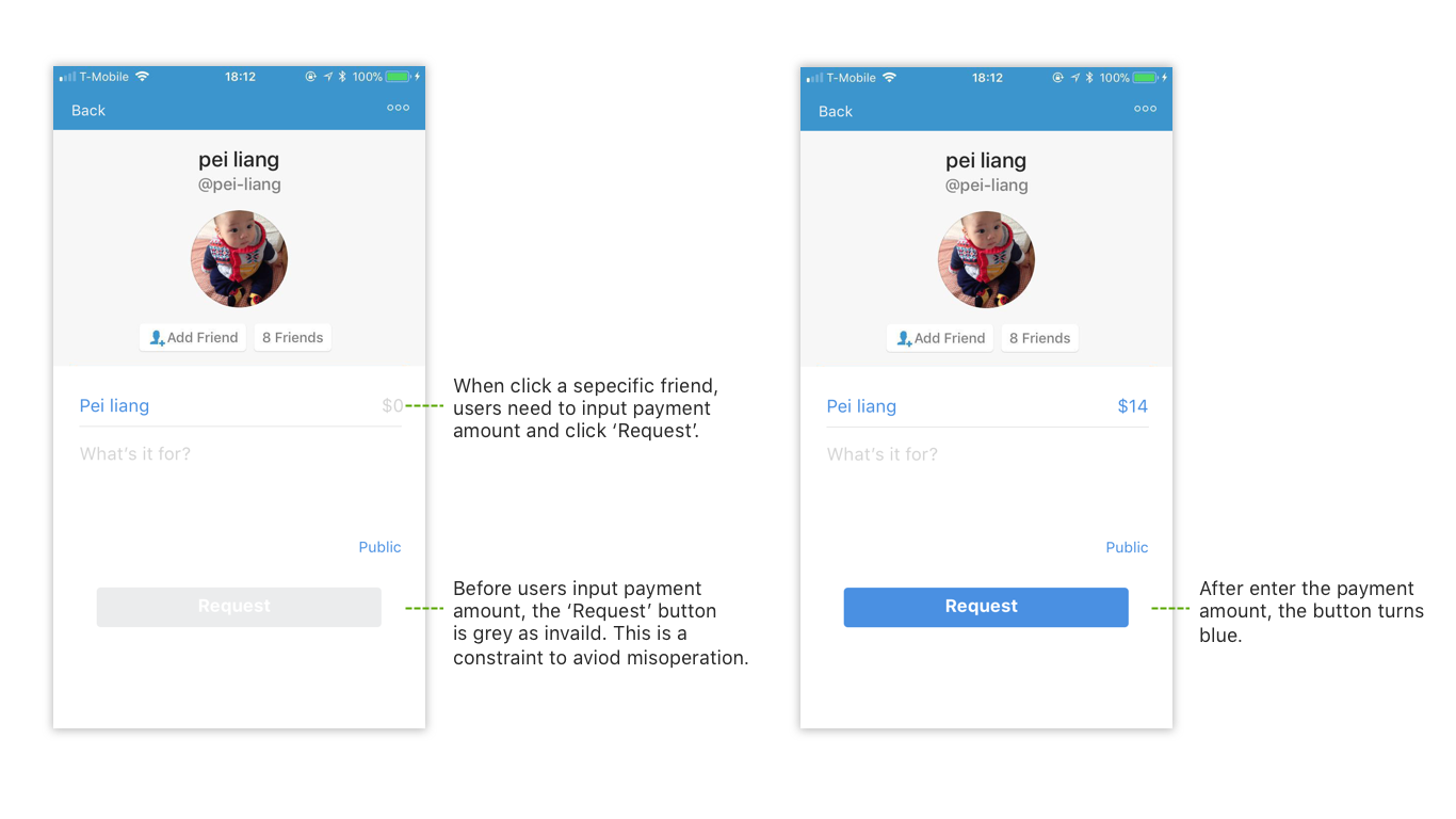
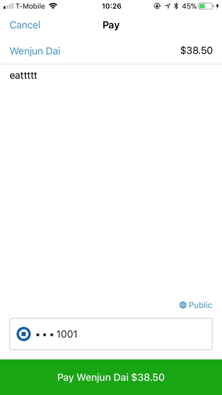
In the ‘Pay & Request’ page, when users check ‘Pay’, it will jump to a new page. In this page, users can input the amount and the receiver. Below the page there is a green button: ‘confirm your payment’. It is a good constraint. Because transaction is an activity people should be very carefully with. This button acts like a second confirm to the users and avoids misoperation mistakes.
Conclusion
Overall, Venmo convenient people lives, makes it much easier for us to make payments. But it still has some UX details needs to be improved. I believe it is better for Venmo to focus more on the payment than the social network because its first priority is always payment but not to be a social platform.
