Attractive And Emotion Change Our Decision
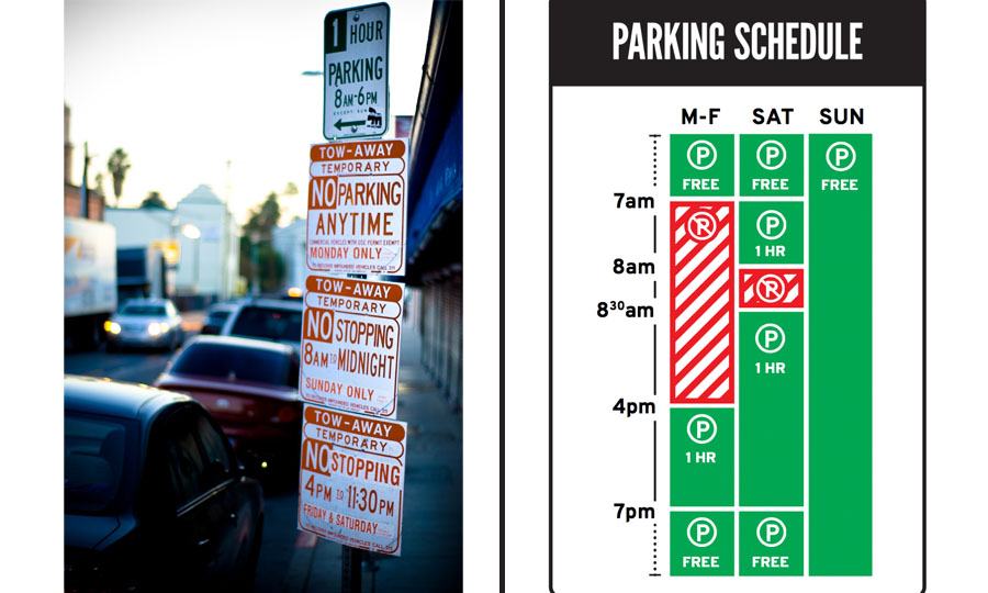
Fig.1 Image Parking Signs in Los Angeles VS Nikki Sylianteng’s (Siang)
Introduction
As Fig.1 showing, it is two examples of the parking signs. I believe that we could pick the better design one in 5 seconds from this two, this should be a super simple question. Because the right one looks simple and well aesthetic. Attractive things certainly should be preferred over ugly ones (Norman, 1). But for what reason, why we would like to take more time on understanding those beautiful sense. I will use some design example and the emotion and attractive theory to try to explain this phenomenon.
Bad Emotion Limited Your Choice
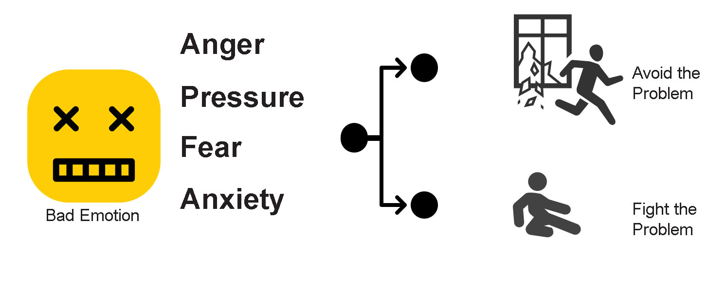
At first, introduce two theories in the psychology field. Bad emotion will create pressure, anxiety, fear, anger and finally force people avoid the thing which offer those emotion to them, and the other choice for them, is force themselves on focusing finding a way to solve this problem. You could notice that, whether what the final choice they will make, they already treat the things they will face as a kind of problem.
Fig.2
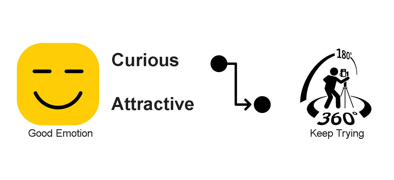
While the Good Emotion which means the curious and attractive will arouse users’ creativity and desire. And finally, they will be willing to use different way to understand and trying the same thing. For the interface and usability design, this means they would like to use more time stay in the interface and try different functions, sometimes they will also like to repeat trying the same thing.
Fig.3
Therefore, a good designer will have the goal to let their design support the good emotion. But how and what is the meaning of good emotion from the good design, is it only means that the design should be beautiful?
Aesthetics is important but not for all
Aesthetics is an important part and should be the most subjective part in the design area. People have different background, gender, education with different culture will have totally different understand in this field. Like in ancient China treat the black color with the meaning of void, but in ancient Greek, they think black means solid (Gage, 11). There is also an ATM example come from Norman’s book, that they set two ATM for design testing, but have different result when use the same design test in Japan, and in Israelis (Norman, 1). Therefore, we may come out the question if there is something or someway helping us doing the design for control the users’ emotion?
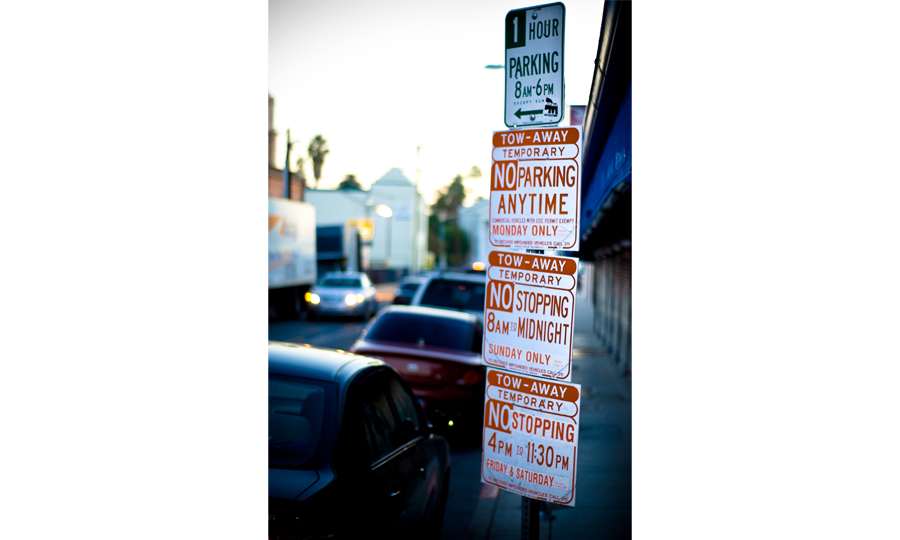
The answer is yes, based on the theory mentioned above, since we have the understanding about what is the bad emotion and what is the good emotion, then we could utilize the theory to consider what should be a good design. At least, it is not a battle for users or scare them let them run away. Come back to the first example showing as the Fig.1. Focus on the left example showing as the Fig.4, at first.
Fig.4
This is the parking sign we could easily seeing around in the US cities. It is not a good design not because it is normal and ugly, but it forces the user to read all of them to get fully understanding of what is going on there. And their user will only have one way to read it. Think about you are a driver hope to park your car from 4pm to 6pm in the street and has the normal reading order like from top to bottom. You will feel enjoy at first, because the first information you will get is that you could stop here during this period, but then, you will feel more and more anxiety, the other information comes behind are all bad news. Only 1-hour parking, and some rules about no parking anytime. “Do I break the rule of no parking anytime here? Will my car be towed away because I break the rule?” Questions come in one by one, and once you hope to confirm your situation, you have to read them all, because there is no other design system here to support it and help you quickly get the key information. Finally, you finish your reading and still not sure your understanding, but you understand there is only two choices left to you, stop here be ready for what may happen in the next 2 hours, or just run away and find the next one.
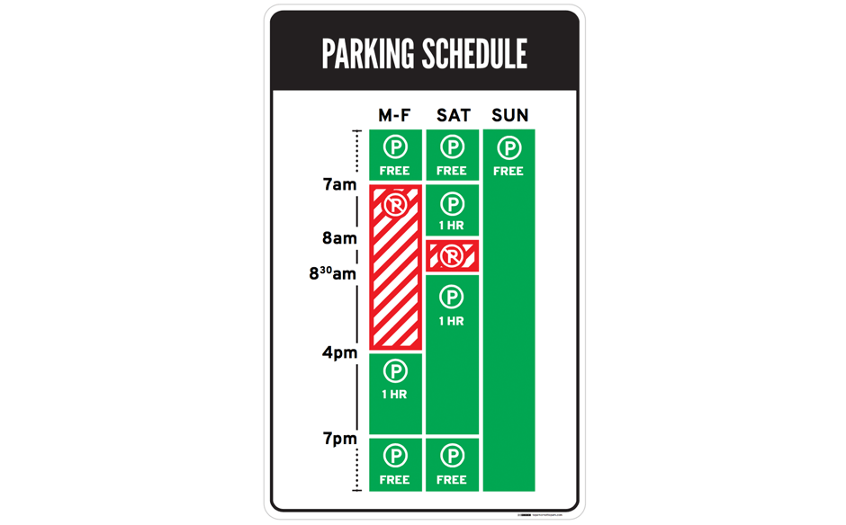
While if the parking sign is showing as the Fig.5, the situation will be totally different.
Fig.5
The designer for this sign create a coordinate system here. So, for its user, they could make their choice to read the coordinate points first then understand the meaning of each axis, or they can also read it follow the exact opposite order. What’s more the color coding here makes the sign easier to read and search the information. The user emotion for this kind design should be like this: “I hope to park my car here, today is Sat 4pm, and it work.” Or: “Sat 4pm is good to park, let’s do this.”
Answer user’s need
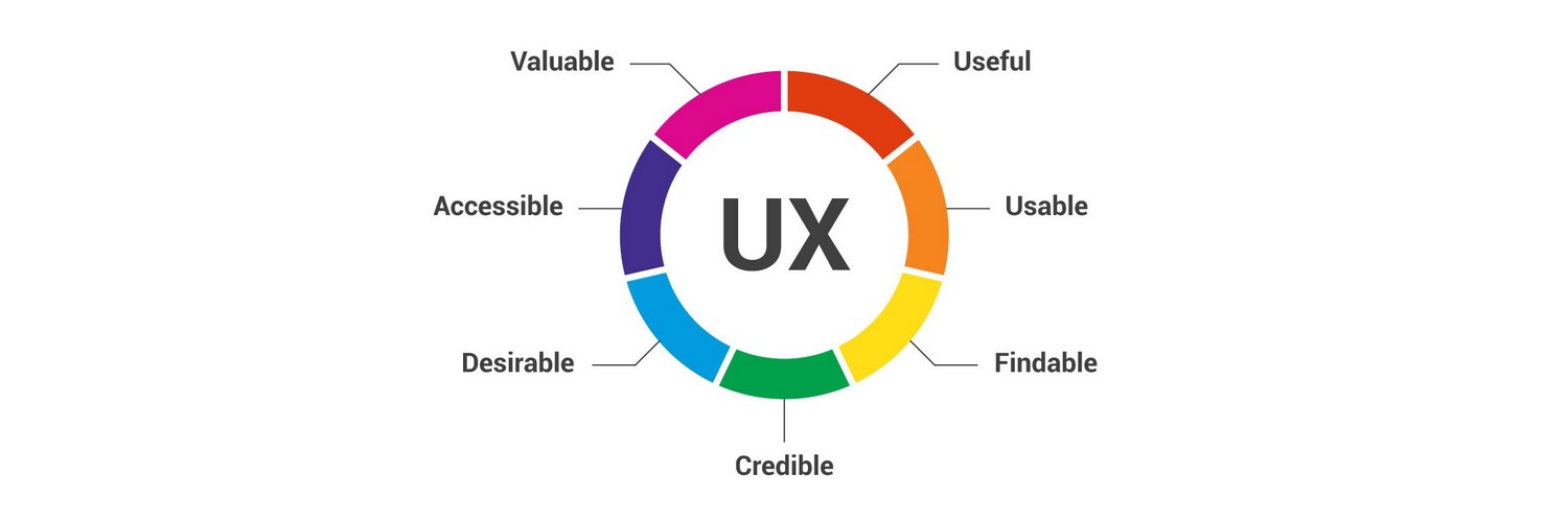
Continually considering with the example mentioned above, the good design which could offer the positive emotion is those design which could answer user’s need quickly. As the Fig.6 showing, researchers consider 7 factor which will influence the user experience.
Fig.6 Image The 7 factor that influence User Experience (Anonymous)
In one sentence summary, those design which could let their user quickly find the credible information they desire and accessible to get the value of the information will be consider as the good and useful design.
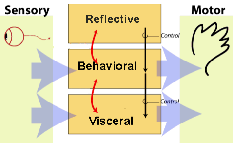
Generally, based on the reference, this is my understanding of how our design influence users’ emotion. As the parking sign example, the bad design will let the user get the pressure and fear to park their car in the place, and even make the user feel anger and anxiety. The good design will offer the user the way to understand their meaning, not to force them. And there is still more in this area of how to use human’s psychology and emotion to help making the design decision. One theory example is as the Fig.6 showing, Three levels of processing” visceral, behavioral and reflective.
Fig.7
Scientists trying to combine the knowledge from physiology to explain people’s change in their psychology way, and if for more information in this part, Donald A. Norman’s Emotion & Design: Attractive Things Work Better could be the recommended book.
Reference:
- Gage, John. Color and Culture: Practice and Meaning from Antiquity to Abstraction:
John Gage: 9780520222250: Amazon.com: Books, 1993,
www.amazon.com/Color-Culture-Practice-Antiquity-Abstraction/dp/0520222253. - Norman , Donald A. Emotion & Design: Attractive Things Work Better, www.jnd.org/dn.mss/emotion_design_at.html.
- Siang, Teo. “Bad Design vs. Good Design: 5 Examples We Can Learn From.”
The Interaction Design Foundation, www.interaction-design.org/literature/article/bad-design-vs-good-design-5-examples-we-can-learn-frombad-design-vs-good-design-5-examples-we-can- - Anonymous. “The 7 Factors That Influence User Experience.”
The Interaction Design Foundation,
www.interaction-design.org/literature/article/the-7-factors-that-influence-user-experience.
