Introduction
Understanding some basic psychological principles that impact visual perception is essential to user experience (UX) professionals interested in designing systems and products that better serve the needs of users. This post provides a brief overview of Gestalt psychology and demonstrates how many of its principles can help UX and interaction designers create interfaces that intentionally direct the user’s attention to the functions and features that are most useful.
Origins of Gestalt
“The whole is other than the sum of its parts.”
– Kurt Koffka [1]
Gestalt psychology is a theory of perception which attempts to examine psychological phenomena as structured wholes, rather than breaking them down into components [2]. Although the notion of Gestalt, a German word for “shape” or “form,” had already been introduced into psychology as early as 1890 by Austrian philosopher Christian von Ehrenfels, it was the Berlin School of Experimental Psychology, represented by Max Wertheimer, Kurt Koffka, and Wolfgang Köhler, that defined many of the classical principles [3]. At its simplest, gestaltism describes how the human mind processes visual information.
Principles of Grouping and Prägnanz
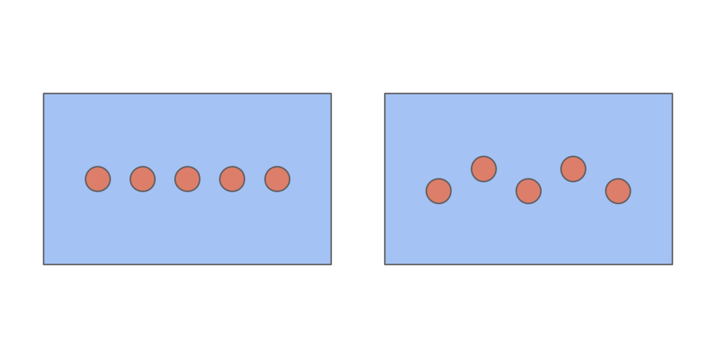
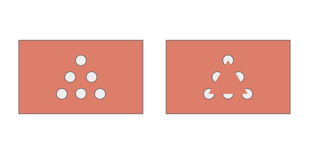
While there are many laws of Gestalt psychology that can be applied to user experience design (UXD), its principles of grouping have been shown to benefit visual working memory [4] and by extension, can minimize the cognitive load imposed by a user interface to maximize usability [5]. Each of the following illustrated principles demonstrates how grouping amongst a set of elements in a simple image is affected by varying properties of those elements relative to one another [6].
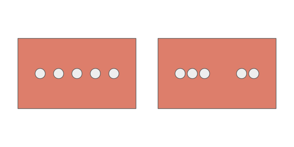
Proximity – elements that are placed closer together are perceived as a group.
For UXD, proximity can help organize the layout of the interface to make it quickly scannable (e.g. white space being used to separate blocks of content to present unified information).
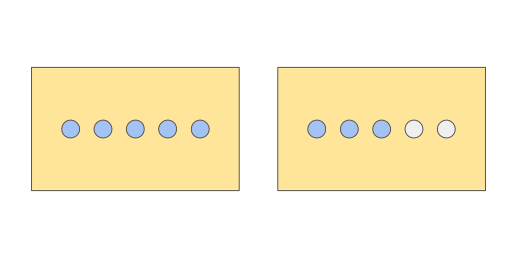
Similarity – elements that share a similar attribute or property are perceived as belonging together.
For UXD, similarity can be presented in color, shape, size, and orientation to create strong visual hierarchy (e.g. color prompts for different tasks).
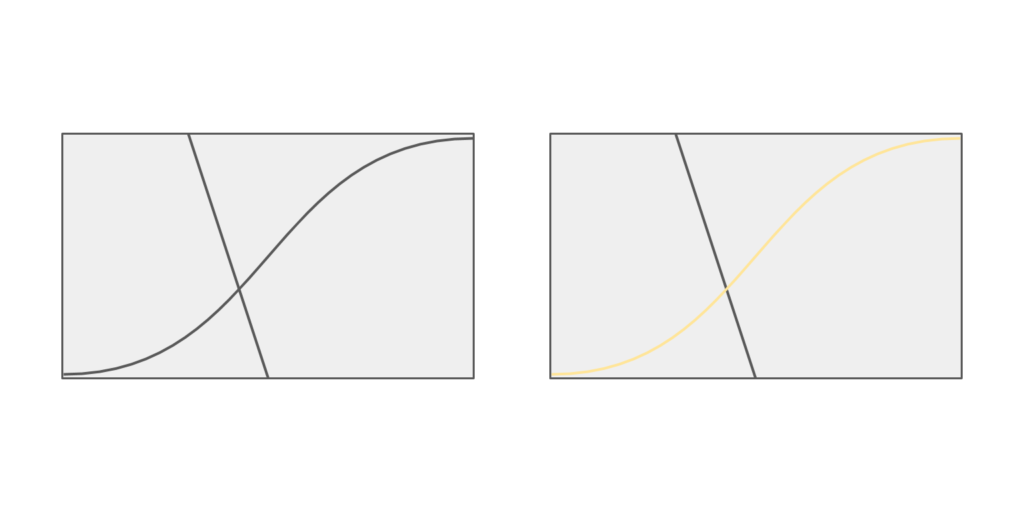
Continuity – elements that appear to be a continuation of a preceding sequence or a line of similar items are perceived as belonging together.
Connectedness or “common fate” – elements that move together in the same direction at the same rate simultaneously are perceived as a group.
Closure – elements with shared boundaries are perceived as belonging together, even if the outline they form is not complete.
For UXD, closure can make for memorable icons, like the bitten Apple logo or NBC’s modern peacock.
In addition to perceptual grouping, prägnanz (“pithiness”), also called the law of simplicity or good form, can be easily applied to UXD. Prägnanz suggests that our sense of reality is organized to the simplest form possible by eliminating what does not seem to be useful. This same rule can be translated to interface designs by removing feature creep and information overload, thus allowing users to make decisions more easily [7].
All five of these principles, along with the law of prägnanz, are demonstrated in the featured image at the top of this post. See how many you can find! Hint: some principles are illustrated more than once or are combined with another principle.
Final Thoughts
Gestalt psychology does not result in good UXD by itself. Instead, we must leverage its laws and principles, like proximity, similarity, continuity, connectedness, closure, and simplicity, to create mental shortcuts for visual problem solving when designing human-centered interfaces.
References
- Gestalt psychology. (n.d.). In Wikipedia. Retrieved from https://en.wikipedia.org/wiki/Gestalt_psychology
- Max Wertheimer (n.d.). In Encyclopaedia Britannica online. Retrieved from https://www.britannica.com/biography/Max-Wertheimer
- Wagemans, J., Elder, J. H., Kubovy, M., Palmer, S. E., Peterson, M. A., Singh, M., & von der Heydt, R. (2012). A century of Gestalt psychology in visual perception I. perceptual grouping and figure-ground organization. Psychological Bulletin, 138(6), 1172–1217. https://doi.org/10.1037/a0029333
- Peterson, D. J, & Berryhill, M. E. (2014). The Gestalt principle of similarity benefits visual working memory. Psychonomic Bulletin & Review, 20(6), 1282-1289. https://doi.org/10.3758%2Fs13423-013-0460-x
- Whitenton, K. (2013, December 22). Minimize cognitive load to maximize usability. Retrieved from https://www.nngroup.com/articles/minimize-cognitive-load/
- Brooks. J. L. (2015). Traditional and new principles of perceptual grouping. In J. Wagemans (Ed.), Oxford handbook of perceptual organization (pp. 541-559). Oxford, U.K.: Oxford University Press. https://doi.org/10.1093/oxfordhb/9780199686858.013.060
- Loranger, H. (2015, November 22). Simplicity wins over abundance of choice. Retrieved from https://www.nngroup.com/articles/simplicity-vs-choice/
