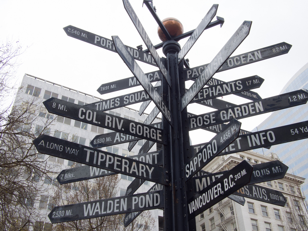
If you’ve ever tried to find your terminal in an airport, you’ve undergone a psychological process called wayfinding. Wayfinding is the navigation of 3D environments through the use of spatial cues, such as following signs and hallways to your intended destination. All humans learn how to wayfind from the moment they learn to crawl, so this technique is deeply ingrained into our psychology. The catch is that human wayfinding is based on the navigation of 3D environments, so what do we do in 2D environments like websites?
While navigating an airport follows a slow and logical process (“I was there, and now I am here, and the distance between connects the two.”) navigation in the 2D world, strictly speaking, is a magical process. When browsing a website, users can simply “appear” in “locations” without having to physically traverse the space in between. Despite the clear differences between an airport and a website, users still apply the logic of 3D navigation to their 2D environments. They wayfind.
The process of wayfinding is built on four core principles:
- Orientation: Where am I right now?
- Route Decisions: Can I find the way to where I want to go?
- Mental Mapping: Are my experiences consistent and understandable enough to know where I’ve been and predict where I should go next?
- Closure: Can I recognize that I’ve arrived in the right place?
By meeting the requirements for 3D wayfinding, 2D interfaces can be designed for natural navigation.
In a 1960s study of wayfinding, Kevin Lynch asked interviewees to draw a map of their hometown from memory. His research revealed that participants’ maps relied most heavily on five types of elements, which can be applied to 2D user interface design in order to promote wayfinding.
Paths
Examples: streets, walkways, subway routes, bus lines
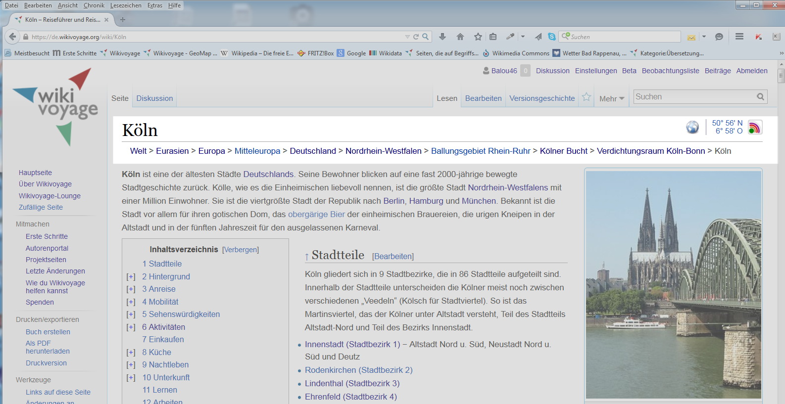
Paths are the trails that connect Point A to Point B. When traveling in 3D space, a path allows you to move forward and backward, as well as see what lies in either direction. In the 2D world, paths are most commonly seen in the use of navigation. If a user is browsing a website, the path might be constructed entirely in their mind as they follow links from one page to the next. A stronger 2D path, however, is the use of breadcrumbs, which addresses all the functionality of a real path.
Districts and Edges, AKA “Regions”
Examples of Edges: Physical barriers such as walls, fences, rivers, and shorelines
Examples of Districts: Places with distinct identity, such as Chinatown and Wallstreet
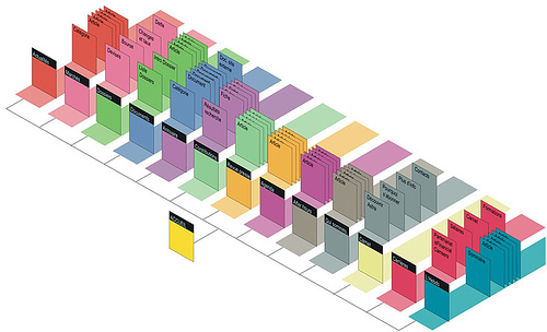
For purposes of design for 2D navigation, the concepts of “districts” and “edges” can be combined into the same functional concept of “regions.” Same as how cities can be divided into distinct areas based on common cultural or architectural themes, so too can a website be divided into regions based on visual theme, such as color or header images. Dividing large websites across regions in this way helps a user orient their current location in relation to the rest of the website.
Nodes
Examples: Major intersections or meeting places, such as the clock in New York’s Grand Central Terminal
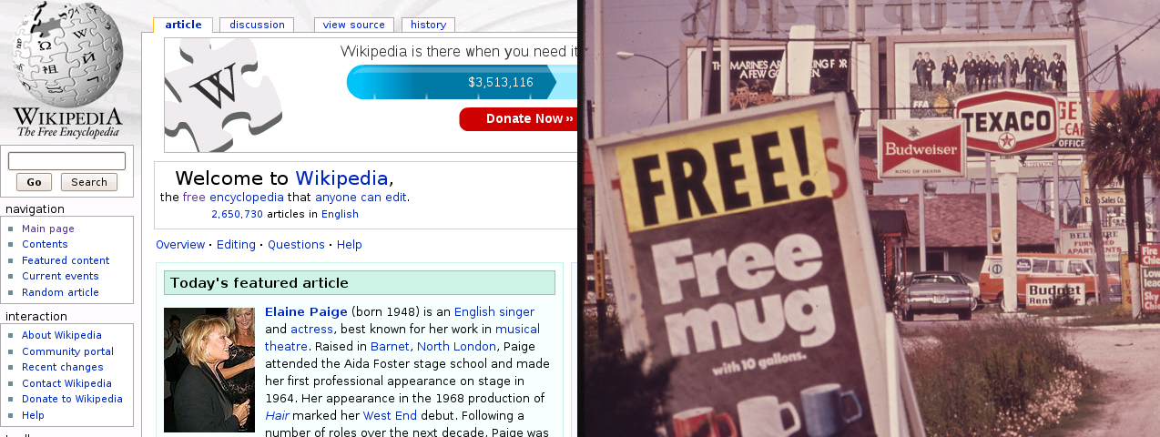
The presentation of “intersections” on a website is similar to intersections, or nodes, in the real world. Nodes are points on the page where a user must make a decision about where to go next. Similar to how a busy intersection can slow down and stress out a traveler, a busy interface can do the same. Keeping a close eye on how many nodes exist on your interface will help streamline the wayfinding process.
Landmarks
Example: Tall, visible structures that allow travelers to orient over long distances
Landmarks allow a traveler to turn their heads upward and orient themselves in relationship to their current location, like searching for the Chrysler Tower in New York. This same need can be met on websites by providing page headings. This allows the user to identify if they’ve arrived at the right location or if they need to keep going (and in which direction). This is particularly important to support search functionality (as opposed to browsing) since a user could simply “appear” in a location without any context, such as jumping in from a Google search.
By meeting the natural requirements of 3D wayfinding, a 2D environment can be designed for easy navigation. Addressing paths, districts and edges, nodes, and landmarks is essential to keeping the user oriented in an interface so that they can know where they came from, where they are, and where to go next.