 Image credit: KnowYourMeme.com
Ignorance is not bliss
There’s an old saying you might have heard. It goes something like this: “fool me once, shame on you; fool me twice, shame on me.” Usually, this is said after a series of betrayals by a friend, a family member, or a loved one. But could it reach into UX research as well?
The fact is, just because you try to do good, clean, ethical research, it doesn’t mean you actually are. We all strive to be ethical human beings, and that includes our professional work. There aren’t many UX professionals with posters hanging on their walls that say: “Pulling one over on users is the key to success.” But if you do see someone with a poster like that, you might want to delete their app. Immediately.
In all seriousness, good UX means you “have a deep understanding of users, what they need, what they value, their abilities, and also their limitations.” (Usability.gov, 2017) Empathy, and the use of that empathy, leads to design brilliance and usability success. However, despite this lofty goal, unethical research happens, and it is more common than we think. Why is this? Well, with over 160 recorded types of cognitive biases, it’s harder than it seems to have unbiased, objective, and productive data. (Kiryk, 2017) With these many biases out there, we can’t hope that our intentions are enough to combat what I’ll call the “cognitive creep.” We have to proactively fight bias – and the first step is to name your enemies.
The framing effect
Image credit: Pixabay
Two of the more insidious cognitive biases out there that work hand-in-hand are leading questions and the framing effect. The framing effect describes a cognitive phenomenon by which we react differently to the same information depending on how it’s worded. It was first described by Kahneman and Tversky, two psychologists, in a seminal 1981 study that asked people about the impending outbreak of an “Asian disease.” They described a scenario in which this disease would soon outbreak and kill 600 people. Two groups were asked to choose a program to help combat the outbreak.
Group 1 was told that Program A would save 200 people, and Program B would have a 33% chance of saving everyone but also a 66% chance of killing everyone. As you might expect, most people chose Program A.
Group 2 was told that Program A would kill 400 people, and Program B would have a 33% chance to save everyone or 66% chance of killing everyone. Here, most people chose Program B. (Tversky & Kahneman, 1981)
Here’s the rub. In both groups, the fact is that Program A sees 400 people die. However, because it was framed differently in Group 2, people chose Program B in order to find some positive outcome in the negatively worded options. Literally, the exact same odds, and the exact same scenario, but completely different results because of wording and framing. Crazy, right?
You are not immune
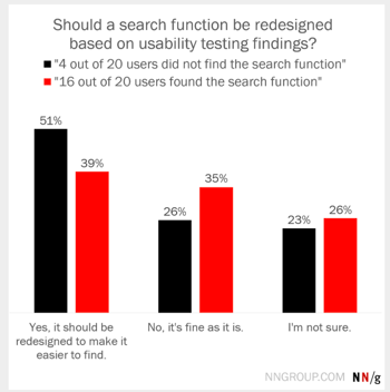
You might have the intellect of Einstein, but I’m sorry to say that the framing effect still works on almost everyone. Even UX researchers. Nielsen Norman Group created a study in which they asked ~1,000 UX practitioners if a search function should be redesigned after providing the same usability test findings in two different ways. Check out what happened for yourself:
Image source: Whitenton, 2016
The frame of “4 users not finding the search function” seemed to be a much larger issue as it focused their attention on the negative findings: poor usability for a small fraction of users. However, when told the reverse side of the story, that 16 users found the search function successfully, more experts agreed that to redesign the website would be a fool’s errand. Now imagine if we had followed the advice of those in the first group, worried about those 4 users? We’d have a majority of very unhappy users. (Whitenton, 2016)
So, you may be saying to yourself by now, “well, this is interesting and all, but I would never frame a question in a way that would skew an answer.” Like I said before, cognitive bias is insidious. If you are overconfident that you won’t fall victim to it, you may not realize you have until it’s too late.
Don’t be like Walmart
Walmart is our UX cautionary tale of the day. In 2009, Walmart jumpstarted Project Impact, designed to reinvigorate their stores into ones that could rival Target’s clean, open appeal. In a survey, they asked users a simple question: “Would you like Walmart to be less cluttered?” (Popken, 2011) As you might imagine, most people answered yes. Who wants clutter anywhere in their lives? The very word is imbued with meaning. And so, Walmart removed 15% of their inventory, removed large pallet displays, and generally created a more open look and feel (similar to Target’s). As a result of a redesign based on an unethical, leading and framing question, Walmart paid the heavy price of $1.85 billion in sales decline. It was an expensive exercise in how not to do usability research and in the power of cognitive bias.
Conclusion
And so, the moral of this tale is as follows: critically evaluate every single question you ask, because cognitive bias could be lurking around the corner. My best advice is to look at your questions and see if you’re desiring a certain response. If you are, it’s probably a bad question. It’s time to unlink good intentions and good research, because the plain truth is that’s not good enough to ensure ethical research. The sooner you realize bias’s “cognitive creep,” the sooner you can plan for it and improve your research. And trust me, you’ll be great.
References
Kiryk, A. (2017, September 7). Overcoming cognitive bias in user research. Design at NPR. Retrieved from https://npr.design/overcoming-cognitive-bias-in-user-research-e4082f4506a
Popken, B. (2011, April 18). Walmart declutters aisles per customers’ request, then loses $1.85 Billion in sales. Consumerist. Retrieved from https://consumerist.com/2011/04/18/walmart-declutters-aisles-per-customer-request-then-loses-185-billion-in-sales/
Tversky, A., Kahneman, D. (1981). The framing of decisions and the psychology of choice. Retrieved from https://www.uzh.ch/cmsssl/suz/dam/jcr:ffffffff-fad3-547b-ffff-ffffe54d58af/10.18_kahneman_tversky_81.pdf
Usability.gov. (2017, July 10). User experience basics. Retrieved from https://www.usability.gov/what-and-why/user-experience.html
Whitenton, Kathryn. (2016, December 11). Decision frames: how cognitive biases affect UX practitioners. Nielsen Norman Group. Retrieved from https://www.nngroup.com/articles/decision-framing-cognitive-bias-ux-pros/

