
Introduction
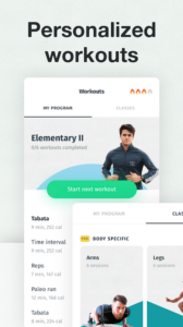
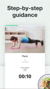
8fit Workouts & Meal Planner is a mobile health and fitness app offering free personalized workouts with step-by-step guidance. Exclusive workouts and meal plans are available with subscription to 8fit Pro but this review is for the initial set-up and use of the free version of the 8fit app. The 8fit app aims to simplify fitness and nutrition, and to create a healthy lifestyle change for everyone, from beginners to advanced fitness enthusiasts. Convenient for busy lives, the HIIT, high intensity Interval Training, based workouts take 5-20 minutes and can be done anywhere and anytime without any equipment.
Set-Up
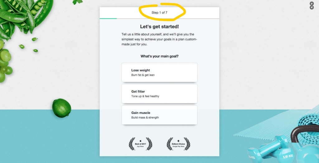 Image 1
During the sign-up process, users are taken through seven-steps. The conceptual model is clearly defined as each step is labeled at the top of the window so we know that there are seven steps and where we are in the seven-step process. As shown in Image 1, we see the label “Step 1 of 7” at the top.
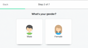
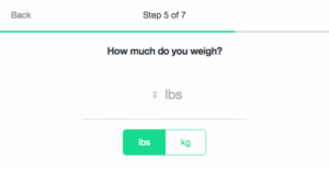
Image 2
Once an option is clicked, users are taken to the next succeeding step until the process is complete. There is only one question in each step. The question and “next” button in each step signify to the user what actions need to be taken to proceed. Once a selection is made the screen goes to the next step and the label indicates which step the user has moved to and how many steps are remain. Being guided in such an interlock constraint forces the user to provide the input in a specific sequence so the user is not able to jump to a workout that may not be suited for him or her.
This immediate feedback, the constraints limiting the questions, options and buttons per step, signifiers (labels, questions, buttons) and a clear conceptual model aid the user to easily bridge the Gulf of Execution, where the user can quickly understand what options are available to them and how the set-up operates, and the Gulf of Evaluation, where the user can readily interpret the results of their actions and if those actions were successful in proceeding to the next step.
Goal-Setting
A user is able to customize their fitness plan by indicating their fitness goals in terms of workout frequency and body fat target. 8 fit utilizes these settings along with your age, height, and weight to formulate you fitness plan.
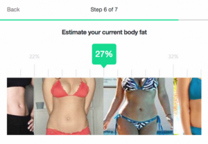
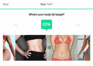
The 8fit app provides a visual estimation of a user’s current body fat percentage and the target body fat percentage. Visuals can be a quick and simple way to communicate information however, while the visual cues are clear as to which direction the scale of percentages are heading, there is little information to understand the difference between for example 27% and 29% or 25%. This mapping of visual imagery to percentages can cause confusion as the scale for percentage can be scrolled incrementally by whole percentage points, but there isn’t a matching visual for each percentage point.
Image 3
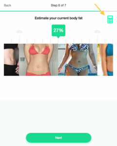
If the 8fit app does not formulate a fitness plan with as much detail, one solution could be to limit percentage selection to a range corresponding to each visual rather than being able to select any whole percentage point. Alternatively, if percentage precision does have an effect, access to a built in body percentage calculator could be added by way of a small calculator icon in the top right for users who would like to be more precise (image 3).
Main page – Fitness Plan
Once set-up is complete, a fitness program is generated for the user based on his/her responses including their goals, desired exercise frequency, and fitness level. The 8fit app aims to be like your own personal trainer, walking the user through each exercise step-by-step.
Image 4a Image 4b
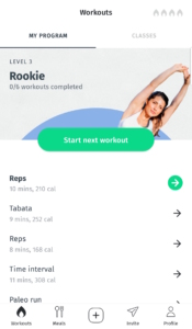
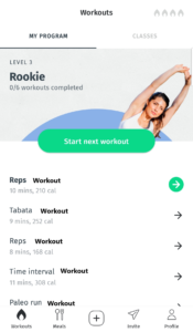
A list of the user’s fitness plan for the week is displayed on the main screen of the 8fit app. The user can start their next workout by clicking on the large green button at the top labeled “Start next workout.” The green arrow indicates which is the next workout in the queue. (see Image 4a).
Alternatively the user can explore each workout routine by clicking the arrow next to the routine. The arrows are clear signifiers that indicate an action can be taken. However, the it is not initially clear that each line item maps to a workout routine with multiple exercises within, as opposed to individual exercises, thus the Gulf of Evaluation takes a little more effort and trial and error. The the work “workouts” is listed at the top, it can easily be miss as the large green button towards the middle labeled “Start next workout” draws your attention to the middle of the screen and common convention is for the eyes to naturally look below for the next bit of information. A simple solution is to add the word “workout” to each line item in the workout list (see image 4b).
Conclusion
The 8fit app is a good example of Human-Centered Designn with a clean, simplified, unified design. While some mappings can be improved, users can easily navigate the app via clear signifiers, contraints, and conceptual models.
