Introduction
Great Parks of Hamilton County is a public agency manages 21 parks in Hamilton County, Cincinnati, OH. It plays a very important role for local residents by offering different varieties of activities and recreation, such as special events, educational programs, hiking,, campground and so on. By using the website, people can learn about the park information and decide whether they should go or not before visiting.
Critique
Positive Design
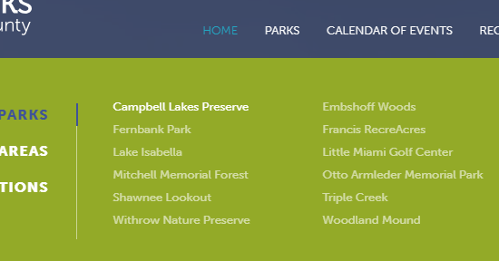
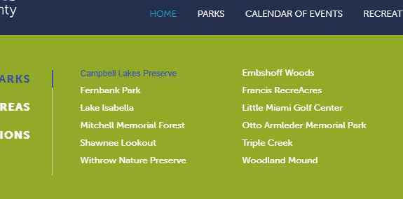
With all the information as detail as possible, Great Parks of Hamilton County definitely proves their well understanding of their users and provide the correct guideline. Navigation is the best design of the website, it gives user a great discoverability experience. Visually, the content in the navigation is clear and reasonable. All the most popular park subjects are listed on there and sort by popularity. It also meets the seven stages of action by Norman(Norman, 53). If users move the sensor to the content, a drop down menu will show up. When user selects the content, the hover of color will change to give user feedback and user won’t lose track of it.
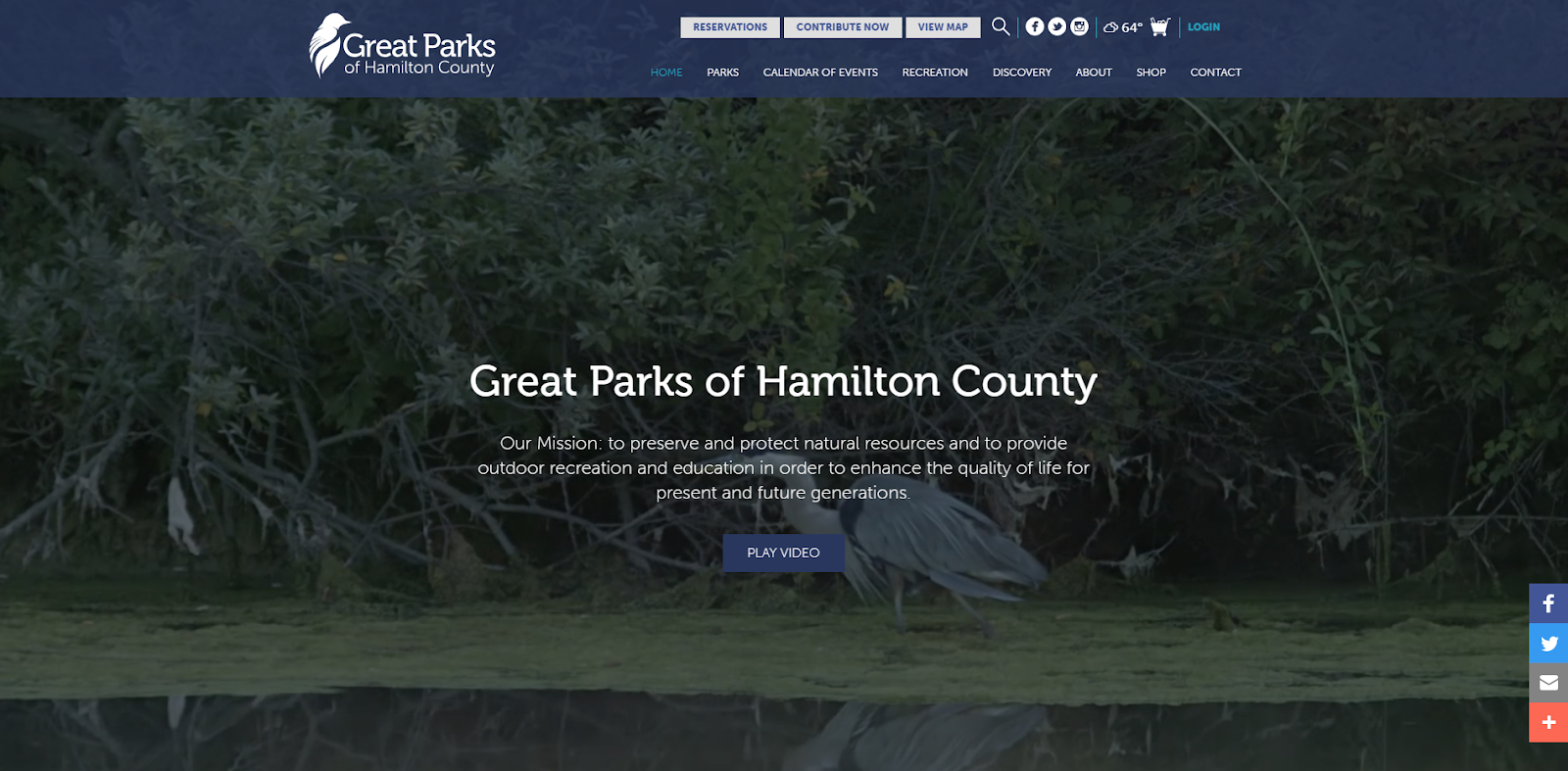
Meanwhile, using video as hero background is one of the advantages to promote Great Parks of Hamilton County. Through watching the video on the homepage, user will get to learn and even get attracted to the environment of the parks and their features.
As Norman says, conceptual models need not be very complex(Norman, 14). As long as the information is on user’s side, a user will know how to use it. In this case, user is able to reserve reservation or look up park information directly and quickly instead of going into subsite(Figure 1).
Figure 1. Navigation with drop down menu(Sensor was on the Park content) is clear and organized.
Figure 2. Hero background video is a great promotion for Great Parks of Hamilton County and helps user more understand the parks.
Negative Design
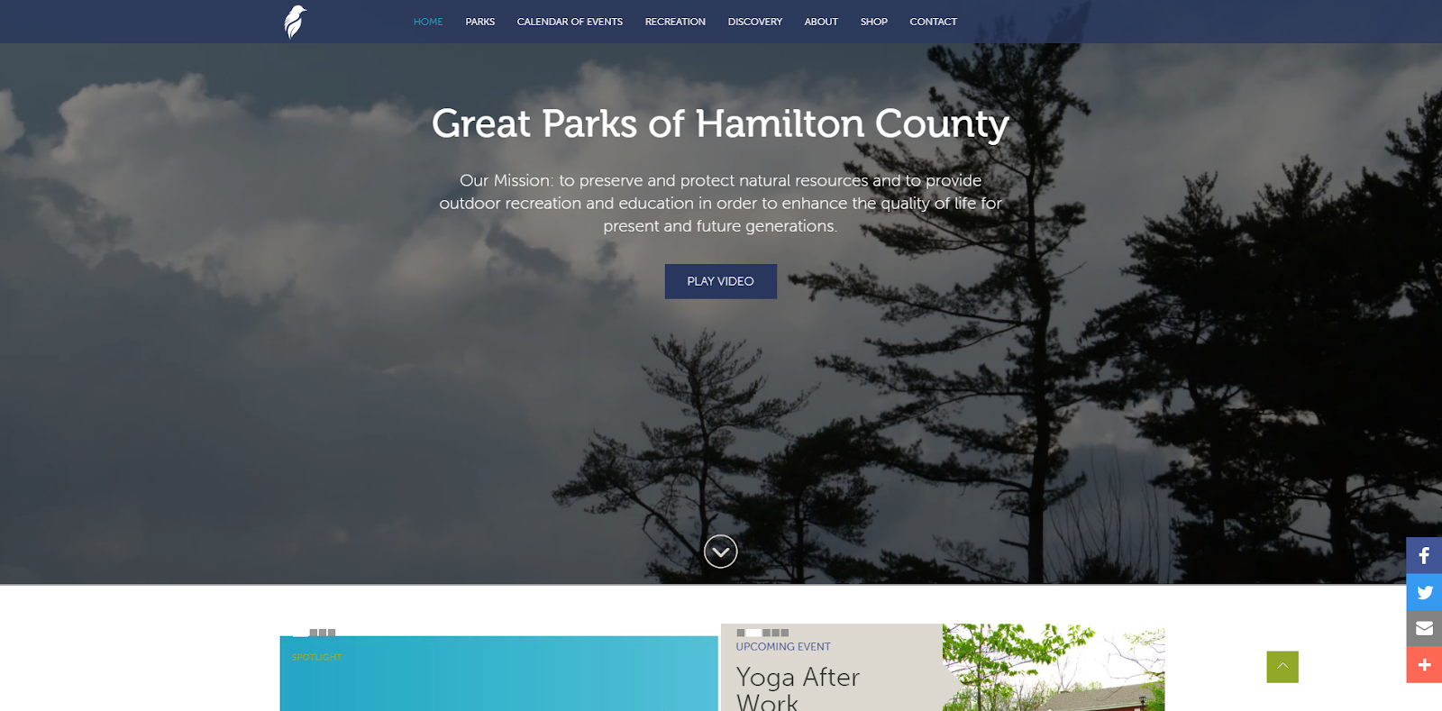
However, there are still two things Great Parks of Hamilton County can improve better. The background video takes over the whole screen, there is a scroll down slider on the bottom of the hero background video but it won’t be seen unless user scrolls down the homepage which against the principle of discoverability(Figure 3). Norman mentions about much human behavior is done subconsciously, without conscious awareness and not available for inspection(Norman, 125). Since the scroll down slider is out of visual, user will assume the page in their side is a completed page and will not scroll down to check more information below the background. Therefore, the events and programs that Great Parks of Hamilton County are hardly seen and promoted. This is a bad example against discoverability principle. Things stay out of user’s side and they won’t use it.
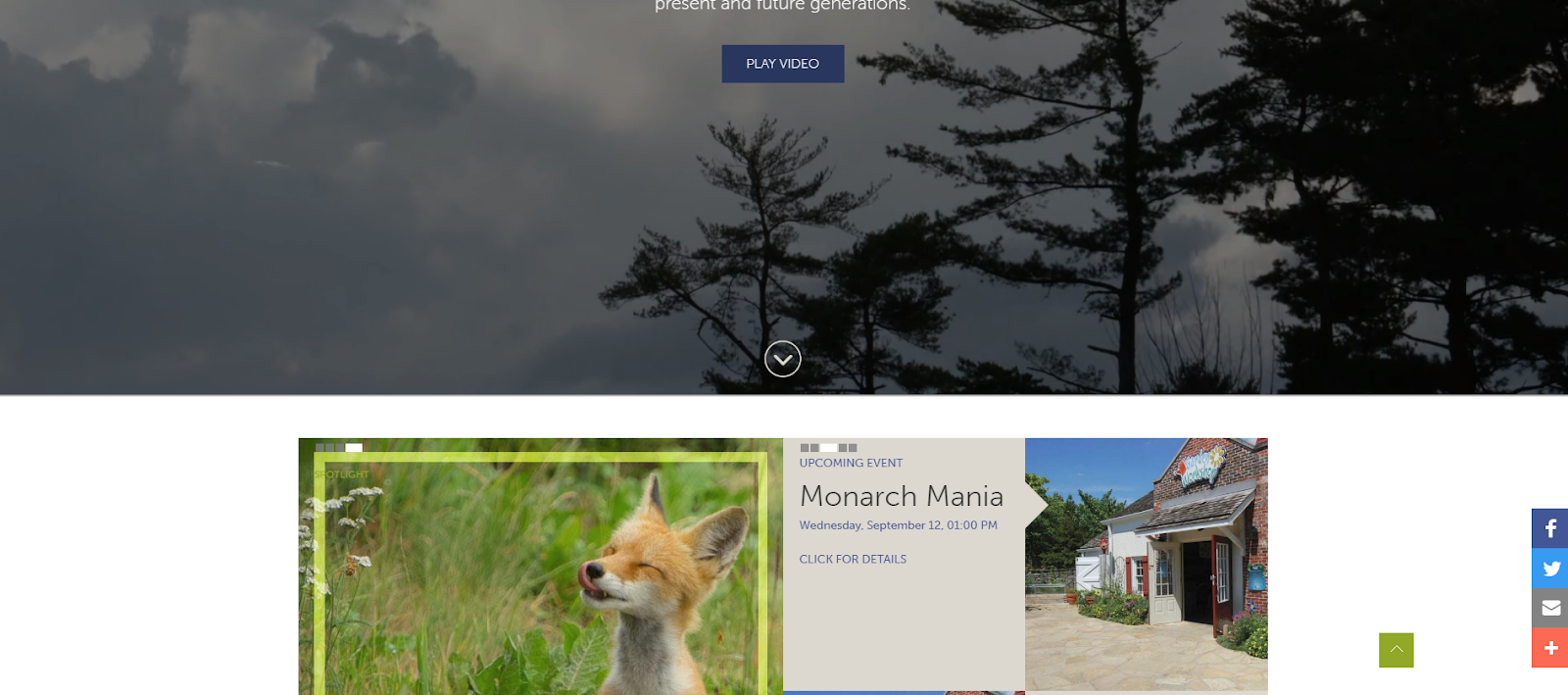
Figure 3. Scroll down slider is hidden below the video background.
Recommendation
There are two solutions. The background video can decrease the height size to 50% of the homepage, so user will be able to see the full video while parts of the spotlight will be shown(Figure 4). Another one moves up the scroll down slider and increase the slider size to be visible on the screen.
Figure 4. Background video takes half of the space of the homepage.
The color contrast in navigation consider poor and not user-friendly. The color contrast between parks and background color are low, so it comes with very low recognition(Figure 5). It is hard for user to read the content since there is so many information on the drop-down menu, especially for user who has a vision issue, such as myopia, color blindness, astigmatism.
Figure 5. Low color contrast on the navigation
Recommendation
Change the font color of the content from #F9FBF4 to hex white #FFFFFF to increase the contrast. The hover color change from white #FFFFFF to blue #3f5398 to matches with the PARKS on the left menu to give more clear feedback(Figure 6).
Figure 6. Hover color change from white to blue, font color change to hex white.
Summary
Overall, this website is considered a good example to meets the principles of Norman in his book. The designer knows well about user and their needs also prioritize for them according to the popularity. Designer also created a clear, organized, visually beautiful homepage, background hero videos increases positive emotion of user, which also builds a good connection between Great Parks of Hamilton County and user.
Reference
Norman, Donald A. The Design of Everyday Things. Basic Books, a Member of the Perseus Books Group, 2002
