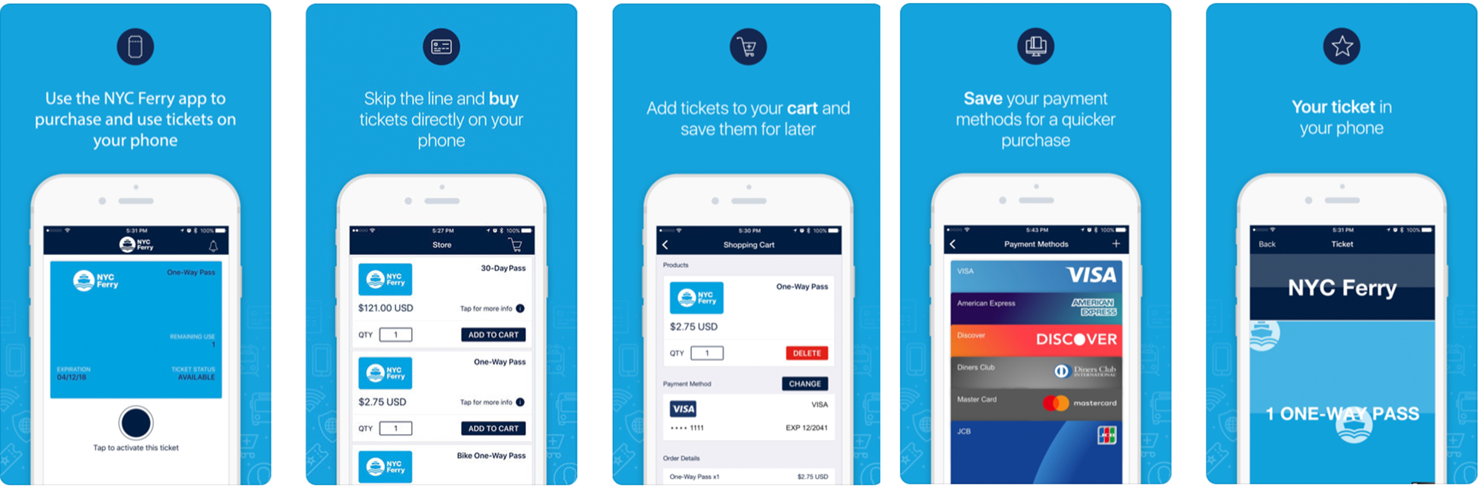
The NYC Ferry mobile app provides riders a “green”, on-the-go, alternative to purchasing and activating e-tickets and passes. The mobile app also provides maps and schedules, as well as real-time notifications and service alerts. Users have options to purchase a one-way with or without a bike, or a 30-day pass with or without a bike, which are valid up to one year from the time of purchase. This mobile application’s purpose is mainly for purchasing tickets; most riders purchase their one-way ticket while waiting in line, rather than at a ticket kiosk which takes too much time and sometimes keeps you from making it onto the ferry.
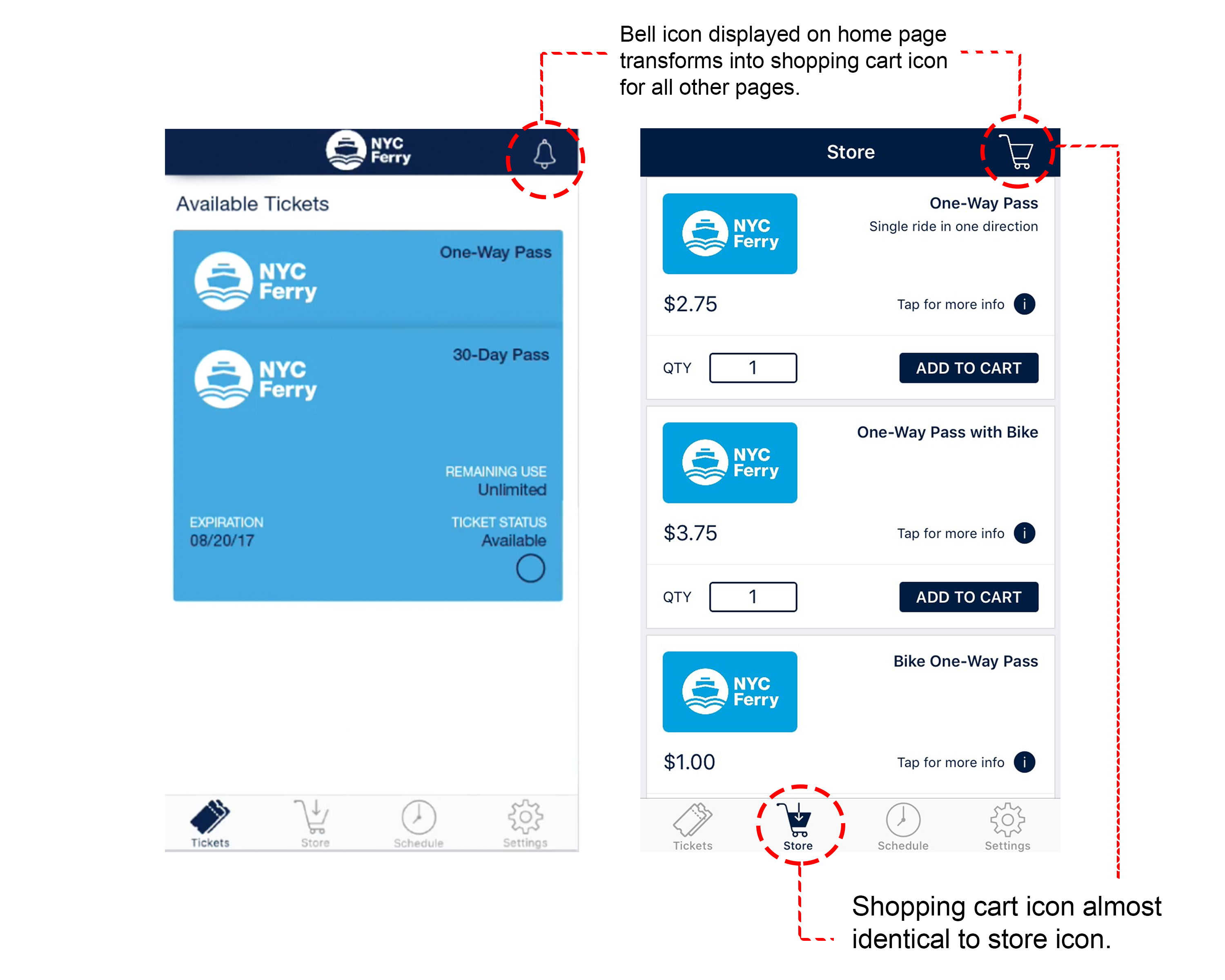
The main page appears to have good discoverability for what the app provides: storing tickets, purchasing tickets and viewing the schedule. Each button on the menu is clear. There are four icons on the bottom of the homepage: tickets, store, schedule and settings. On the upper right corner, a bell icon is displayed. However, when you click on the store, schedule, or settings icon, the bell icon on the top right is replaced with a shopping cart icon. It is almost identical to the store icon, which is confusing to the user, despite the fact that both icons are two separate pages: “store” and “shopping cart”. The title “store” is also confusing, as users tend to think of a gift shop rather than a place to buy tickets.
Recommendation:
I would recommend changing the text on the menu from “Store” to “Buy Tickets” and “Tickets” to “My Tickets”. This will help users easily distinguish that one page is for their ticket display and the other is for purchasing tickets. I would also recommend changing the icon of the “Store” to a better icon that demonstrates a place to purchase tickets, for example a dollar ($) sign over a ticket icon.
Smooth Transaction Process
The process of purchasing tickets on this app is quick and easy due to the use of well designed signifiers, constraint, feedback and the natural mapping structure.
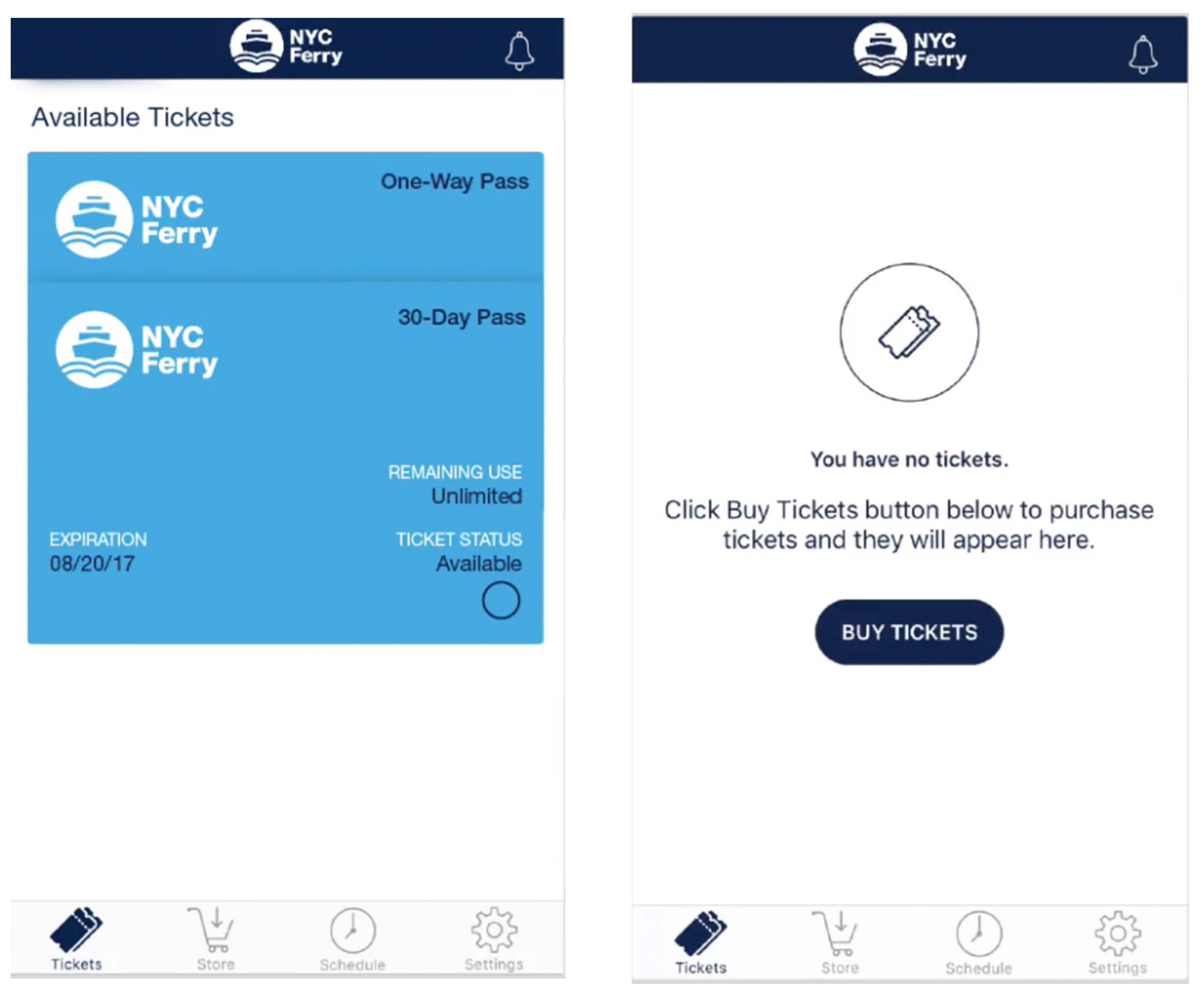
As soon as the user opens the NYC Ferry App, the user is brought directly to the tickets page. Two ticket options appear: either a display of the available tickets, or a message which states: “you have no tickets” if the user has not purchased a ticket yet. In this case the user will be directed to purchase a ticket with the use of a “buy tickets” button. Users also have the option to purchase a ticket by clicking the store icon.
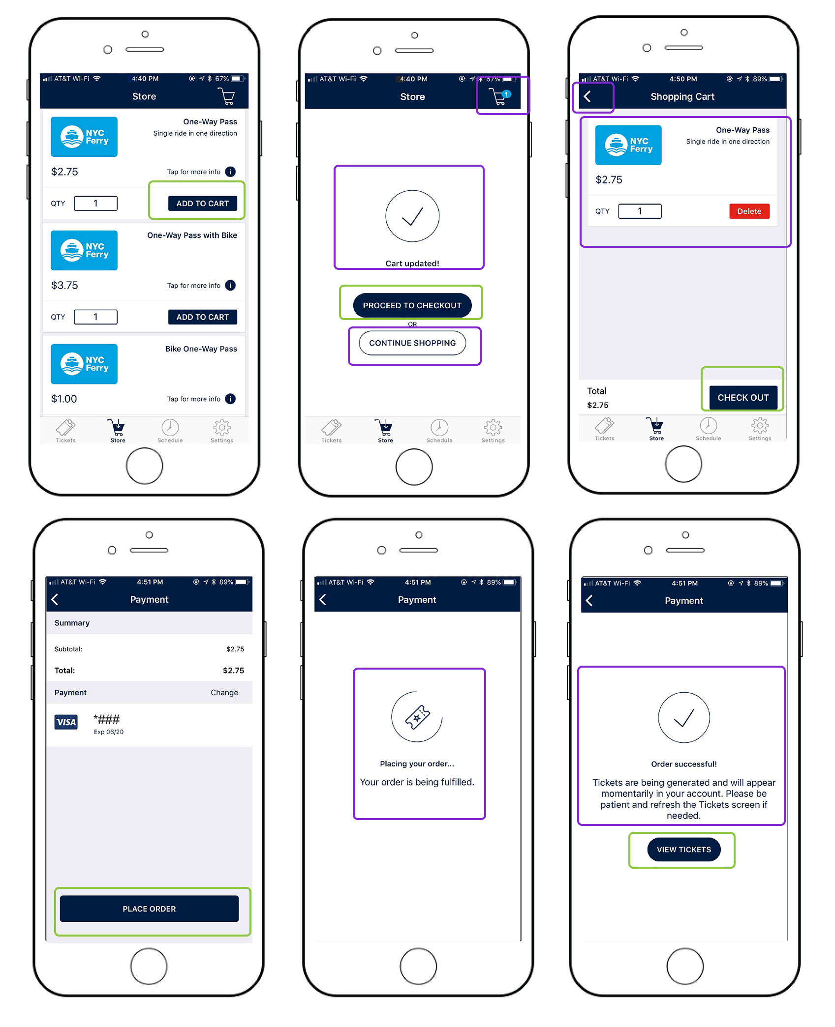
The NYC Ferry App provides multiple examples of good feedback throughout the app for tickets. The quantity of tickets will appear in the shopping cart on right top to show that you have successfully added a ticket to the cart. When the user purchases the order, an animated loading bar is displayed with a message saying “placing your order…”. And lastly, when the order is completed, the user is redirected to a confirmation page, an option to view tickets, and an e-mail is then sent immediately with your purchase confirmation. Users can also view all their ticket purchases through the app in their settings section.
Ticket Activation: Effective Signifiers & Feedback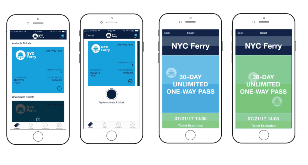 The ticket activation prior to boarding the ferry is rather confusing. However, there are multiple signifiers on the ticket to help the user with the process. Users are directed with text and circles indicating where your finger should tap the screen In order to activate. Once the user presses the circle, the ticket color will change from light blue to green, giving the user positive feedback that the ticket has been activated.
Schedule: Not user friendly
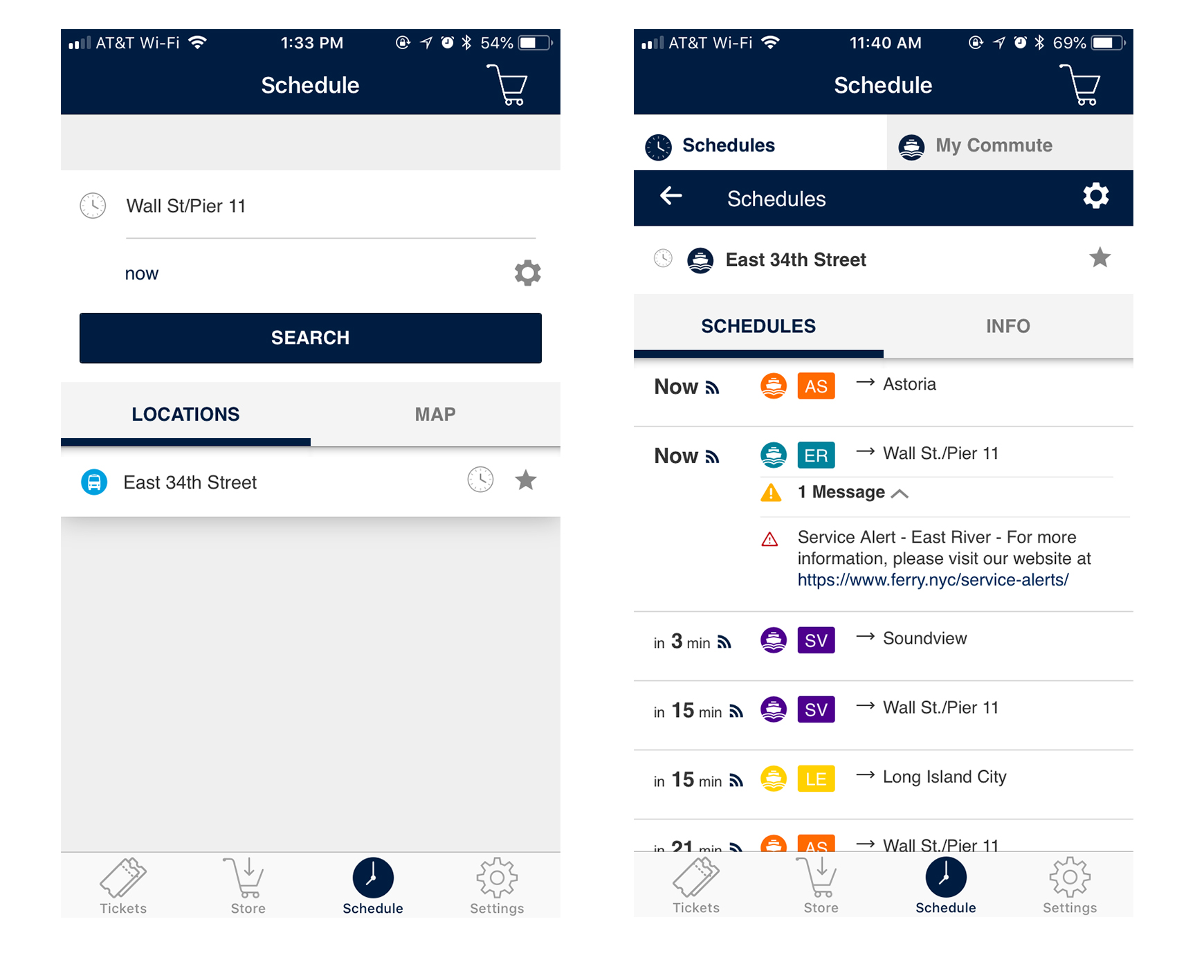
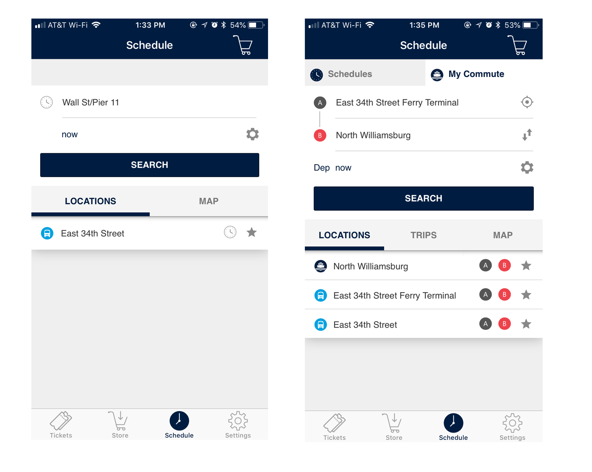
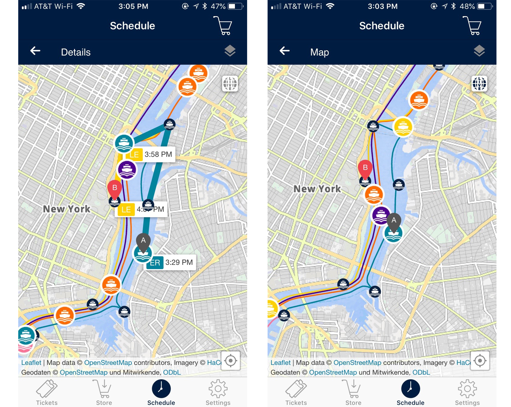
The schedule on the NYC Ferry App has a confusing user flow and is just not user-friendly. There are two tabs that appear on the page: “Schedules” and “My Commute”. However, this option does not appear until you plug in a route to view the schedule. When a location is selected on the schedule tab, all other routes from that location is displayed, creating a very overwhelming and distracting visual. When you click the map all routes are also displayed, making it difficult for the user to narrow down on their specific route. Secondly, most users only want to see the schedule of their route. However, that option is buried in the app which requires too many clicks to get to. Lastly, the time is set in count down mode, which does not work at this stage of the process. In order to update the time, users must close the app completely and navigate back to the specific schedule page.
Recommendation
This poor design can be frustrating to users who are in a hurry. Because this app requires users to create an account, users should be able to save routes, schedules and opt in for real time notifications of boat departures. I would recommend only displaying the destination the user has requested on the schedule section of the app.
Overall, the interface of this app is clean and serves the purpose. Passengers are purchasing tickets and using the app regardless of the confusion and hassle, which is a success according to Don Norman who mentions that “It doesn’t matter how good a product is if, in the end, nobody uses it.”