Snapchat is a free multimedia messaging application available for both iOS and Android phones. It allows users to send pictures, videos, or messages that are only viewable for a short period of time, either through direct messaging to individuals or user created groups or by creating a “story” that is visible to anyone on your list of contacts for up to 24 hours of posting. Snapchat also has a “Discover” feature in which brands post ad-supported short-form media, videos or animated slide shows. This format allows users have a casual experience sharing their lives with friends, watching their friends’ videos, and learning about news and products relevant to their interests.
When opening Snapchat users are immediately taken to the log in screen. The screen features a bright yellow background with pink and blue strips where the login and sign up buttons are respectively. Snapchat’s mascot, a small ghost given the moniker “Ghost face Chillah”, is featured prominently on this page. The adaptation of these bright and eye-catching colors connects with users at the visceral level. This highly saturated color scheme feels playful and inviting, creating a fun and positive emotional connection with the users.

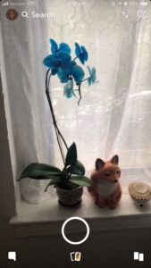
As users login in to their snapchat accounts the app then opens the camera with the snap chat interface prominently featured. The Snapchat camera interface features their user image, the search feature, and a number of other symbols with no further explanation. The search feature is the only clearly labelled icon on the page and also features a magnifying glass as an skeuomorph, making the mapping of that feature easy to understand. The visibility on this page is poor, without clearer mapping it will be very difficult for first time users that lack computer literacy.
Snapchat Camera Interface
Having this kind of non intuitive design can halt the user from crossing the gulf of execution. Snapchat was the user to take an image but if the user doesn’t understand the interface then they cannot complete the action.

Feedback: The discovery page is where most users run into problems. The layout is cluttered, putting the stories of your contacts in thin stripes at the very top. This leaves most of the space free to be filled with ad sponsored posts. There are also ads placed in between the users contacts stories, many of them are disguised to seem like stories themselves. Snapchat also does actively monitor what ads are being posted on their platform, leading to inappropriate posts, such as ones making light of domestic violence. There are also issues regarding using the ad based stories as they do not have clear mapping and do not show users how to advance to the next section of the sponsored ad story.

Other users find issues in their interactions with Snapchat’s friend page. On this page users can find a list of their snapchat contacts, listed in order of most recently contacted. This page also functions as both the page to see your chat history and the snap images that you recieve. The merging of features causes mapping issues, the only distinction between the two services is a pink square or a blue chat square. These skeuomorphs provide some differentiation but, ultimately, not enough for easy use.
