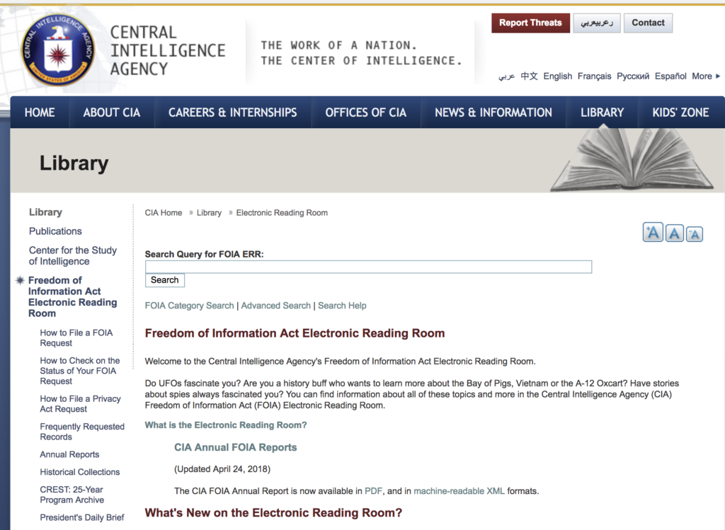
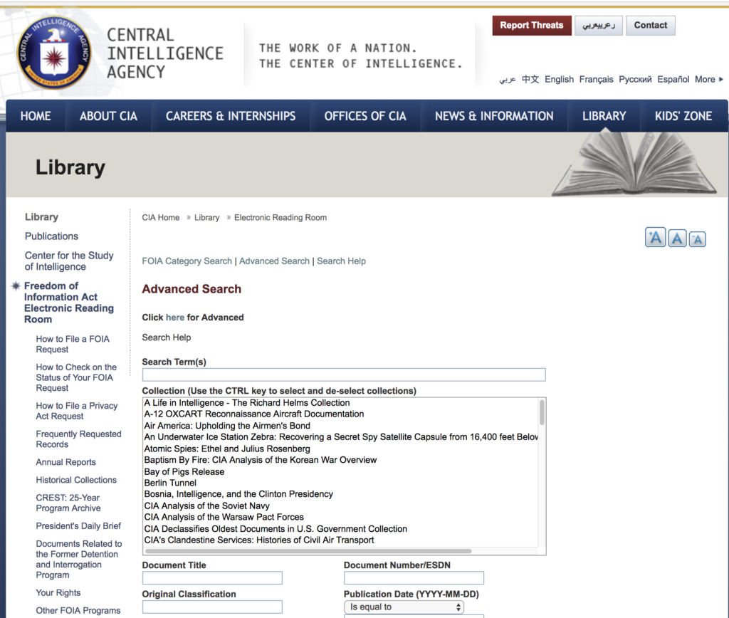
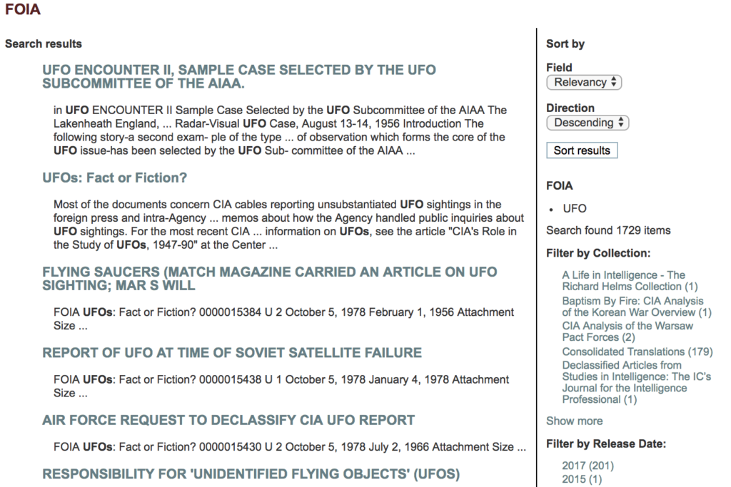
The Central Intelligence Agency’s (CIA) FOIA Electronic Reading Room (www.cia.gov/library/readingroom) is a section of the CIA’s overall website dedicated to providing public access to CIA documents that have been released under Freedom of Information Act (FOIA) requests and/or other information release mechanisms. This section of their website hosts a number of digital/scanned agency records and provides access to these records to the public via links and search tools. Where some federal US agencies provide only static lists of agency documents in their FOIA Electronic Reading Rooms (see, for example, the FOIA Library website of the Department of Justice), the CIA has an interface that is intended to provide more sophisticated search options to facilitate document access.
Background on FOIA Electronic Reading Rooms
Electronic Reading Rooms that provide copies of agency records to the public have been required of US federal government executive-branch agencies since the amendments to US FOIA law in 1996. Known as the Electronic Freedom of Information Act or E-FOIA, these amendments were an extensive re-working of FOIA to accommodate new technology, address concerns that electronic agency records might be getting destroyed or lost, and address new potentialities for providing public access to government information through then-emerging digital circulation technologies. Executive-branch government agencies were mandated to provide access to their most frequently requested documents via the Internet through this amended law, with the lawmakers’ intention to improve the public’s ability to access records that had already undergone declassification review and release — though this vision of greater access is not yet fully realized in practice on many federal agencies’ websites.[1] The CIA’s FOIA Electronic Reading Room is one effort toward compliance with this law.
Design Critique Focus: Document Search Functions
Though a full review of the comprehensive CIA Internet presence could provide interesting feedback for potential website re-design, the design critique below focuses on elements related to searching for CIA documents and how design elements of the currently configured CIA FOIA Electronic Reading Room might better facilitate user experience in government information accessibility.
Critique 1: Signifier Issues in Left Sidebar / Navigation
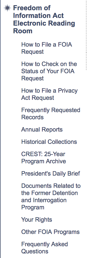
One design element where signifiers are unclear is in the left-hand sidebar navigation list of links. The left-hand sidebar would benefit from having more clearly defined link titles and separating links into subgroups by their purpose. Currently, the links under the “Freedom of Information Act Electronic Reading Room” sidebar section include both links to pages of information about CIA’s FOIA processing itself, such as “How to File a FOIA Request,” and links to highly requested subsets of actual agency records. This mixing is likely to cause confusion for users. The recommended design change to resolve this issue would be to create subsections within the left-hand sidebar that would clearly demarcate and separate links to pages of general FOIA/”How to” information from links to pages of frequently requested CIA records.
Critique 2: Signifier Term-Destination Confusion in “Advanced Search” 
The “Click here” terminology at the top of the Advanced Search page of the site could cause confusion for the end user because what the on-screen text indicates as the destination of the link does not match the actual link destination. On this screen the user has already navigated to the Advanced Search options, yet text directly under the page title states “Click here for Advanced” (where “here” is a hyperlink) and then, on a separate line underneath, “Search Help.” The link implies it will take the user to even more advanced CIA agency record search options but it instead navigates to the user help page on advanced searching. This is likely a simple programming error that introduced separation between the two lines, as the intention of the link would seem to be to guide users to help tools. A recommendation to improve this interface would be to choose a less text-based, more icon-based symbol to indicate that pages of help tools are available to users — such as circle containing a question mark or letter “i” with explanations on mouse hover that their links offer access to help pages — and utilize that symbol to facilitate navigation to help tools throughout the site.
Critique 3: FOIA Category Search Screen — Unclear Terminology/Signifiers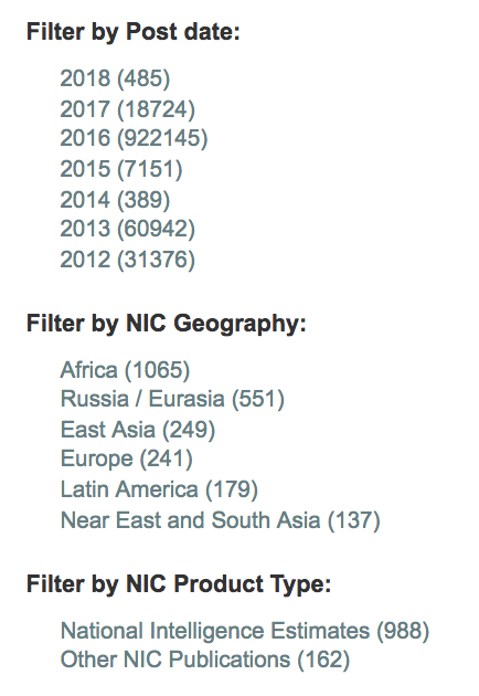
Critique 4: Search Results Page — Unclear Feedback & Options
Conclusions and Implications of the Design Critique
In his influential book, The Design of Everyday Things,[2] cognitive scientist and usability engineer Don Norman discusses the psychological phenomenon of “learned helplessness” (p.62) as it applies to design and usability. He describes learned helplessness in the design context as a state that may develop when a user is unable to complete a task multiple times, resulting in a sense of inability to ever complete the task. This can lead to the avoidance of attempting to complete it in future. Learned helplessness has particular dimensions in the context of access to government information — if the public experiences repeated failure when attempting to access the government agency records to which they have a legal right, they may be less likely to continue attempting to access records and give up in practice the information that they have the right to in theory. There are sociopolitical implications in the need for good design of public access tools to government information in a democratic system where design and technology can support citizen empowerment and government transparency. Improving the user experience of government information seekers could potentially result not only in improved access to information for the public but also increased citizen participation.
1. National Security Archive. “Most Agencies Falling Short on Mandate for Online Records” Mar 13, 2015.
