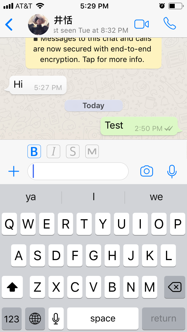
Conversation Page of WhatsApp
Description
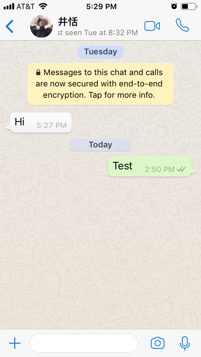
The conversation page of WhatsApp is what shown after user clicks any individual/group chat in chat list of the app’s 4th main tab, where they can communicate with other users through rich text, voice messages voice calls or video calls. In addition, it also supports document, location and contact sharing to enable a rich communication platform.
Critique
✔ Clear Visibility of General Message Features
Clear Visibility of Message States
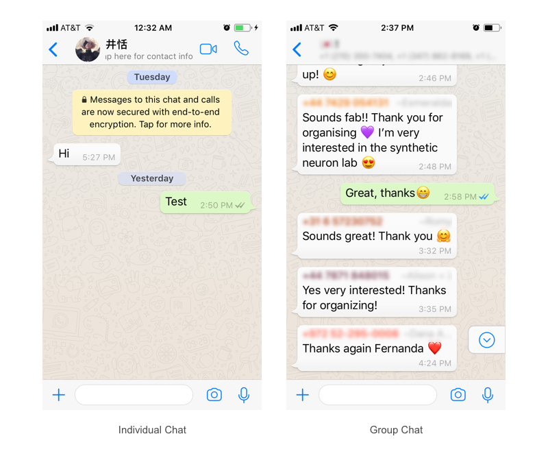
By using the principle of feedback, WhatsApp make the states of a message visible after user click the send icon. There are totally four states: wait to be sent, successfully sent, successfully delivered, read. Through this way, the app eliminate the gulf of evaluation for users.
Separation of my messages and others’ messages
It also improves the visibility of message sender by taking advantage of the mapping principle. The conversation bubbles on the left represents the messages from others, while the bubbles on the right are from users themselves, which maps the two people’s face to face conversation. It also using white and green colors to distinct the messages. In the group chat, all the messages from other users also list on the left with their name, which make it clear to check the message and its sender.
✔ Good Conceptual Model of Sending Text Messages
The conceptual model of sending text messages meets users’ expectations. As instant messages app rose up after the internet, they mirror the conceptual model which is similar with writing letters, that from drafting a letter, then wrap and send it. So user could easily predict the effects of their actions, e.g. know the “send icon” will deliver the message.
✗ Poor Visibility of Rich Text Feature
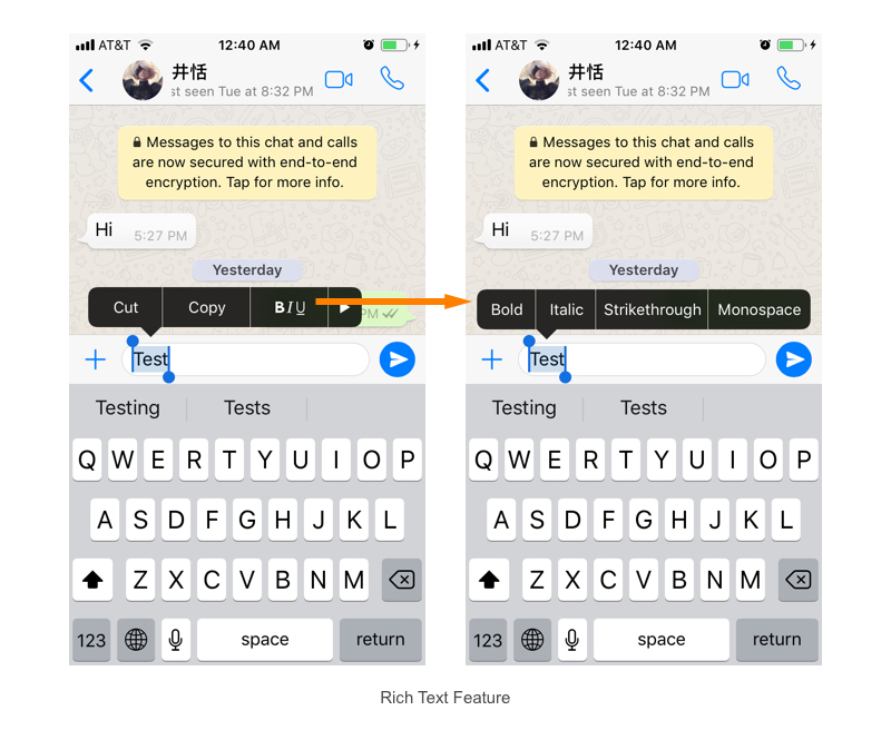
The rich text function is hidden, except when user has selected the draft text, which is a rare action from users unless they want to copy text. This leads to the poor discoverability of this feature and can cause the gulf of execution in some cases.
● [Controversial] Poor Conceptual Model for Sending Voice Messages, But Clear Instructions And Good Consideration for Efficiency
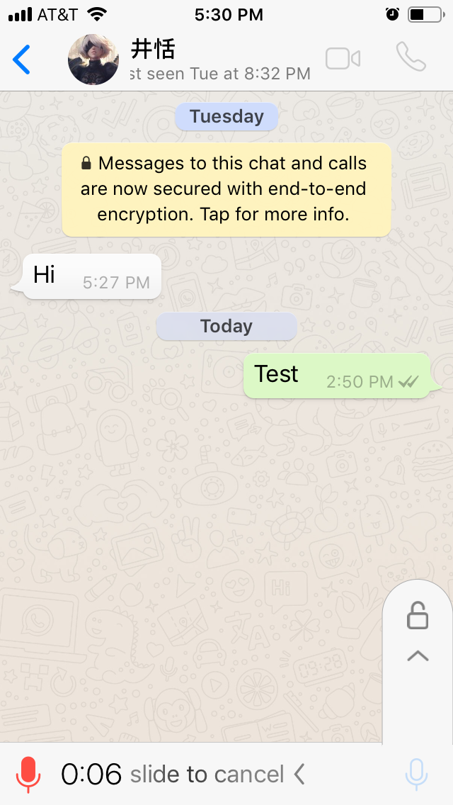
Compared with the conceptual model of sending text, the one for sending voice messages fail to consist with user’s conceptual model. User needs to hold the recording icon for recording, slide left to cancel and release to send the voice message or swipe up to lock the recording mode. This interaction is totally new and require users to learn and practice, which can be risky for learned helpless that users might blame themselves for unable to perform the action. From a user perspective, they are expecting to click to record first, and then click to send the voice message.
However, this new action actually helps improve the efficiency of sending voice message, which is also the goal of using it. And WhatsApp provide a very clear instruction for users when they trigger the function.
Suggestions
Make “Rich Text” Feature More Visible
The mockup list the rich content feature at the top of edit box, so users are able to notice the function upon they click the edit box to text something.
