
In last blog post, I talked about some basic principles to follow when designing for multi-screens. There is 3Cs Framework (Consistent, Continuous, Complementary) I found extremely helpful when analyzing the strategies of multiscreen design.
However, there are more specific strategies could be discussed which I believe can also fit into the 3Cs Framework. The book Multiscreen UX Design provides 17 strategies of multiscreen UX, and I tried to categorize them into the 3Cs Framework:
-
Consistent
- Mobile First: Concentrate on the smallest device first, which forces a meaningful structure of information
- Coherence: Individual features are optimized for device capabilities
- Fluidity: The display is switched between the screens involved
-
Continuous
- Device shifting: The display of information or content is shifted to a separate device by the user
- Synchronization: Information is kept in sync and up-to-date across devices.
- Emotionality: Make a service emotionally more attractive (make it fun and supports a device fragmented daily routine)
- Microjoyment: Delight users based on different device capabilities
- Smart Content: Content should be as flexible as possible, to be easily used and published across different channels and devices
-
Complementary
- Simultaneity: Different devices or information services are used simultaneously
- Social TV: Spatially separated viewers can quasi watch TV together or directly participate
- Screen Sharing: Use several screens together
- Mashability: Aggregate various content to a new information package
- Communification: Create a community for users to create, share, rate and comment on the content
- Gamification: Simulate a competitive environment
- Storyfication: Use different devices to build a story for users
- Hybrid Media: Combine other physical channels to create a new experience
- Complementarity: Use different devices together to complete a single goal
Based on these strategies, I identified some good examples to share and further explain how to leverage these strategies when designing for multi-screens:
Consistent + Continuous
(Mobile First, Emotionality, Communification, Device shifting)
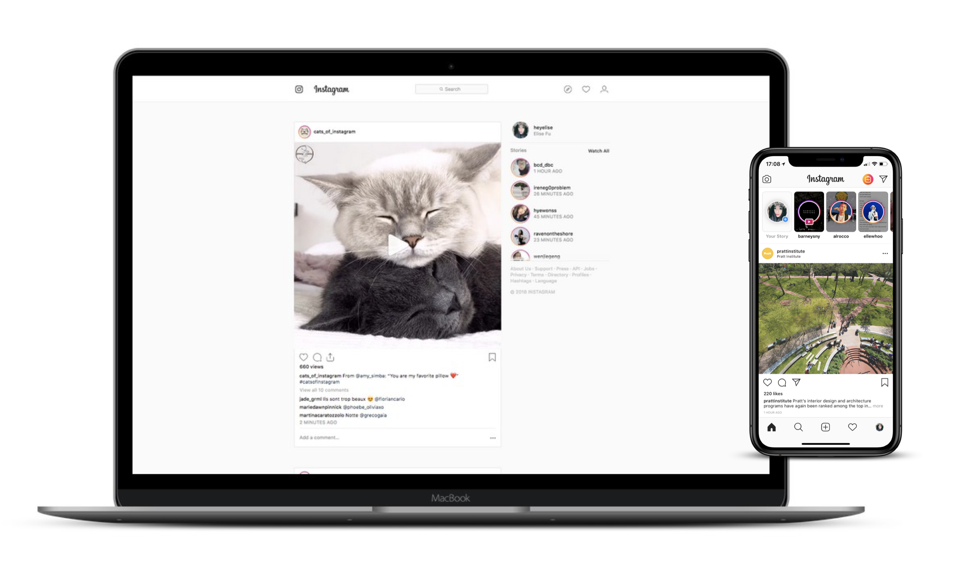
Most of us may consider Instagram is a mobile app, but it does have a desktop version (web-based) for users to browse the stories and feed on the desktop. Yes, it’s majorly for browsing (and liking, commenting and sharing) instead of posting on the desktop. Only its mobile app is fully functional, which indicates its “mobile first” strategy.
As a social media, Instagram absolutely created a community for users to create, share and comment on content – adopting the “communification” strategy. Compared with other photo sharing website, such as Flicker, Pinterest or even Facebook, Instagram wins because it is the easiest to create nice-looking content (photo, with built-in filters) and interact (follow, like and comment). Besides, Instagram is also a role model of using “emotionality” strategy – it’s fast, pleasant and entertaining to use at a fragmented daily base.
Google Map, Drive and Docs/Sheets/Slides
Consistent + Continuous
(Coherence, Synchronization, Fluidity)
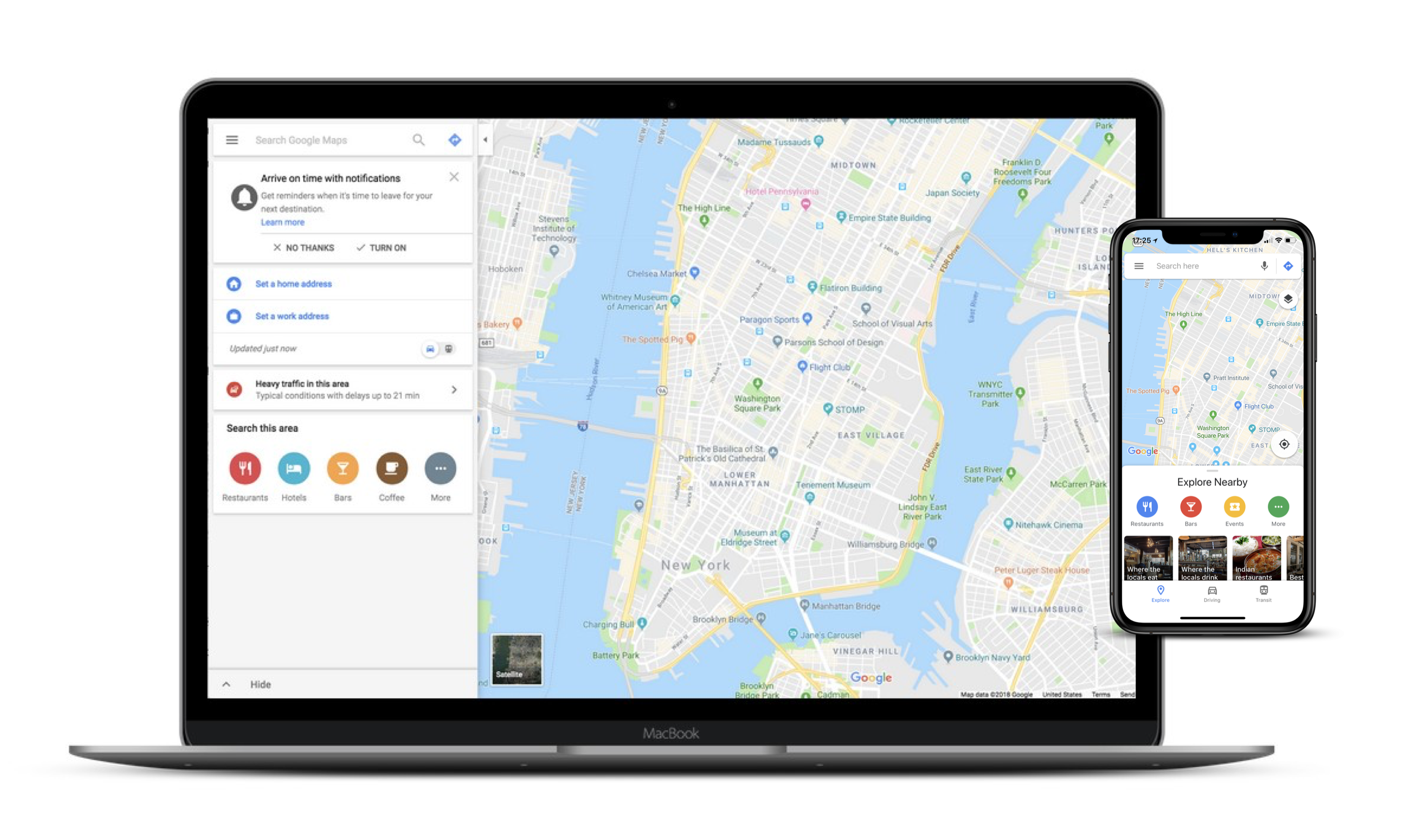
When it comes to “consistent” and “synchronization”, Google products are no doubt the pioneers. Most of its products provide great consistent experience across different platforms, especially Google Search and Google Map. They are very similar on desktop and mobile, just different on the layout and how much information showed on the first screen (because of screen sizes). However, there is no navigation feature on the desktop of Google Map because users are not moving when they on the desktop. On the other side, navigation is an essential feature on its mobile app. Moreover, voice control is another unique thing on the mobile app because of the hardware capabilities and use cases.
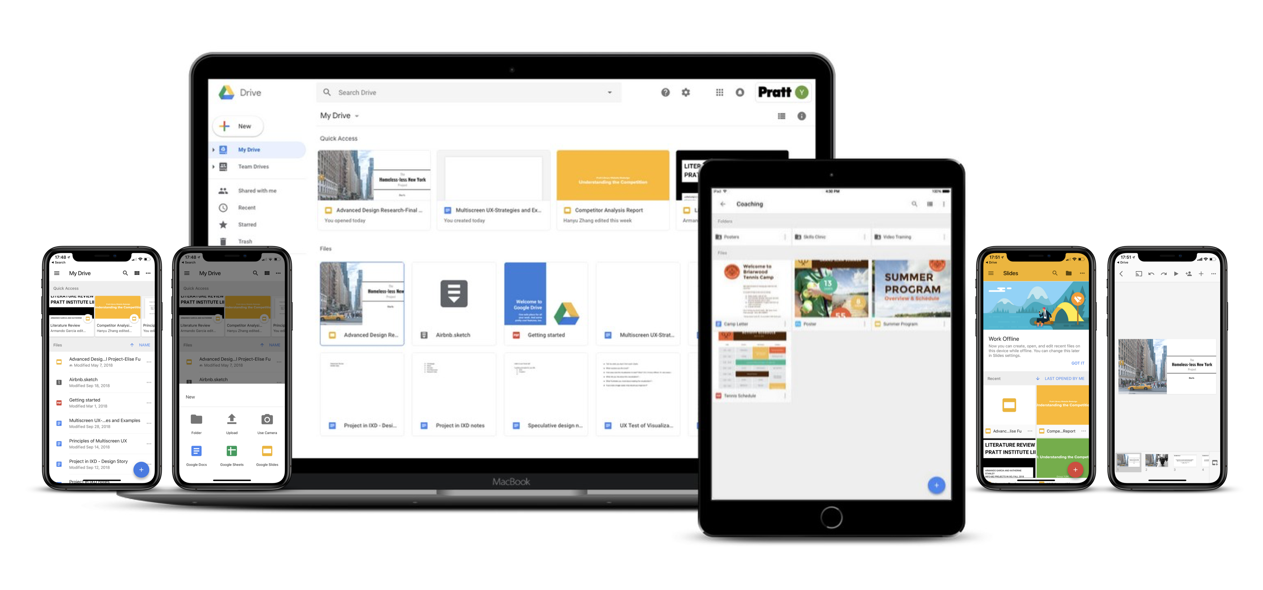
In terms of G-suite products (Docs/Sheets/Slides), they are great on “synchronization”, although with varied focus on different devices. Different from Instagram, the center of G-suite products is on the desktop, where users are fully powered to create, edit, share and delete their files. While on the mobile app, the main use case is browsing instead of editing. Although the apps are trying hard to provide full functionalities, they are clearly optimized for browsing on mobile, which is a right way to ensure a good mobile experience.
Kindle and Medium
Consistent + Continuous
(Device shifting, Synchronization)
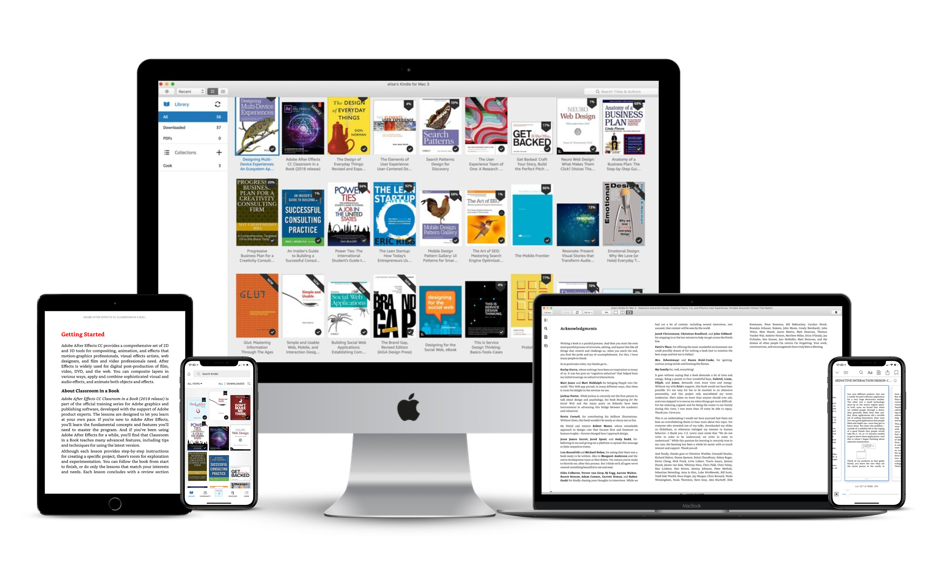
Reading is always a “continuous” activity. In the digital world, it means people use different devices to read. Or, find something to read first, and then read it.
The desktop app of Kindle is great for looking up information or scanning books, because the large screen can fit up to 3 pages on one screen. On mobile, either tablet or phone, you can only read one page at a time. Thanks to the “synchronization”, it’s very easy to jump from one device to another device while reading a same book because it saves your reading progress.
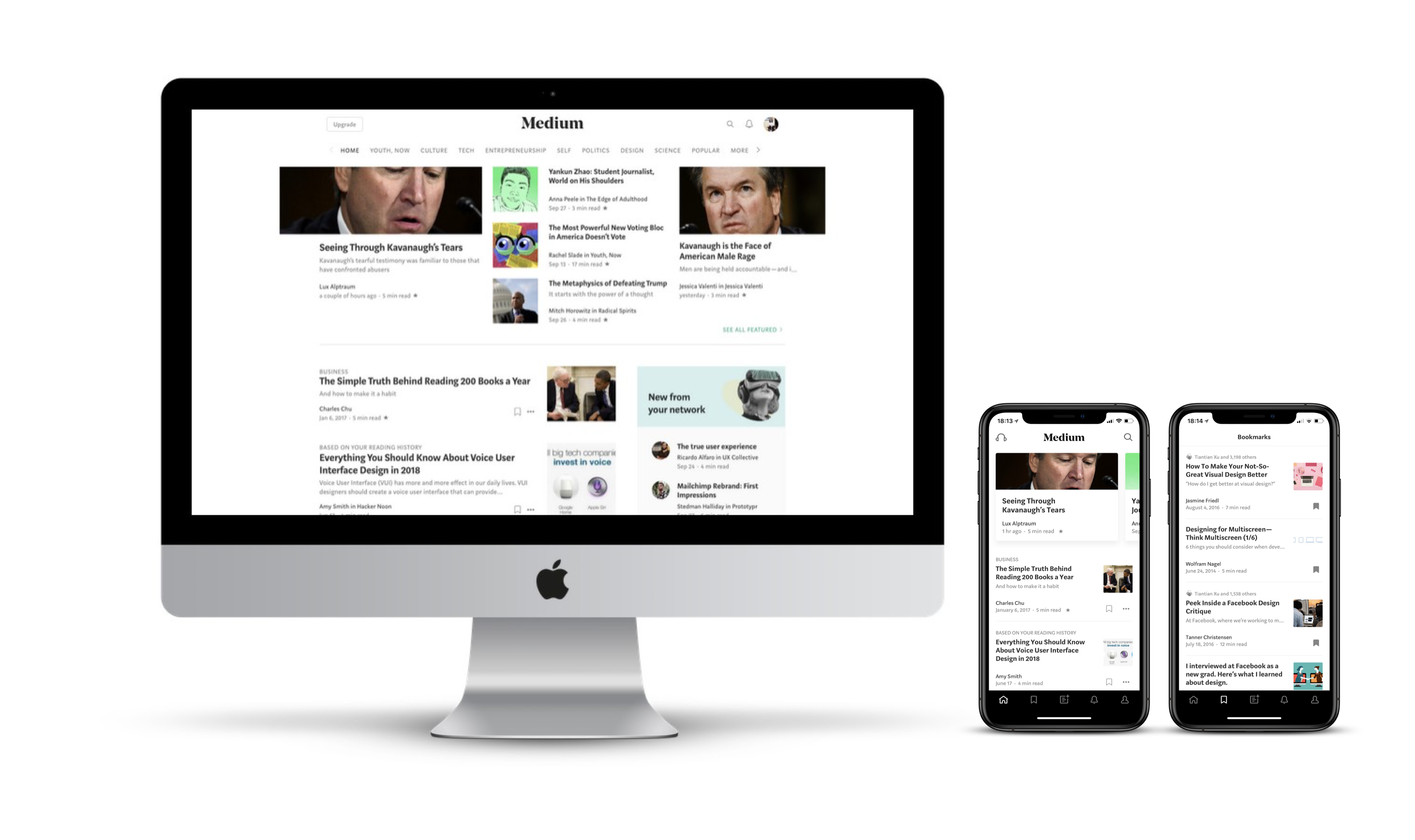
Similar to Kindle, Medium provides consistent and continuous experience on desktop and mobile, but the Medium mobile app is better optimized for the device capabilities. The “Audio” and “Bookmarks” are more prominent on the homepage on its mobile app than on the desktop. Because users are more likely to listening than reading when they’re moving, and it will be more convenient for them to start reading (from their bookmarks) than looking for something new to read. It also works better on “communification” with a stand-alone tab of “Activity” on the mobile app for users to check other users’ activities related to their post and to follow other users.
Netflix and Spotify
Consistent + Continuous + Complementary
(Coherence, Fluidity, Synchronization, Screen Sharing)
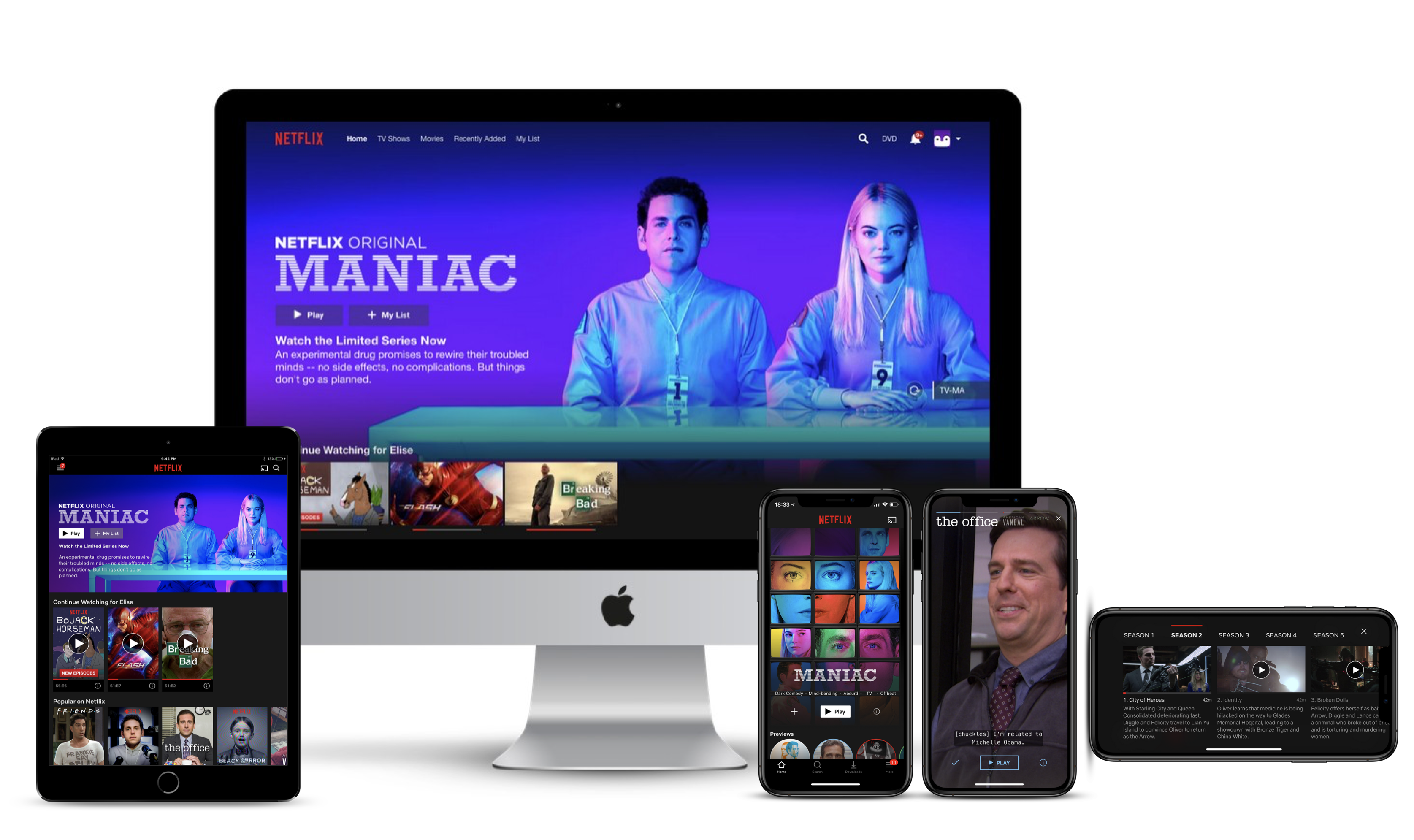
After gathering all the examples, I found entertainment industry is trying the hardest on multi-screens experiences. They are building all the relations among all devices.
Netflix provides consistent experiences among devices, and optimizes for each of them. On tablet and phone, the “Download” option is very prominent since they know most users don’t have a lot of high-speed data to abuse on mobile. The screen will turn to horizontal automatically when it stars playing for best watching experience. A new trick I just noticed is they have “(Instagram) story-like” previews for users to glance before clicking “play”, which is also clearly optimized for mobile. Users can also easily connect and play the show on TV from their phone or tablet, as long as they are in the same Wi-Fi networks. In the meantime, the phone or tablet can be used as a remote while watching Netflix on TV.
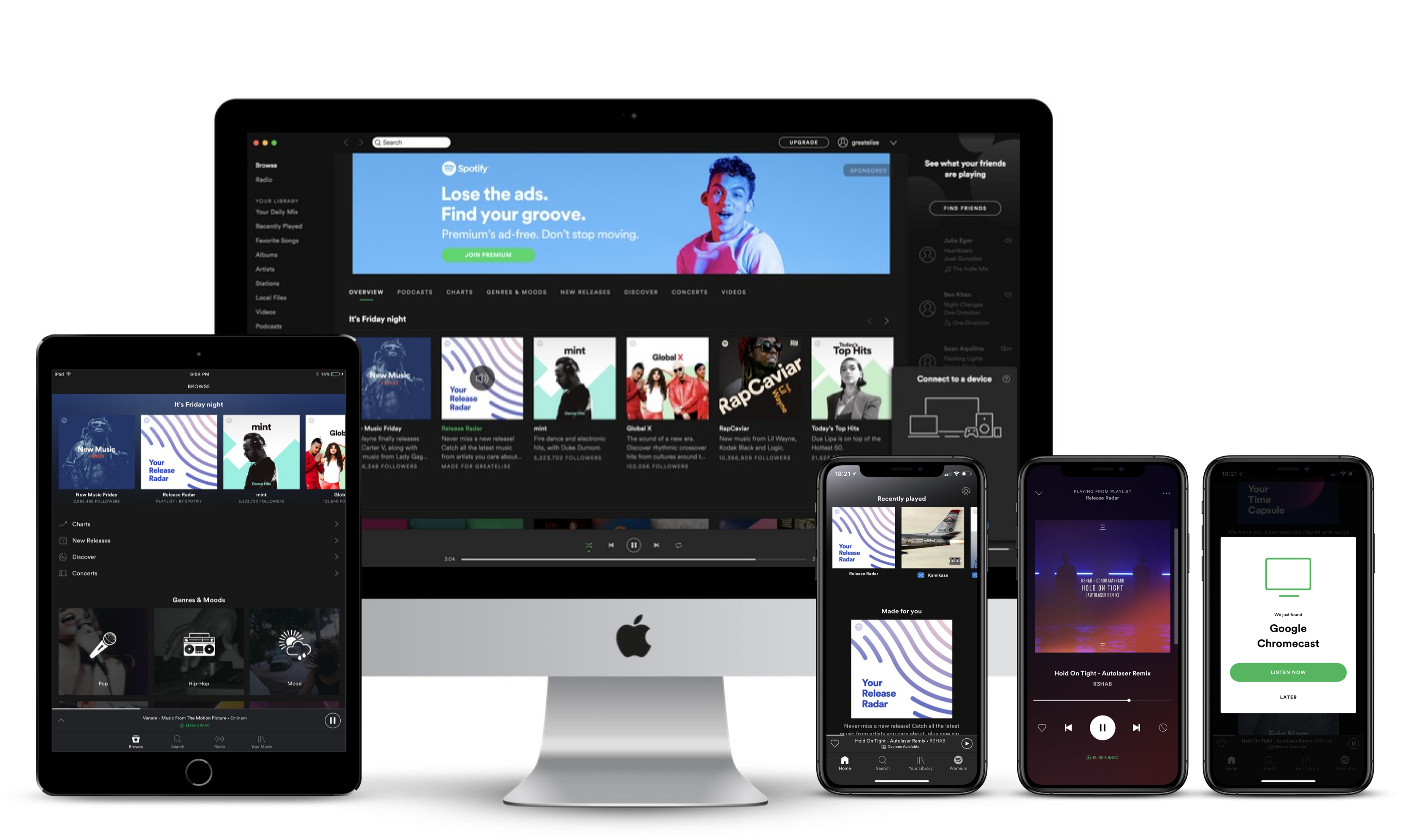
On Spotify, it’s also a pleasure to switch from one device to another. Users can play and control music on their desktops using phones or tablets. Discovering (music) works better on the desktop because larger screens can contain more information. Its mobile app is also equipped with voice control for users to search for music by talking. Try saying “play something special”, you may get a song that surprises and delights you.
Conclusion
Although there are many strategies to follow, multiscreen design is still a case-by-case challenge. If you ask me what is the ultimate strategy, I will say: think about what to focus on each device, and then design for it. On different screens, things that have to be changed is layout and navigation; things that best not to be changed is content; things that could be optimized is additional features or the priority of features (based on device capabilities). And most likely, it is the last one makes the multiscreen design standout.
Reference:
Nagel, W. (2017, January 24). Multiscreen UX Design – Developing for a multitude of devices.