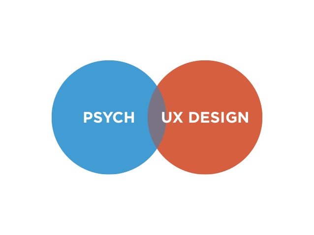
User Experience design is all about understanding users. In order to be a good UX designer or interaction designer, we have to know that we are not solving our own problems, but users. With Gestalt psychological rules and theories, we can add more value to our products by better understanding users’ behaviors, emotions, and motivations. Using Gestalt principles can not only help the designers create fantastic products, but also assist you to convince your boss, customers, and engineers to say YES!
The Background of Gestalt Principles
Gestalttheorie, one of the most important schools of psychology, rose in Germany in the early 20th century and is also called Gestalt Psychology. It was founded by three German psychologists, Max Wertheimer (1880-1943), Wolfgang Köhler (1887-1967) and Kurt Koffka (1886-1941), on the basis of the study of Apparent Motion phenomena.
The Gestalt school advocates that the human brain operates in a holistic way, “The whole is other than the sum of its parts.” For example, our perception of a flower does not only come from the shape, color, size of a flower, but also from our past experience and impressions of a flower, which adds up to our perception of a flower [1].
The whole is other than the sum of the parts. – Kurt Koffka
How Can We Use Gestalt Principles in Our Design?
In this section, I am going to talk about the 4 most important Gestalt principles and how to use it.
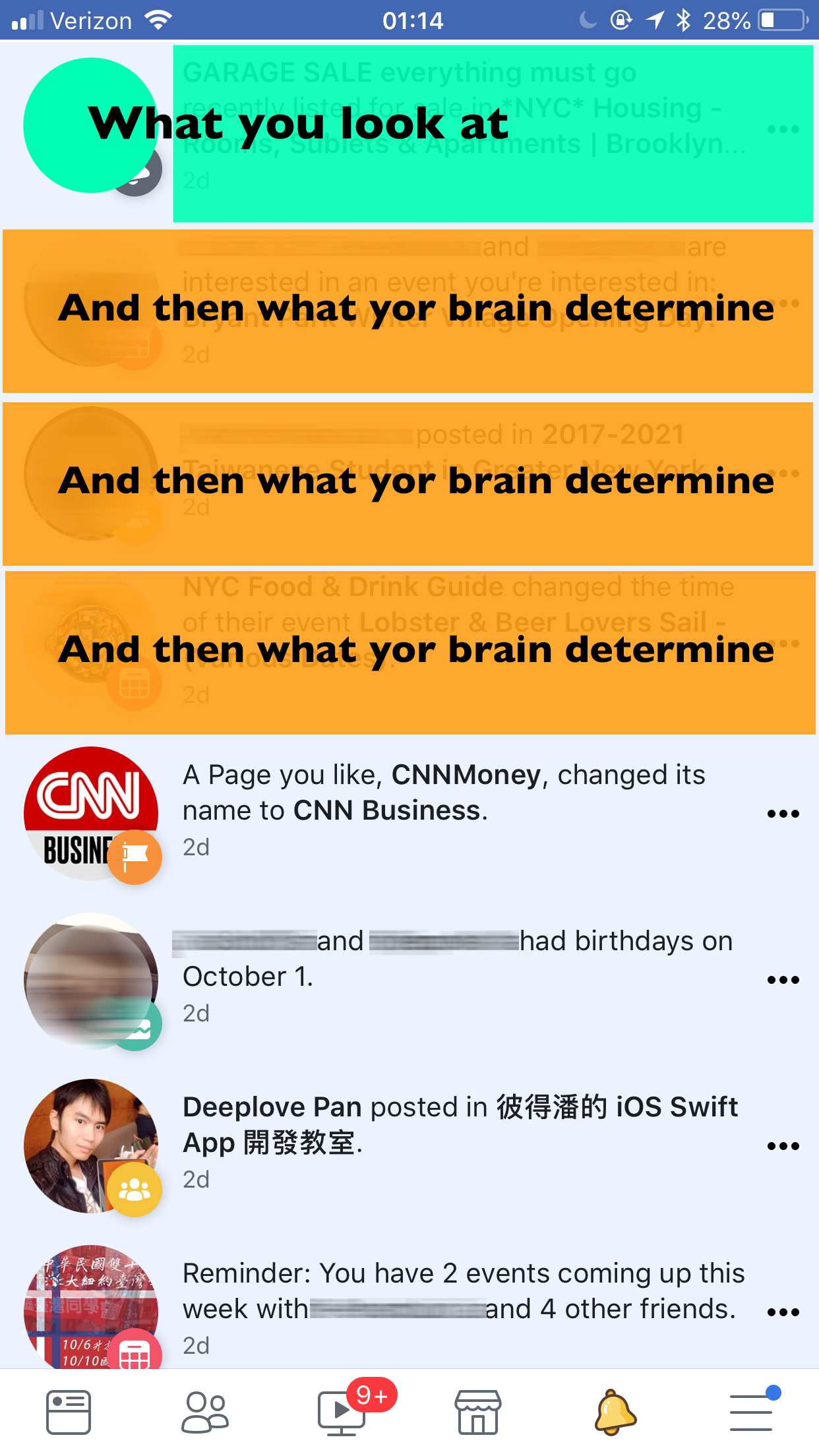
Law of similarity – We seek differences and similarities in an image and link similar elements [2].
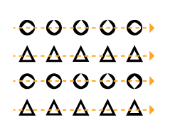
If several elements have similar sizes and colors, users will automatically associate these elements with each other. This is because our eyes and brains are more likely to organize similar things. Our brain will determine the same things as a whole. As the picture above, when a series of triangles and circles are displayed side by side, we will see a row of circles and two rows of triangles.
When applying the law to user interface design:
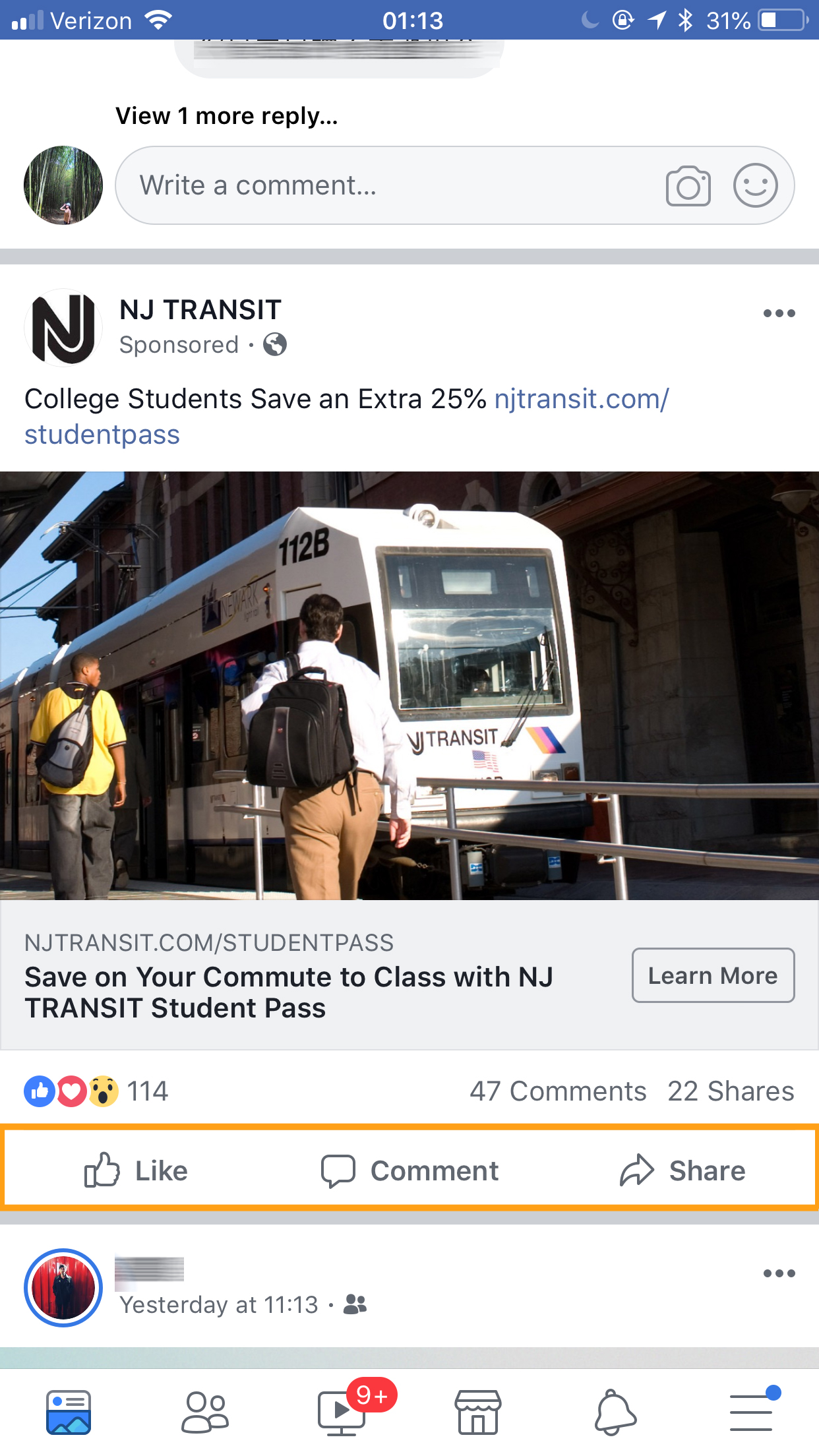
Even though the button icons below each FB article (press Like / Comment / Share) have different functions, users will see them as the same level of functions because of their visual similarities in color, size, and arrangement.
Law of proximity – We group closer-together elements, separating them from those farther apart [3].
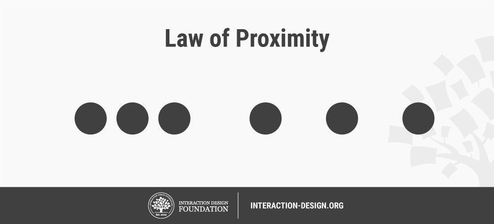
If we look at the three circles on the right side, we will think that the three circles are independent individuals. And then, when we look at the three circles on the left side, our brains will automatically determine these three circles as a group because the different distance between similar objects will affect the cognition of the brain. Thus, similar objects with relatively near distance will be determined as the same group by the brain.
When applying the law to user interface design:
In the previous rule, I mentioned that the brain will classify objects of the same shape into the same group, but in this picture, because the circles and rectangles are closer together (See green colors above), the brain will give priority to identifying these objects as the same group (See orange colors above).
Law of continuity – We follow and “flow with” lines [2].
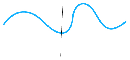
Our brain will see things as continuous forms. For example, when we look at the picture above, we can still identify the blue line as a whole wavy line and would not be disturbed by black lines[5].
When applying the law to user interface design:
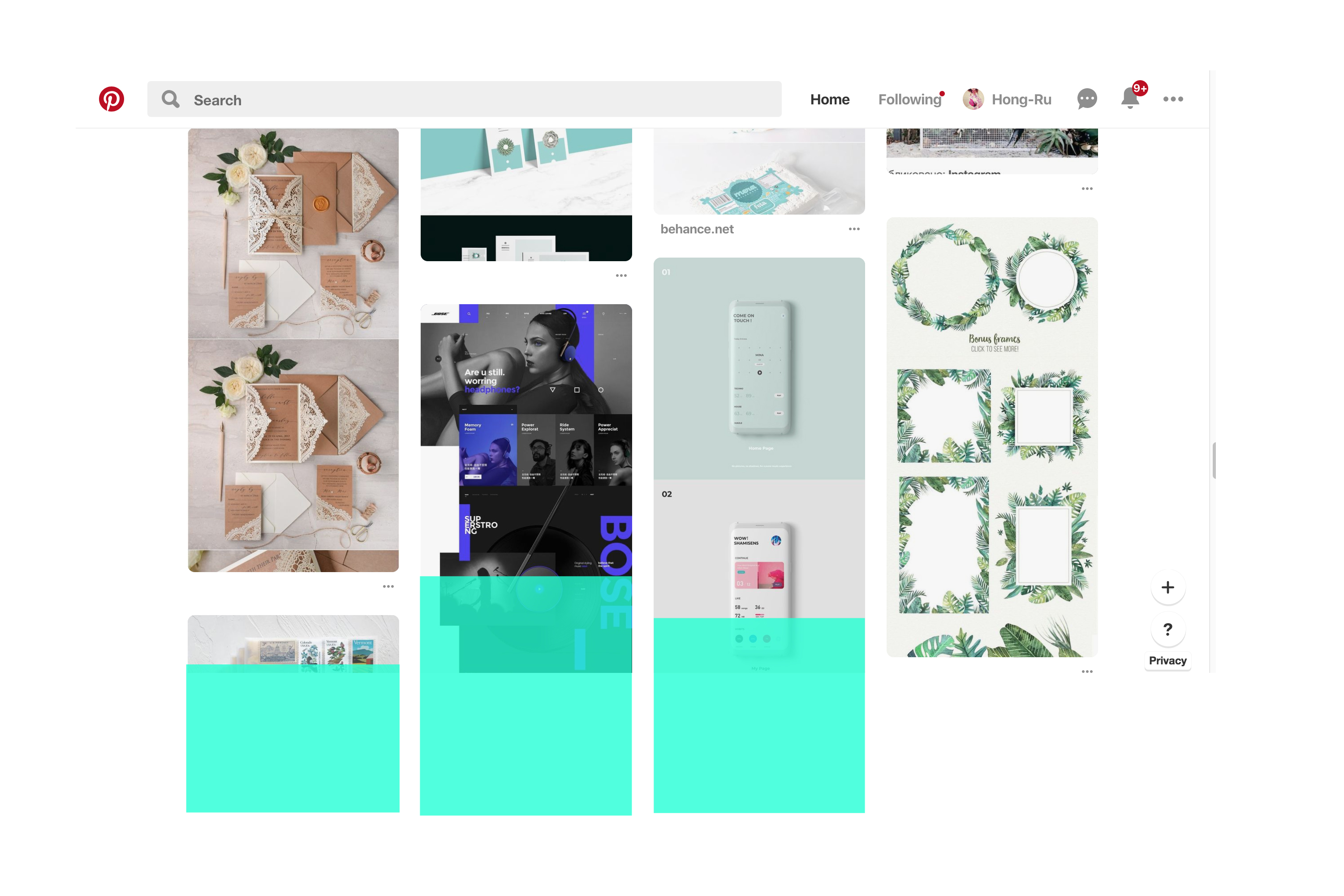
The law of continuity is very common in waterfall website layout. Even if the block-based card contents are limited by the height of the page, our brains will automatically continue to build the cards shapes (See green blocks above) and identify it as “unfinished content”.
Law of closure – Preferring complete shapes.
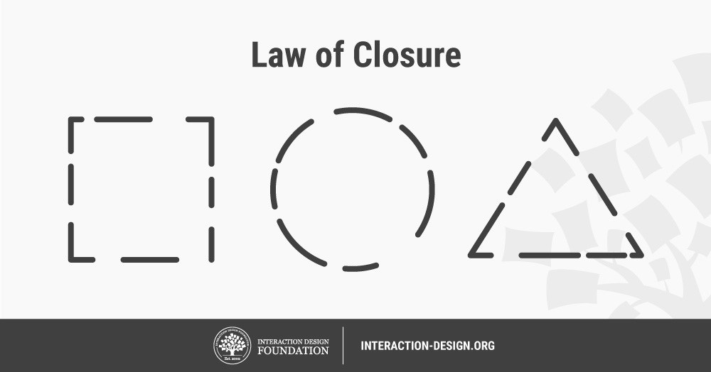
Like the image above, our eyes first observe a series of short lines that are not continuous, and then our brain begins to fill the gap between each line. Finally, these shapes will be recognized as a complete circle, square and triangle.
When applying the law to user interface design:
Because the images and the texts are arranged properly, these elements create the sense of stability in the website. Users would not feel messy. Although there are no clear boundaries between each image and the text (See the upper image), our brain will automatically fill the gaps between each content and creates some blocks in our mind (See green blocks in the lower image)[5].
Conclusion
Understanding psychology can help us know how brain think when people use products, and this can help us create user-friendly interfaces.
Cited and sources:
- https://en.wikipedia.org/wiki/Gestalt_psychology
- https://www.interaction-design.org/literature/book/the-glossary-of-human-computer-interaction/gestalt-principles-of-form-perception
- https://www.interaction-design.org/literature/topics/gestalt-principles
- https://www.pinterest.com/
- https://www.slideshare.net/SealTseng/ss-82594431
- https://uxplanet.org/psychology-and-product-design-dae4c4cff62c
- https://www.slideshare.net/MarissaEpstein/designing-for-brains-the-psychology-of-user-experience