Usability is important, well researched and designed interfaces are
- Communicative and persuasive
- Guide, limit and create a user’s actions and experience to help meet needs
- Are related to and fulfill deeply rooted emotions
As researchers we’re acutely aware of this, at every stage we attempt to capture a user’s attention and we have a many powerful tools in our kit to optimize for this- Normanian principles, design thinking and usability testing, etc just to name a few.
However, ultimately, companies profit off every second of engagement and emotion and sometimes those goals are at odds with the wellbeing of a user. So the question remains- “how do you ethically steer the thoughts and actions of two billion people’s minds every day?”
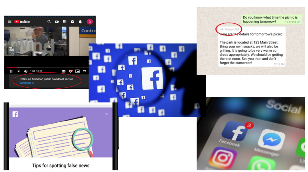
Recent events have shown us that design signifiers are vitally important- fake news is driven by hidden URLs and vital information is not displayed on Political ads, not because it’s unavailable but because they often interfere with the illusion of a seamless platform or interface. We are beginning to see that a user’s best interests might run counterintuitive to usability indicators.
Notifications
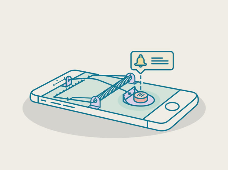
A common way that users are kept engaged is through notifications, everything about them, from the red color of the alert window to the times and frequency of occurrence are optimized to ensure that users return to an application or platform. However, research shows that bundling notifications has a significant impact on reducing user stress instead of the current system of on-demand or “pull to refresh” which ensure user addiction and reducing churn (Pielot). What if user research took into account more comprehensive factors, do heuristics need to take into account user stress and well-being beyond just measures of usability and ease of access? Friction is generally considered undesirable because it inhibits a user’s ability to quickly carry out a task but is it possible that strategic friction might actually be better for a user overall?
Infinite Scroll
Another ubiquitous mechanism present in many interfaces is infinite scroll, research shows that users respond more to “visual cues” than to their own “internal cues”. So when limits like pagination are removed, a user spends more time on a platform, sometimes without realizing or intending to. Interactions like infinite scroll take advantage of interface breakthroughs that lean too far into user’s visceral, behavioral or reflective impulses however, they may not serve a larger societal goal.
It is clear that usability experts are good at understanding user behavior but they often fail to anticipating user values. This is where approaching usability research from a more holistic perspective is immensely important. Value sensitive design begins with usability and with an unbiased evaluation of the stakeholders involved- companies, institutions, users and society. This shifts the paradigm of user testing a little bit- perhaps adding another dimension to the host of methodologies researchers are trained to apply. It changes the criteria by which researchers judge a interactions, interfaces and platforms.
Tristan Harris, former design ethicist at Google, is currently developing a “framework for ethical persuasion, especially as it relates to moral responsibility”. The conversation on how best to do this is only beginning, these are important questions that researchers must grapple with as the devices and interfaces they create become more connected and pervasive.

