All designers should aim for an experience that removes as much friction as possible and creates a usable digital experience. However, it is rare to simply want to create something that just exists. It should be interactive, people should be motivated to use the product.
To create such a product that aims to engage the user, designers often use surprising and different approaches in their designs. But how can this effectively increase user engagement?
“Surprise can be a very minor change that adds flavor and variety to an otherwise routine experience”.
– Stephen Anderson
Our brains actually get a brief “high” from solving a problem. We delight in bringing order to the chaos. And there is a reason for that: Categorizations is a strategy our brains use to more efficiently process information.
Categorical Thinking and Puzzles That Need Solving
In 1998 a trio of researchers at the University of Washington published a paper that many see as evidence that unconscious, or “implicit”, stereotyping is the rule rather than the exception. It is called the Implicit Association Test (IAT) and has become one of social psychology’s standard tools for measuring the degree to which an individual measures the strength of associations between concepts. I want to use this test as a tool to explain how every user categorizes information on a very basic level.
Here is how the test works:
In the IAT a subject responds to a series of items that are to be classified into four categories – typically, two representing a concept such as flowers versus insects and two representing an attribute discrimination such as pleasant versus unpleasant valence.
Here is what we can take away from the IAT: when the labeling you are asked to do follows your mental associations, it speeds you up, but when it mixes across associations, it slows you down. This means that every pattern that we can follow, understand, and which makes use of our knowledge of the world will make us move through content quickly, but when this knowledge and expectation is being challenged one has to slow down and think about what this means.
This categorizing and natural seeking for patterns in information can be used to an advantage.

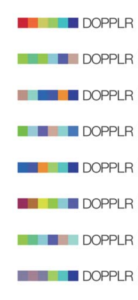
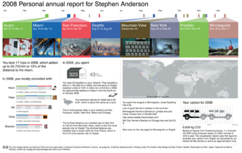
Anderson gives an example of how pattern seeking behavior was encouraged by DOPPLR, the free social networking service, launched in 2007, that allowed users to create itineraries of their travel plans.
When starting to use DOPPLR the logo would catch the users eye: it seemed to change. It was always six colored blocks but the colors shifted in subtle ways over time. The changes were never random – there were always remnants of the colors that had been seen previously. But was was the patter?
Since these changes were obviously not random, the user feels tempted to figure out the pattern, or rule, governing these changes. This is a puzzle to be solved!
Here is the solution: each city has a unique hex code and the colors change depending on every users travel pattern.

Conclusion
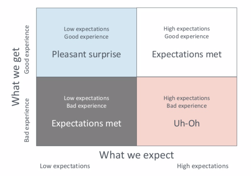
In her talk “| Are you Failing the Most Important Design Challenge?” at World IA Day 2019 in New York, Whitney Quesenbery spoke about the importance of falling into the category of pleasant surprise when a user is interacting with a product or service.

When keeping in mind that a user is naturally categorizing information, a carefully designed service or product that can make use of slightly disrupting the flow, making the user think, creating a pattern out of it and ultimately letting the user find the solution, it can possibly create a very pleasant and engaging experience.
It is however important to remember to keep the challenge hard enough to keep the user engaged and easy enough to not let the user get frustrated.
In conclusion, it is important to acknowledge the fact that information is categorized on you website, app, digital interface, etc. and to understand what these categories are and patterns they create. Patterns can be used to create pleasant surprises to go from only decreasing friction on the site and to improving motivation to use it.
References
Anderson, Stephen P. Seductive Interaction Design: Creating Playful, Fun, and Effective User Experience. Berkeley, California: New Riders, 2011.
Implicit Association Test (IAT). https://implicit.harvard.edu/implicit/index.jsp
Mlodinow, Leonard. Subliminal: How Your Unconscious Mind Rules Your Behavior. New York: Pantheon Books, 2012.
Porter, Joshua. Designing For Social Traction. 2011.
Quesenbery, Whitney. “| Are you Failing the Most Important Design Challenge?” at World IA Day 2019 in New York. February, 2019.
