Introduction
During my time supporting a US defense project, I found myself more privy to my privacy needs and started using a Google Voice number as an alternate to my real number for calls, texting and online usage.
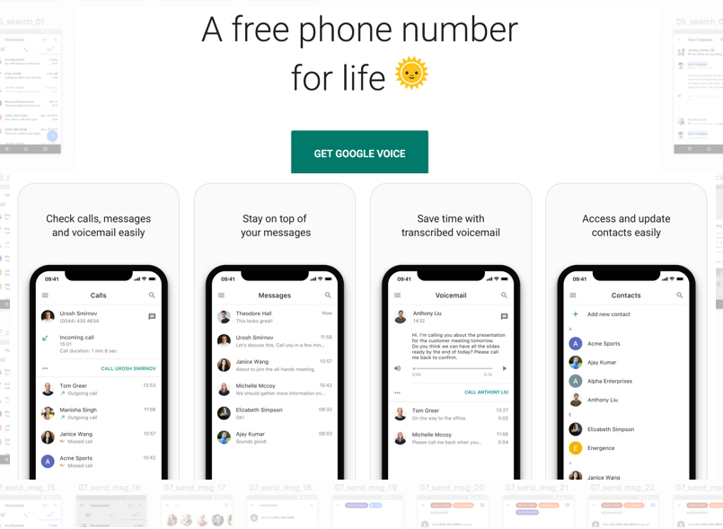
Google Voice gives you a phone number for calling, text messaging, and voicemail. It works on smartphones and computers and syncs across your devices so you can use the app in the office, at home, or on the go.
Google provided a major update to its Google Voice App interface last year along with another Material Design update for the app last week. However, there are still a number of UX design opportunities for this App.
Critique
 Visibility: Separate Tabs for Main features
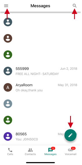
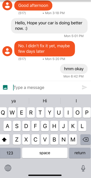
On opening the application, there are four separate tabs that lead to Google Voice’s main features: Calls, Contacts, Messages, and Voicemail. Users can immediately locate the features using proper signifiers as shown below. Further, one can easily locate the Hamburger Menu on the top left, Compose Message icon on the bottom right and the Search filter on top. During a text conversation, it also improves the visibility of the message sender by taking advantage of the mapping principle. The conversation text from a user (sender) is represented using grey color while as in this image below blue is used here for others which helps distinguish the messages.
 Poor Notifications for text messages
Google Voice App for iOS does not provide any Read receipts or notifications as yet.
Recommendation #1
By applying the principal of Feedback Include delivery and read receipts for users sending text messages. Also, It will help to show the other user an indication like an icon (as below) when the sender is typing a message in reply and the message is still being sent.
• Sending: The message is still being sent.
• ![]() Sent: The message was sent to Google servers.
Sent: The message was sent to Google servers.
• ![]() Delivered: The recipient received the message.
Delivered: The recipient received the message.
• ![]() Read: The recipient has read your message. Tap the message to find out what time it was read.
Read: The recipient has read your message. Tap the message to find out what time it was read.
Note: In group messages, the status will update when all contacts receive or read a message.
 Conceptual model for Messages
The Conceptual model of sending text messages meets users’ expectations for this App. It includes ‘placeholder’ text as a hint inside the input field for typing message. A user can also predict various actions while drafting a message, wrapping text and using ‘send icon’ for delivery.
 Restricting Access to Photo Albums
The new revamp of the Google Voice App finally allows MMS messages. But when selecting an image from your phone, it doesn’t allow you to include pics from different iOS Photo albums. A Constraint is applied so, a user can only pick from default camera roll album.
Recommendation #2
Allow User to select images from any available photo albums on the user’s phone.
Current – > Proposed
 Mapping: Generic Search vs Message Search
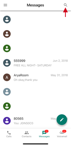
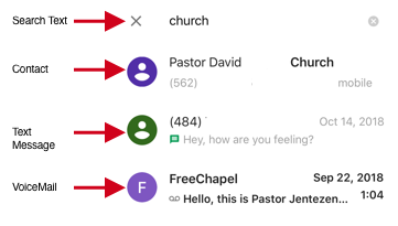
The App can gain from improved Mapping. The Search function searches through contacts, calls, voicemails as well as text messages irrespective of the tab where a user is performing this search. This could be really confusing for the user.
Recommendation #3
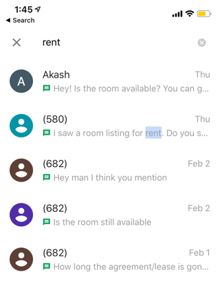
Allow tab specific search for the user. When using the Search functionality, while the user is using the text messaging tab; it should only search for text messages. When the user is inside the contacts tab then the same should search for contacts and so on.
Click on Search icon while in Messages tab.
Current Message Search: Results show contact numbers and voicemails along with text messages.
Proposed Message Search: While searching inside the Messages tab, results come up
for text messages only.
Conclusion
Overall the newly updated Google Voice App offers a far better user experience and design compared to its legacy version. Though at the same time, this App can gain a lot by improving on a few of the design principles following recommendations suggested above.
