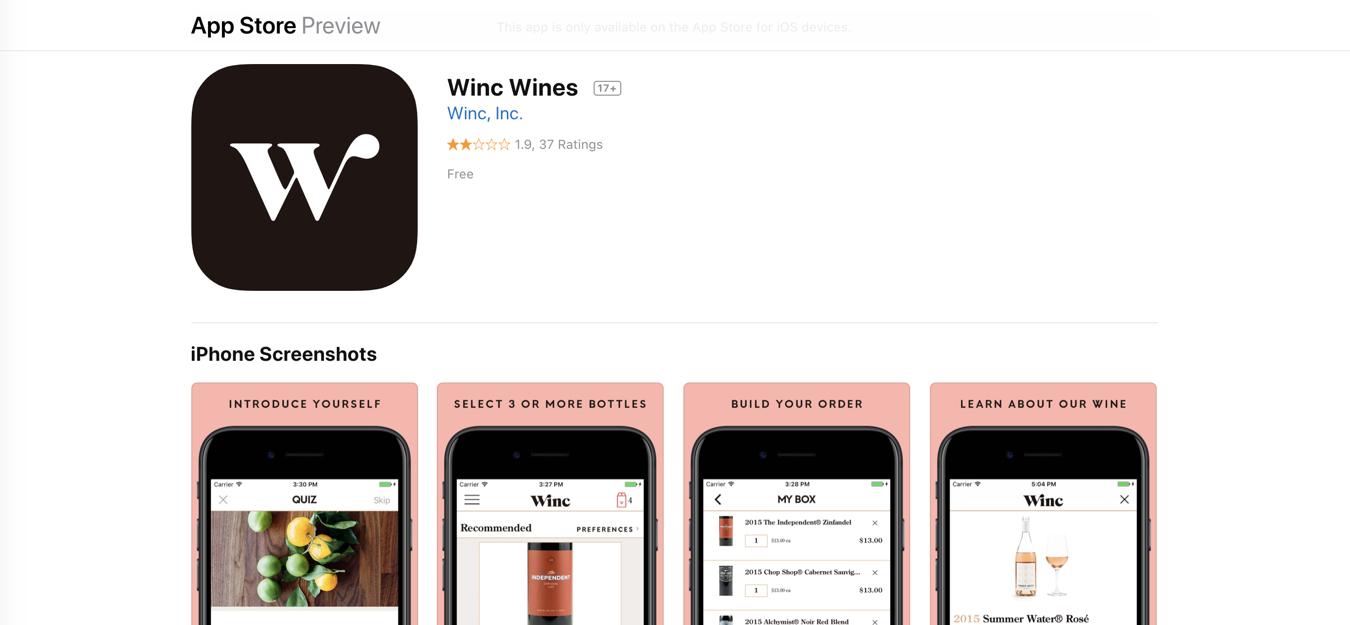
Introduction
Winc is an iOS app I use to order wine online. Users take their simple 6-question Palate Profile Quiz and Discover their personalized wine recommendations. The selected wine will be delivered per month. Users can use the app to:
- Sign up/Sign in
- Manage membership
- Discover personalized wine recommendations
- Customize orders
- Ship box immediately
- Rate wines
- Invite friends
In this design critique, I am going to analyze the experiences of Manage membership, Discover personalized wine recommendations, and Customize orders.
Manage Membership
Overall Rating: ★★★☆☆
Well Designed:
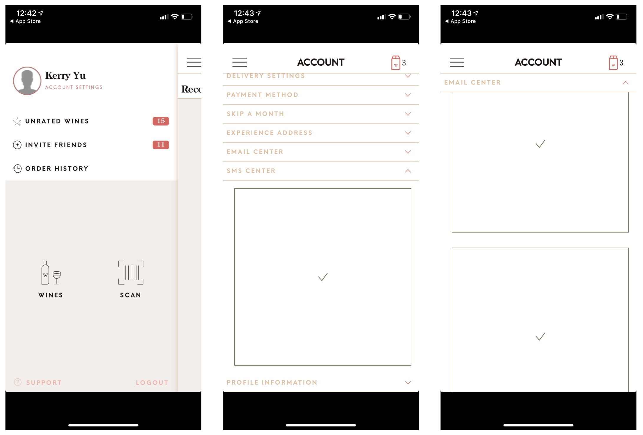
To get access to membership, there are only two tappable icons provided. One clearly indicates the number of wine user added(top right). Proper using of semantic constraints suggests that users should tap the “hamburger button” to find their membership information even though it is the knowledge of head that “hamburger button” means “menu”.
Could Be Improved:
Invite Friends is highlighted while not being used by users often. The highlighted number causes problems because it dominates over other more useful features too much, which is not designed with the needs and interests of the user in mind.
The SMS center and email center has poor mapping and system image, the user flow is incomplete, users can’t predict the outcome after checking or unchecking all the checkboxes.
Recommendations:
The action of “Invite Friends” can be designed when users finish their order. So it won’t appear every time in the menu with the red notification. After failing to clear the red notification multiple times, users would decide that they cannot do the task and ignore it. Relocating the“Invite Friends” action to the finishing order stage will provide a better user-centered design.
Clear word instructions (what type of text message and email services they will get) can be provided with the checkbox, which will improve the visibility of the design and complete the system image in order to make the users know what to do and understand the outcomes.
Discover personalized wine recommendations
Overall Rating: ★★★★☆
Well Designed:
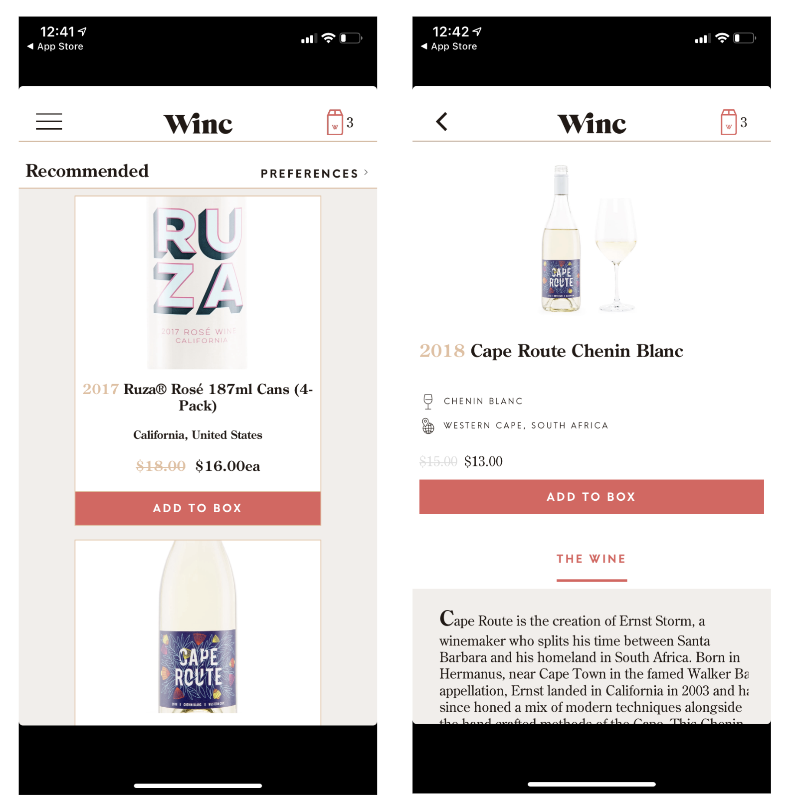
The experience of discovering personalized wine recommendations is designed with clear and separated cards with the name and the location of the wine, the price, and an “ADD TO BOX” button, which provides great visibility and natural mapping. Users know exactly what they will expect after tapping the button. After tapping “ADD TO BOX” button, the number of wine added will show on the top right which provides solid feedback.
Could Be Improved:
There are no clear instructions on how to get access to the detailed description of the wine, users have to rely on their knowledge of the head to tap the card to get to the destination, which also doesn’t help users complete a smooth seven stages of the gulfs of execution and evaluation.
Recommendations:
By adding a light grey background color and a simple Learn More button will improve the affordances of the card and provide a better conceptual model. Users will know the physical properties of the “Learn More” button affords to tap and the outcome from that would be the detailed description of the wine.
Customize orders
Overall Rating: ★★☆☆☆
Well Designed:
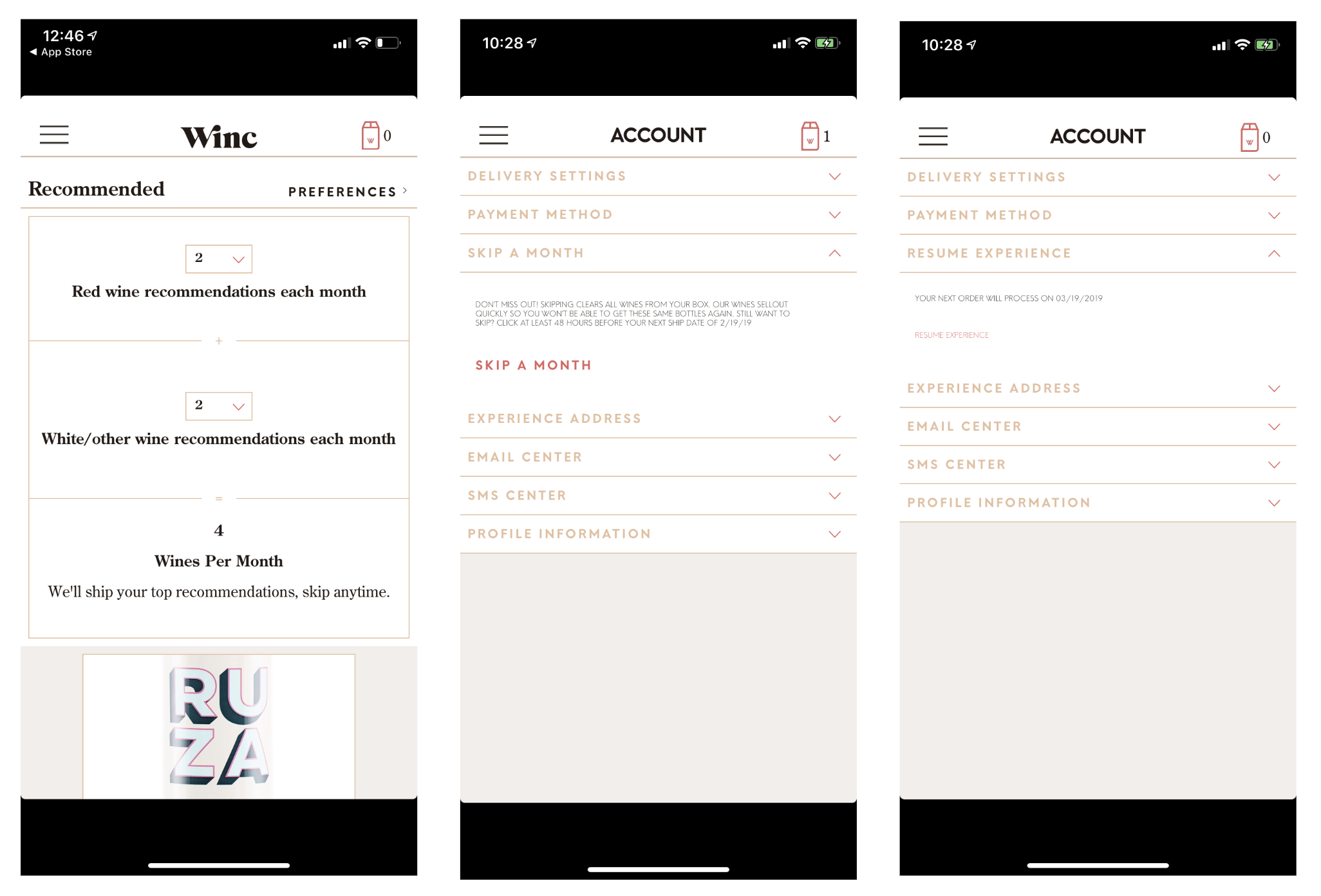
The experience to choose the preference wine has a good balance between usability and aesthetics which makes it easier to use. Two clear selection boxes are provided to customize the amount of red wine and white wine with no other useless features. The total number of wines per month changes after the selection which provides good feedback.
Could Be Improved:
Users can’t cancel the order or the monthly subscription without contacting the support, which also leads to a low rating result in Apple Store (two stars). With the current design of the ordering system, wines are sent monthly even without personalized selection, which creates Loss-of-Activation Errors and makes users feel stupid by forgetting to choose their wines.
Recommendations:
To prevent human error, it’s better to make it possible using the app to cancel the order by adding a “Cancel Order” section under the menu. Notifications should be sent before the order date to remind the users to pick their desired wines, which will create a better system with less human error.