If you checked the design principles of making good designs, you’ll easily find out that good design always has a high correlation with psychology. For most of the time, human beings need to “understand” the design through all our sensations. We see objects to read the signifier that would help us to make the first move, then we touch it to check the logic mainly based on the mapping logic through the feedback. The desire of understanding things comes from “control”. By fulfilling the need for control, designers would be able to create better usability and UX. Placebo button is the most common one that makes the better UX but not better usability that fulfills the need for control. Thus, I’d like to share what I’ve learned from the placebo button and apply it to create better usability.
Born to choose
Before we right jump into applying placebo button in design, understanding the fundamental of human nature: born to choose-in order to control, would really help you make a better design solution on top of the theory. Scientists already have shown a lot of evidence to prove that the human race is born to have the need for control. I’d like to walk you through an overview of this human instinct from both biological and psychological aspects, so you would know the origins and the value of fulfilling the need for control.
Biological aspect
Leotti, Iyengar, and Ochsner (2010) claim that there is a brain region programmed to perceive control in the environment in order to generate the responses to the threats in that situation, then evaluate the possibility of survival. That brain region also helps to modulate the responses and mediate the regulation of emotion. When negative emotion affect is caused by the removal or restriction of control, the brain region would also activate a protective mode to reduce the negative biological impact on the human body. Thus, the assumption of “automatic perception of control seems to be essential for healthy functioning” and might cause “various manifestations of psychopathology” when disrupting perceived control (Leotti, Iyengar, and Ochsne 2010).
Psychological aspect
There are two major control theories to explain how human beings react to control in different contexts. Locus of control explains” whether the outcomes of our actions are contingent on what we do (internal control orientation) or on events outside our personal control (external control orientation) (Philip, 1985).” Illusion of control describes that people tend to “overestimate their ability to control events; for example, it occurs when someone feels a sense of control over outcomes that they demonstrably do not influence.” Both of the theories reach a conclusion that “the belief in one’s ability to exert control over the environment and to produce desired results is essential for an individual’s general wellbeing. (Leotti, Iyengar, and Ochsne 2010).”
The illusion of control is a usability issue
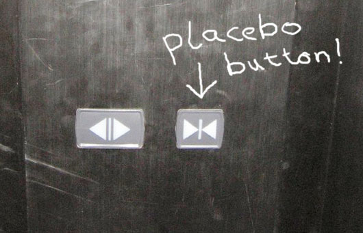
Fig 1. Placebo Button in Elevator
By far we’ve understood why there is always a need for control, and now let’s move on to how we can ensure good UX or usability by fulfilling the need. One of the most common approaches to fulfill the need for control is to apply placebo effect into designs, such as a refresh button in the app, or a crosswalk button in intersections. None of the button works, there is no direct connection between the action (pull/press) to the result, but it fulfills the need for control and makes the whole UX better since it’s “understandable” and fits the conceptual model.
However, sometimes this would cause usability issues since it can’t reflect the correct system status by giving feedback.
In my opinion, the notion of a placebo button is to “provide the users the feeling of control” in order to achieve better UX, not better usability since it’s kinda misleading. Thus, I’ll like to share my thoughts on how we should correctly use “the need for control” while designing products for better usability:
1. Give user choices, especially the undo or cancel option
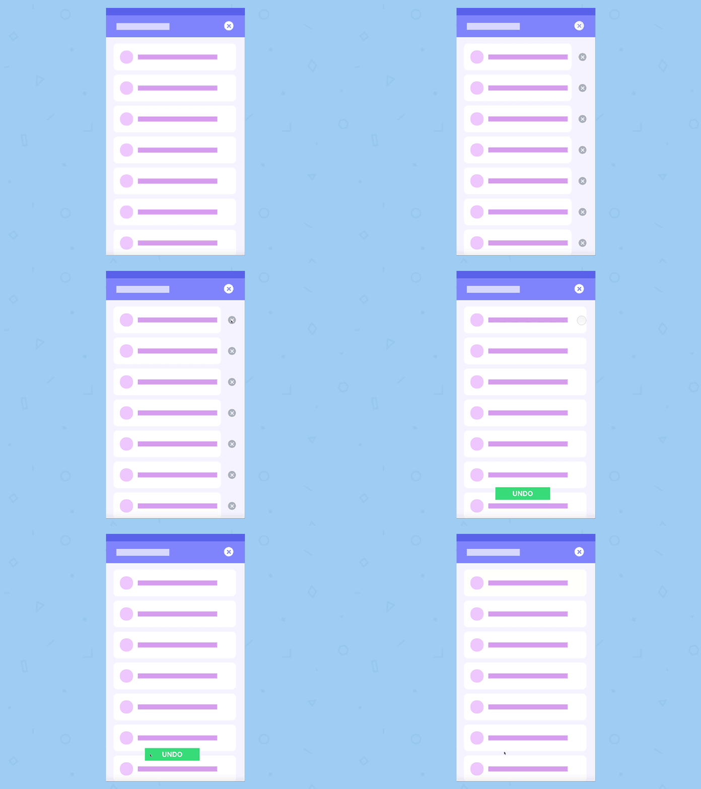
Fig 2. Undo design created by
Always provide users more than one options so they can “control” the results. Undo or cancel is essential since be able to recover from error can prevent some critical problems to happen.
2. Give users something to do when the system is down, but don’t fake the system status
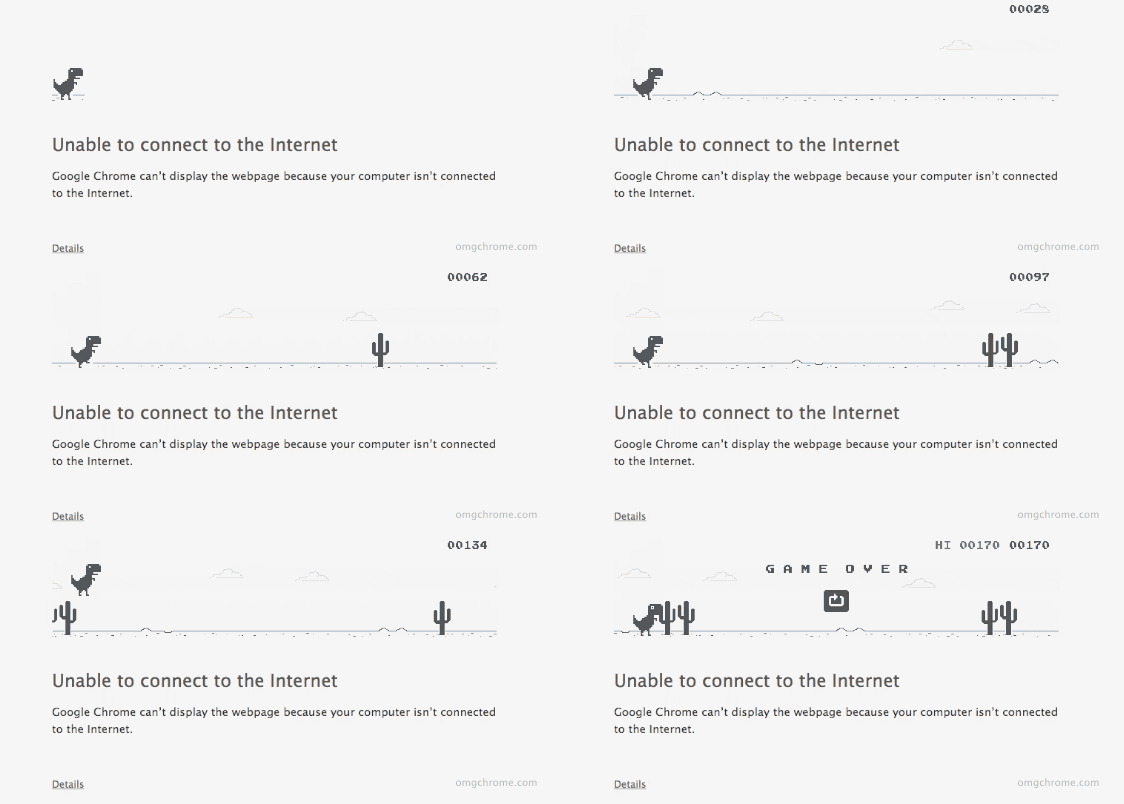
Fig 3. Google Small Game When Offline
Give users something to do that is separate from the main operation when the system is down. A small game to play is a good idea to let users feeling that they can still control parts of the systemwithout frustration. Don’t fake the system status so the users would still know the further action to do when the system seems not recovering back to normal.
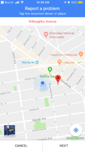
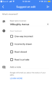
3.Provide a way to let users reflect their feedback, and show them you’ve heard it
Fig 4. Report Issue Feature in Google Map
Be able to communicate is also a way of control, by doing so, if the system eventually makes some changes, the users would think the environment is controllable. Even if you don’t take the suggestion, express that you’ve heard it still makes users think they have the power to control in some degree.
The placebo button reminds us of the importance of the “need for control”, not about to create the “illusion of control” that might cause potential usability issue, by doing it correctly, it could provide users both good UX and good usability.
Reference:
https://www.ncbi.nlm.nih.gov/pmc/articles/PMC2944661/
http://www.cond.org/deception.pdf
https://pdfs.semanticscholar.org/136e/9cf6b5a4d17dbe8400fa5d7f4bf3ad01f6ac.pdf
http://www.bbc.com/future/story/20150415-the-buttons-that-do-nothing
https://www.psychologytoday.com/us/blog/automatic-you/201611/your-world-is-full-placebo-buttons
https://www.nirandfar.com/2016/10/your-world-is-full-of-placebo-buttons-and-thats-a-good-thing.html
