Project Summary |
|||
|---|---|---|---|
Timeline |
My Role |
Goal |
|
| January – May 2019 | I was a UX designer, designing this product end-to-end from research to prototype | To completely transform the university library’s website in order to provide help to undergraduate students at their points of need |
Problem Statement
How Might We make it easier for undergrad students to get help in every step of their research process?
The current website is not ideal
The last time the site was designed was a couple of years ago and since then, changes have been ad hoc. At no point did anyone conduct user research.
- The website looks and feels very dated.
- Information is not structured properly
- Proper hierarchy has not been established
- There is no template for the site and every page looks different from the other
- It hasn’t been optimized for mobile
My 4 months summarized
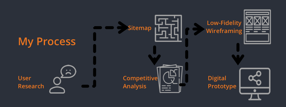
Design Process
“We want to prevent students from getting lost all the time” – stakeholder quote
Meeting with the stakeholder
Our initial meeting with the librarians at the SHU library convinced us that our focus should be on undergraduate students.
- They are the least experienced user group
- They needed the most help
- They were most likely to be intimidated by library jargon
Qualitative and Quantitative Research
Surveys, Interviews, and Observations
We triangulated research methods to accurately find out how comfortably students were using the library website and what they they actually used it for.
Survey |
I helped my team develop a survey that they then sent to about 40 undergraduate students. |
Interview |
I created an interview protocol and conducted 3 user interviews with undergraduate students at Seton Hall University. |
Observation |
Finally, I devised 3 observation tasks to see how these students interacted with the current website. |
But what did all of our collected data mean?
Analysis
We had collected an overwhelming amount of information on our users
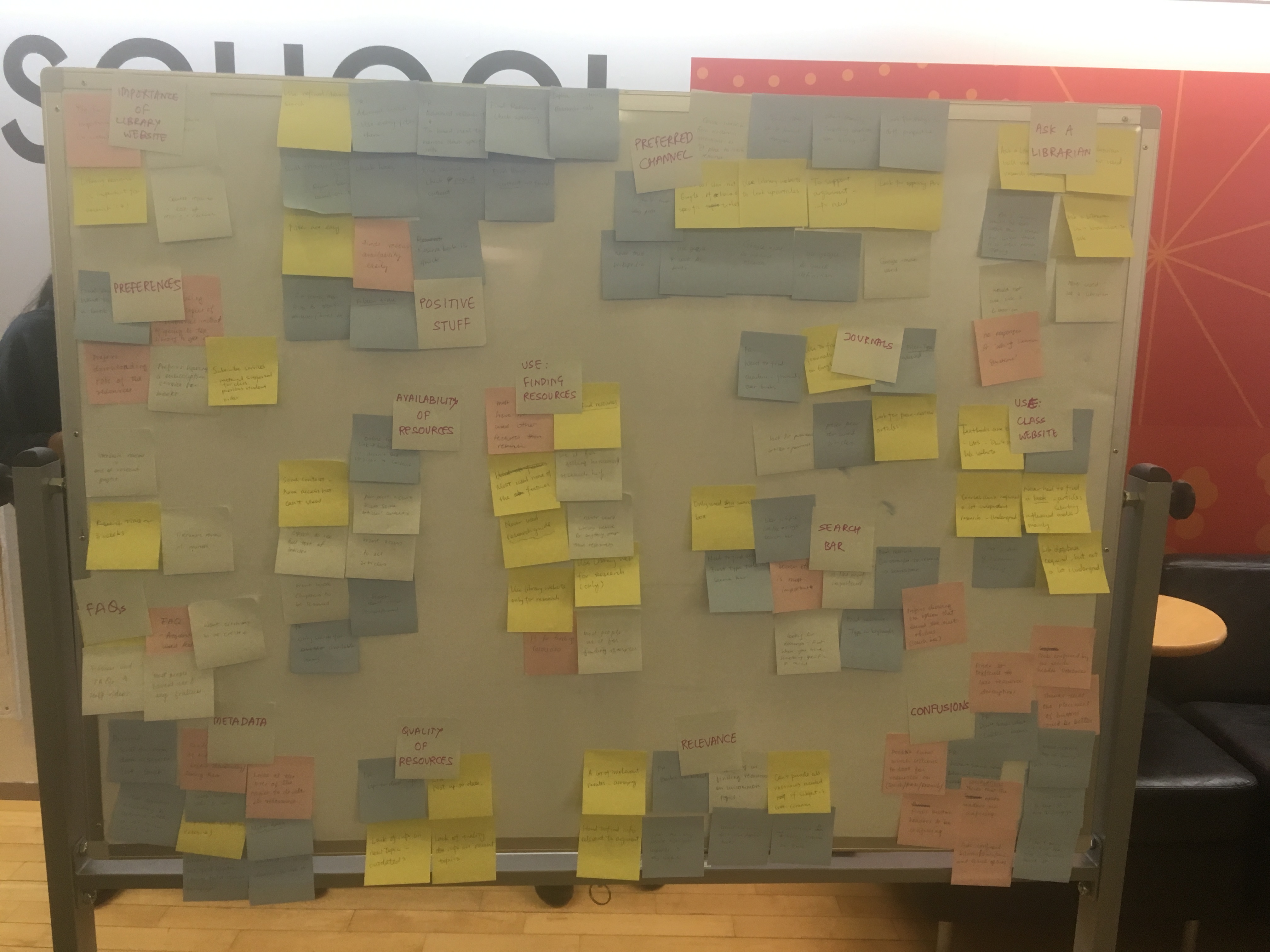
We spent 5 hours analysing, grouping, and making sense of our user data.
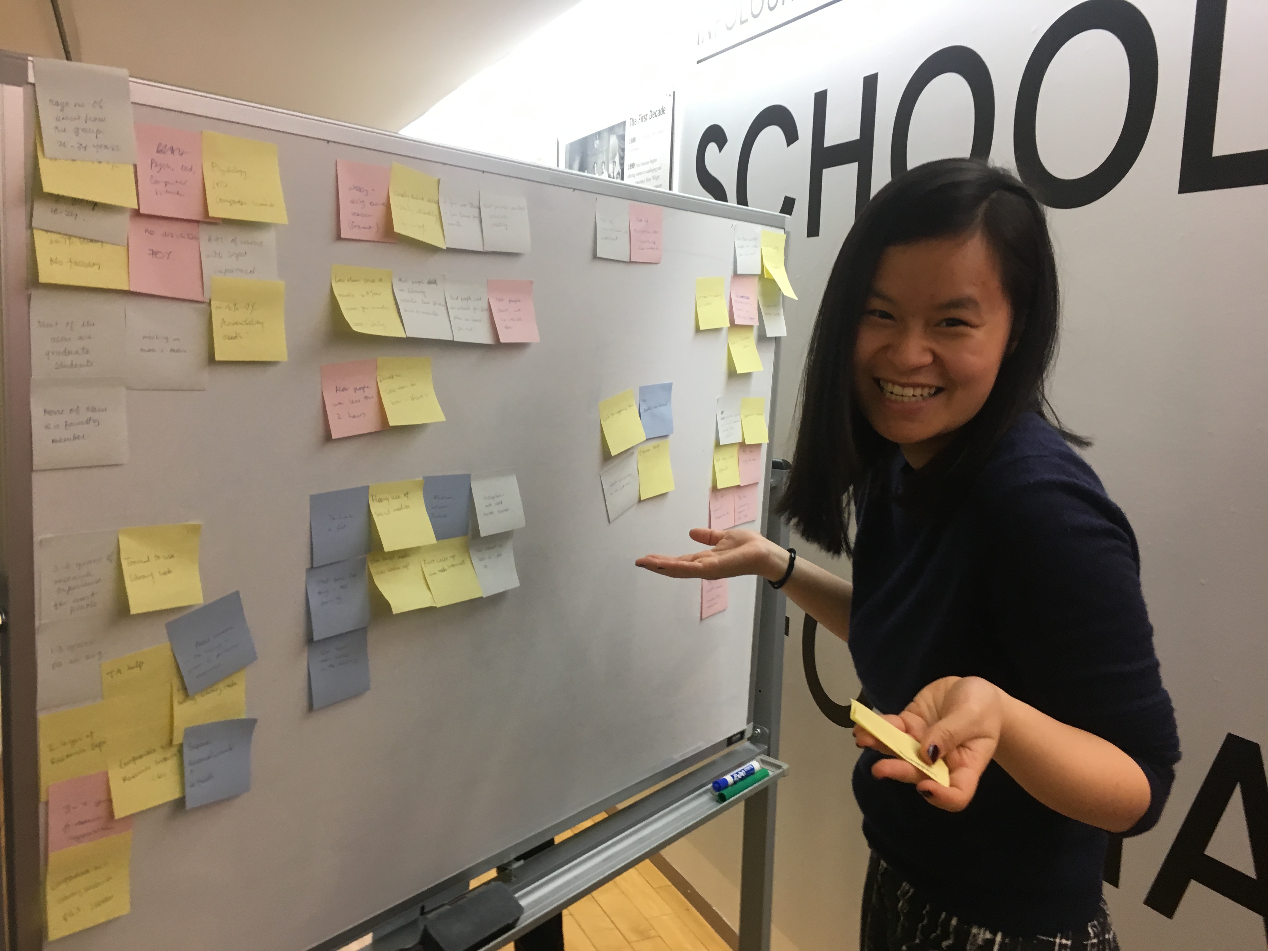
Finally we formed a pretty good picture of who our users were.
Every undergrad student undergoes multiple sessions of training to use the library but still weren’t confident users
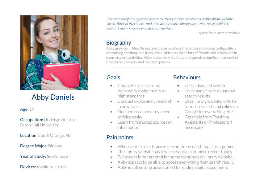
User Persona
Our users were well-trained on how to use the library website, having been trained 4 times (avg.) in one semester, but they still didn’t know what services the library provided or where to go when they needed help
Research, Research, Research
Research Findings
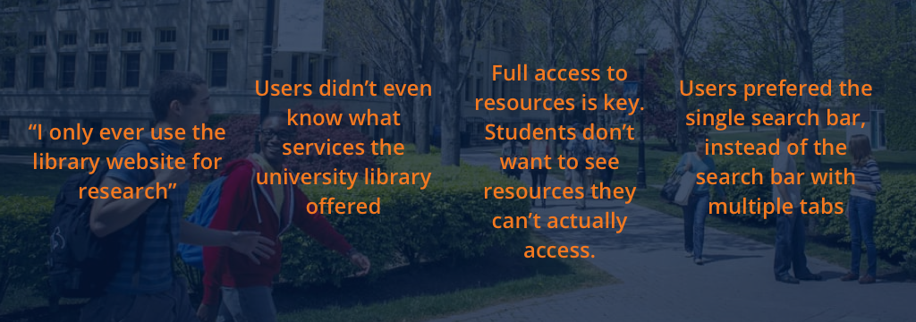
Users didn’t even know what services the university library offered
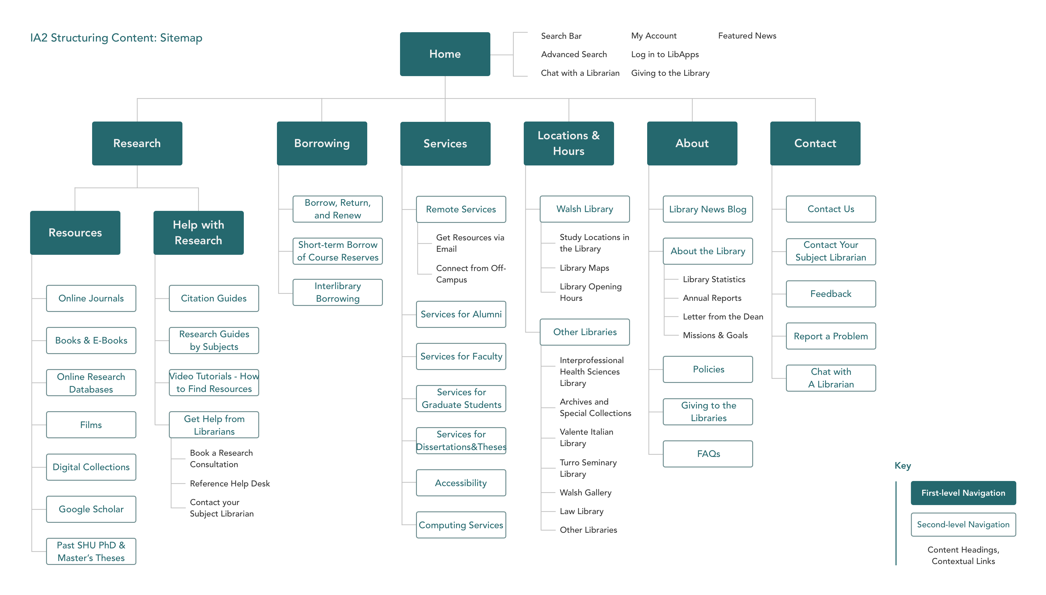
Structuring Content
That’s because they couldn’t find anything on the website. On the original website, the “Services” tab became the unofficial miscellaneous heading under which everything fell.
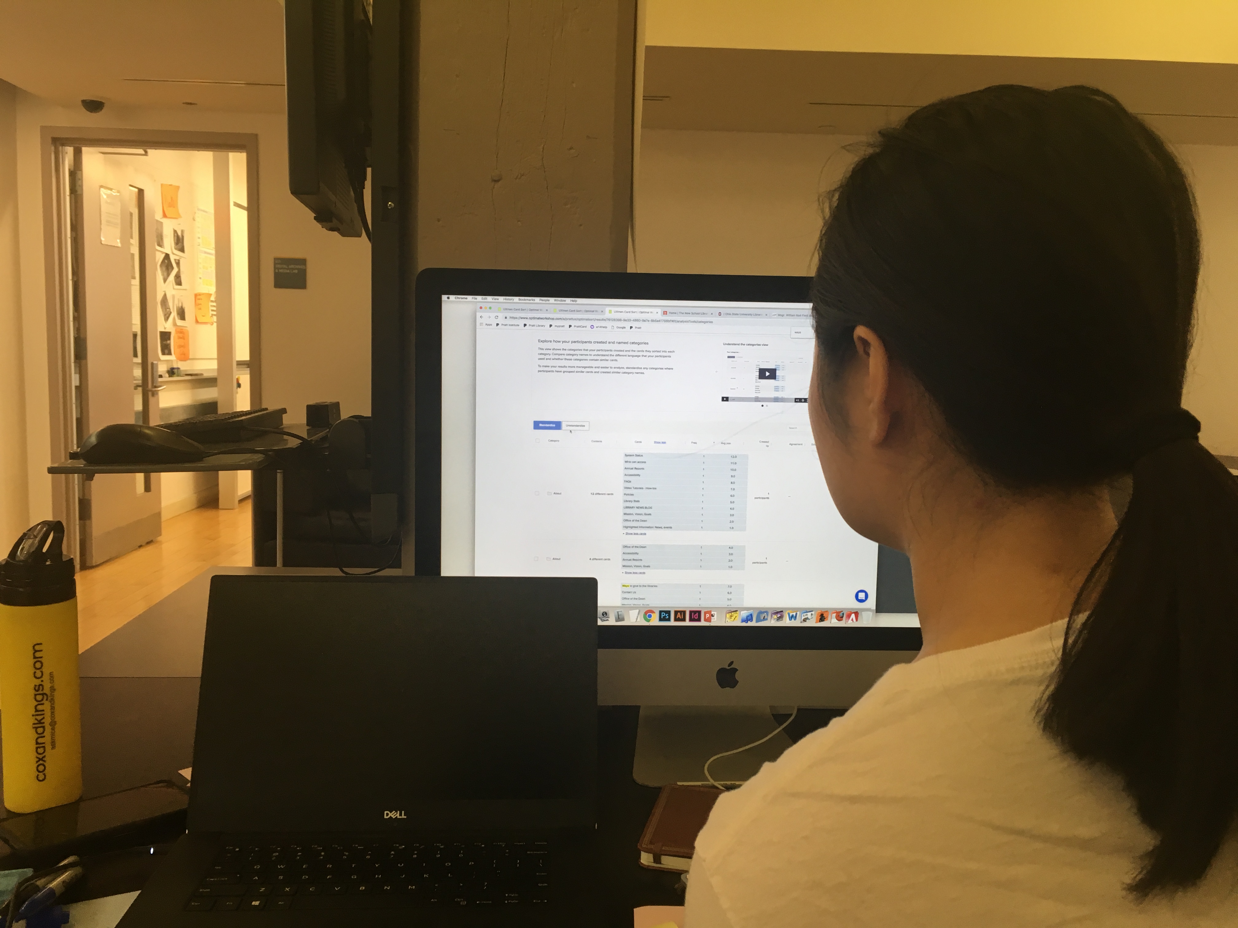
So we did a cart sort to figure out a better way to structure the content.
Not a very successful card sort
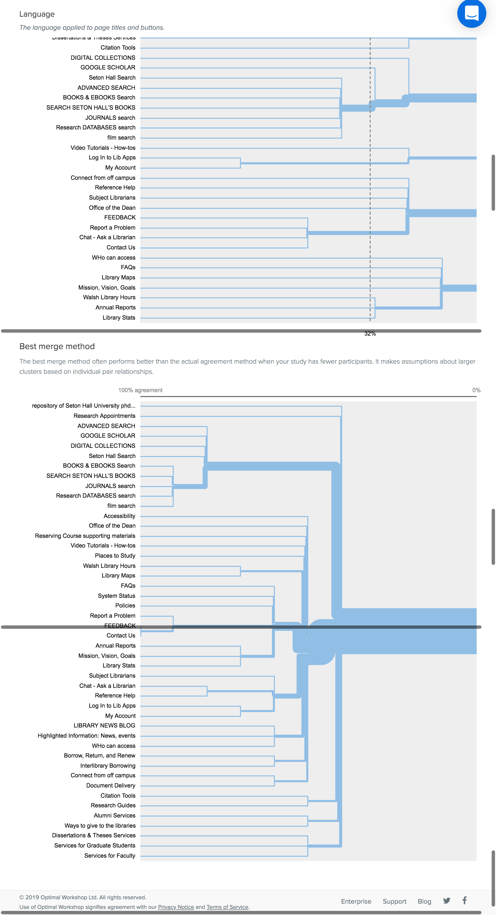
Our participants didn’t know what different library terms meant. To be honest, neither did we.
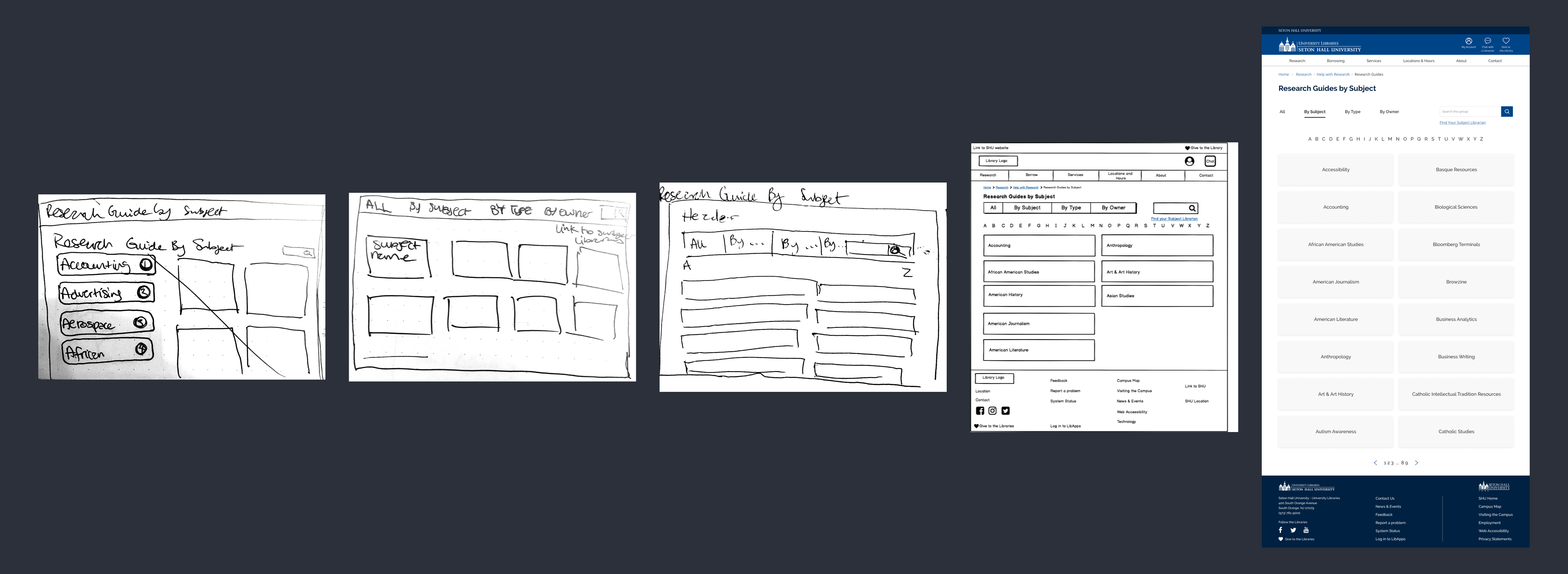
Needless to say, our card sort wasn’t very helpful. But we drafted a sitemap anyway based on our imperfect findings. And did some tree testing.
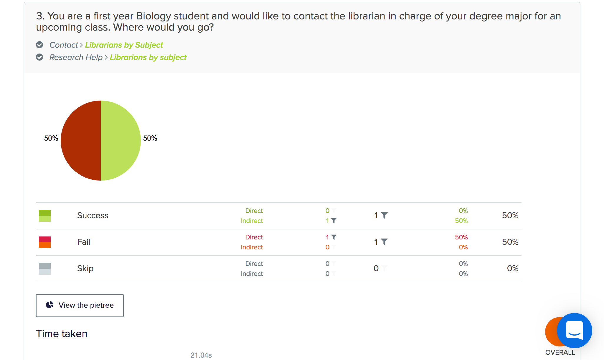
We struggled with tree testing too
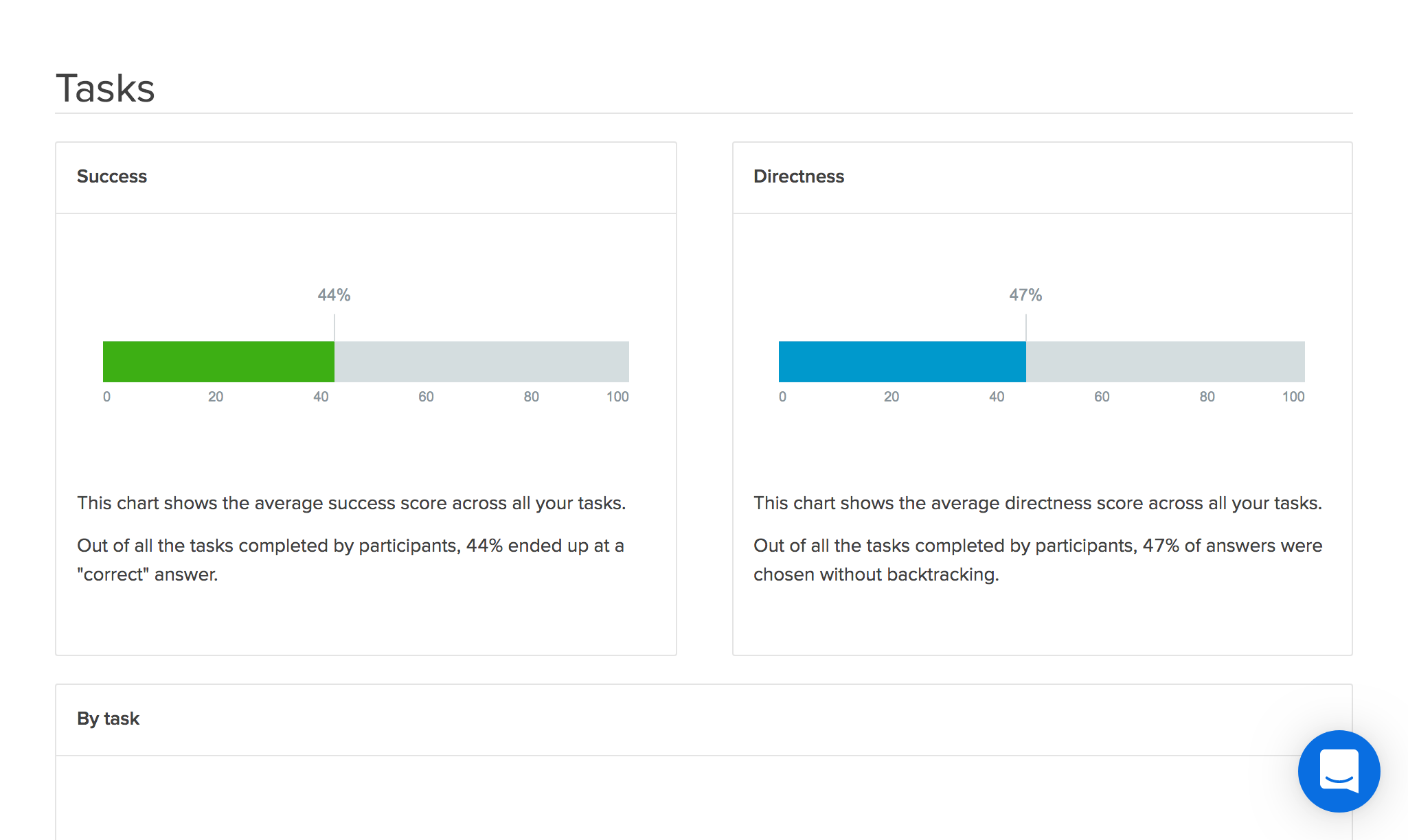
So instead of doing 1 tree test, we did 3, iterating our sitemap every time. And went from this:
To this:
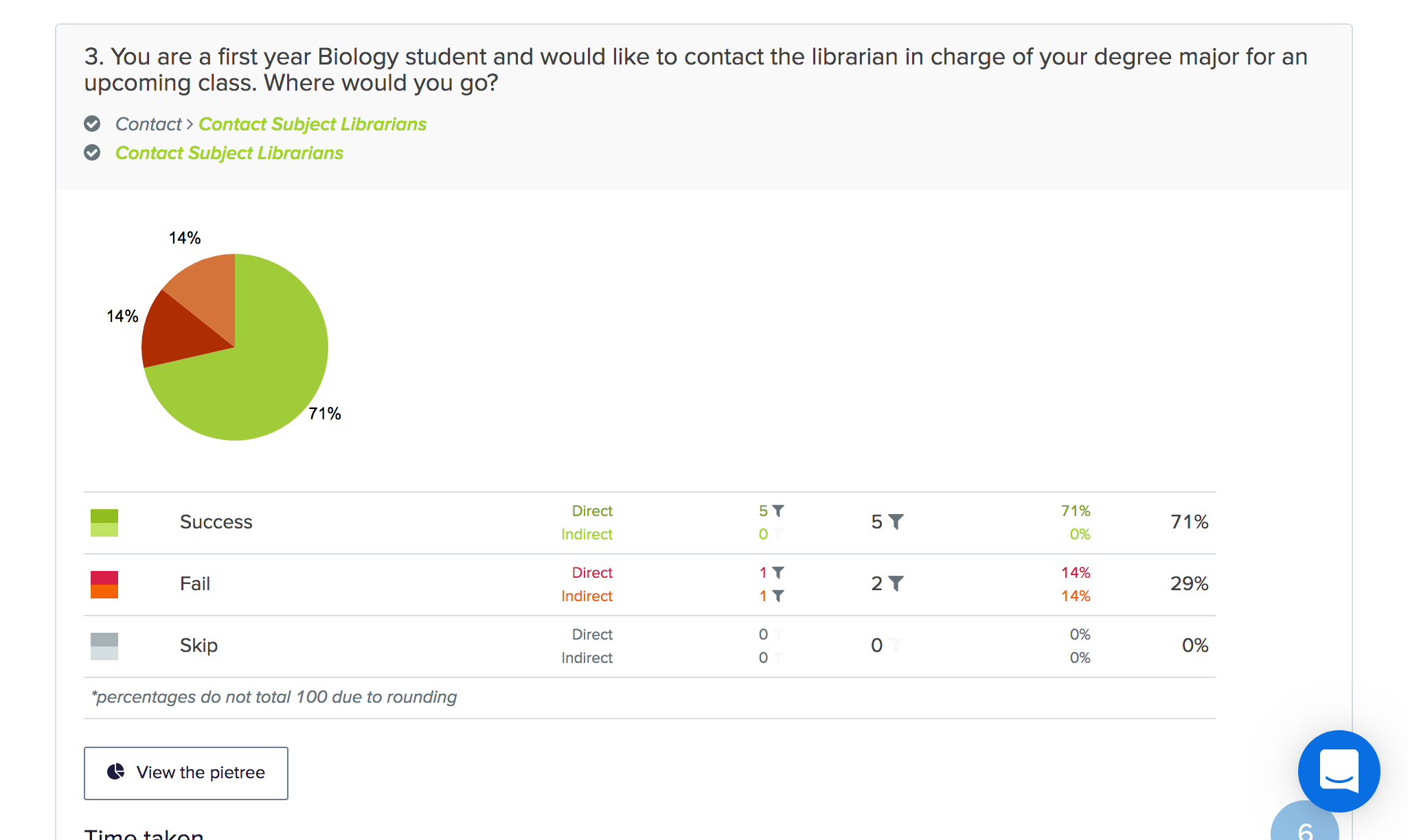
In the end, we created a sitemap that works really well
But we still had no idea how a library website looks or feels
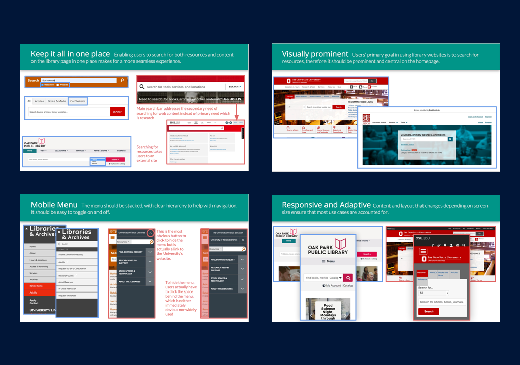
Competitive Analysis
We analyzed similar websites and found that there’s a delicate balance between having simple layouts and providing adequate functions.
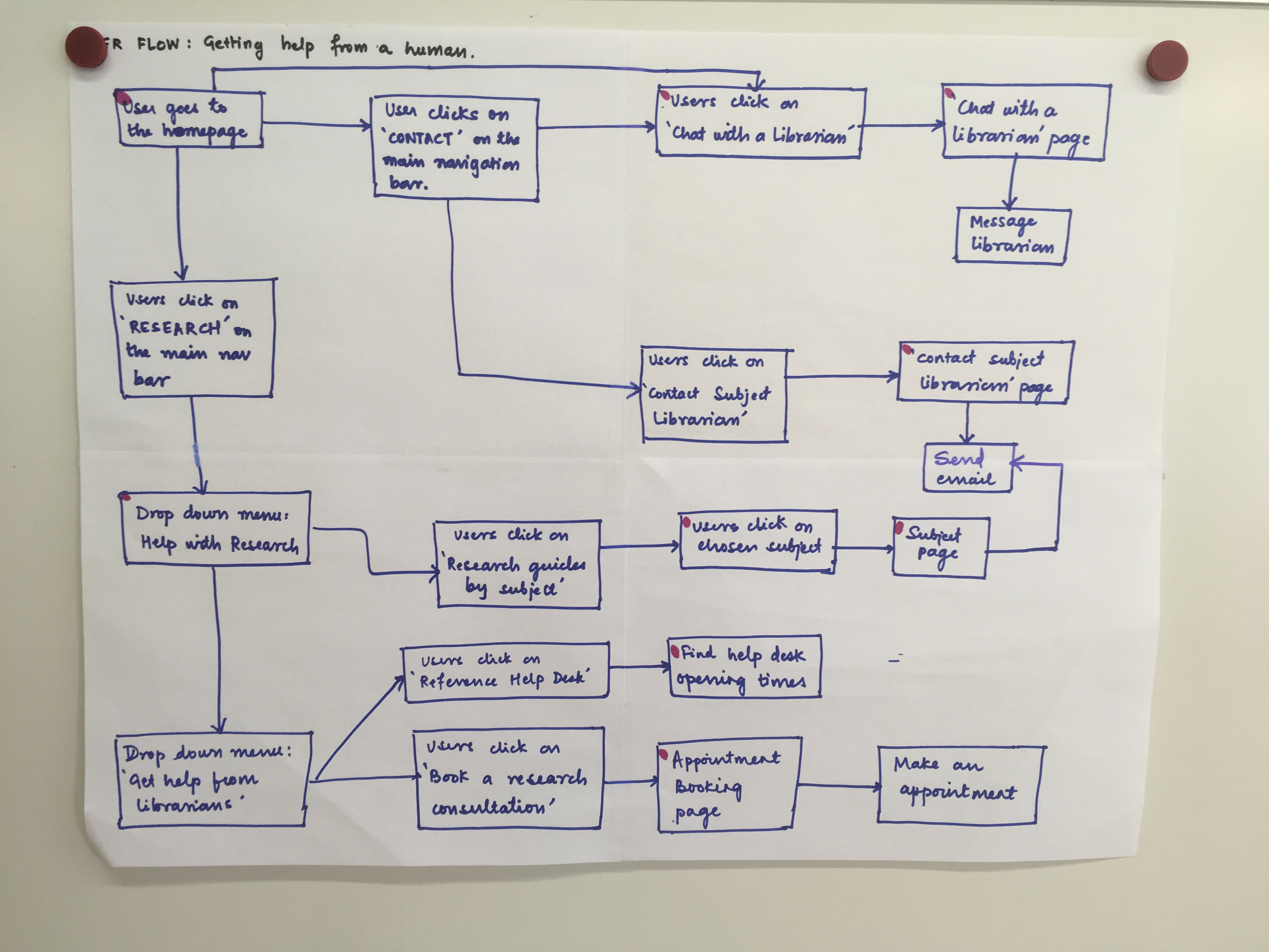
After learning more about library websites, we decided to focus on one key task: helping users get help directly from a human being
User Flow
We sketched for 2 weeks straight, not stopping until we had exhausted all of our ideas
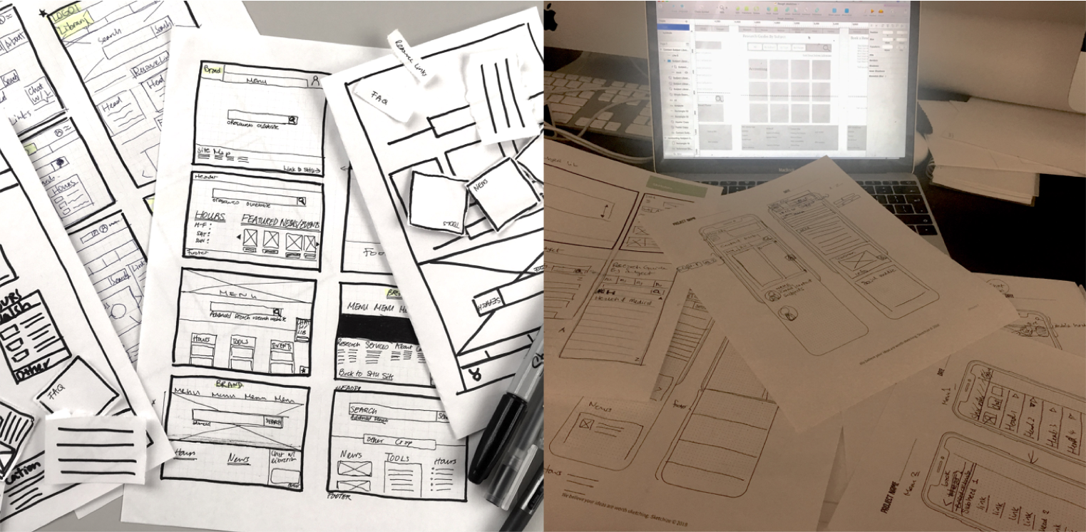
Low fidelity prototype supported 5 tasks
For example, finding a research guide
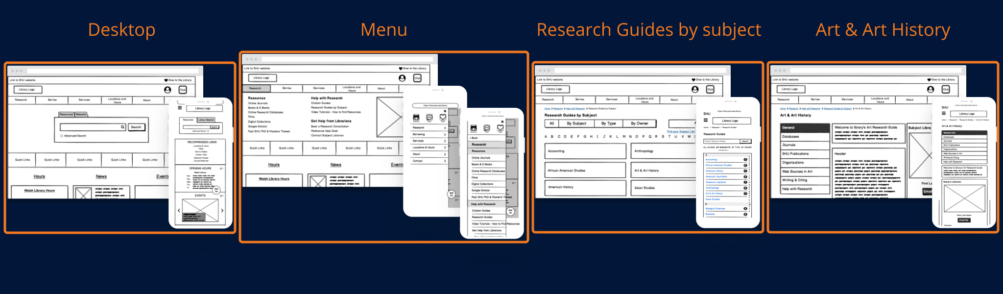
Click on the links to play around with our low-fidelity mobile prototype and our low-fidelity desktop prototype.
We tested this prototype with users & found some usability problems with our design
- participants didn’t know where to find “Help from librarian” features
- the mobile menu was too long
- using the mobile site took a lot of guess work because buttons didn’t look like buttons
- Our chat icons were inconsistent and this confused our test participants
![]()
We were finally ready to design our high-fidelity prototype
But first, a style guide
This is an abridged version.
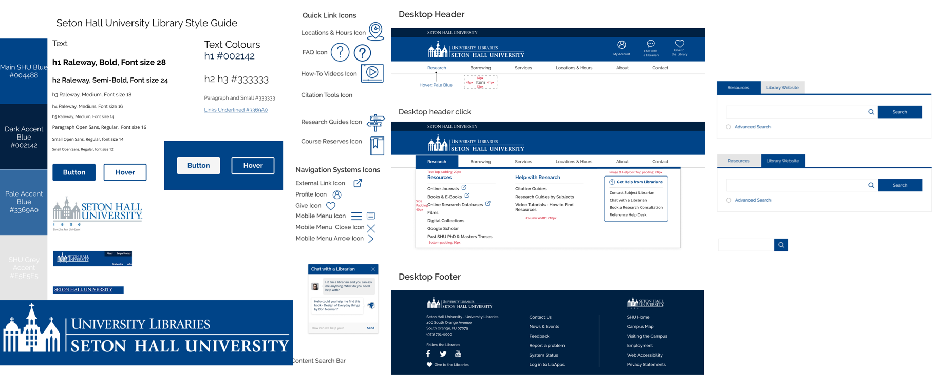
We definitely went overboard with the details but we didn’t know when to stop doing the style guide and start putting screens together!
We iterated and iterated every single screen until we ran out of time
There are a couple of features that we’re really proud of
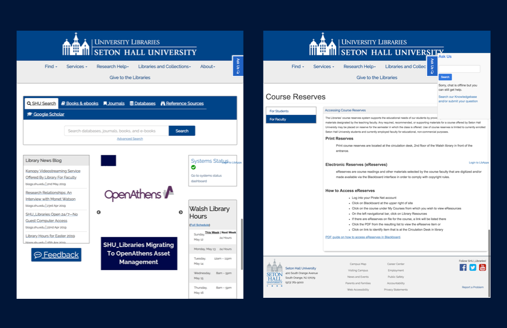
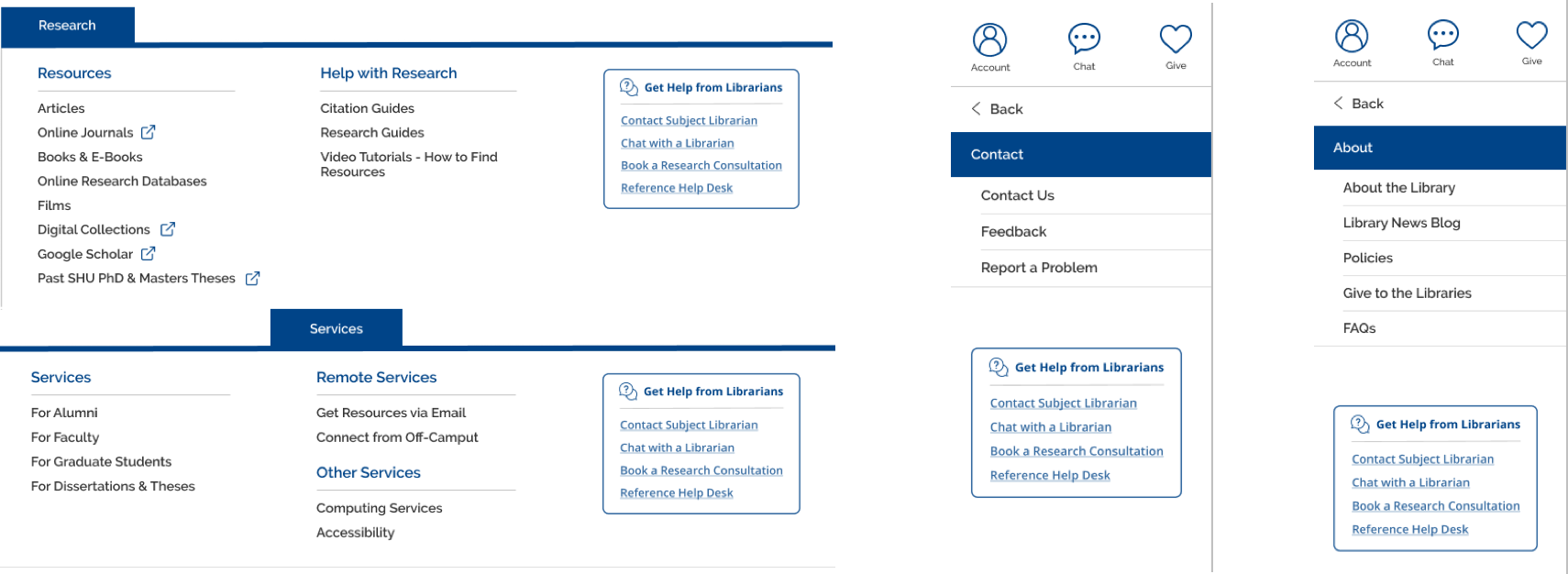
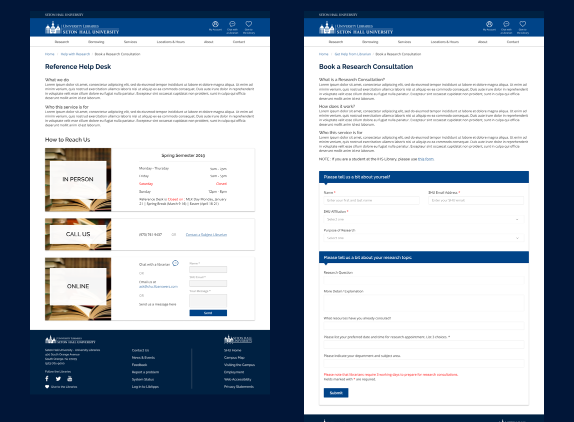
Feature 1: Help is everywhere
Why?
We didn’t want users to have to think about where they had to go to find help when they are already frustrated. So we put a blue “help from librarians box” in every drop down menu and on most content pages
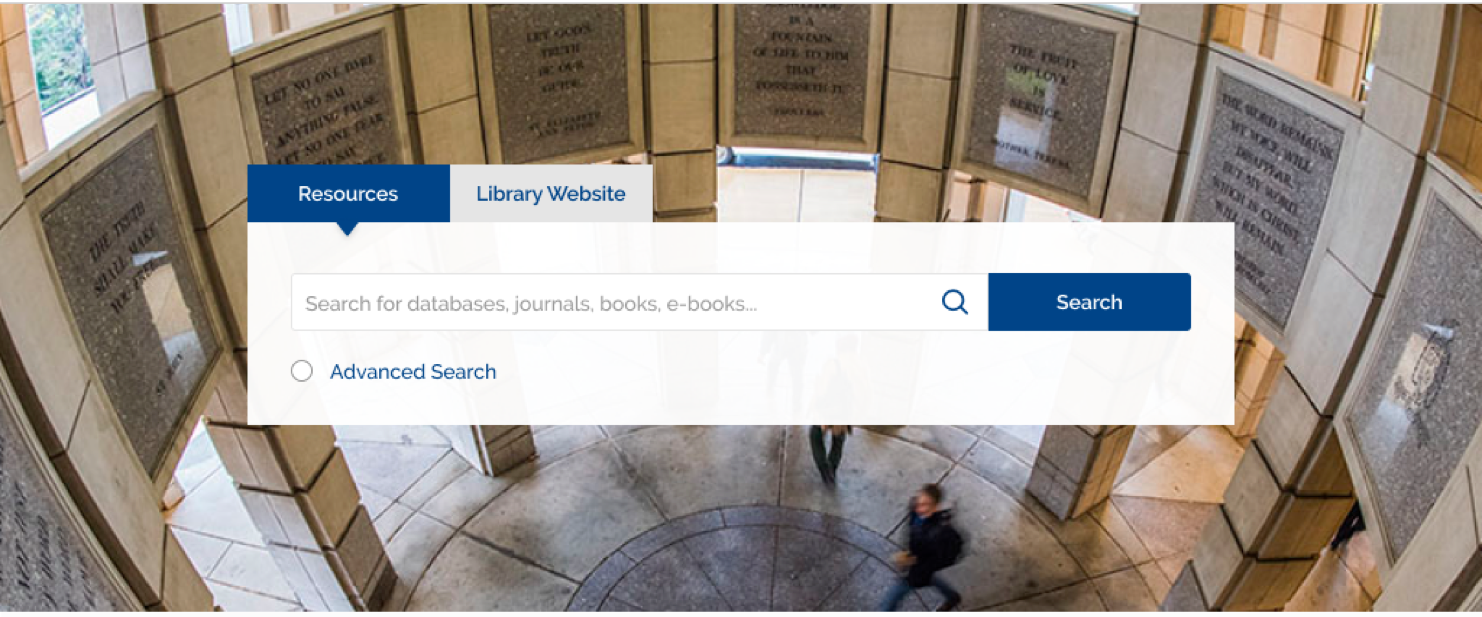
Feature 2: Integrated Search Bar
Why?
Most users don’t know the different between the terms “journal”, “article”, “database”, and “repository”, so making them choose between which of these kinds of resources to search from seems weird. When I asked them how they made the choice, most told me they just went with what they were used to doing. But every research project is different. This allows users to filter out the types of resources they don’t need after the initial search.
Feature 3: More information to explain library services
Why?
Users expressed feeling like they weren’t supposed to use the library’s services because they were “just undergrads” but these services were designed for them! We wanted students to stop being intimidated by library jargon and feeling like its too advanced for them. We also wanted users to understand what these services are in order to feel empowered to use them.
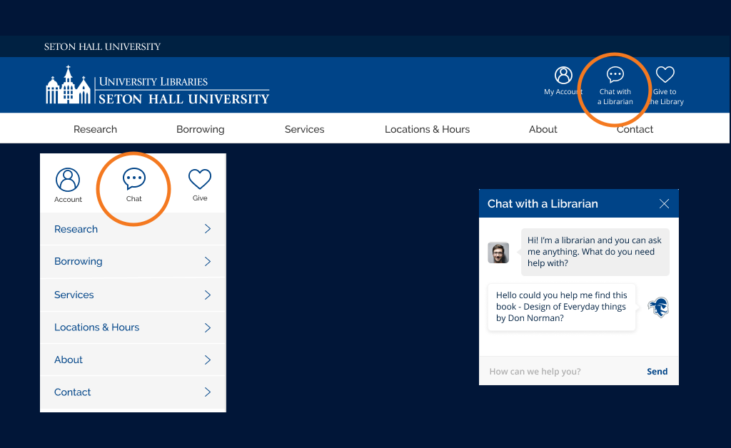
Feature 4: “Chat With a Librarian” is prominent but not in your face
Why?
Users expressed feeling frustrated by the “chat with a librarian” or “ask a librarian” pop up box, especially when they rarely used it. But stakeholders felt it was really important to make that accessible. So we’ve put it in our header and disabled the automatic pop-up function.
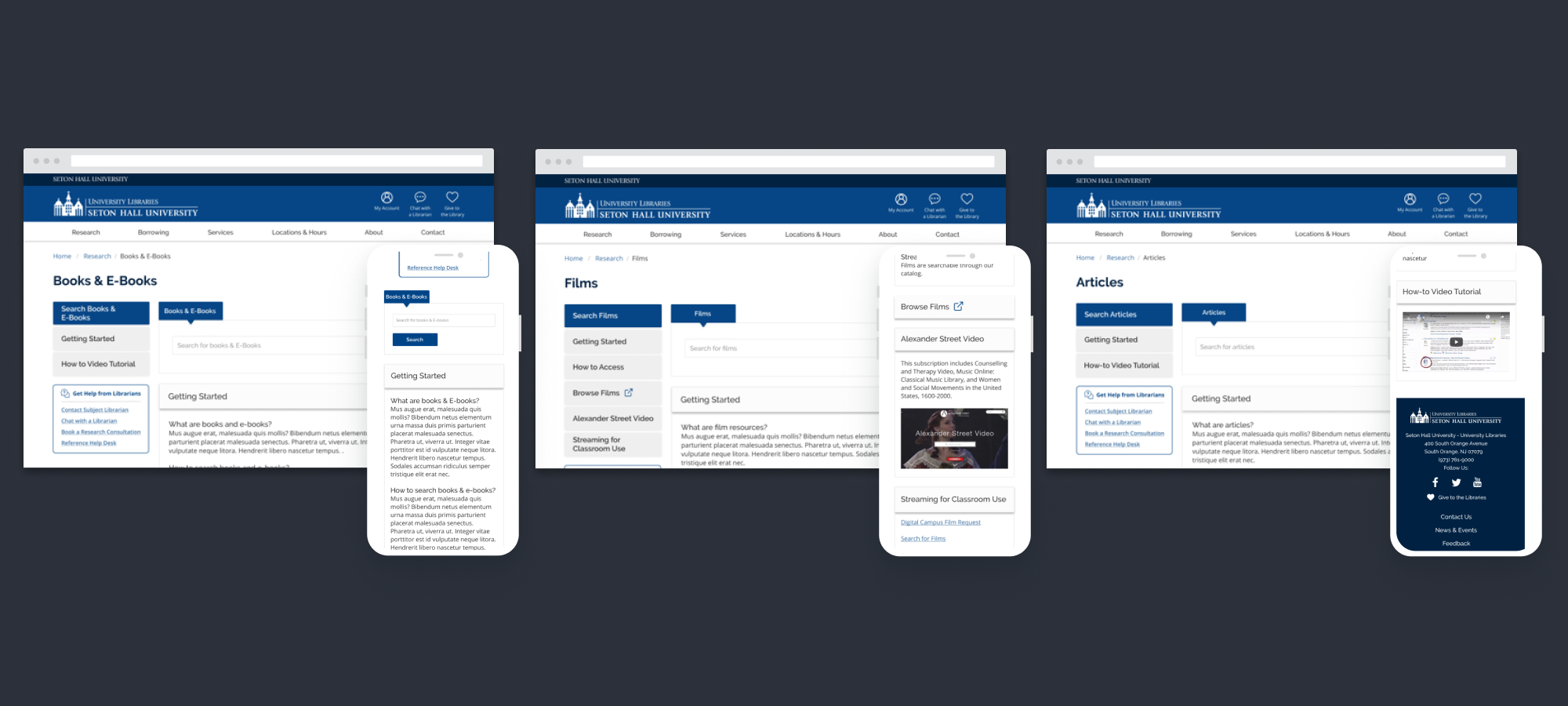
Feature 5: Populating Resources Pages
Why?
We recognize that students don’t always want to ask for help, so by providing information at the point of need, we allow students to help themselves
Click on the links to explore our mobile prototype and our desktop prototype.
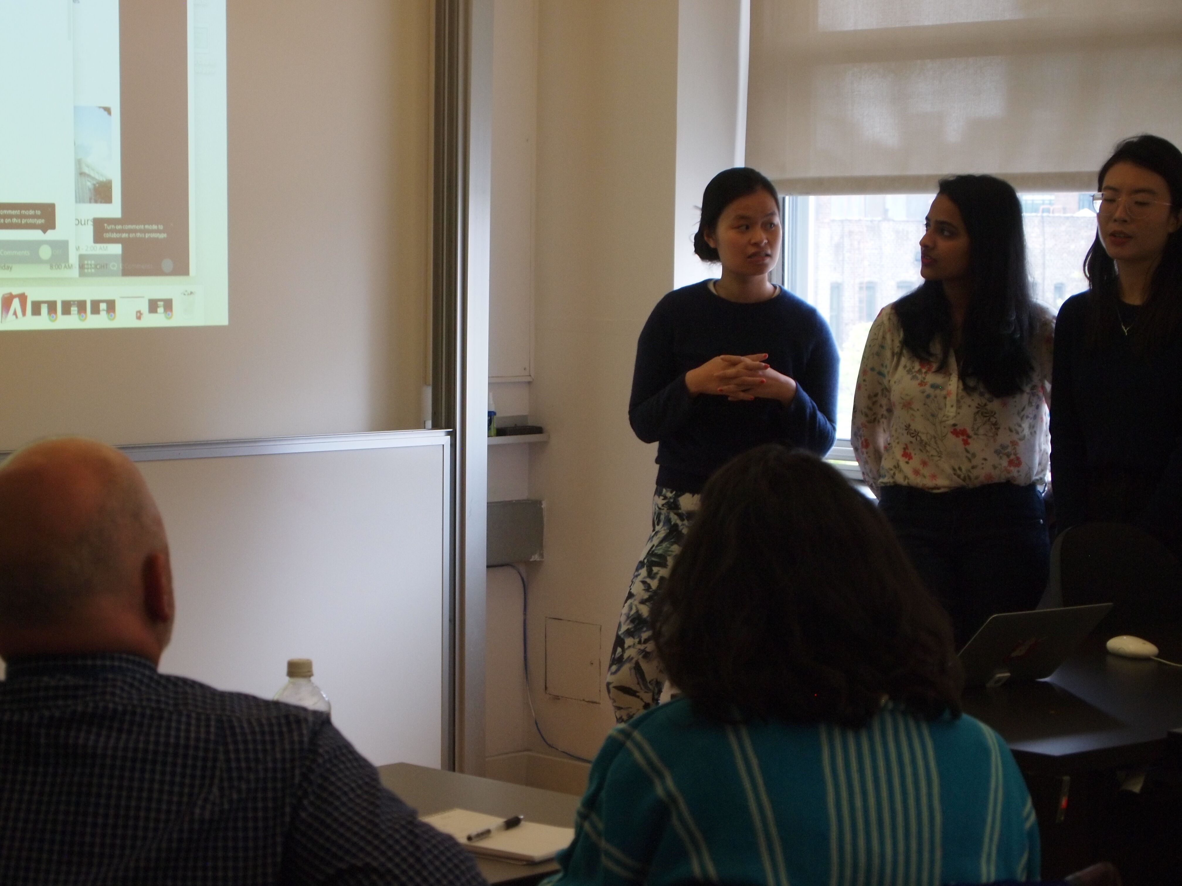
The Clients liked our product too!
Outcomes and takeaways
What I’m really proud of |
What I wish I did better |
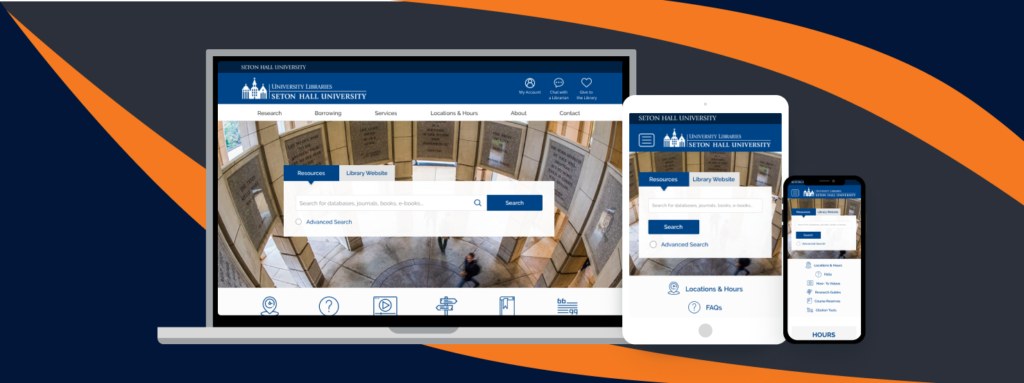
We drastically improved the look and feel of the SHU library website, |
I wish we could have tested the hi-fi prototype on actual users |
We managed to find design solutions that both satisfied stakeholders and met user needs |
I wish we could have had more discussions with the library’s tech team to learn more about their capabilities |
We made help more accessible to everyone, everywhere |
I wish we had time to rethink the content of the website to make it more scanable |