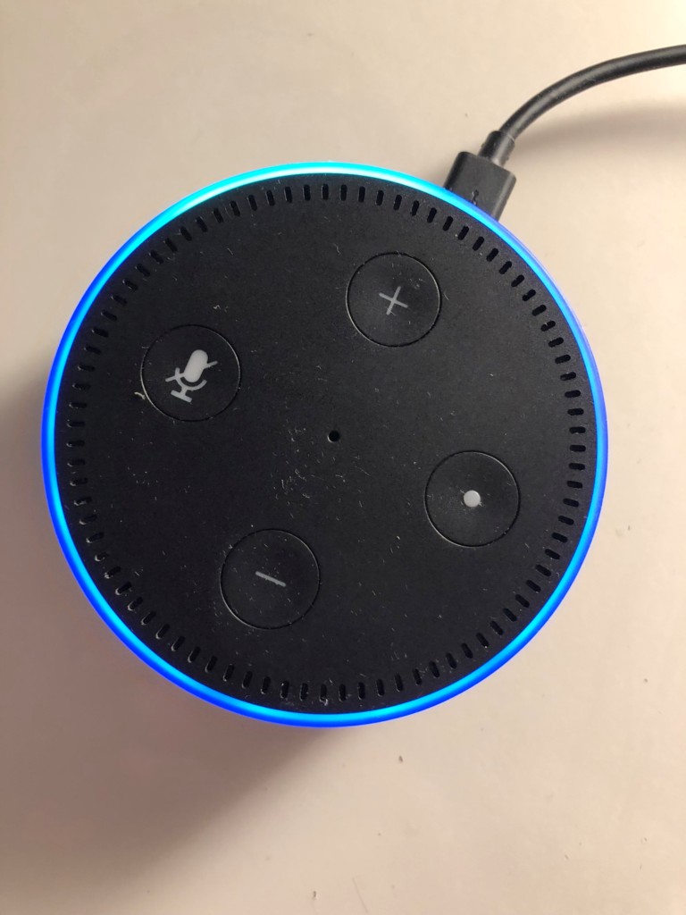
Amazon Echo Dot is a small smart speaker, with the accompanying Amazon Alexa App, which is designed with the intent to make one’s life easier by using the devices programed tasks and skills. The physical object as well as the app continue to receive modifications and upgrades as Amazon continues to incrementally innovate the design of this product to create an improved Dot and other Echo products for the consumer.
The Amazon Echo Dot is relatively well-designed regarding Normand’s principles, yet continues to alter its physical design as it seeks improvement. The version I am most familiar with is the second-generation Echo Dot, however Amazon has already created changes to this product through the release of the latest iteration: the third-generation Echo Dot. As Echo products remain a priority for Amazon, it is likely we will see more iterations of the product that continue their exploration with improved design and increased function.

Signifiers
One issue that Amazon has changed between the two latest versions is the signifiers on the top buttons. Echo dots are short cylindrical devices, which only indicator of a front is the cord and plug attached to the back of the device. In the second-generation version of the device the four buttons on top are concave into the device which visually display the function but ignore a tactile signifier. Someone of low or no vision would have to find the cord to orient the buttons while remembering the function of each button. Visually three of the four buttons are relatively clear in their function: plus, minus and microphone off button. The right-side button however is labeled as a simple dot which does not indicate the function at all. One would have to research its role on the device in order to know when to use it. Likewise, the button does a few different tasks depending on how long you hold the button down, and can activate or restart the device. The latest version does have more tactile signifiers on the buttons however they are still relatively subtle to touch.

Feedback
Visual feedback is an area in which the Echo excels. There are numerous examples of feedback that highlight the Echo is functioning properly. The light ring is the most noticeable source that the machine is activated, listening, thinking or responding. Pressing the buttons or using the app will light up the ring as well, highlighting that the tasks are being completed on the device. There are numerous ways to control many of the tasks because it responds to both vocal and application commands, and there is helpful visual feedback from all methods of modifying the device.

The strongest noticeable lack of feedback is with its relationship with WiFi. The two things the echo needs to function properly is power and a WIFI connection. If the WiFi goes down so will the Echo’s ability to complete tasks. However, the only way to know if there is no WiFi connection to the device is to ask the machine to complete a task. When the task cannot be completed there is a noticeable pause in activity before the Echo lights up red and informs you the connection is lost. Once the connection is reestablished you will not know until prompting again if the device is functioning. A potential solution for this could be to have a light on the device acknowledging connection and that the machine is ready for use.
The industry is starting to get saturated with a variety of products in similar veins to this one. Amazon alone has multiple different versions and types of similar products that they offer. Additionally, this product is improved because there can be multiple iterations of the app before they can produce and redesign a whole new version of the Dot.
Norman, D. (2013). The Design of Everyday Things: Revised and Expanded Edition. New York, NY: Basic Books. ISBN: 0465050654
