Paper is a comprehensive tool to sketch, paint and type people’s thoughts in creative ways. It offers great convenience with the application of an apple pen, natural gestures, and a fluent interface. Currently, Paper is available on both iPhone and iPad, and it earns a high rating of 4.8 with the great satisfaction of users.
First-Time Use
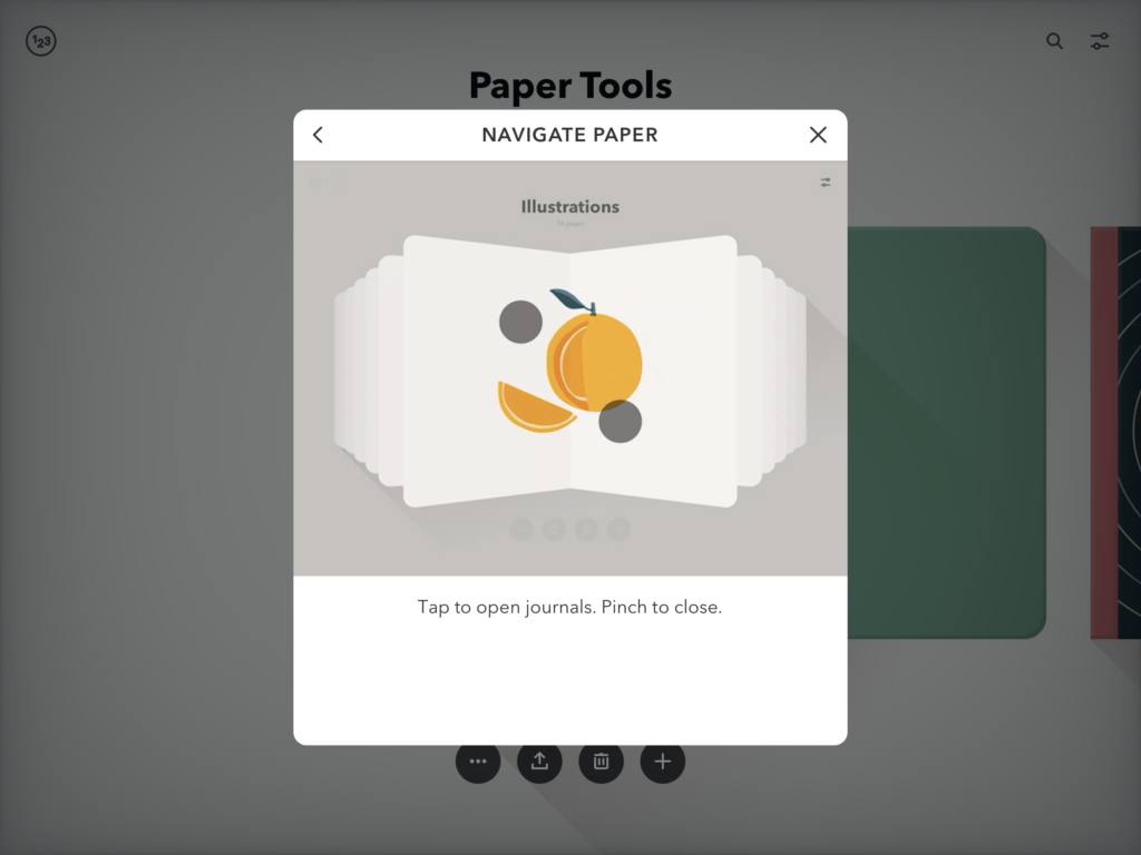
The quick tutorial (Fig. 1) and clear display of the Journal (Fig. 2) and Artboard (Fig. 4) set up an understandable system image to the user, which is coherent with the user’s conceptual model. The user can draw on the device with a finger or an apple pen just as drawing on a regular notebook.
Creating a New Journal
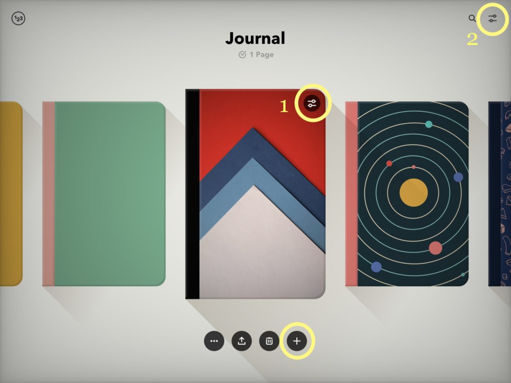
When the user wants to create a new Journal, a discoverable signifier —a clear “+” button (Fig. 2) under the target Journal leads the user to accomplish the action.
The natural mapping of two “edit” buttons allows the user to know how to make desired changes—click the first “edit” button (Fig. 2-1) to make changes of the journal and click the second “edit” button (Fig. 2-2) to make changes in the app setting.
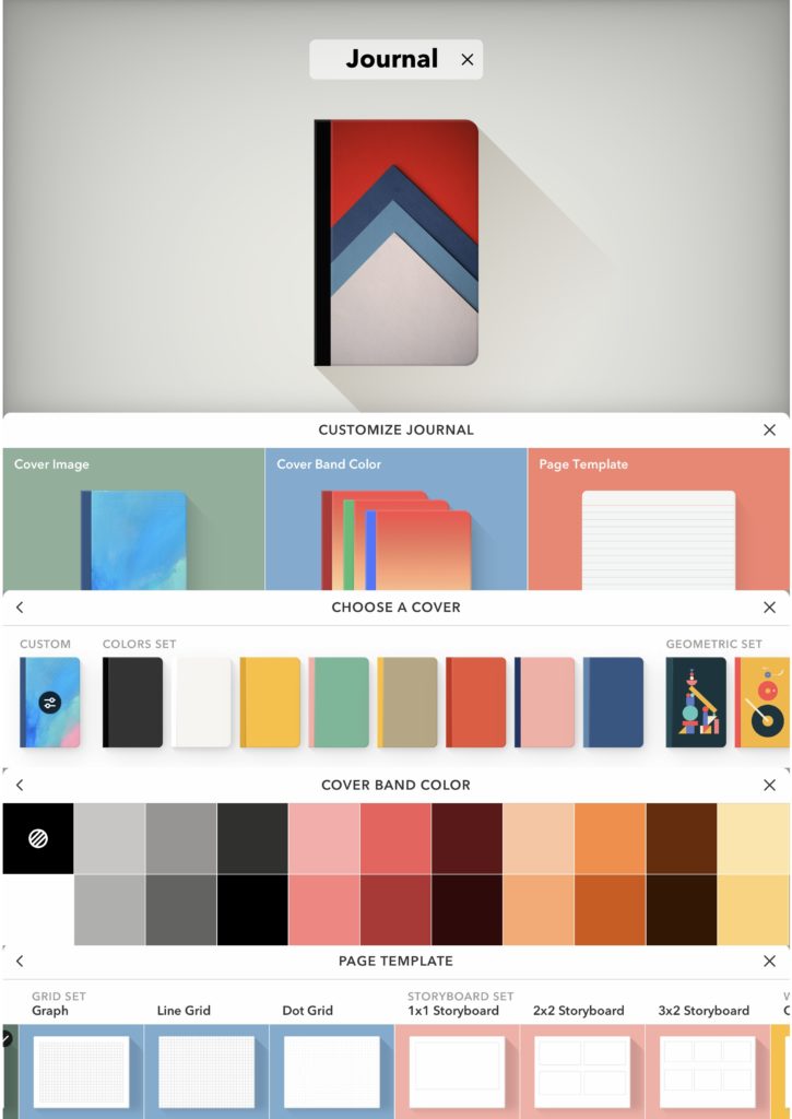
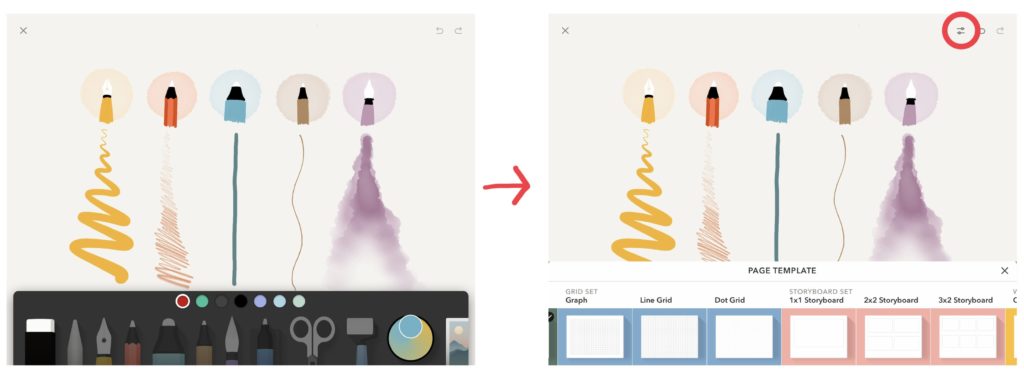
The function of customizing the Journal follows the principle of interaction and Human-Centered Design because Paper learned that its target users are sharing a common: they want to create something with aesthetics value. Therefore, all sorts of cover images, cover blend colors, and page templates (Fig. 3) not only satisfy people’s needs in utility and differentiation but also offer them with pleasure and enjoyment.
Start to sketch
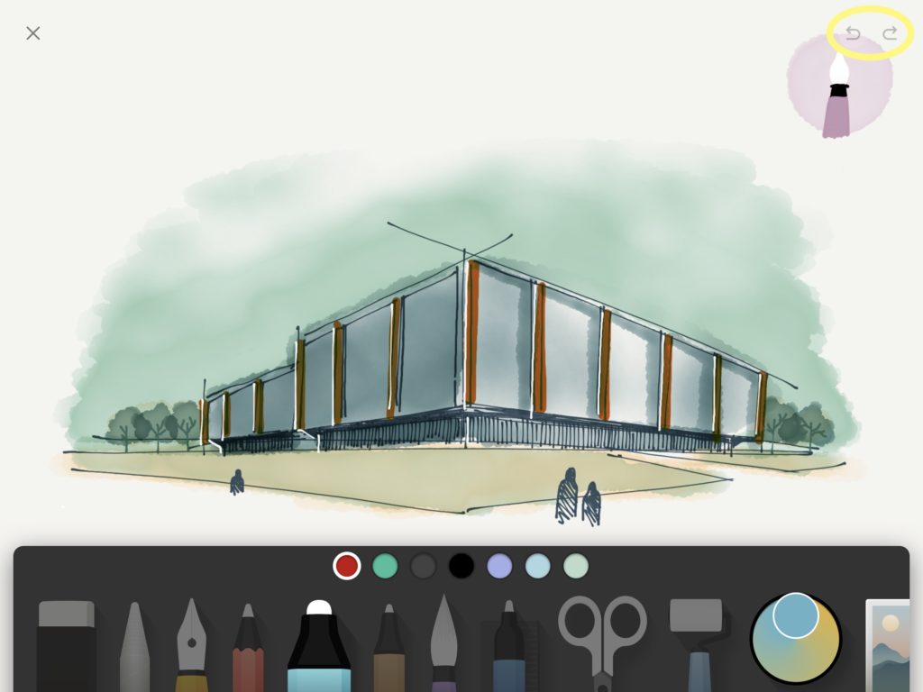
Once, a Journal is opened and the user can click on a page to start creating. A variety of tools (Fig. 4) are placed on the bottom which is discoverable and tells the user it affords to be picked for sketching. Since people know how to draw and what they can do with clear signifiers that have familiar appearance with the commonly used tools (such as pencil, eraser), the Gulf of Execution doesn’t exist in this period.
The natural mapping and immediate feedback of “backward” and “forward” buttons (Fig. 4) help bridge the Gulf of Evaluation, because users can know what happened and whether the action is wanted.
Changing Page Templates
It is very easy to create a new journal with a new paper template, but it is difficult to create a new page with a new paper template inside the journal. The reason is that there is no “edit” button along with the page, so the user must return to the previous layer to click on the “edit” button on the Journal.
Also, if a person wants to change the template of the existing pages in a journal, he may click on the “edit” button on Journal to choose the wanted one. However, the existing pages will not have any changes, and only the new page can have that new template.
These procedures violate users’ conceptual models with wrong cause-and-effect pairing. In these two situations, users learn helplessness in accomplishing desired actions. To solve the problem, the “edit” button should add to the page layer (Fig. 5), so users can edit the template of both new and existing pages.
Deleting Works
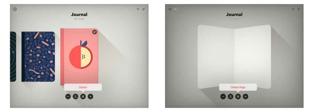
The “trash bin” icon (Fig. 6) is discoverable and signifying under the Journal in both Journal Layer and Page Layer. When the user wants to delete the unwanted works and drafts, he needs to click on the button and confirms “Delete Page”. These two steps can help users to avoid action-based slips.
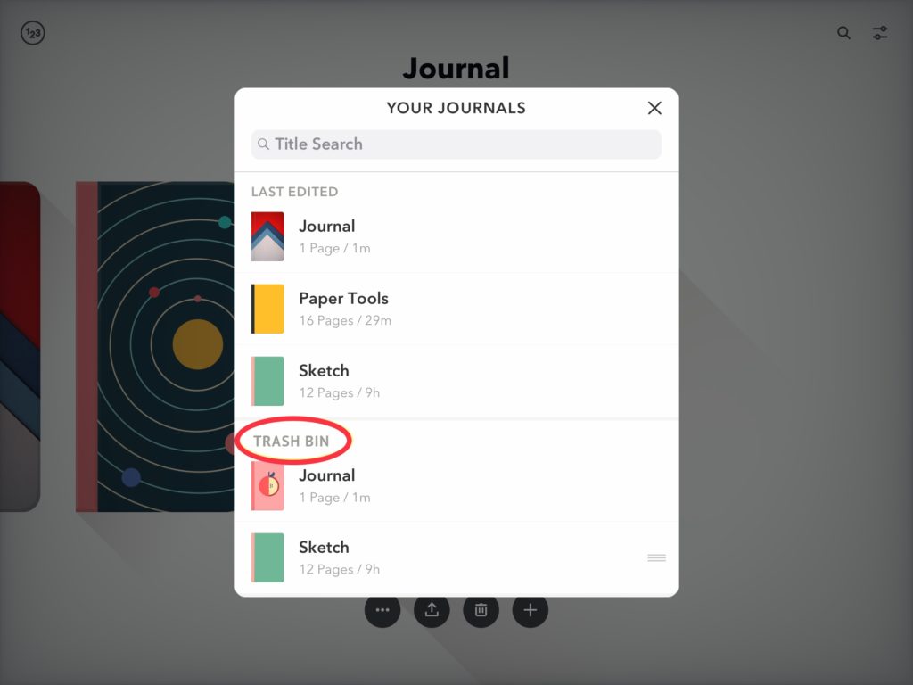
However, people make mistakes and regrets all the time. When the user wants to have the deleted works back, there is no way to recall the action. To reduce users’ anxiety and improve their experience, the recall action should be allowed. Add Undo or Trash Bin function (Fig. 7) might be helpful.
Conclusion
As a great application based on Activity-Focused Design, Paper lets the activities of drawing, typing, and collaging to define the product and its structure. In hence, its conceptual model can be built around the conceptual models of the activities that people all familiar with. Although there are several imperfect functions, the main functions are well-designed and the overall user experience is wonderful.
