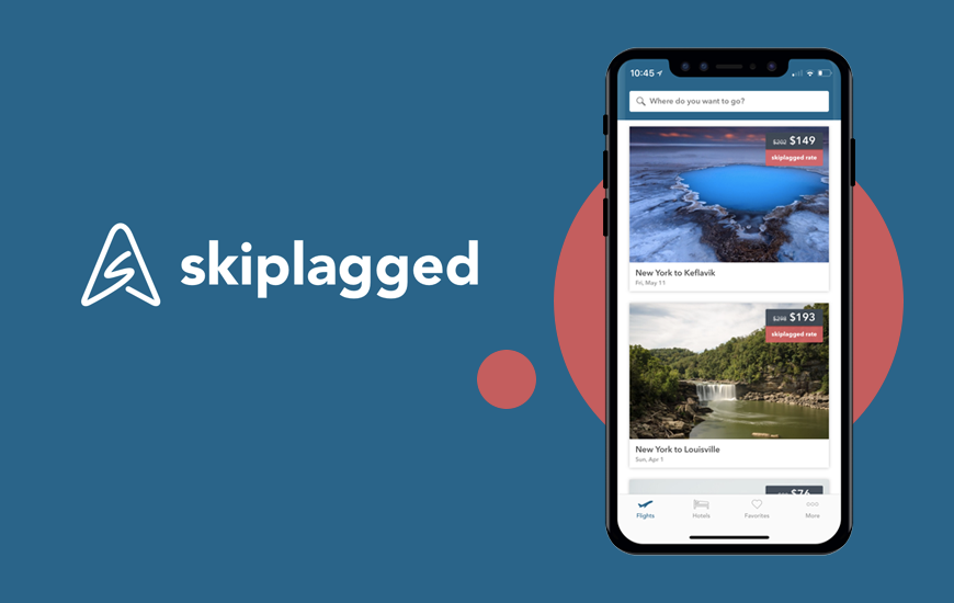
Skiplagged is a both web and mobile travel app designed to provide best rates of airfare and hotels. From last year, me and my friends have been using this platform to plan our trips whenever we decide upon dates. This app was a game changer for us. Instead of doing intense research on what place to go, this app suggest places to go according to ascending price range of airfare. It really helps when you are on a budget but want a vacation too !
For My critique, I decided to do it on app as I have used the web app several times I wanted to know which one was the most convenient to use.
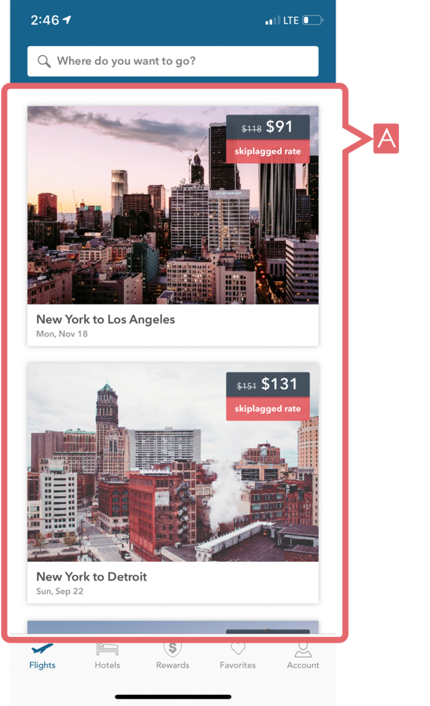
This application follows a very simple process. On the home page, the user can scroll through flights to various destinations along with skiplagged rates. This gives the user the ability to find a place according to the date and budget. Conceptual model have been used by providing a glimpse of image at the end to signify the possibility of scrolling the page. The eye catching images provides discoverability and affords user to explore various destinations. (Figure 1)
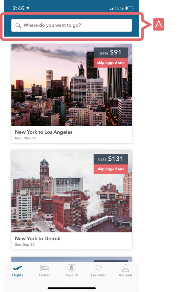
The home page has essential signifiers which give users indications of what functions can be carried out effectively. At the top of the home page is the search tab with a simple signifier of “where do you want to go ?” is easy to understand for the first time user to understand without having knowledge in the head. (Figure 2)
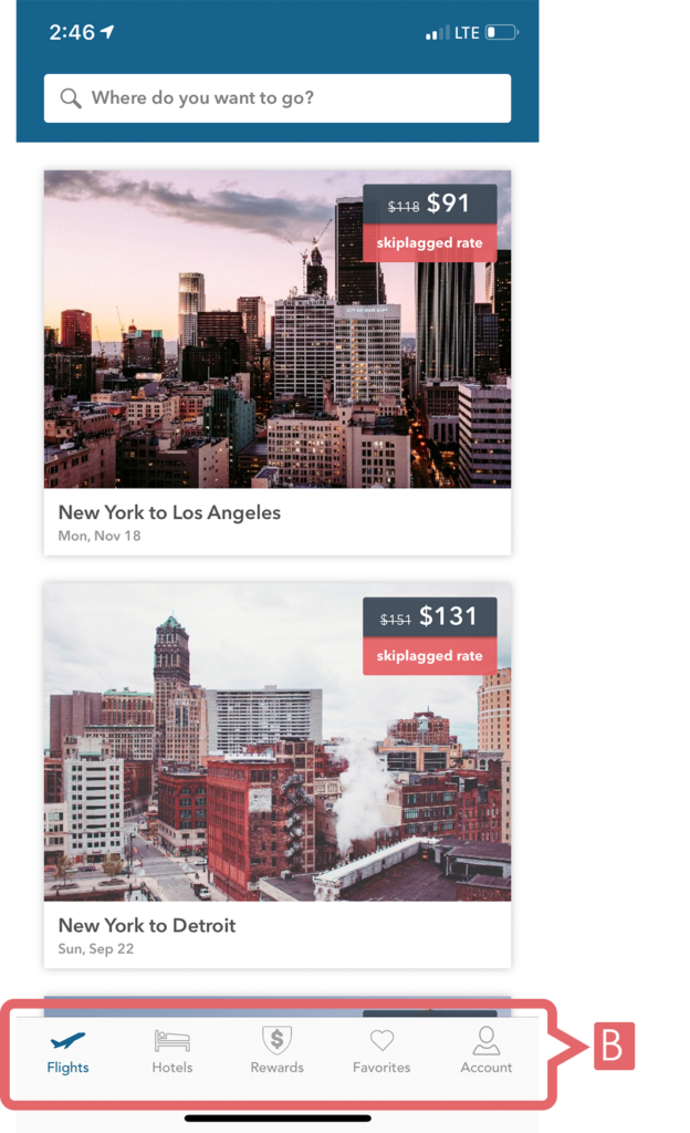
At the bottom is the navigation bar where natural mapping has been used. (Figure 3)The icons give clear idea of what function is carried out. The change in color of the icons is a feedback to signify the user what activities are carrying out on the screen. Affordance and mapping has been taken into consideration by adding text under or besides each icon.
After searching destination, while selecting dates for a location the chart Affords user to find Highest and cheapest time to visit a particular destination. (Figure 4)There are signifiers beside the searched destination. These lack affordance and mapping, as the user needs knowledge in the head to understand the feature. Hence, discoverability of signifiers for saving and filtering a location is a constraint. Tapping the favourite icon gives an instant feedback and highlight the heart with red colour. (Figure 5)
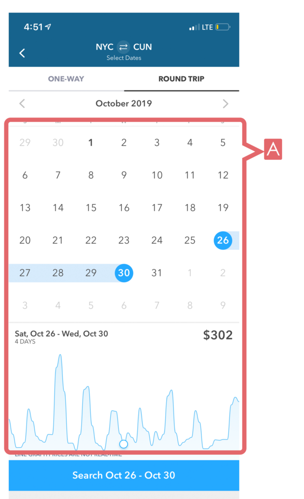
Figure 4 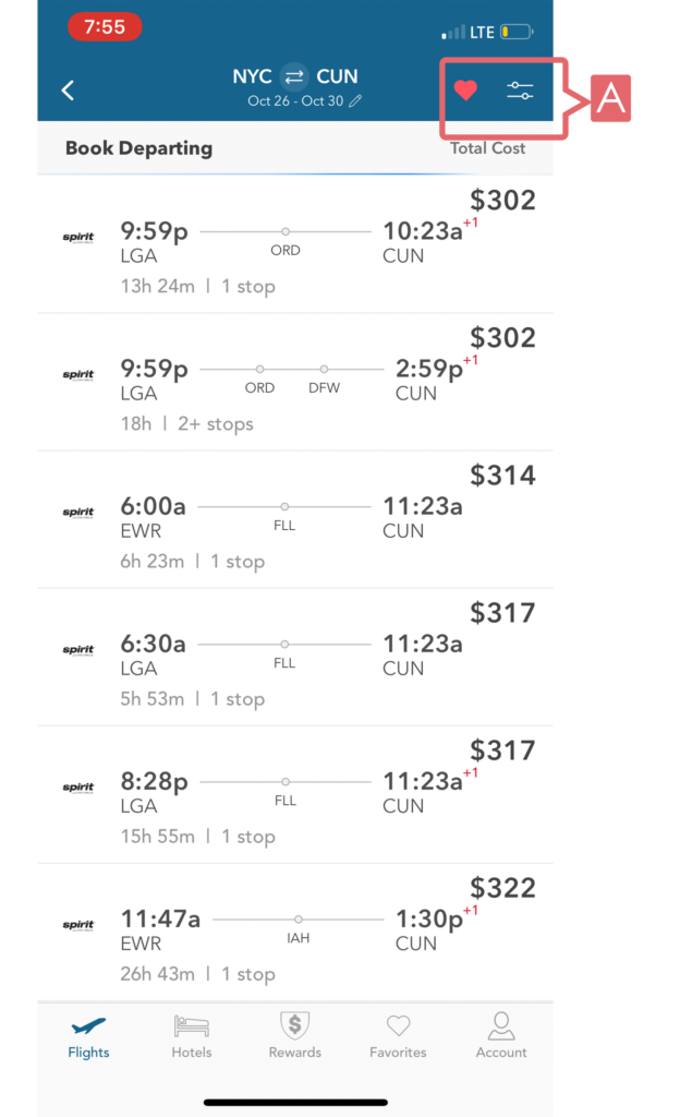
The hotel search opens a new screen which affords the users to search & view the information regarding the hotels in detected location. There are icons on the left and right of the search tab. Without signifiers these icons will act as a constraint for the user without previous knowledge. (Figure 6)
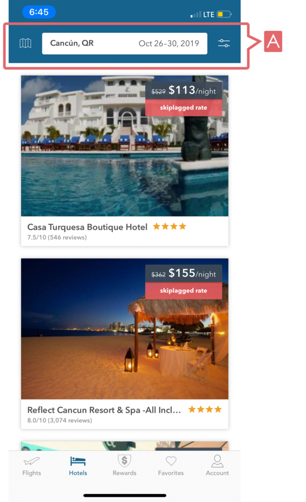
Where as with knowledge in the world users can explore this map without any instructions given.(Figure 7)The pins laid on map are laid in two colors signifying two distinguished categories according to the rates. However it is difficult to understand the distinguished function because there is no description given and requires knowledge of head. Corresponding entry will appear at the bottom of the page above the navigation menu. The entry and distinguished categories do correlate with a signifier. (Figure 8 & Figure 9)
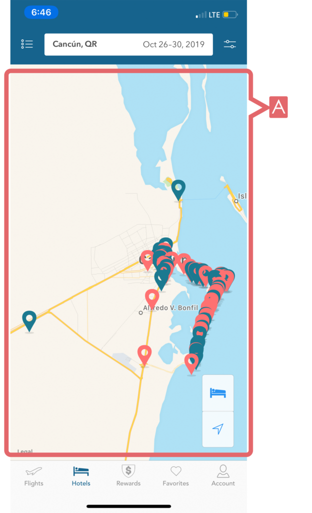
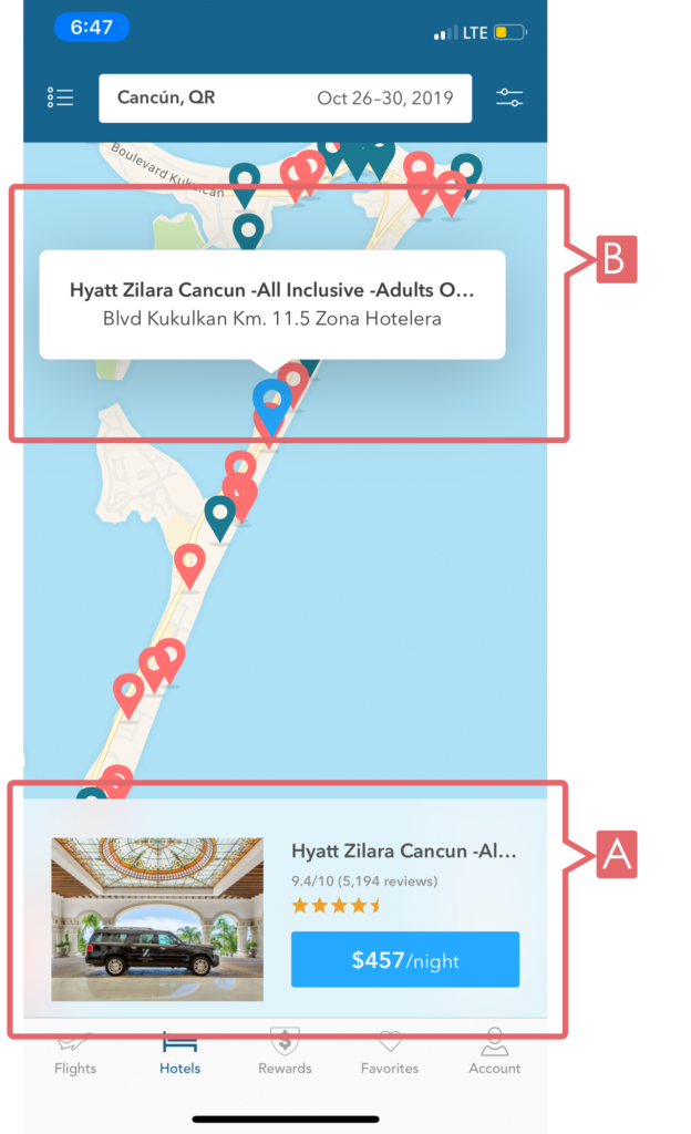
Figure 8 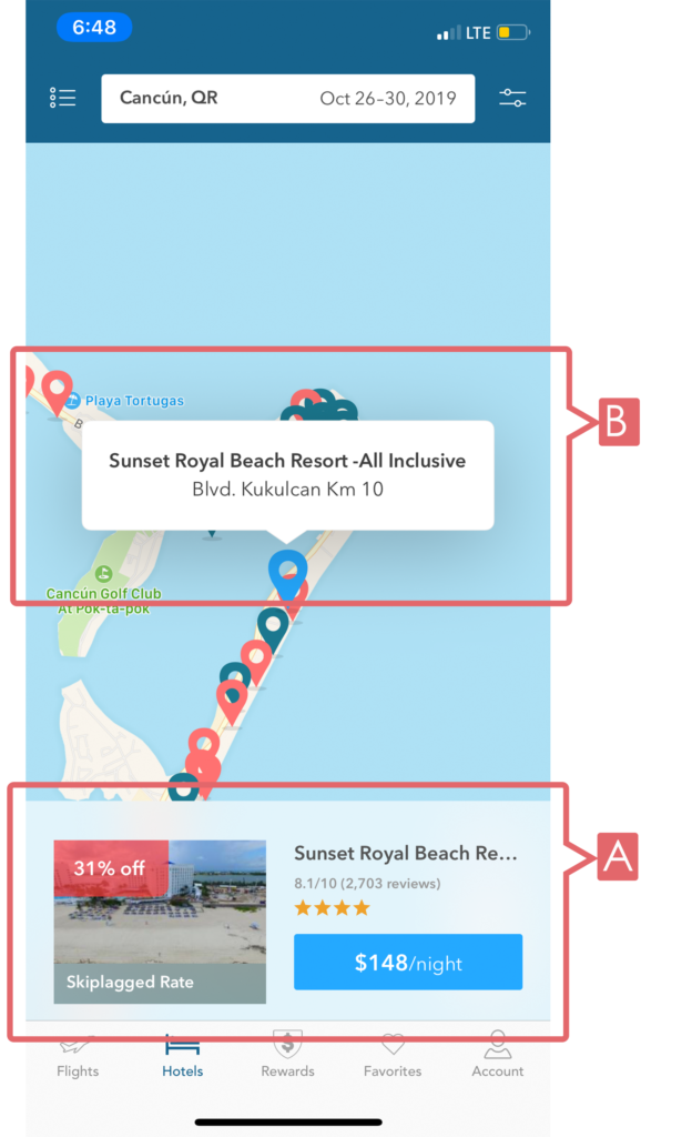
Figure 9
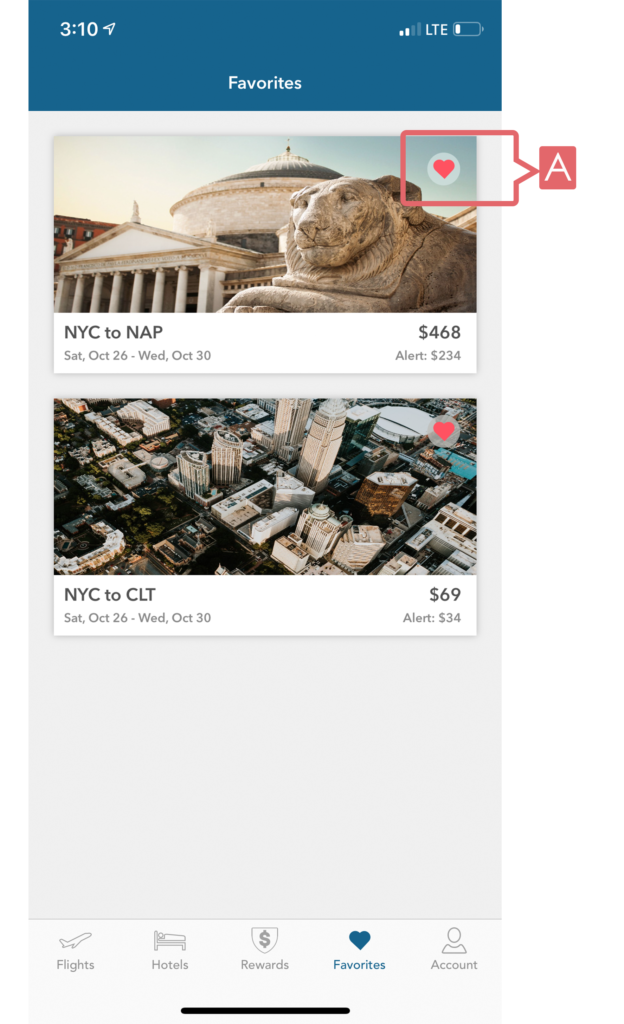
The design of favour page is very simple. The favourites icon corresponds on the saved location in the favourites. However the user requires Knowledge in head to tap on heart and remove the destination for favourites. (Figure 10)
In conclusion the skiplagged app has a very clean and minimal design due to the relatively young audiences that are familiar with the technology. The colour coding with red & blue have been used in the app in a consistent manner. But there is room for improvement is terms of discoverability & affordances like using text user icons or / and buttons instead of icons. This may avoid confusion for the user without knowledge in the head.
