The Room is the first of a series of mystery-puzzle video games originally developed by Fireproof Games. It follows a format similar to the genre of Escape Room games available on the mobile and consists of highly elaborate boxes with multiple puzzles that must be sequentially solved to unlock the box. The game was originally released as an iOS app in September 2012, with an Android release in March 2013. Further editions were also released for Microsoft Windows and the Nintendo Switch. This critique takes a closer look at how The Room (on Android) makes use of the Design of Everyday Things‘ Design Principles and uses them to lead the player through the game.
Fireproof Games have provided a highly tactile interface in their game, in stark contrast to similar escape room games that present several UI elements in addition to the narrative taking place on the screen. Users are provided 3 degrees of freedom with which they can intuitively explore the object at their own pace. This lack of switching between the UI and the screen helps to provide less cognitive interruptions and increase the level of immersion in the narrative.

This immersion is contingent on subtle and impactful affordances provided across the game. This can be implemented in the form of lighting, contrast, and (as provided in the narrative) a lens that displays clues that are not otherwise visible. The vignette and reduced scope displayed when using the lens signify that the lens is not to be used all the time, but only during key moments. This makes the cues to proceed ahead seem random and uniquely discoverable to the user.
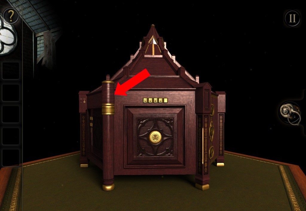

The mapping between the user’s actions and the gameplay on the screen is seamless. Users can interact with items in a manner very similar to real-life interactions such as turning a key in the keyhole to unlock it. Swiping to the left or right maps to the horizontal plane and swiping upwards or downwards maps to the vertical plane, providing 360-degree access to the objects in sight. The user’s knowledge in the world is utilised by the photorealistic graphics and the tangible interaction to build a natural understanding of the system image. In my personal experience, I was able to naturally adapt to the controls without needing the tutorial section provided at the start of the game.

Fig 4. Natural mapping among the objects in the gameTo overcome the initial gulf of execution, a simple tutorial level is provided at the start of the game. However, it still encourages discoverability by using minimal prompts that are only available when the user finds a particular item of importance. Physical constraints are provided through depriving access to items or clues that are required to solve a particular puzzle. Thus, though the means of discovery are abundant in the game, it still follows the flow intended by the developer. The gulf of evaluation is bridged through feedback that is received either through the movement of pieces or a slight vibration that acts as haptic feedback not to continue with that action.
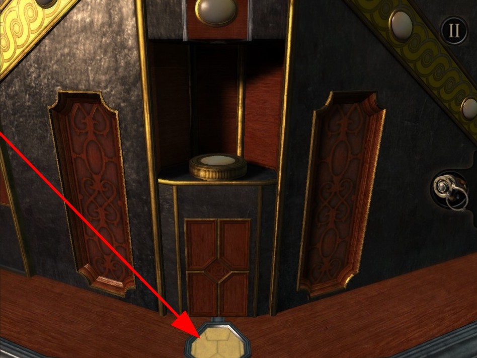
Fig 5a. Constraint from lack of items 
Fig 5b. The user can only progress after obtaining the right item.

The Room presents a very engaging puzzle that gives the illusion of freedom while guiding users through a specific narrative flow. However, it does not design for slips particularly well. The broad field for exploration often results in users being unable to find the particular signifier in order to continue with the narrative flow. This is remedied by a “hint” option that is accessible through the menu and opens a video of the gameplay. Ideally, the signifiers could be made less subtle(eg. increasing the lighting in an area) or the clues be presented within the gameplay as a text prompt or a visual indicator of the clue’s location to retain the immersion in the game.
In conclusion, The Room has an interface that utilises the user’s instincts to provide a highly intuitive experience. There is room for improvement in terms of affordances for slips that may occur during the game, but overall it is an excellent reminder of design that keeps its users in mind.
