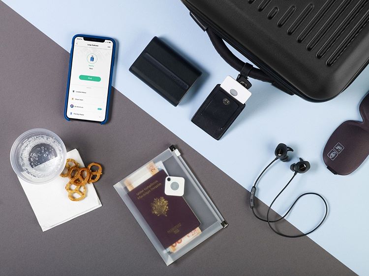
An IoT solution that helps users find lost items, Tile has sold more than 15 million devices. Users attach Tile devices to their items, pair devices to the Tile mobile app, and use the app to locate items when they are lost. Therefore, users must interact with two interfaces, the physical devices and the Tile mobile app, which will both be critiqued.
How it works
Tile leverages both Bluetooth 4.0 and the community of Tile users to locate lost items. Devices have an in-built battery, speaker, and Bluetooth tracker and can be located within 300 feet of the user’s phone. When devices are out of range of the owner’s phone, Tile devices can be located by other Tile users, whose apps will automatically and anonymously send the device’s location to its owner.
Neither of the two interfaces display this information. The user’s conceptual model is that the Tile device is connected with their phones via Bluetooth and that the app will find the device when it is lost. This inaccurate and imprecise conceptual model is sufficient for the correct usage of Tile, and is an example of successful satisficing.
The Device
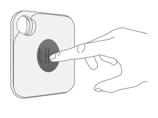
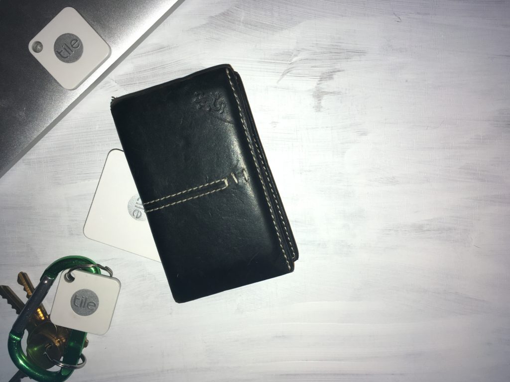
Tile devices are both slim and equipped with a hole which affords users to attach devices to items without limiting the item’s portability. In the middle of each tile is a button, which when pressed will trigger the paired phone to ring. While this affordance satisfies the user need to find their phones with their Tile devices, its design is not perfect.
The button is not clearly signified and requires instructions (shown in the image above). Its function is also not mapped. There is nothing that indicates its connection to the user’s phone. This requires internal knowledge is definitely a limitation in the design of the device.
As the button only has one function, triggering the phone, feedforward is easy with knowledge in the head. Feedback is also satisfactory, as the phone immediately rings when the button is pressed. However, there is no troubleshooting mechanism for when the phone doesn’t respond. This is a weakness of non-screen interfaces. As the device lacks good signifiers and mapping for its button and a troubleshooting mechanism, both the gulfs of execution and of evaluation are not fully bridged.
A possible solution:
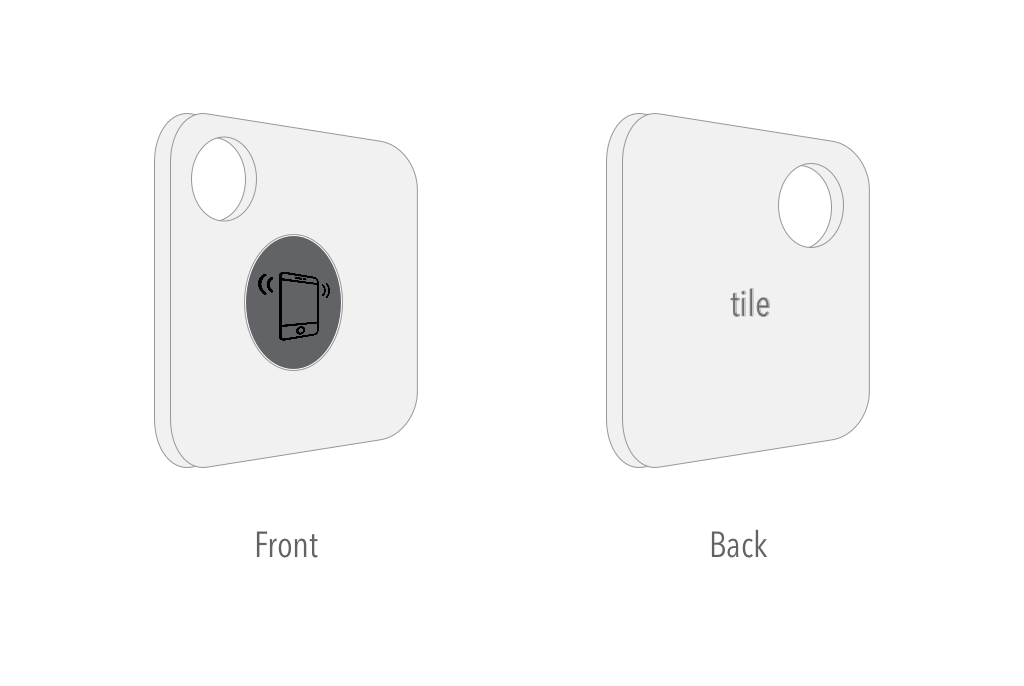
A simple rim around the button would improve its discoverability. The middle of the button currently displays Tile’s logo. This is a missed opportunity to map the button’s function and I have replaced the logo with an icon of a ringing phone. Finally, I moved Tile’s logo to the back of a device, which is a sacrifice in terms of branding, but would bridge the gulf of execution.
The App: Find my Wallet
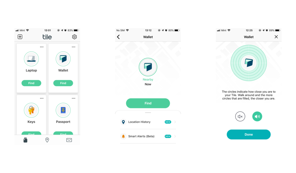
When users lose their items, the mobile app is their primary interface. The home screen is simple, hiding most of the apps features and highlighting its main function which is to “find” lost items.
The size of each section increases its discoverability. And the icon in the middle maps directly to the item to which the tile device is paired. In this case, there is sufficient knowledge in the world and no need for knowledge in the head. It is also deployed in the right context.
The “find” function is also clearly signified, with an accent colour and a rounded rectangle button. As users may panic when items are lost and simple direct buttons will appeal to users’ visceral needs.
Upon clicking the find button, the app displays imprecise information about a device’s location and time. This again satisfies the user’s visceral level of processing when items are lost as “nearby” and “now” is sufficient information to settle users’ panic.
The repetition of the item’s icon and the “find” button removes the need of any short term memory. By clicking on the find button, the user triggers the tile device’s internal speakers and is transported to the third page.
The item’s icon vibrates and the accent colour on the “sound on” button indicates that the device is currently ringing. This is important feedback to let users know that their device is ringing when they cannot hear it.
Conclusion
As this critique has shown, apart from a few usability issues with the Tile device’s button, both the device and app interfaces are understandable and usable. Well-designed interfaces that are seamlessly connected will become ever more important as user adoption to IoT solutions becomes even more widespread.
As this critique has shown, apart from a few usability issues with the Tile device’s button, both the device and app interfaces are understandable and usable. Well-designed interfaces that are seamlessly connected will become ever more important as user adoption to IoT solutions becomes even more widespread.